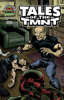
 Tales of the TMNT #57 (Mirage Publishing) Is it just me, or does Jim Lawson’s art get a little weirder with each new book he draws? Look at that cover. Look at the rigid, jagged lines on the outlines of the human characters’ limbs, the strange muscle-to-joint ratio of the figures, the bald dude’s caricature of a face, and the deep, look-at-me! blacks of the shading.
I’m sure I’ve mentioned this before, as I’ve reviewed issues of Tales of The TMNT Mirage has sent me before drawn by Lawson, but I used to really dislike his art when I first started reading comics, as it was so far-removed from what I felt the “real” ninja turtles should look like (That is, like Eastman and Laird’s or, failing that, then maybe Michael Dooney’s).
His art has changed a lot since the, and my appreciation for comics art has changed even more. For example, I stopped caring what the “real” ninja turtles should look like, because hey, the ninja turtles aren’t really real-real anyway, and the question of whether or not artwork is good is a pretty different matter than whether or not the artwork is exactly how I would like it in the best of all possible worlds.
Anyway, this is another Lawson-illustrated issue of ToTMNT, illustrating a done-in-one script by Dan Berger.
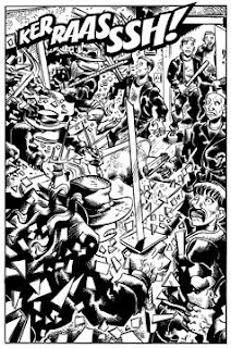
 That weird Lawson art looks a little weirder on the inside in black and white too. I don’t remember Lawson ever using quite so many blacks, before, but I kinda like the thick texture of all the objects and surfaces. I also really dug the fight scene at the end where the characters are splayed out in such flailing positions that it seems like someone grabbed the panels by the frames and just shook them, the combatants bouncing around within (Looking at all the hard straight lines and the bodies in motion in this scene suddenly filled me with a desire to see a Jim Lawson-drawn story featuring Captain America or OMAC or Etrigan or Black Panther or some other character known for the way Kirby made him move around the page).
Am I being too complimentary of Lawson? I don’t think so, but I’d hate to lose my reputation as hard-to-please, so let me take this opportunity to point out that I hate the way Lawson always draws the turtles wearing their weapons at all times. Like, Raphael, Leonard and Donatello are all shown sitting on couches and easy chairs at one point, while their big, rigid ninja weapons are tucked into their belts. Can Raphael breathe with his sai handles pressed against his chest like that? How comfortable is it to lean back against a bo staff or pair of katana? (Perhaps the shells mitigate this). It can’t be good on the furniture.
The story opens with Michaelangelo, wearing the Ben Grimm-approved disguise of a trench coat and wide-brimmed hat, bounding over New York rooftops while being pursued by nimble gangbangers who operate under the unfortunate name of the “Madhattan Maulitia.” He’s content to just runaway, until one of them pulls a gun, which does not sit well with Michaelangelo (Wouldn’t you be pissed if you spent all that time learning to master some ancient weapon, only to find out some dudes are just going to pull a gun on you? Bringing a gun to a nunchuck fight might seem like smart thinking on the part of the gun-bringer, but it is also a dick move).
Back at a/the apartment, the four turtles argue about their living arrangements, with each of them preferring to set up shop in a different place. This leads to a lot of arguing, which is only resolved—after a big, 12-page fight scene in which all four turtles arrive dressed in their flasher costumes of trench coats and wide-brimmed hats—by Shadow pointing out that they’re being a bunch of mean babies.
It just occurred to me that although ToTMNT costs $3.25 per issue, it actually contains 28 story pages (plus the frontspiece/pin-up/introduction page), which is actually a pretty good value for that extra 36-cents. Michael Dooney provides that image, and there’s another pin-up bookending the story, this one by artist Darryl Graham. It looks like this:

Pretty cool, huh? Graham’s Raphael is so goddam cute, I’d like to read a whole story of these turtles.
 The Muppet Show #2 (Boom Studios) Hey remember, when The Muppet Show #1 came out at the end of last month? People went nuts for that comic. Everybody on earth loved it, except for a few people who didn’t, but those people don’t review comics formally, they just showed up in comments section to say, “Gonzo’s nose isn’t quite right, Roger Langridge should be punched in the abdomen!” so let’s just stick with “Everybody on earth loved it.”
 This is the second issue of that series, and it’s also quite good. I think response will be a more muted for this one—I personally liked it a little less—largely on account of the fact that the surprise/shock of a comic book based on a decades-old live action TV puppet show inspired by the Vaudeville theater of sixty to seventy years before no longer being a factor.
That is, this time out, I expected it to be great. And I wasn’t disappointed.
The story this time is focused on Fozzie Bear, and his struggle to find comedy material that connects with his audience. He attempts doing so by looking to the past of comedy, but each attempt takes him farther and farther away from doing so. Langridge again interrupts the main narrative with Muppet Show skits (the medical soap opera starring Rolf as “Dr. Bob,” Pigs In Space), including a couple of “musical” numbers which are arranged on splash pages with characters moving across them in implied panels.
Good stuff. Again.
I can't wait to go to the store tomorrow and buy my copy of Muppet Show #2. If only the DVDs for season four would follow.
ReplyDelete*sigh*
I love the Muppets, but I think a comic is a terrible idea. It only feeds the nostalgia market when comics ought to be looking forward.
ReplyDeleteThanks for the kind words. I'd love to make a turtles comic in that style. Maybe a 5 issue mini series. I should pitch it to Mirage. :) thanks again.
ReplyDeleted.