Wednesday, July 31, 2013

Some Mad magazine jokes that didn't age super-well

I read and reviewed the Mad Super Spectacular: Superman, Man of Steel for Good Comics For Kids (you can read it here, if you like), and I was rather surprised by some of the contents (none more than the bull semen joke in the Superman Returns parody, really, but that's only because it was a joke about bull semen in a place I did not expect to find a joke about bull semen).

The book contains the Mad parodies of each of the Superman movies save for Superman IV, plus one for Smallville. The great Mort Drucker drew all of them (except for the Superman Returns one), and I was rather surprised at how many gay jokes were in them.

I can't necessarily say I was offended by them, and I don't think they necessarily should have been edited out of the book, or that DC shouldn't have collected those comics because of the presence of those jokes in them, or that people shouldn't ever make gay jokes. Personally, I don't think any subject should ever be off-limits to a comedian of any kind (including cartoonists, obviously), but the thing is, if you're going to embrace potentially offensive, controversial subject matter, then you have to be funny enough to justify doing it (Comedy is one place where I think the ends usually do justify the means).

And I certainly don't think one shouldn't be able to make jokes about Superman being kinda gay. He was a character who, in the 1940s through early 1980s or so, clumsily, half-heartedly courted a woman he didn't really like, let alone love, while keeping a deep, dark secret from everyone but his very best friend (who had the very same secret).

And Superman would literally enter a literal closet, and then come out of the closet as his more flamboyant, true self.

Also?
None of these "Superman is gay" jokes really qualify as funny, though, and thus don't really justify their existence. (Humor's subjective though, I suppose, and maybe some of you will find them funnier than I). They all seem really...odd in 2013. Like, these are subjects we don't really hear or tell jokes about much anymore, at least not in such a broad, clumsy, gayness-is-in-and-of-itself-inherently-funny kind of way.

Perhaps they made more sense at the time (I'm assuming and hoping that one about Arabs was referencing something specific and thus wasn't just the wild, offensive stereotype it looks like now, for example). I was technically around at the time of all of these, being born in 1977, but I wasn't conscious of much outside of my immediate surroundings. "My" Superman was the one on Superfriends and the Super Powers Saturday morning cartoon and toy line, and I didn't really watch any of the Chistopher Reeves movies until I saw bits and pieces on cable as a teenager and, later, on VHS and/or DVD as a grown-up.

So maybe this was okay, or at least common, in the late seventies or early eighties, but, man, it sure looks weird and wrong and off-putting in 2013:

—"Superduperman" (Parody of 1978's Superman), written by Larry Siegel


—"Superduperman II" (1980's Superman II), written by Frank Jacobs


—"Stuporman ZZZ" (1983's Superman III), by Stan Hart


—"Smellville" (2001's Smallville), Dick Debartaolo


Here's the weird Arab joke from the Siegel-written "Superduperman":


Finally, so as not to go out on a down note, here's a joke from the "Superduperman II" strip that is funny in a very different way, given the similarity of Man of Steel's plot and conflict to Superman...
...and the differences in the number of people who can be killed off in a 1980 PG movie vs. a 2013 PG-13 movie.

Sunday, July 28, 2013

Some notes and thoughts on Earth 2 Vol. 1: The Gathering

•This is a hardcover collecting the first six issues of Earth 2, a "second wave" (i.e. replacement) title in DC's New 52 line. The series is written by James Robinson, and the artwork comes primarily from the team of pencil artist Nicola Scott and inker Trevor Scott, although a second penciller and a second inker are also credited, as are three different colorists. As with other recent DC collections, it's not clear who did what page, but based on the fact that the Eduardo Pansica and Sean Parsons art team produces work similar enough in style to that of Scott and Scott, there aren't any terribly drastic shifts in visuals, and both teams do a fairly great job, particularly by New 52 standards.

•I trade-waited this series, but not because of misgivings about the creative team (I really like Nicola Scott's artwork quite a bit, and while Robinson's written some really quite incredibly terrible comics for DC of late, he has a large body of work full of more good comic book writing than bad comic book writing). Rather, I wasn't really sure what to make of the premise of the series, as suggested in its title.

•Most DC readers know that "Earth-Two" was the name of the parallel Earth where the Golden Age superheroes used to reside, a conceit the publisher used for a whole host of cosmic crossover adventures between Earth-Two's Justice Society of America and Earth-One's Justice League of America, between the time Gardner Fox introduced the concept in 1961 to the 1986-1987Crisis On Infinite Earths, which smooshed the two worlds and their sets of heroes (along with those of several other Earths) into one, single world with one, single history. Post-Crisis, there was no Earth-One and Earth-Two, just the "Earth" of the DC Universe, in which the Golden Age versions of most of the heroes had their adventures between the late 1930s and mid-1950s or so (excluding Superman, Batman, Robin and Wonder Woman, whose Golden Age versions more-or-less ceased to exist), while the other heroes of the DC Universe, including the Silver Age reboots of The Flash and Green Lantern and company, "The Trinity" and original Silver Age characters like Martian Manhunter began their careers on a sliding timeline of about ten years ago.

I liked that solution quite a bit, as it gave the world of the DC Universe a longer, more complicated, more interesting history, and sort of promoted some of the Golden Age characters to, if not co-equal, than at least more equal status to their Silver Age replacements. So while Flash Jay Garrick and Green Lantern Alan Scott might not have been in cartoons or appeared in the toy lines, while they might have looked like they threw their costumes together based only on the contents of a high school drama club's costume trunk, they were now portrayed as trailblazers and pioneers, the founders of a heroic legacy. They were fighting Nazis while Barry Allen and Hal Jordan were just twinkles in Julius Schwartz's eyes. Looked at from the real world, I like the way these characters' place in the fictional DC Universe acknowledged the work of their creators and the guys writing and drawing them in the 1940s; they were kind of like symbols of that era of creators, and their being a part of the DC Universe's story felt like an in-story acknowledgment and hat-tip to those creators as well as that era.

I understand that it never felt quite right to certain folks though, because it implied that Superman, for example, wasn't the father of all DC's superheroes, and it made Batman seem somewhat derivative of, say, Dr. Mid-Nite and The Sandman, rather than vice versa (And, unfortunately, it did de-couple Wonder Woman from the best era of Wonder Woman comics, the war-time efforts of her creator and artist H.G. Peter).

When DC rebooted their universe once again with The New 52, they deliberately did away with the Golden Age of superheroes altogether, and even cut their timeline of ten or so years in half to five or so, so that the heroes of the DC Universe can trace their careers only as far back as the final year of the Bush administration—The George W. Bush administration.

This title re-instated the multiple, parallel Earths concept then, and Earth 2 once more became the home of the Golden Age heroes like Flash Jay Garrick and Green Lantern Alan Scott, only with a twist—it would be presenting new versions of these Golden Age heroes in the present day, so rather than World War II veterans, the heroes of Earth 2 would be millennials and members of Generation Y, same as their counterparts in the regular DC Universe.

I wasn't really sure what to make of this, and given that the series was starting with an alternate take on the conflict from the first story arc of Geoff Johns, Jim Lee and company's New 52 Justice League, which I loathed, I figured this would be a comic I'd want to hold off on.

•To complicate matters more, a few years prior to the New 52 relaunch, DC started using the term "Earth One" to refer to a line of original graphic novels set in their own, distinct and (apparently) unrelated continuities (In easier to understand terms, "Earth One" now translates into DC's version of Marvel's "Ultimate," differing only in their format and the fact that the titles don't seem to interlock). So far there have been two volumes of J. Michael Straczynski and Shane Davis' Superman: Earth One and one volume of Geoff Johns and Gary Frank's Batman: Earth ONe, with a long in-the-works Grant Morrison-written Wonder Woman: Earth One expected in the near future.

So the DCU of The New 52, The New 52iverse, isn't ever explicitly referred to as Earth 1, even though there is now an Earth 2.

•Earth 2 differs rather significantly from Earth-New 52. For one thing, it only has 3-5 superheroes: Superman, Batman, Wonder Woman and, depending on whether you want to classify them as superheroes or sidekicks, Supergirl and Robin (These two young ladies come to Earth-New 52, find themselves terrible costumes, adopt the personalities Power Girl and The Huntress and star in Worlds' Finest, another "second wave" New 52 series).

•Also, they don't call superheroes "superheroes" on Earth 2. They call them "wonders," as in 2003's JLA: Age of Wonder Elseworlds series (republished rather recently as DC Comics Presents—JLA: Age of Wonder)

Earth 2 opens in more or less the same place that Justice League did: It's five years in the past of the narrator (television producer Alan Scott, providing narration for a documentary he's produced), and an army of alien invaders is threatening to overwhelm the Earth. This Earth having fewer heroes, the aliens—which are, of course, Apokaliptian Parademons, here led by a redesigned Steppenwolf rather than a redesigned Darkseid—are doing a much better job of it, and Earth looks like it's in real trouble. Batman has a plan to stop the Parademon invasion, by infiltrating one of the towers they've erected and downloading a maguffin virus that will knock them all off-line, cutting them off from their home dimension.

•Also as in Justice League, the heroes are all, like, crazy violent.

Superman heat-visions them in their faces, grabs them by their throats and smashes their heads into pieces. Robin (Helena Wayne) guns a parademon down from the Batplane, and Batman even shoots one through the head. Wonder Woman chops off the heads of, let's see...five of 'em, on-panel, and uses the word "kill" repeatedly.

This being an alternate world with alternate versions of the characters, and ones that don't need to survive even one entire issue, Robinson certainly has more leeway in how he depicts their morality, and these alternate versions of the Trinity are depicted as being backed into a corner and fighting for survival. Wonder Woman, for example, is the last surviving Amazon: Steppenwolf and the Parademons have already killed every single one of her sisters.

The violence is also somewhat muted by the fact that these versions of Superman and Wonder Woman know that the Parademons are robots of some kind, or, at the very least, cyborgs, as Batman's plan is to knock out the towers remote controlling them (without which they will "fall from the sky," he says), and Scott goes to some pains to show wires, tubes and oil spurting from their wounds every time Wonder Woman chops a head or limb off, or Superman smashes one to bits.

In Justice League, remember, the heroes (and, presumably, the readers, if the New 52 was doing its job) were seeing Parademons for the first time, and Superman and company were just murdering them left and right, with no line of dialogue dedicated to explaining that they were mechanical monsters made of machinery and corpses or whatever and that, since they were already dead, it was okay to, say, sever their heads. Weirder still, the Parademons were just kidnapping people in that story, which, while certainly a crime and a scary experience for the victims, doesn't exactly merit execution on the spot from the likes of Superman and Aquaman, you know?

•Batman's plan works, downloading the virus is a suicide mission for him, and he doesn't survive the resulting explosion. Superman and Wonder Woman's part of the plan is to buy him some time. Both of them get killed as well. Superman by some kind of bomb the parademons attach to him, while Wonder Woman gets Geoff Johnsed:

•I know hindsight's 20/20 and all, but I think I found one way to improve upon Batman's plan. Rather than Batman himself climbing a tower and downloading the virus, which resulted in an explosion that killed the mortal Dark Knight, maybe he could have had Superman fly to the tower at top super-speed and install the virus for him; not only would the job get done a lot quicker, but chances are Superman might have survived the resulting explosion (Or maybe not; he did get blown up to death by an Apokoliptian bomb).

But in any case, Superman would have had a better chance of surviving. When it comes to suicide missions, enlisting the invincible, indestructible guy on your team is usually your best bet.

•I think opening a new title featuring new-ish characters with an adventure starring three other characters is kind of a weird strategy. It's not until the last five pages or so of the first issue that the stars of Earth 2 really appear. Alan Scott is revealed as the narrator, on private plane to Beijing. And Jay Garrick gets the last four pages; having just been dumped by his girlfriend, he's brooding alone on a hill at night with a six-pack, when the Greek God Hermes—seen earlier in the issue telling Wonder Woman that he and the other Olympians were trying to fight off Apokolips as well, and were getting their divine asses handed to them—appears to him (It works okay here in the trade, but was likely rather frustrating to those reading the monthly, serially-published installments).

•Most of the second issue is devoted to Jay Garrick's origin, which is here sort of like a mash-up of myth and Hal Jordan's origin; the dying Hermes gifts Garrick with his super-speed powers (which would certainly explain Garrick's old hat, but, this being the New 52, he has to have a new costume, which resembles his old one in some ways, but is heavily modified: His Hermes hat, for example, is now just a Hermes-inspired helmet, and looks more 1950s/1960s sci-fi than something truly mythological, like his old hat.

•Mr. Terrific II Michael Holt, who had a quickly-canceled title in the first slate of New 52 books (set on Earth-New 52), appears teleporting onto the Earth 2. He's immediately confronted by Terry Sloan, who introduces himself as the "smartest man on earth." That's the secret identity of the original Mr. Terrific. Sloan appears throughout this volume, and seems to be somewhere between an anti-hero and a villain.

•The same scene features an ad for Tyler-Chem (Hourman Rex Tyler was a chemist) and an add for a boxing match between Grant and Montez (Wildcat's secret ID being heavy-weight boxing champ Ted Grant; his first successor was Yolanda Montez, although the Montez in the ad isn't her, but a big, bearded, bald burly guy).

Later, a character mentions a man named Fate, and there's a "Commander Dodds and His 'Sandmen'" working for the World Army.

•Alan Scott's origin starts in this issue. He's riding a bullet-train with his boyfriend Sam, and pulls out a ring to propose to him, just as the train explodes (This is more-or-less in-keeping with his Golden Age origin, minus the boyfriend part).

•While Garrick received his super-powers from a dying god, Scott gets his from a glowing green fireball, that reminded me of the burning bush of Moses' story. A big deal was made out of Alan Scott being rebooted as gay at the time of this comic's original, serial release, but it is, of course, anything but controversial. It's very much a situation of a hero who happens to be gay, rather than a gay superhero. The gender of either Scott or his boyfriend could have been changed, and nothing about the story itself would have changed.

•Sam is "fridged" within an issue of being introduced...sorta. The main thing accomplished by having Scott in the midst of a proposal when his train explodes and the flame finds him is that it allows a rationale for him to be a hero who fights with a ring: "You must have a token or weapon with which to focus your power," the green fire says, "Something close to your heart." (Later, Scott is briefly tempted to stay in the land of the dead with Sam rather than returning to the land of the living to fight on, I suppose that's a second reason to include the Sam character's death in Scott's origin).

•The only other heroes introduced in this volume are Hawkgirl (Kendra), who has an unusually not-so-bad redesign, complete with a new color scheme and a hawk-helmet with a hint of Egyptian design about it, and The Atom, diminutive World Army Sergeant Al Pratt, who gains both size-changing and nuclear powers after exposure to Apokaliptian energies and a nuclear weapon the World Army was planning to use against the enemy.

Both are part of the government's plans to manufacture their own Wonders, but Kendra escaped and went rogue, while The Atom remains a loyal soldier (and thus is in conflict with the other three heroes of Earth-2).

•The four heroes—Flash, Green Lantern, Hawkgirl and The Atom—are united by the common foe of Grundy, who is here a hulking, zombie-like creature wearing a sort of butcher's apron and commanding tendrils of dead plant-life. He's the champion of The Grey, a death-force in opposition to The Green, of which Green Lantern is the new champion, and his plan is to draw out GL and kill him. Obviously, that doesn't happen, as the four heroes defeat him (after spending some time with The Atom trying to capture Hawkgirl and The Flash).

•All in all, this turned out to be an all-around pretty good New 52 superhero comic, although, ironically, even if I had tried out the first issue when it was initially released serially, I probably would have ended up dropping the book. Scott's art on that issue is nice and all, but the plot of the first issue amounts to little more than "Superman, Batman and Wonder Woman all die horribly," and that's not the sort of first issue that makes me wanna read a second issue.

By the end of this trade though, I was eager to see what would happen next, and I find myself looking forward to the next trade.

Naturally, this creative team doesn't last long; Robinson is already departing the book. And DC Comics in general. Not that we should read anything into Robinson being the 27th or so professional with long-standing DC ties to run away from the publisher screaming!

I think I was most surprised by how good this turned out to be because Robinson, like Johns, is a writer whose best work for DC has been fairly grounded in arcane continuity and recycling and reusing the publisher's many pre-fab characters—generally, the more unloved and obscure the better—and doesn't exactly have a reputation for radical reinvention. But he does a pretty good job of recreating some of DC's best-known characters into something completely new here, fusing their Golden Age secret identities with more Silver Age power-levels and concerns and distinguishing his origins of them greatly from pre-existing versions.

•I remember making fun of the cover for the second issue of the series—which shows Jay Garrick running through a sewer, covered in rats—when it was released. The cover of issue #3 shows Alan Scott on fire, the flesh of his left hand literally burning off of the bone. The following issue? A crowd of zombies pulling Hawkgirl out of the sky.

I don't know what the idea of these particular covers were, but Earth 2 really seemed to go out of its way to advertise superheroics as something truly nightmarish (and, in all of the above cases, the cover makes the events inside seem much worse than they are; The Flash handily traps a bunch of vicious mutant rats in a garbage can, rescuing a couple being swarmed by them in an alley, in a two-page sequence of standard superheroics, for instance).

After the first issue, which shows the Trinity killing Parademons, it's not until issues #5 and #6 where the covers depict the heroes doing something heroic (Although, even in these images, being a superhero seems to be more about fighting for your life, rather than, I don't know, being able to run super-fast or to fly.


•Despite my initial revulsion to these designs when I saw some of them released on cover solicitations and so forth, I actually kind of like most of them. The Flash costume certainly lacks the charm of the original, and putting the character in such man-made looking clothing given his divine origins here (The Kingdom Come Flash is probably the best blessed-by-Hermes Flash design), the more time I spent with it the more I liked it.

The Green Lantern costume also lacks the flair, charm and individuality of the original, but rather works here, striking a compromise between the Silver Age costumes and the Kingdom Come green knight loook. This Lantern costume wouldn't work if Scott were still sharing an Earth with a half-dozen or so other Green Lanterns similarly attired, as he'd get lost in the crowd, but here he's his Earth's only GL, so that's not a concern.

I actually like Hawkgirl's look, and how much it differs from the original (specifically in the color scheme). It certainly sets her apart from all the the other Hawks that have preceded her, and offers a strong contrast to the colors of her teammates (although the trio haven't really formed a team of any kind by book's end), whereas if she were in her old green and orange orgold, she'd be sharing a color with each of them.

I even kinda liked The Atom's costume, which looks like a cross between the costume of post-Infinite Crisis Damage and that of G.I. Joe bad guy Firefly.

Grundy looks pretty dumb, but his original look would have seemed out of place here as well, given his function in the story.

As for the Trinity, Superman's costume is a vast improvement over his New 52 duds: He's lost his shorts (but has red "paneling" around his hips, not unlike the weird metal space girdle he wears in the Man of Steel movie), a different cut to his boots, and a much bigger S-shield, but otherwise he still looks like Superman. Much better than Jim Lee's high-collared, darker-colored, heavily-armored Superman on Earth-New 52.

Wondy's costume has quite a bit of tinkering, her tiara becoming a heavy-dut, heavy-metal headband that threatens to eat her face, and instead of a bracelet on her left-hand, most of the arm is covered in armor. She also wears a sort of battle skirt instead of shorts or pants.

I prefer even the New 52 version (which is basically just an over-accessorized, darker version of her standard costume) to this, but not by much, really; a toned-down version of this costume (which exists in the sketch gallery in the back of the trade) could have worked justt fine in The New 52.

Batman's costume is pretty drastically different, looking closer to Damian Wayne's future Batman costume than one Bruce Wayne could conceivably wear in a normal continuity, but it's kinda hard to judge Batman costume's too closely, since we've seen somewhere around 700,000 different Elseworlds Batman costumes.

The book ends with a six-page sequence of Scott's pencils (which are so great it seems a shame they had to be inked and colored at all), and nine pages of character sketches.

According to these, Jim Lee came up with the Solomon Grundy, Teh Atom, The Batman and a Steppenwolf (Although the one used int he story looks nothing like his version). Scott apparently designed The Superman, The Wonder Woman (the final version of which differs greatly from the one shown here, which basically just looks like the sort of Wondy costume that could have been put together in ancient Greece), The Flash (with several different lightning patterns and color schemes apparently run through) and The Sandmen. Joe Prado gets a credit for The Green Lantern.

•Hey, check it out! I finally figured out how to make bullet points!

Saturday, July 27, 2013

Meanwhile....

It's been a while since I've seen a re-run of the Batman live-action TV show—it was before I'd hit puberty, at the latest—so I don't remember the contents of that Batman's Batcave all that well, but I'm pretty sure the Batspresso machine is new.

Man, I could really go for a Batspresso right about now, I think, depending on how much it differs from espresso...

Anyway, the above image is, of course, a panel from Jeff Parker and Jonathan Case's Batman '66 #1 (the paper version), which I reviewed for Good Comics For Kids earlier this week. In addition to being a pretty fun comic, I think it's especially noteworthy as being another kid-friendly, all-ages DC comic featuring the publisher's most popular hero (which brings the grand total up to two with Li'l Gotham; maybe more if you wanna count the Beyond stuff, but I don't, because that's just some punk kid without a cape, not the real Batman), and for its unequivocal embrace of a show that used to hang like an albatross around too many in comics for too long. Anyway, you can read my piece here.

That there is John Constantine, temporarily imbued with the powers of Shazam, holding aloft the head of a demon he had just torn off with his bare, super-powered hands, taken from the pages of the Ray Fawkes-written, surprisingly-nice-looking Renato Guedes-drawn Constantine #5, a tie-in to DC's kinda awesome, kinda dumb "Trinity War," which I'm still covering for ComicsAlliance. You can read that here.

Finally read the first part of DC's reboot of the the He-Man and Masters of the Universe franchise—collected in He-Man and the Masters of the Universe Vol. 1—which is breathtakingly, mind-bogglingly bad comics, with art on part with that of Countdown and an extremely confused script no doubt hurt by the original writer leaving after just one issue. See all those credits up there? Those are just the writers and pencil artists; it leaves out the eight—eight!—inkers. You can read that piece here.

Thursday, July 25, 2013

Comic shop comics: July 17-24

Classic Popeye #12 (IDW) The best part of this issue is probably the first story, in which the Sea Hag gets her gnarled hands on a magical flute that can control all of the birds of the earth, with which she plans to conquer the world. But not Hitchcock's Birds-style; instead she raises an army of millions of huge vultures, using them to kidnap farmers and force them to raise vulture food to feed more vultures (I'm not entirely sure the Sea Hag knows how vultures work).

Naturally, Popeye saves the world, and does so in part through an epic, mid-air 500 vulture battle, in which one tries carrying him off, he punches it out, another grabs him and continues carrying him and so on until he gets to her island base, he punches out the last vulture and falls hundreds of feet to the ground (Seriously kids; eat your vegetables—you'll be practically immortal).
I was a little surprised when, at the end, Wimpy tells Popeye to be sure and destroy the flute so it can't be put to evil use ever again, as I would have thought its ability to control all birds—particularly ducks—would have been of great interest to Wimpy.

The worst part was the advertisement on the back for the collected editions of this very comic book, which look so big and fat. Looking them up online, it looks like he get about 200 pages for $20 (at least through a particular online bookseller), so about the same page-to-price tag ratio as the comics, but in a sturdier, easier to store format.

So now I'm torn. I guess in the long run I'd prefer to own the trades, but, in the short run, I really enjoy reading this old-timey comic book in its comic book format.


Daredevil #28 (Marvel Entertainment) So here's that issue of Daredevil that came out a few weeks ago, but Diamond apparently shorted my shop on (this week, it's the Hawkeye annual that didn't show up, for whatever reason).

In this issue, the regular, superlative creative team of Mark Waid and Chris Samnee Javier Rodriguez and Alvaro Lopez lean the narrative in a different direction, after the hero's epic, life-or-death battle with his archenemy that composed the last story arc and, to some degree, the last 27 issues or so.

Matt Murdock meets someone from his childhood who knows he's Daredevil, someone Murdock doesn't really want to help one bit, but who needs the help of a lawyer he can trust, as he's been falsely arrested for involvement with the Sons of the Serpent (before my time, but it gave Samnee the artists a chance to draw a flashback panel featuring Son of Satan, so that's cool with me).

In a nice little twist, Waid uses the opportunity to show a young, pre-secret origin superhero through the eyes of one of his antagonists, and we see that while Matt may not have deserved the violent bullying he got, he wasn't exactly a perfect, innocent angel, either (That's the sort of thing that's sort of at the core of Marvel characters, and that separates them from their DC counterparts—rather than paragons of good from day one, they tend to be emotional fuck-ups trying and usually or eventually doing the right thing; it's nice to see Waid conjure scenes where the reader can empathize with the bully and think, "Hey, maybe someone should slap that Murdock kid to shut him up," and nice to see how he and Samnee render that revelation when it hits adult Murdock).

Pages 16 and 17 are your bravura, show-stopping, only-in-comic scene, by the way, and props for an excellent surprising cliffhanger...the second most dramatic one I read this week.


FF #10 (Marvel) This is the pool party issue, the one with the best cover of any Fantastic Four comic that I can remember seeing on a comics rack with my own two eyes. This is a cover that sells a book all by itself, that you kinda wish you had a framed print of and that makes a powerful argument for the return of Marvel's old swimsuit specials.

Unfortunately, the artist responsible for that image is MIA on interiors, but at least Marvel got the excellent Joe Quinones to provide the fill-in art, and Laura Allred's still coloring, giving the book some further visual continuity with the previous, Mike Allred-drawn issues.

Quinones is an excellent artist who acquits himself quite well here (You may remember him from the Green Lantern strip in Wednesday Comics), and I like the way he manages a surprising historical likeness in a surprising guest-star, the slightly geeky, professorial look he gives plain clothes Ant-Man, and the mustache he gives Alex Power. Still, there are a lot of two-piece bathing suits in this issue, which translates to a lot of cheesecake and I prefer Mike Allred's cheesecake to that of many artists.

Matt Fraction has three different narrative strands going in this issue, each with a varying degree of a comedic component. The FF get invited to the penthouse pool of a very rich, influential man who has a proposal for them. Dragonman and the kids frolic in the pool, the grown-ups talk to the man and Bentley-23 makes a movie about his classmates Vil and Wu for a school assignment.

It is, as usual, pretty great comics.

Young Avengers #8 (Marvel) Too bad that Hawkeye annual didn't show up; if it had, I would have read an issue of all four of my favorite ongoing super-comics of the moment today, and it would have been a particularly great Wednesday evening.

In this issue, the team follows the Patriot-shaped monster thingee that captured Speed through a series of alternate dimensions, most of them horrible dystopian sorts of places, in which the young heroes find twisted mirror versions of themselves ("How many Earths did other yous make the capital of a new Kree Empire?" Kate shouts at Noh-Varr at one point; he seems to be behind more than one of those dystopias). The regular creative team of Kieron Gillen, Jamie McKelvie and Mike Norton make it through a pretty remarkable amount of alternate dimensions, partly through a narrated montage, partly through a couple of scenes, in just 12 pages. As with the last two issues, the creators pack a lot of action into a short amount of space, making it seem and read bigger and longer than it actually was.

But, most importantly, Noh-Varr grows a beard.
Oh, and the last page? Pretty unexpected, and a pretty incredible cliffhanger. It's also a textbook example of how to splash pages should be used effectively as narrative devices. You either have to have a very big moment emphasized by the space you're devoting to it, or you have to have a lot of very detailed shit to show the reader; this is a case of the former.

A public service announcement from Popeye and Bud Sagendorf

Hey kids! If someone ever points a gun at you, never, ever stick your finger in the gun's barrel, like Popeye does here:
Not because there's a danger that the the gun might go off, either because the person holding it pulls the trigger or on accident, causing you greivous bodily harm (although that is a conceren), but becaue there's another real danger involved in such an action.
Your finger might get stuck.

Tuesday, July 23, 2013

Apparently, Batman is the most delicious.

My father recently purchased these adorable little toy cars for my 10-month-old nephew, who doesn't realize just how lucky he is. I had to wait until I was in grade school until I had access to toys based on DC's superheroes!

So far, he doesn't seem too terribly interested in discussing superheroes with me. He doesn't even make eye contact when I try to explain to him how silly it is for Superman to drive a car, since Superman can fly (And I don't think it's not just because my nephew's a baby; my father is just as disinterested in my correcting him every time he refers to Green Lantern as Green Arrow or The Riddler).

At this point, my nephew mainly just sucks on their heads.

Batman is his favorite, but I'm assuming that he's basing his preference on the fact that maybe the black plastic tastes the best, or that perhaps Batman's slightly-pointed bat-ears feel more soothing against his teething gums than the plastic, round heads of hair on the other guys.

Sunday, July 21, 2013

Some picture books of note:

A Big Guy Took My Ball! (Hyperion; 2013): Either I don't do these posts often enough, or Mo Willems is just too prolific, because it seems like every time I do one of these, there's at least one of Willems' books included. Wait, what am I saying—Willems? Too prolific? Impossible! I could probably read Willems books all day every day, especially entries in his Elephant & Piggie series of starter reading books, which feature some of the all-around best cartooning you'll find pretty much anywhere you look for high-quality cartooning. I mean, just look at the cover, and the way the illustration tells so much of the story that the title does and doesn't; Gerald and Piggie's postures and expressions tell you their exact reactions to the incident and how they intend to cope with the conflict, and the whole thing looks like it was drawn with a well-sharpened black Crayola crayon!

The fine-print summary on the first page sort spoils the entire story, which I will strive not to do, as the species and specific identity of that "big guy" are quite a surprise, and the main narrative pleasure of this entry in Willems' long-running series. Suffice it to say that the big guy isn't just big in comparison to the rather diminutive Piggie, he's also big in comparison to Gerald who is, remember, an elephant ("That is a BIG guy," Gerald tells Piggie, "You did not say how big he was. He is very BIG").

So what kind of animal is that much bigger than an elephant? Well, the options are limited, and it's neat to see Willems draw this new animal in his series, and to see it sharing page space with Gerald and Piggie, who Willems must render very, very small. I also like the way the big guy's dialogue is all in large font, all-caps.

There's likely a lesson in here about getting along with others who are different from you, not judging books by their covers (metaphorically; you can literally judge this very good book by its very good cover) and sharing and playing together. If you're still young enough to need those lessons. For the rest of us, its instructive in the same way most Willems books are—as an example of world-class cartooning, a demonstration of how one can tell a great story for an audience of any age and for a lesson on the effectiveness of timing in comedy.

The Boy Who Cried Bigfoot (Simon & Schuster; 2013): This book written and illustrated by artist Scott Magoon (Whose name you may recall from reviews of his excellent Spoon and its sorta sequel Chopsticks, both with writer Amy Krouse Rosenthal, which I've reviewed here before; or maybe from the many other books he's written and/or illustrated that I have not reviewed here before).

Its inspiration comes, of course, from the story of the boy who cries wolf, only this boy, Ben, cries the name of a much a more exotic mammal than that of wolf.

Magoon sets most of the story at the edge of a little wood, where Ben and his little dog set up shop. Ben repeatedly cries "Bigfoot!" (sometimes in big, hairy lettering) and his family and neighbors and passersby come to the edge of the wood to see the imaginary Bigfoot, and Ben continues to do things to drum up interest and belief in his tales of Bigfoot, including hoaxing footprints.

As with the boy who cried wolf, Bigfoot eventually does show up, but at a point at which no one believes Ben. Rather than eating all his sheep or killing the boy like the wolf did—the wolf did kill and eat the boy too, right? It's been a while since I've read or had that story read to me—he just steals Ben's bike and dog (Naturally "Bigfoot is stealing My Bike! And my dog!" didn't bring anyone running).

It imparts pretty much the same story as its inspiration, with the same lesson, only with less violence, less aspersions cast toward any poor wolves and with the added benefit of Bigfoot, whose inclusion in pretty much any story of any kind generally improves it. I really like Magoon's artwork, and it's nice to see it applied to some human characters, the natural world and, of course, to the title character, who fits a nice, cartoony, child-friendly version of the most popular descriptions of the legendary beast.

I'd be really interested to hear what a real Bigfooter or enthusiast or believer thought of the book, and if they found the parallels between them and Ben that Magoon suggests as innocent, amusing coincidences, or as jibes (I'm assuming it's the former, as Magoon seems to have a place in his heart for such cryptid creatures; he's previously illustrated a book about the Loch Ness Monster too).

Cat Secrets (HarperCollins; 2011): Like Jon Stone's classic Grover-starring The Monster at the End of This Book or the aformentioned Mo Willems' Don't Let the Pigeon Drive the Bus, Jef Czekaj (of Grampa and Julie: Shark Hunters fame, comics people) has his protagonist directly address the reader in a story that is almost purely participatory and which is about the conversation between character and reader more than anything else.

Here, a trio of cats are about to open up and read or discuss the contents of a big, red, locked book entitled Cat Secrets, but before they do, they have to make sure no one other than cats are reading the book the reader is holding in their hands. To do this, they present a small battery of tests to prove that they are actually cats, the surprise final test being "taking a cat nap."

Apparently, then, this book is really one meant to be read to a small child right before they (probably reluctantly) go to take a nap. That's kind of brilliant, actually, and I do wonder if it would work. Probably the first time, but I wonder how many kids will request the book they know leads directly to a nap the second time.

Cheetah Can't Lose (HarperCollins; 2013): This book by EDILW favorite Bob Shea stars an arrogant cheetah and his two little kitten friends, who have organized a very special series of competitions for the day of "The Big Race."

"Which big race?" Cheetah asks the little orange and blue kittens, whose dialogue appears in blue and orange type, or when they both say the same thing at the same time, in words that alternate blue and orange capital letters, "The one I always win because I am big and fast and you always lose because you are little and cats? That big race?"

The cats have "lots of races so everyone can win," but Cheetah sees it as an opportunity for him to win them all...and he does! But some of them are pie-eating and ice-cream eating races, and some have prizes like "special winner shoes"/cardboard boxes, so by the time comes for the actual big race, the good old-fashioned who-can-run-the-fastest race, Cheetah's not really in any shape or dressed properly to beat anyone, whether he's the fastest land animal on earth or not.

Luckily, absolutely no lessons are learned—well, other than maybe an implied lesson about brains being as important as size and speed, or to not be too arrogant or too much of braggart—and Cheetah remains Cheetah throughout, suffering no real comeuppance that he's even aware of. There's a twist following the twist, making it a doubly charming story.

Chu's Day (HarperCollins; 2013): Neil Gaiman is another writer who apparently writes a lot faster than I can read, and while a decade or two ago I read every word he wrote for public consumption, now I'll quite often come across a book of his that I had no idea even existed until I found it in my hands.

Such is the case with Chu's Day, which Gaiman wrote and artist Adam Rex (responsible for the incredibly illustrated Frankenstein Takes the Cake and Frankenstein Makes a Sandwich, among a bunch of other stuff) illustrated. Chu is the name of a little panda in a world of gorgeously-rendered anthropomorphic animal.

While the title is a kinda clever play on Tuesday, I'm afraid the joke of Chu's name is of much older, less amusing and potentially even offensive vintage. See, Chu is quite a prodigious sneezer, to the extent that he wears a little old-fashioned aviator's helmet and goggles, which he securely places over his little eyes when he begins to "aah- aaah-" before a sneeze.

That's right: He's named Chu, as in "Ah Chu"...although the "Ah" is never assigned to him explicitly in the book.

The story is, as the title says, of his day, which includes going to a series of three places with his parents, being exposed to a potential sneeze-trigger, and managing to stifle two of the three sneezes, the third of which meets the promise of the first line of the story: "When Chu sneezed, bad things happened."

It is, of course, beautifully illustrated, and, as a guy who works in a library, I really appreciated the two-page spread of what the library looks like...
...right down to the little details like the animal ears and snout on the figure in the "library" pictogram and the fact that while the card catalog cabinet is still there, it is now manned—moused?—by mice with computers.

I particularly liked the ladder on wheels though. My dream library job entails one where I get to climb up and down such a ladder.

The lame old Asian stereotype gag of Chu's name aside, the story is a decent one, but is rather disappointing, knowing it's source. Gaiman is a great writer, one of the best, in more than one medium, and this is, from him, a rather pedestrian effort.


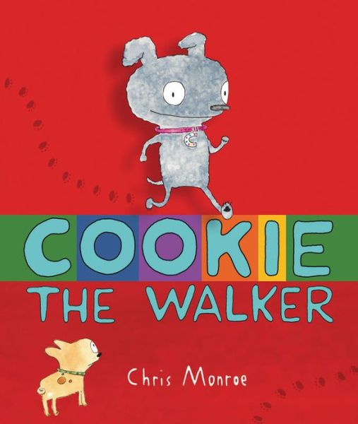
Cookie The Walker (Carolrhoda Books; 2012): Another new book from another favorite maker of children's books, this one's from writer/artist Chris Monroe (Sneaky Sheep, the Monkey With a Toolbelt series), and is one of her better books (Of interest to comics readers perhaps is the fact that this, like her previous works, are told in large part in comics, with panels and dialogue balloons and everything).
Our star is Cookie, a dog who walks, but not on all four legs. As she explains to her friend Kevin on page two, it is not uncomfortable at all, "And it's very handy!" On her hind legs, Cookie can reach the candy dish, look out the window, get herself ice cubes from the ice maker on the fridge door, and more.

What's more, people really seem to like looking at her walking on two legs ("It is pretty cute I guess...")

Soon, her walking on two legs draws the attention of a famous dog trainer, and Cookie gets a job, which brings with it fame and treats. One gig leads to another—a dog show, the circus, reality TV—and the more famous she gets, the more treats she gets, but all that fame and all those treats come at a great price, as she misses aspects of her life before she became Cookie The Walker, something Kevin reminds her of whenever he comes to visit.

Will Cookie throw it all away to walk on all four-legs again? That's the drama of the story, which is wonderfully illustrated with thin, slightly wiggly lines and delicate water-colors. Monroe excels at montages, and filling them either with a great deal or detail, or simply funny little riffs. Here's a page in which we see Cookie as "a big TV star," appearing in various generic reality TV roles:
I particularly like the ghost-hunting one.

Cookie The Walker is another great book from a great maker of great books. If you're only going to read one book discussed in this post, well, that's a silly and arbitrary rule to follow, but this might be the one you should choose to read.

Well this one, more maybe this next one...

The Dark (Little, Brown and Company; 2013): Writer Lemony Snicket teams with artist Jon Klassen (I Want My Hat Back) for a dream-team collaboration. The subject matter? One close to the heart of all children everywhere, as close to their little hearts as that which chills them. One of Snicket's better (and probably most serious) children's books, he writes about the relationship between a little boy named Laszlo and the dark, which lives in Laszlo's basement (although it is often nearby, in corners and closets and, of course, at night, it leaves the basement to spread itself all over the house).

Snicket quite elegantly writes every single, simple line, and he does so in such a way that most of them can have two meanings, so that what he writes is, in one way, quite literally true, but also sounds semi-mythological (like everything does in childhood).

Klassen's art pulls off a very neat trick, depicting Laszlo and the dark's house as "a big place with a creaky roof...and several sets of stairs" as a place unmoored from a particular temporal or geographical setting (this could be your house, and probably is), and of depicting the same locations within the house during the day and during the night, in the dark, in the light, and the dimness in between, transforming them as the dark transforms things, usually for the worse when you're a child. The words are arranged just so on many of the pages, the lettering itself shifting from black to white (depending on whether the page is light or dark, for a sort of perfection of impact (the line "it did," for example).

It's rare to read a book as an adult that speaks so directly and eloquently to the little kid you used to be. It's rarer still for me to read a book, wish I would have read it when I was a little kid and spend very much time at all wondering how that book and that act of reading it might have changed me for the better.

Hen Hears Gossip (Greenwillow Books; 2008): This picture book written by Megan McDonald is essentially a game of telephone framed as gossip being spread across the barnyard. Hen, who loves gossip, hears Cow and Pig talking, and tries to overhear their news. When she (mis)hears it, she runs to her fellow barnyard birds (apparently, the birds all gossip and hear worse than the mammals; I guess the latter may be because they lack exterior ears?), and the news is changed to something increasingly ridiculous, until it comes back as something insulting to Hen herself. The birds then trace the gossip back to its source, investigating each spurious claim (like the cat grew a horn, for example), until they find the truth.

It's a cute "gossip is bad" sort of story, one that offers a lesson that's probably as important to folks that work at libraries as it will prove amusing to little kids who visit libraries for picture books, elevated further by artist Joung Un Kim's delightful artwork, which seems to be assembled of mostly-painted over, re-used papers and cut-up shapes of wallpaper, so type-written words or the music from sheet music will appear along the edges or show through the art. Here are some examples, clipped from the pages and thus, unfortunately, alienated from their context.
I like it a lot. I also like the way she draws some the bipedal characters, like Duck's posture in this image:


The Kindhearted Crocodile (Holiday House; 2008): Writer Lucia Panzieri and artist AntonGionata Ferrari collaborate on a large, sharp-toothed, ferocious-looking crocodile who had a very kind heart (as is noted in the title) and whose dream in life was to become a family pet, like a goldfish or a puppy. Unfortunately for the crocodile, families tended to prefer goldfish and puppies to keeping one of the world's largest and most dangerous predators around the house, so he had to hatch a plan so weird it kinda blew my mind, and I'm still trying to figure out exactly how it worked.

The crocodile snuck into a family's house at night through the pages of an innocent-looking picture book called The Kindhearted Crocodile (Hey! That's this book!) and proved how helpful he would be by picking up, washing the dishes and suchlike. Curious to see who the mysterious, night-time housemaid was, exactly, the family hid, and were surprised when rather than the expected elf or goblin, a crocodile crawled out of a book to do the housework again.

The kids were immediately cool with the croc, as they knew him from his book, The Kindhearted Crocodile, but what was the story of that book, if it deviated so much from the story of the story book, which features the book itself in a pivotal role so very early on? And is the premise that there's only one such book, rather than a bunch? Because, otherwise, would the crocodile be able to crawl out of any copy of The Kindhearted Crocodile? If so, why didn't he crawl out of my copy? While I don't have any toys lying around that need picked up, I pretty much always have dirty dishes that need doing and laundry in need of folding, and I sure wouldn't object to a large reptile bringing me toast and jam and a cup of coffee every morning. What's the deal, crocodile? (And did he aks Panzieri and Ferrari to put him in this book, as a means of sneaking into the family or familes' homes...?

So many questions!

No question it's a great looking book though. Ferrari has a slightly sketchy style and composes figures with sharp, bold, energetic lines. The coloring isn't exactly haphazard, but it's not exact, either, and the crocodile's skin color changes like that of a chameleon, usually some form of speckled green, but sometimes he adopts very un-crocodilian colors, particularly when doing something domestic.

There are a few night scenes which are colored almost all black (the only color being the characters), while the lines the make up the house and furniture are drawn in white (and the color of type is white as well). It's a great-looking book.


The Little Matador (Hyperion; 2008): Writer/artist Julian Hector tells a simple tale of a little boy from a proud family of matadors (boo!), who had a secret passion for drawing that he hid from his parents, who expected him to grow up and carry on in the family business (so much so that they dressed him up like he was in the ring, like, every day; his dad similarly dressed like a matador dresses for work in every image, while his mom just dresses like a fancy Spanish lady—are ladies not allowed to fight bulls? Not that anyone should fight bulls, really). What he likes to draw best is, of course, animals.

I hesitate to say anything more about the plot, but it is, in one way, an echo to Munro Leaf's The Story of Ferdinand, only from the perspective of a bullfighter who doesn't want to fight bulls, rather than that of a bull who doesn't want to fight bullfighters.

Hector's artwork doesn't look much like that in the story of Ferdinand, of course, being much simpler and more abstract, and with very warm colors.


Otter and Odder: A Love Story (Candlewick Press; 2012) How's this for a Romeo and Juliet story? One day Otter, an otter, is looking for food and seems to find it when he finds a fish, but when he looks into the fish's eyes, he begins to fall in love, and asks the fish her name; she says "Gurgle," which he takes to be "Myrtle," and while she was simply looking not to be food, when she looked into Otter's eyes, she fell in love, too.

"Impossible," Otter tells himself, "I am in love with my food source."

Naturally, complications arise, although they mostly consist of otter society gossip and Myrtle's pleading with her otter not to eat her friends and family. Despondent, he swims off until he meets a wise beaver, who offers him an apple, which Otter refuses, asking Beaver if he's ever eaten a fish: "No," said Beaver, "but I suppose I might if I ever fell in love with an apple."

I suppose you can guess where writer James Howe's story goes from there, the writing is simple, but also clever and rather elegant, with almost every word chosen for usage being a word that really counts. After a few complications, it does finally reach a "happily ever after," presumably because neither Otter nor Myrtle want children.

The most striking aspect of the book is artist Chris Raschka's artwork, which is of a very studied, child-like look, in which the fish are triangle-on-oval simple, and the otter's head and body are a figure eight, his tail another, smaller figure eight. The entire thing looks done in crayon, as as if by a child (although the consistency of the imagery and design from page-to-page would make that fairly impossible. Even more simple shapes are used for backgrounds and animals without speaking parts.


That Is Not a Good Idea! (Balzer and Bray; 2013): Hey, it's Mo Willems again!

This non-Gerald & Piggie, pigeon-free* book from Willems is told in a form inspired by a silent movie, a particularly odd choice for a children's book, but then, getting that particular reference isn't necessarily necessary when it comes to enjoying the plot of the book, which revolves around a big, shocking (no seriously; I was genuinely shocked) ending.

A page of art, starring a well-dressed fox and a goose, will be followed by dialogue in an old-timey font, the white text atop a black, silent movie-style title card. The artwork featuring the goose and fox is in full-color, deviating somewhat from the illusion of a silent movie.

As the male fox courts the female goose, inviting her back for a walk in the woods, and then back to his place, and then for soup, a group of goslings, which Willems draws like yellow tennis balls with beaks, dot eyes and triangle wings, yell back at the movie, variations of the title.

For example, when the fox asks the goose, "Would you care to continue our walk into the deep, dark woods?" and the goose replies, "Sounds fun!", Willems will shows us a two-page spread of the goslings, one of them shouting "That is REALLY not a good idea!" at the "screen," as if they're watching the movie the fox and goose are starring in. Kinda like people watching a horror movie and yelling to the protagonist not to go into the basement alone.

The ending is something of a surprise, although there are actually a couple of surprises all braided together into it, none of which I should even think about spoiling here.

Suffice it to say that this is a new Mo Willems picture book, and it's hard to imagine anyone needing much more information than that to know if this is a book for them or not.


This Is Not My Hat (Candlewick Press; 2012): I Want My Hat Back's Jon Klassen further establishes himself as the number one creator of picture books about small animals stealing hats from larger animals. The differences between this book about hat theft in the animal kingdom are many.

First, it's told from the perspective of the thief, rather than the victim. Second, it takes place under water, the cast including only the thief (a fish), the victim (a much bigger fish) and a witness (a crab). And third, the hat is a little, blue derby rather than a little red, conical hat.

Like, I Want, it is very funny, and Klassen does an incredible job of showing big or slight shifts in emotion with slight variations of the drawings of the characters, as when the large fish, for example, wakes up, realizes his hat is missing and we see his immediate reaction.
I'm glad Klassen won the Caldecott for this, because he's a great artist and a funny writer and desrves all the medals he can get, but boy does it's placement really transform that cover, as not it looks like the hat-thieving fish is fleeing not the scene of the crime, somewhere in the deep, black, mysterious ocean, but is instead fleeing the Caldecott medal. Did he steal the Caldecott's hat...?!


*Save for the now customary, half-hidden cameo, of course