Monday, May 31, 2010

Karen Matchette's Scooby-Doo art (And Velma's makeover)

Okay one more post about Scooby-Doo comics and I’ll give it a rest for a while, I promise. I did want to focus on a story drawn by Karen Matchette before I called it quits though, as she was the artist with the most unique and individualized style I noticed while reading through that stack of Scooby-Doos recently, and whom I had singled out there.

So tonight we’re going to take a close look at the short story “Fashionistas,” which appeared in the back half of 2008’s Scooby-Doo #131, the one with the Earth Day cover (Is that the Tar Monster in silhouette? It looks like the Tar Monster). Jack Briglio wrote this story, and Matchette handled the art, pencils and inks, apparently.

Here’s the very first panel, which should give you some indication of how unusual Matchette’s art is, in the proportions alone: The gang are driving around Paris in the Mystery Machine and…wait. What are they doing in the Mystery Machine in Paris? You can’t drive to Paris, on account of the Atlantic Ocean. Did they pay to have the Mystery Machine shipped to France, just so they could drive it around Paris? Wouldn’t it be cheaper to simply rent a car there? Or to take cabs? Why are they driving their van in Paris?! How did it get there? Now this, this is a mystery!

Well, let’s move on. Fred is the only one who knows where they’re going and w hy, and he suddenly stops when he sees their destination, leading to this weird image:
I kind of love how Matchette draws the characters here. Fred looks way off-model, but in a cool way. He still looks like the product of 1970s cartoons, but here it’s something of the School House Rock variety rather than a Scooby cartoon.

Anyway, they’ve arrived at the Hotel Pitz (Ha ha! Like Ritz, only with a “P,” as in “This place is the pits”), for—well, Fred will explain:
As soon as they get inside, this happens:

They start interview suspects immediately, and one of them takes quite an interest in Velma:I know I noted that these comics tend to be more for kids than for an all-ages audience, and the quality of the jokes fairly sub-par, but I have to admit I liked the bit where Scooby holds out his paw to get kissed and Gaston Librevou totally ignores him.

Librevou has a suggestion for busting the ghosts—someone should go undercover as a model.

On the show, this would undoubtedly be Shaggy and Scooby, but the comic works on a slightly different logic, so Daphne volunteers, but Librevou only has eyes for Velma:
Check out this panel......Velma’s so tiny all of a sudden!

And so, one off-panel makeover later...Cool, huh? Apparently we’re operating under the pop culture phenomenon that glasses automatically equals unattractive, while the absence of glasses automatically equals pretty. Looking aback and forth between the Two Velmas Matchette has drawn, there doesn’t seem to be much difference other htan the glasses. Her eyes are drawn differently, her hair less helmet-like and she’s got lipstick, which suggests the presence of lips absent from her normal look.

I can’t tell if the new Velma’s nose is suddenly more pert or not though, as the thick line of her glasses usually obscures parts of it. Nor can I tell if her waist has suddenly got slimmer, giving her a more hourglass-shaped figure.

Is that huge, baggy orange turtleneck just not terribly flattering to Velma’s figure? (This marks the third time in my life I’ve thought about Velma’s figure for longer than a few seconds at a time, following the initial shock of Linda Cardellini being cast in the live-action movie and seeing Philp Bond’s sketch a few weeks ago).

Now that we’ve talked foreground, check out the models in the background. Like Librevou, they belong to a completely different design aesthetic than the Scooby-Doo characters, only they seem even further removed than Librevou. That’s precisely what I find so interesting about Matchette’s drawing of these stories—it’s like the Hanna-Barbera characters just sort of wandered into a comic book, rather than being a comic book created specifically around them. It’s not necessarily a better approach, but it’s an interesting approach, especially considering she’s one of the few artists who went that route on the comics I’ve seen.

Here’s another image of Matchette’s non-Scooby characters, as they take to the catwalk (Meanwhile, Shaggy and Scooby are being chased by the ghosts, and have run up into the rafters)...
When the ghosts descend on the models, the blinded Velma accidentally headbutts one...... bringing them all down in a chain reaction, and the mystery is solved...
Of course! I knew there was something fishy about him when he chose to give Velma a makeover instead of Daphne!

And that's what Karen Matchette's Scooby-Doo comics look like.

Oh, and this issue also includes another “Velma’s Monsters of the World” feature, this one focusing on The Acheri, which artists Roberto Barrios Angelelli and Horacio Ottolini sure made scary…

And another awesome child’s drawing of Scooby-Doo…

Sunday, May 30, 2010

Comic shop comics: May 26th

Archie #609 (Archie Comics) I don’t read very many Archie comics (In fact, I haven’t read one since the last time I noticed Josie and the Pussycats were guest-starring in an issue), so I was surprised to learn that apparently Betty and Veronica are such possessive psychos that they can never learn that Archie actually loves someone other than them or all hell will break loose?

This issue, which follows Archie and Valerie’s kiss on the eve of the Archies/Pussycats tour, consists of the young lovers trying to keep their romance on the DL so Archie’s warring would-be-lovers don’t destroy the tour itself, and everyone in Riverdale eventually finding out on their own, but vowing to themselves to keep it a secret, less Veronica and/or Betty wreak terrible vengeance upon Archie.

That’s kind of weird.


Batman: The Brave and the Bold #17 (DC) I loved this comic book so much that when I saw it on the shelf earlier today, my hand automatically grabbed it and added it to my stack, despite the fact that I bought it the last time I was in a comics shop. I guess my love for Batman: The Brave and the Bold #17 so deeply impressed itself on my unconscious mind that I just grab at it whenever I see it now? Well, I’m not going to re-review it. If you’d like to re-read a review of it, you can do so here.


Batman: The Return of Bruce Wayne #2 (DC) The first issue of this Grant Morrison-written, six-issue miniseries about Batman recovering from having been “killed” by Darkseid in Final Crisis seemed to promise a pretty straightforward premise—Batman was sent to the past, and would end up in the present by fighting his way through his own family tree, stopping in various time-periods to briefly Batman* there. That first issue was very well-executed, and an awful lot of fun.

With this issue, though, it becomes clear that this isn’t going to be a comic book series that’s just about Batman fighting crime in period costumes for six issues. Instead, it’s shaping up to be the single most cosmic Batman story ever told, more cosmic than Morrison’s own JLA stories (which usually featured Batman quite prominently), or Cosmic Odyssey, and ensemble series featuring Batman that had the word “Cosmic” right there in the title.

It seems that Darkseid’s plans to create an army of Batman clones during Final Crisis wasn’t the DC god of evil’s only plans for Batman. He also managed to weaponize Batman, or, in Superman’s words, Darkseid turned Batman into a doomsday weapon and aimed him directly at the 21st century!

Can Batman out maneuver the god of evil and Superman, Rip Hunter and their posse and return to the present? Yeah, I assume so, but holy crap that’s a big, huge Batman story, one that necessitates him fighting “crime” on a colossal scale, as we see him here doing his thing in pilgrim times and at the end of time itself.

There is a lot going on in this issue, beyond the main course, which involves Batman sword-fighting a Lovecraftian monster and using his detective skills to bust witches while dressed like Solomon Kane. I have no idea how it’s all going to shake out, but the history of Gotham, the Wayne bloodline, Batman’s relationship with bats and the sigils of the superheroes are apparently part of the story.

Frazer Irving is the artist for this issue, and having previously illustrated a Morrison-written comic book featuring people in pilgrim clothes (Seven Soldiers: Klarion The Witch Boy), he’s a pretty good choice for the issue. I’m not terribly enamored with his art, although it is technically quite good. Irving seems better at atmosphere than place, which occasionally results in panels or pages that err on the side of expressive, sacrificing clarity.

He draws wonderfully grim visages though, and the scenes at Vanishing Point, the high-tech headquarters at the end of time, where a 64th century bio-organic archivist explains the nature of time to Superman’s search party are quite effectively alien.


Billy Batson and the Magic of Shazam (DC) Four issues of Black Adam and Captain Marvel punching one another is probably a bit excessive Art Baltazar and Franco, no matter how cool the new style Mike Norton has adopted for this series may be. I suppose it’s a byproduct of DC’s kid-friendly comics always being done-in-ones, but this multi-issue story arc has seemed interminable.

On the other hand: 
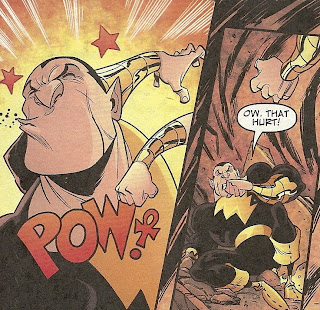
Ha! I love the ankh-clamation point!


Ghost Rider: Hell Bent & Heaven Bound (Marvel Comics) This trade paperback did not come out last Wednesday, but I did purchase it at the shop during this shopping trip, so by the rules of this feature I’ve set up for myself, that means I should discuss it here.

The shop I currently shop at does this swell thing where they give you a coupon for your birthday that gives you a 25% discount on any trade. Mine was about to expire, and they didn’t have my first two choices for trades I’d like to buy, so I figured now might be a good time to try out the Jason Aaron run of Ghost Rider that the Internet was so enamored with.

It is every bit as good as I heard it was.

This six-issue collection contains two different stories—the title story, illustrated by Roland Boschi, and “God Doesn’t Live on Cell Block D,” illustrated by Tan Eng Huat.

Ghost Rider Johnny Blaze, a kinda sorta superhero whose power is the ability to turn into a flaming skeleton on a flaming motorcycle, wants to find a way to get to heaven in order to wreak revenge on the rebel angel that cursed him with his flaming skeleton powers.

In the first story, he travels to the town of New Beulah to find someone who had a near death experience and might be able to help Blaze get to heaven. That town is home to a hospital full of armed-to-the-teeth killer nurses. And a mortician who also happens to be a cannibal. And a stretch of highway haunted by the hungry ghosts of cannibal frontiersmen.

In other words, Aaron thinks up some really crazy plates, sets them all spinning and then just smashes them all together at the climax. Actually smashing them all together is the plot of the final issue, as the characters from those various subplots all participate in a horrible accident at a four-way intersection that could really use some stop signs.

It’s a trashy heavy metal horror western with some Garth Ennis-style touches of dark absurdity and some awesomely over-the-top deadpan nonsense (I’m thinking, for example, Ghost Rider with a flaming sword, saying “Suck it!” to his foes).

The two-issue follow-up is a much calmer, quieter story, one that benefits from Huat’s extremely weird cartoony art, which evokes a little Sam Kieth here, a little Judge Dredd there. It was Huat’s byline that attracted me to the collection (well, that and all the rave reviews I’ve read of these comics from bloggers whose opinions I often agree with), but I ended up liking Boschi’s art better, as it’s far closer in style to that which I think of when I think of Marvel Comics art I want to read (John Romita Jr., Marcos Martin, etc).

Like Aaron’s Wolverine comics then, his Ghost Rider seems to be pretty great. I look forward to reading the rest of it, hopefully sooner rather than later.


Green Lantern #54 (DC) This comic book has a scene where someone has all of their flesh and tissue burned right off their skeleton. It’s written by Geoff Johns. Is that redundant to mention both of those facts?

The extreme gross-out gore sits surprisingly well with me here because a) it’s drawn by Doug Mahnke, whose such a great artist that he packs detail into a crumbling human skeleton and makes it look like an object of beauty rather than something merely disgusting and b) the agency which melts the human being is the burning napalm-like blood-puke puked up on him by a house cat wearing a Red Lantern uniform with a Red Lantern ring on its tail, and that’s the exact brand of stupid awesome that I read Geoff Johns comics for.

This issue doesn’t move all that quickly from where we left off last time. It was clear that the White Lantern was going to ask Hal, Carol and Sinestro to get the band back together for a quest, and here they join up with the main Red Lantern. Apparently, they’re reassembling the, um, “rainbow rodeo,” I believe Hal Jordan called it, to find the Pokemon-like hero-gods of Earth evolution before they little flying mummy midget in chains can get ‘em all—and he/she/it already has two of ‘em!

Before they get to all that though, it looks like they’re going to have to fight Lobo, according to the last-page splash. After having just recently read Reign in Hell, I’m not sure exactly how Lobo got from that Point A to Point Green Lantern #54, but I don’t really care because a) Doug Mahnke draws a hell of a Lobo and b) he has his space bulldog on the back of his space bike, which makes a burning blood-puking space cat vs. super space bulldog fight inevitable, and that’s exactly what I’d like to read about in a Green Lantern comic book.


Justice League: Generation Lost #2 (DC) So far, so good! Writers Keith Giffen and Judd Winick explain the lingering question of how Max Lord could erase all clues of himself from the Internet and libraries of the world right out of the gate, and rather cleverly (the evidence all exists, but he was able to alter everyone’s memories enough that when they see the evidence, they perceive something else). That makes two Judd Winick comics in a row that I’ve read and not hated!

The other thing I was little concerned about was the presence of pencil artist Joe Bennett this issue, whose work I haven’t really enjoyed in the past, but it looks far better here than in any of the previous books of his I’ve seen. I’m not crazy about his style—he was a tendency to draw very small faces, and it’s sort of irritating that Fire and Ice have the exact same body, right down to their height—but it seems slightly simplified, with inker Jack Jadson providing a lot of nice lines to sell almost every panel.

I don’t love the look of the art, but it’s not bad, and it really pops. So that takes care of my concerns; I’m down for Generation Lost #3, I guess.

If I have any complaints to make here, it’s more of a nitpick of an omission. I know we’re only two issues in, but it seems strange that Booster and the others haven’t yet looked up J’onn J’onnz, since he’s the A-List superhero they all know the best, and who happens to be an expert in the sort of psychic mind-messing with that Max Lord, who J’onnz also knows super-well, is engaging in. The Martian Manhunter being MIA is made noticeable only because the first half of this issue deals with the heroes formerly known as the Justice League checking in with Superman, Batman, Wonder Woman and, in a sequence of cameos, nine different heroes, including Plastic man and Captain Shazam (or whatever Winick is calling the superhero formerly known as Captain Marvel Jr. these days).

That aside, this is a boatload of DC Universe heroes bouncing around a bi-weekly book. The writing isn’t bad, and the art isn’t bad either. In other words, this book’s good enough.


Super Friends #27 (DC) This is another J. Bone-drawn issue of the series, which automatically makes it a must-buy for me, because every image J. Bone draws for this comic book is a great one, his Super Friends characters always having silly, emoticon-simple faces that crack me up no matter what else is going on in the story.

This ish, written by Sholly Fisch (who also wrote that swell issue of the Brave and the Bold I accidentally bought twice, and the Scooby/Geoff Johns team-up I blogged about last night), has plenty of other things going for it, of course.

Green Lantern John Stewart and Flash Wally West both have birthdays the same week, and both want to throw the other a surprise party for the other in the same place and on the same day. What are the other Super Friends going to do? Well, the point is moot, since Sinestro and Professor Zoom, The Reverse Flash have a surprise of their own for their archenemies.

This one’s got it all. Sinestro and Zoom in disguise as GL and Flash, giving each other daps...

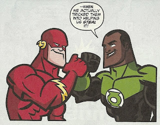
...a make-your-own Green Lantern Corps mobile craft project...

...guest stars galore...

...and, most amusingly, Superman making this face: 
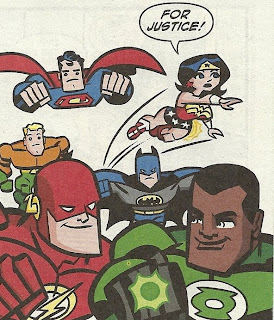
It's those expressions that make me love all of Bone's Super Friends comics.
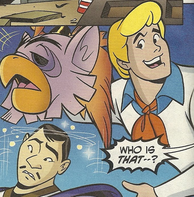
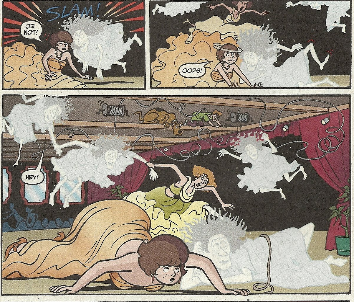
Saturday, May 29, 2010

The least essential Blackest Night tie-in of them all

The cover of Scooby-Doo #150 features the tag line, “Darkness Falls On Scooby-Doo…As Mystery, Inc Face Their Blackest Knight Yet!” It was released in November of 2009, when the phrase “Blackest Night” would have invariably evoked the Geoff Johns-written, Green Lantern-starring event series Blackest Night, which at that point was as much as a DC Universe line-wide branding term as it was the title of a particular story.

Scooby-Doo is, of course, part of DC’s unofficial Johnny DC imprint, and as such never subject to what’s going on in the DC Universe proper, but if not a Blackest Night tie-in proper, DC was at least going for a joking allusion to the biggest DCU story at the time.

Note what Scooby-Doo is holding in his right paw on artist Vincent Deporter’s cover, after all.

The contents are split between two short stories. In the first, Scooby and the gang investigate a host of pampered black cats that inherited their eccentric late master’s fortune and now run riot all over town, seemingly plaguing it with bad luck. Hence all the cats on the cover. The green lantern on the cover references the events of the second story in the issue, “The Blackest Knight” by writer Sholly Fisch and artist Fabio Laguna (Laguna is one of the artists I mentioned in yesterday's post as being one of the better Scooby-Doo artists).

Lest one think the Geoff Johns’ Blackest Night references are a coincidence, check out the first two panels of the story, in which the gang arrives at a castle in England:
And now let’s meet Lord Geoffrey himself:I’m not familiar enough with Geoff Johns' personal appearance to know whether or not that’s supposed to be his likeness or not (I do know that he's probably rich and successful enough now that he can probably afford to live in his own castle and dress as ridiculously fancy as he wants now). The amount of detail Laguna draws into it suggests that Lord Geoffrey is modeled on a real person though, as opposed to cut from the same cartoon cloth as the Mystery Inc. characters and the other supporting ones that appear throughout the short story.

If Lord Geoffrey is Geoff Johns, then who is Sir John? The fact that he’s colored slightly darker than Lord Geoffrey and has a goatee makes me think he’s simply supposed to be an evil Geoff Johns. Er, not to ruin the mystery or anything!

(And hey, while you’re scrutinizing that panel, check out Fred’s face. What’s that expression all about? Is there something…unnatural going on with his face? He looks sort of sick or possessed or injected with Joker venom).

As introductions are made and snacks devoured by Shaggy and Scooby, the ghost suddenly appears……demanding a ring!

Like the others, Lord Geoffrey runs for his life when the ghost appears.
(Wow, did you ever think about Fred’s footwear? I mean, really think about it?)

As Lord Geoff barricades them all in the study, we get some more subtle Green Lantern allusions: Are they overdoing it at this point? No. They overdo it on the next page, after Lord Geoff explains that the Black Knight is looking for a lost emerald ring, carved in the shape of the eagle from his family crest:Get it?! Eagle? Evil? Ha ha ha ha ha ha!

Ah.

But wait, there’s more! When everyone splits up to search, Shaggy and Scooby volunteer to start with the kitchen and—wouldn’t you know it?—the ghost finds them. He chases them back to the crest in the study, and just as he’s about to stab our cowardly heroes, the crest falls from the wall, clobbering the knight and allowing Daphne to unmask him.Will power! Green Lantern has that!

Finally, Velma puts two and two together and realizes the emerald ring must be hidden in the lantern, which is what caused it to glow green all this time, and sow Lord Geoffrey gets his green ring back:
The end.

Maybe DC should have done a free plastic ring giveaway with this issue? It couldn’t have hurt.

Now let’s look at some more awesomely weird little kid art from the letters page of this issue.

Here’s a piece entitled “Scooby-Doo Scares Mummy,”and here’s one from the perspective of someone totally tripping:Aaaaaaaaaaaaaa! The strange special relations, Daphne’s tiny plum-sized head atop a long neck stalk and her horrifying, claw-tipped paws! This is much scarier than a bunch of black cats or a sword-wielding black knight ghost!

Friday, May 28, 2010

Library comics Pt. 6: Some thoughts on Scooby-Doo #131-#151

The covers of these comics tend to be really great. Often times they tell a little story on their own, or a gently macabre gag (like Shaggy and Scooby inadvertently building a sandcastle full of tiny bats, above), and in general evoke the covers from classic kids comics like those published by Dell and Gold Key way back in the day.

Most of the issues I grabbed from the huge stack sitting on the library were determined by the strength of the covers, so I’m pretty confident that these covers do what comic book covers were originally designed to do—sell a particular comic book to a particular audience (Contrast that with all of the static, boring, interchangeable characters posing covers of today. I think the first 50 or so covers of Ultimate Spider-Man were so interchangeable that it didn’t matter which one was on which issues).

I also felt something I don’t think I’ve ever experienced in my life time while reading this: Disappointment that a cover promised a story that didn’t happen within. I was looking forward to seeing a leprechaun in Scooby-Doo #130, but the cover turned out to just be a gag for that particular cover, which probably came out in March or so. I understand this used to happen pretty frequently in the olden days, but I can’t recall ever experiencing it in my comics reading career (Now, kung fu VHS tape collecting, on the other hand…)


—These are really kids comics. It sometimes bugs me that the term “all-ages” is usually applied to comics that are actually just meant for kids, when the term “all-ages” should rightfully just be applied to comics that are actually geared toward entertaining readers of all-ages. These aren’t all-ages comics, they’re kids comics. As much as I love the concept and characters of Scooby-Doo (and I love ‘em a lot, but would need a couple hundred pages to tell you about it; endless repeats of the first few seasons of the show, and its various 1980s Saturday morning iterations, made up one of my first cultural experiences, and determined large aspects of my world-view for the first few years that I can remember), I had a hard time forcing myself to read through all of these stories.

Part of me wants to blame the format, as each book contains several mysteries, most of which use the original Scooby-Doo formula (common, non-violent criminal dresses up as a monster to scare people away from somewhere for some reason; the kids investigate and bust the criminal/monster). Seven-to-ten pages isn’t much space to build an interesting monster and present a plausible mystery, while allowing room for chases and gags.

But I think my failure to connect with the material in any strong way is actually a product of how faithfully the comics adapt the Scooby-Doo cartoons. See, as hard as this is for me to admit, Scooy-Doo cartoons are generally pretty terrible.

The things I liked most about it as a kid—the music, the action, the awesome monsters, the weird feelings I felt about Daphne—had nothing to do with the strength of the writing or the depth of the characters (The strongest of which were Shaggy and Scooby-Doo, who, as potent as they’ve become, were pretty basic in conception, a simple grafting of the opposite characteristics one would expect onto character of that type.)

Looking back on a lifetime of Scooby-Doo watching, I think A Pup Named Scooby-Doo was probably the best of them in terms of quality, and when I’ve watched later incarnations, like the direct-to-DVD movies, What’s New, Scooby-Doo? and Shaggy and Scooby-Doo Get a Clue (I love the character redesigns on this one, by the way), I’ve never really more than half-watched them, with the TV on or a DVD playing in the background while I drew or colored or worked out or whatever.

So in terms of providing engaging stories, thrilling mysteries, drama and humor, these comics are about the same as the television shows. They can be a bit more frustrating in that reading a comic book requires 100% of one’s attention, while it’s easy to devote less of that to a TV show, which moves ahead without you).


—While there’s a general format to these, in which two to three compressed TV show-like mysteries unfold per issue, they can occasionally be surprisingly experimental. Some issues include puzzles and mazes within the panels of a story, allowing readers to participate in a monster chase as Shaggy and Scooby do. Vito DelSante and Nick Purpura write a “musical” story, in which the characters "sing” the majority of their dialogue, their lines rhyming while musical notes appear in the various cartoon bubbles. There’s a riff on It’s a Wonderful Life, in which Shaggy imagines a world in which the gang never formed to fight pretend ghosts. Another story features a faux mystery arranged by the gang, leading to a surprise party for Shaggy. Scooby-Doo #135 opens with a retelling of 1969 episode “A Clue for Scooby Doo” from the villain’s perspective.

Oh, and then there’s one story that’s set in a women's prison. Swear to God.It’s called “Stars Behind Bars,” it appears in #148, it’s by Frank Strom and Scott Neely, and it sees the gang investigating the ghost of Lizzie Anderson, the first inmate ever incarcerated in Sentworth Penitentiary.


—There’s a surprising amount of variety in the artwork. I’m always genuinely fascinated by licensed comics, particularly ones like this, that are based on a cartoon which has had precious little basic design evolution in over 40 years. For the most part, all of the artists in these issues stick extremely close to the way the characters looked in 1969—some panels even swipe poses directly from stills, which is kind of disturbing—but there’s room for some real variety here, and I admittedly had more fun studying the different ways artists drew the characters than I did with the stories themselves.

My favorites are probably Tim Levins and Fabio Laguna, who have the most highly animated style. Their art has thick lines that helps it pop off the page, and their characters are all high expressive and full of life, seeming more fluid and capable of movement than comic book characters usually do.

I love the way Laguna draws Freddie’s unmasking face in #148. Check this out:
I think that’s the only time I actually laughed out loud while reading any of these.

Oh, and I also really loved the work of Karen Matchette, whose style pushes furthest away from that of the cartoons in terms of the principles, and whose extras and settings are created without the slightest attempt to ape those of the cartoons.

I plan on looking a little more closely at two specific stories in posts later this weekend, and one of those is a Matchette story, so I'll be posting much more of that later.


—Costuming is pretty fascinating here. The characters spend most of the time wearing the clothes they wore in the seventies, although there are a couple of instances of them wearing updated versions of them, and/or location-specific costumes (like Fred wearing a blue and white Hawaiian shirt while on vacation, for example).


—I like the way that all of Scooby’s dialogue has the first letter of ever word changed to an “R” to evoke his speech pattern. I’ve long been amused by the fact that Scooby is a dog who can talk, just not very clearly.


—Velma is often drawn much slimmer and a bit talker than she appeared in the cartoons. I blame the fact that the producers of the 2002 live-action movie (which I liked, shut up) cast the super-hot Linda Cardellini as Velma, necessitating that the cartoon character become gradually hotter.


—An occasional feature that I really enjoyed was “Velma’s Monsters of the World,” in which a few pages would be devoted to Velma talking directly to the audience about a “real” monster, be it one from mythology or a cryptid of some kind.

These generally feature Shaggy and Scooby delivering some form of corny joke at the beginning or the end of the feature, but in between Velma provides a nice, child-friendly summary of a monster of some kind, and allows artists to draw these creatures in something approaching Scooby-Doo style. I would love a book that was nothing but these things, a sort of Beasts! hosted by Velma and drawn by various Johnny DC artists.

The longest of these I encountered was in #134, a five-pager deoted to the silly creatures invented by lumberjacks, like the Axehandle Hound, the Hodag, the Hidebehind and similar American legendary creatures like the Jackalope.

Shorter pieces are devoted to Japan’s Rokuro-Kubi, Cadborosaurus and the Yeti. Here's a page from the Cadborosaurus story:


—I only encountered a Daphne hosted feature, once, but it was kind of fun too, even if I don't think anyone in Mystery Inc. is in any position to preach about fashion:


—While reading through these I found myself wishing DC would take advantage of the goodwill the characters surely have among comics creators to get some big-name, unlikely creators occasionally involved, the way Bongo does with it’s Treehouse of Horror annual specials.

I can’t speak for DC’s regular Scooby-Doo readers, an audience I most definitely don’t belong too, but I’d sure love to see the likes of Jill Thompson, Sergio Aragones, Stan Sakai, Dan Brereton and so on drawing Scooby-Doo stories every once in a while. Shit, can you imagine a Kelley Jones Scooby-Doo? Or a Richard Sala Scooby-Doo? I can’t tell you how much I would want to read a Richard Sala Scooby-Doo comic.


Scooby-Doo has the best letter column of all the Johnny DC titles. Check out the art it gets: