Monday, February 28, 2011

New Green Lantern event to feature Green Lanterns

And, uh, that's all I can tell from looking at this teaser image DC Comics posted last Friday under the title "BEWARE THEIR POWER: WAR OF THE GREEN LANTERNS."

Oh, and I guess maybe Gollum is involved too? That's him in the middle of the image, right?

Well, I suppose that makes sense. He has a thing for rings, after all.

Man, I love this page:

That's from 1997's JLA #7 by Grant Morrison, Howard Porter and John Dell. It may be my favorite superhero comic of all time, or at least the second half of my favorite story. It's the one where the League rescues the angel-made-flesh Zauriel, who is on Earth in part to warn of rogue angel Asmodel, "a King Angel of the Bull Host of Heaven," who is launching a rebellion while The Presence's attention is temporarily diverted by "a seemingly impossible event."

More than just about any other story in the Morrison/Porter/Dell run, save perhaps the final story arc, this is the one where the League-as-Apocalypse-fighters take seems most fully realized, and the characters featured in it all do super-superhuman feats: Fighting angels, lifting the moon when it begins to fall to earth, lifting an crashing angel "chariot," and, in the case of first Martian Manhunter and then Superman, battling an archangel in hand-to-hand combat.

I found a scan of the page online while I was looking for an image of Superman doing something Moses like to illustrate last night's post, and thought Superman repeating the feat of another Old Testament patriarch might be in the right ball park. I ended up not really needing to use it there though, and figured I'd just post it all by it's lonesome tonight.

After all, it's not like there's ever a bad time to take a page from that run of JLA and just marvel at it, you know?

Sunday, February 27, 2011

Sometimes I read about comics even when I don’t mean to.

(Above: An Alex Ross sketch of Superman and one of the Old Testament heroes he drew inspiration from in his understanding of the character, taken from Mythology: The DC Comics Art of Alex Ross)

A few weeks ago at a small local library, I stood facing their tiny, new non-fiction books section. It consisted of two bookshelves shorter than me, four or five shelves in each unite, and if there were even 60 books on it, there couldn’t possibly have been any more.

As I’ve confessed here repeatedly, I’m not much of a prose fiction reader, but for all the comics I read, I obviously recognize the value of the non-illustrated written word, and am always reading something, almost always non-fiction.

On that particular day in that particular library, I didn’t see anything that caught my fancy, but I needed something to read on lunch breaks and at bedtime, so I ended up grabbing a book about the war in Afghanistan and America’s Prophet: How the Story of Moses Shaped America (Harper Perennial; 2010), by Bruce Feiler (“Bestselling Author of Walking the Bible,” according to fine print below his name on the cover, which I noticed when I got home).

I had never read anything by Feiler, nor did I remember hearing of him at the time (I have heard of Walking the Bible though, which was and is quite popular), but I was mildly interested in American history, mildly interested in religion and I needed something to read—the thesis in the sub-title was intriguing enough that I thought, “Okay, I’ll bite.”

Mixing scholarship with interviews, the location and conduct of which are included in his s narrative, Feiler talks about the importance of the Moses story in America, and follows its application through eras of history, chapter by chapter—the settling of the New World by religious exiles from the Old World, the American Revolution, the presidency and life of George Washington, slaver, the Civil War, the Statue of Liberty and the period of immigration and so on.

I made it all the way to the eighth chapter, entitled The Ten Commandments and surveying pop culture applications of the story in the 20th century, before comics came up, and I realized that I was reading about comics again—even if accidentally, this time.

“The most influential use of Moses as pro-American propagandist during these years may be the least known,” I read while on my lunch break the other day. “It comes from two book-ish Jews in Cleeland, Ohio,” Here I got excited, because Cleveland is in my neck of the woods, and I have never heard of any pro-American Moses propaganda coming from there before.

Then I finished the sentence: “who in 1938 channeled their religious anxieties into a cartoon character they modeled party after the super hero of the Torah.”

The two book-ish Jews were, of course, Jerry Siegel and Joe Shuster, and the cartoon character was Superman.

Feiler goes on to discuss Superman, Golden Age comic book superheroes, their Jewish creators and their Jewishness for the next four and half pages, interviewing Up, Up, and Oy Vey! author Simcha Weinstein in the process.

As a presumably literate and engaged reader of comic books, you’ve probably heard all of this before. The real-world origin of the Superman character, how his parents put him in a rocket ship as a baby to save his life just as Moses’ mother placed him in a basket to save his, Kal-El’s surname echoing a Hebrew name for God, Superman/Clark Kent as a metaphor for the dual identities of Jews wrestling with whether to assimilate and to what extent, the superheroes’ battles with Hitler and Nazi Germany (sometimes given a fictionalized veneer, sometimes not), Joseph Goebbels’ reaction to the character (“Woe to the American youth, who must live in such a poisoned atmosphere and don’t even notice the poison they swallow daily.”)

This isn’t a book for literate and engaged comic book readers, however, and I suppose it’s quite likely that a majority of the people who read, are reading or will read Feiler’s book have never heard most of this superhero/Jewish stuff.

There were two things I wanted to take note of, beyond the obvious, “Hey look, there are superheroes in this book!” observation (and a heads-up regarding Weinstein’s presence).

Firstly, at the end of the section, Feiler puts a question to Weinstein that he asks sources throughout the book.
…while it makes sense that young Jews might identify with these superheroes, why did they resonate so much with Americans as a whole?

…why isn’t Jesus part of this?” I asked. “Or David, or Abraham? Why is Moses the foundation of so many of these stories?”

“Because Moses is the greatest prophet,” he said. “And the story of Moses is the story of the hero. He’s weak. He’s fleeing his past. He can’t speak so well. Yet he becomes the greatest leader in the history of the Jewish people. If you look at any narrative—in film, theater—there’s an element of Moses in it. It’s the ultimate journey. The hero starts out doubting himself—‘I can’t do it. I can’t be a leader.’ Yet he rises to the occasion and saves the day.”
Almost everyone Feiler interviews seems to get asked some variation of why Moses instead of Jesus. The answers vary from person to person and context to context, but in general Moses seems to be a less divisive and more universal figure. He’s shared by all three of the major monotheistic religions to come out of the Middle East, and he is certainly central in Judaism in a way that Jesus is not (One of the interesting things I learned from this book was that there was a movement among "some prominent left-wing Jews" prosoed changing the very name of the religion Judaism to "Mosaism," after Moses).

But Moses is also regarded in a very similar fashion between all of the various branches and sects of Christianity as well—Protestant, Catholic, Mormon, etc.—and the Masons, the deists and more secular, unaffiliated with a particular religion people can view a sort of kinship with him, as his humanity or divinity isn’t a subject of various interpretations in the way that Jesus’ is. (Even a few believers note that Moses is human, Jesus is not; that makes Moses more easy to relate to).

I bring this up because trying to plug Superman into a Moses-shaped hole is difficult, to say the least.

Certainly elements of his story seem similar to Moses, but, like a divine Jesus, Superman isn’t human, and the miraculous powers he evidences aren’t awarded to him by God (or an outside, higher force, working through Superman), they’re his. In that respect, Superman seems more Christ-like than Moses-like. (Although I suppose one could wrack one’s brain, and drive oneself insane, making the analogy work. If Superman’s super-powers are derived from the sun, then does that mean Superman = Moses and the sun = God…? No, because originally Superman’s powers came from earth’s weaker gravity, and besides, Superman is still alien, not human. Well, can we look at Siegel and Shuster as God, since they created Superman? Or does his alien-ness ruin that analogy as well? And so on.)

This is the other thing I wanted to discuss. Here is how Feiler breaks down the similarities between the Superman and the Moses stories:
Just as Moses was born into a world in which his people faced annihilation, Superman is born on the planet Krypton, which is facing extinction. Just as baby Moses is put into a small basket and floated down the Nile by his mother, baby Superman is placed into a small rocket ship by his mother and father and launched into space. Just as Moses is rescued by the daughter of the pharaoh, Superman is rescued by Jonathan and Martha Kent in a Midwestern cornfield. Like Moses, Superman is raised in an alien environment where he has to conceal his true identity. Just as Moses receives a calling from God to use his powers to liberate his people from tyranny, Superman receives a calling from his father to use his great strength “to assist humanity.”
That’s all true enough. Superman’s science-fiction, space-alien origin story presents difficulties, though. Moses, after all, really was an Israelite, sent to be raised an Egyptian, but ultimately returning to save his own people, the Israelites.

Sueprman was Kryptonian and sent to be raised an Earthling; he discovered he was really Kryptonian, but by then all of Krypton was wiped out, and he was called to save Earthlings. That would be a bit more like Moses being the last surviving Israelite, and operating as a hero to the Egyptian people, right?

I’m taking a very close, very narrow, perhaps too close and too narrow reading of the two stories and Feiler’s cursory comparison of them though—hey, I’m a comic book fan, it’s what we do!

In Feiler’s model of the Moses story, as it is presented repeatedly in this book, is that it’s actually a three-part story. It’s not simply one of slavery followed by liberation, but slavery followed by liberation by the assignation of law.

That is, winning their freedom from Egypt was only part of the Israelites’ story. The more significant part was the period of lawlessness and chaos in the desert, which was put to a sort of end when the Ten Commandments were introduced. Freedom depends on law.

That part of the story seems particularly difficult to attach to the Superman story. Even look at the story in rather broad terms, I can’t see a point where Superman and “his people” really form any sort of new covenant that replaces the previous—prior to Superman appearing on earth?—order.

I suppose that is the nature of a character in a serial medium like comics, particularly one that is owned by a company that makes money off of his continued adventures, and thus his adventures must continue in perpetuity. His never ending battle isn't just marketing; it really is a never ending battle, and there’s not really any chance for a conclusion or a resolution to his ongoing conflict.

Moses, as potent and mythological a figure as he may be, has an ending to his story. He really is a human being, and he really dies. While Moses and his story obviously continue to live on, the living Moses is repeating that same life of events over and over, rather than having new and different adventures constantly.

That’s never going to happen to Superman, at least not in any permanent way. While Moses’ story has a beginning, middle and an end, Sueprman’s is infinitely episodic, a perpetual motion story machine going through little beginnings, middles and endings, then starting over again immediately.

Superman will never get to that third part of the story, but he must keep freeing his Israelites from Egypt over and over again, as they get captured every month between issues.


*********************
RELATED: Also! Moses' adversary, the Pharaoh Ramses

Superman's adversary, Lex Luthor

Friday, February 25, 2011

Two from 2 Headed Monster Comics

What is 2 Headed Monster Comics? It’s the name of a self-publishing “label” producing work by writer James Moore and artist Joel Jackson, based in my former base of operations, Columbus, Ohio. They have a cool logo.

So far the pair have produced a pair of comics, both featuring slick, accomplished, professional production values, and varying degrees of quality. The lowest degree seems to be Pretty Good, and the highest degree seems to be Quite Good, so I think this is a creative team that will bear paying attention to.

My favorite of their works so far is The Toyetic Adventures of Coco Fiasco #1, a broad, silly, simple but very fun and rather cool riff on a few of the more omnipresent aspects of Japanese pop nerd culture.

The book opens 50 miles off the coast of Japan, where some vaguely Toriyama-esque drilling robot vehicles are making a whole bunch of noise, awakening a giant monster who, naturally attacks Japan in retaliation (The monster is big and green and Godzillan, but differs by having a bunch of red eyes, a bunch of jagged teeth, a long Venom-ous tongue and some Doomsdaily bone spikes.

Pink-haired school girl Tilly and her pet pig Puerco Bueno are on their way to school when the monster attacks, causing Puerco to spout wings (His “pigesus form”) and Tilly to initiate a magical girl transformation sequence that turns her into the title character.

She fights the monster until it’s defeated.

That’s the whole plot.

That’s not a bad thing.

Jackson’s artwork is flat and full of sharp lines, his style cartoony. His human figures have huge heads sprouting from tiny necks atop thin bodies; button eyes and big expressions are the rule.

There’s nothing subtle about his “acting,” but given the anime/kaiju parody elements, there isn’t really supposed to be. I can see his figure-work being something of an acquired taste among a lot of readers, but there’s no questioning his design chops—the monster, the gadgets, the vehicles, the buildings…everything looks cool.The eye-popping color, provided by Jackson and a Danielle Bailey, help a lot, giving the book a Saturday morning vibe.

Despite what may seem like a rote premise, Moore and Jackson pack in lots of little jokes. Some of them original, some tried-and-true gags (I, for one, never tire of funny sound effects, or descriptive sound effects of the sort Art Baltazar and Franco employ in Tiny Titans, like, say, the sound of a notebook being put into a book bag being “Put!).There’s a #1 on the cover, a story title within (“This is our emergency!”), so it’s quite possible there will be another issue somewhere down the road, but if not, that’s fine to—the book functions perfectly fine as a clever little done in one.

Radio Free Gahanna similarly works just fine as a standalone, done-in-one tale, but a quick look at the creators’ website reveals a #2 is already in progress.

This is a sort of coming-of-age/quarter-life crisis tale of a twenty-something college drop out with a dream deferred, a dead-end job and a distinct lack of romance and purpose in her life. It’s set in Gahanna, which—for my readers not familiar with Central, Ohio—is a suburban city within the same county as Columbus, Ohio (Of note beyond the region for the appearance of an ABC/phantom animal, one of Loren Coleman’s top-ten cryptozoology stories of 2004)

Why I found that less engaging may have something to do with the fact that it’s more-or-less my daily life (although I’m a boy, not a girl. And I got my degree. And live in a different dead-end Ohio city. And am now past my quarter-life crisis and working on my third-life crisis. And…), or it may just have to do with the fact that I’m easily amused, so giant monsters, giant robots and talking pigs delight me more easily than drama.

This comic is black and white, and Jackson uses photo-reference to create some of the backgrounds, and to plot certain photographic elements into certain panels. The characters remain rather cartoony, but almost everything else is more grounded and realistic, as befits the story.The characters are introduced by Scott Pilgrim-esque boxes revealing character names, ages, statuses and favorite songs, and we follow the main one of these, Sam Lewis, through a day and change of her life.

Part of that day includes finding a pirate radio station, and she feels a kinship with the person talking over the airwaves. She eventually realizes why.

As I mentioned earlier, this actually works quite well as a single story, as the cliffhanger ending simultaneously functions as a happy ending. It doesn’t solve all of the realistic problems in Sam’s life, but it’s something good, something to reverse some of the negative momentum of those problems—it’s the sort of happy ending that occurs in real-life.

I confess to hating two pages of it, though:Particularly that first page, as it introduces a character via her e-mail and, well, I spend too much of every damn day looking at e-mail anyway.

Note the company behind K-Mail, though. That’s the same company that runs the supermarket Sam works for and whose drill-bots awoke the monster in Coco. Kip Co., a corporation behind everything in their comics (There’s even a fake ad for it).

Don’t let me talk you out of Radio Free Gahanna, however; it is still a pretty good, impressively made comic. I just liked it less than the other one, and, as I said, some of that could be me—it seems like a younger person’s comic, both in its content and its interest in and discussion of music (Even though I like all of the bands Moore sites in his afterword, with the exception of The Promise Ring, whom I’ve never really listened to for longer than a song in someone else’s car here or there). This issue is named after a Death Cab For Cutie song, and Moore has little essays about a Death Cab album and The Postal Service, for example.

If you’re interested, both books are on sale at various comic shops and record stores around Columbus and the surrounding environs, or you can buy ‘em through the creators. They’re $3 a pop.

Thursday, February 24, 2011

Meanwhile...

I have a review of Image's Captain Wonder 3D #1 in this week's Las Vegas Weekly and a review of Boom's Dracula: The Company of Monsters Vol. 1 at Blog@Newsarama. They are not very good, and pretty good, respectively.

I've pretty harshly reviewed work from Captain Wonder artist Philip Tan here on EDILW before, so I suppose I should note that the one-shot represented the very best work from him I've seen to date—although it is kind of tricky to read the 3D sometimes, and his style, while fine for the superhero bits, seems tonally wrong for what would otherwise be a solid kids' adventure comic (Also, he draws little girls pretty weird).

I was a bit surprised by the strength of that Dracula book, as the premise seemed a bit one-note. I'm not sure how long they can keep it going and keep it engaging, but I found it quite entertaining.

Anyway, enough previewing my reviews. Go give LVW and Blog@ your clicks, please.

Wednesday, February 23, 2011

Let’s talk at great length about Dennis Culver, and how awesome he is.

If you frequent many of the comics news sites I do, chances are you’ve already seen links to artist Dennis Culver’s massive Batman, Inc-inspired image, containing his renderings and redesigns of Batman and his many, many allies—his sidekicks and seconds, The Club of Heroes, The Outsiders, some existing characters Culver decided to Batmanize and even an original character or two.

I know Chris Sims discussed it at Comics Alliance last week, and Robot 6 got to it yesterday.

If you haven’t clicked on those first two links, do go do so now. There you’ll also find a similar image featuring 38 Bat-villains (all of whom look fairly awesome, save for a pretty lame Penguin…also, I’ve never heard of this Calendar Girl, but she’s no Calendar Man!), the characters from that The Wire show everyone seems to like, and a metric ton of great stuff, like this picture of Red Lantern Dexstarr, the napalm blood-vomiting cat or original characters like The Turducken (Culver’s Deviant Art gallery is another good place to spend some time knocking around).

Since character design, superhero costumes and Batman are among my favorite subjects, I thought it would be well worth a blog post to take a closer look at Culver’s work on this piece…particularly since he seems to have solved a lot of what seem like aesthetic problems among the Bat-family of books to me. So maybe you want to open up another window, and point it at this? (I don’t want to just appropriate Culver’s work here).

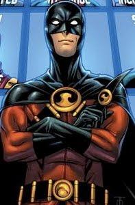
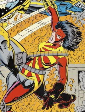
The top row features the current core Batman family, which is essentially Batman and his current crop of sidekicks: The retired Batgirl II Cassandra Cain, Red Robin Tim Drake, Batman Bruce Wayne, Batgirl III Stephanie Brown, Robin IV Damian Wayne* and Batman Dick Grayson.

The two Batmen and the littlest Robin seem to be pretty much just straight reproductions of their current costumes. I really hate the current Batman Prime costume, with the piping and codpiece and Nintendo Power Gloves, but Culver draws all of these costumes great. I really like the elegant, smooth, only-what’s-necessary linework, and I particularly like the fact that you can tell who is in which Batman costume by their expressions and builds.

Bruce Wayne looks bigger, pissier, scarier and older than Dick Grayson, for example. One neat thing about this huge image is the way Culver seems to be able to communicate a great deal about some of the characters based on simply their posture and expressions (Another good example in this very row is Red Robin vs. Robin).

Three of these, however, are redesigns. His Cassandra Cain has lost her mask, which I know some folks don’t care for because it looks fetish-y and bug-like. Personally, I love that Batgirl, even if I think it could stand a bit of tweaking.I wouldn’t have personally wanted to see so dramatic a change as the one Culver gave her, but I think his image is pretty great. Instead of the full Batman-by-way-of-Black Panther mask, Culver gives her a little movie-Batgirl style domino mask, slims her costume so the boots and gloves are part of the whole and adds a bit of color by making the underside yellow. Looks great.

Culver has a note saying he’d call her Nightwing, a pretty cool name that no one’s using or likely to use for quite a while (Personally, I don’t think Batman Inc and the two Batmen status quo can last too long, but I can’t imagine how they’d go back to the old status quo either, which makes it seem like such an exciting story). No one’s doing much of anything with Cassandra Cain, and while I’ve heard she showed up to be written off in the pages of Red Robin, I haven’t really understood how or why she disappeared from all of the Bat-books. The publisher seems to simply have forgotten about her in 2006, as her book was being canceled, and every appearance since then, mostly ones explaining why she’s not around in some form or another, have made less and less sense.

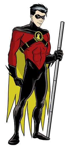
The other dramatic redesign among this group is that of Red Robin, former Robin III Tim Drake. As I’ve noted repeatedly, the original Red Robin costume—designed for by Alex Ross for Kingdom Come, in which a grown-up Robin Dick Grayson became a more Batman-like hero as a grown-up and never took the Nightwing name—was fine for those purposes, but a) Isn’t really all that great a costume and b) doesn’t really fit Tim Drake, as it says “Batman” more than it says “Robin.”Culver loses the tunic-looking shirt, loses the Batman-style cowl (it’s basically Batman’s cowl with the ears cut off) and gives Tim a more Robin-y domino maks.

I don’t think this goes quite far enough—I’d lose the bandolier too, and maybe the not-red Hawkman-style bird shape, perhaps in favor of a red “R” symbol—but I think this is a thousand times better than his current costume. If the official Red Robin costume is a cross between the original Robin costume as Alex Ross’ Batman costume, then Culver’s design is a cross between the original Red Robin costume and Tim’s last Robin costume, which seems more appropriate.

I don’t like seeing his eyeballs, though!

Finally, Culver’s Batgirl. I don’t care for Stephanie Brown’s Batgirl costume at all—the ribbing and purple sides with a black front look too Ultimates, and thus too cutting edge for 2001—but Culver took away its most grotesque elementand again improved the costume some one thousand-fold.

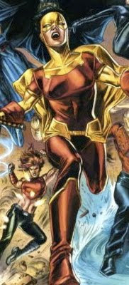
The next row down has some of Batman’s closer allies. There’s Jason Bard, an older character that James Robinson seems to have been turning into Batman’s P.I.; Onyx, a character that was seemingly part of Batman’s network of allies for a bit around the time of War Games; Birds of Prey The Huntress, Oracle and Black Canary and then Flamebird and Batwoman.

Most of these are simply Culver’s versions of the characters in their current designs. He gives his Onyx a little hair (I liked her clean-shaven bald, myself), some green highlights to her costume (maybe not the best color, but its not being used all that much among this group, and looks okay here), and a little bat-symbol on her chest. I like it quite a bit, all in all. I don’t think she’s currently appearing in any books, but I could see her wearing this outfit the next time she does. Culver also names her “The Batwoman of Hub City,” which is the original Question’s base of operations. Many of these characters Culver assigns a city, since the conceit of the piece is apparently the recruiting of characters for the Batman Inc plan of franchised Batmen in major cities all around the world.

I’m not really crazy about his heavily armored version of The Huntress** (her full-body black leotard with purple on top of it and a cross around her neck, the one she started wearing around the “Contagion” storyline in the Bat-books and throughout JLA, Nightwing/Huntress and Cry For Blood remains my favorite), but it looks a hell of a lot better than a lot the costumes she ends up wearing. His Oracle has her old Batgirl boots on, which look pretty cool, and his Black Canary has lots of yellow highlights over her traditional costume. I don’t really care for that look either, but I do kind of like how different it is.

In the next row, things start to get a bit more...random. There’s Nightrunner, the “controversial” parkour Batman of Paris introduced in a pair of annuals this year; original Culver creation Captain Batarang, which takes some design cues from Captain Boomerang; The Batman of Japan, wearing a version of the “Science Ninja Hero Batman” costumedesigned by Cliff Chiang as part of a Justice League/manga amalgam; The Hood, an Alan Grant-created English vigilante I’ve discussed before, given a more Batman-themed design (I thought that was supposed to be Azrael the first time I saw the image, to be honest) and a redesigned Acro-Bat, from the pages of the late, great Chase.

These are all great drawings. I think The Hood looks particularly bad-ass (although I might lose the Bat-symbol over his eyes), and Captain Batarang instantly looks like a character I want to read about. I hope Batman group editor Mike Marts has already seen this image, drooled over it and gave Culver a call to ask him if he’d be interested in developing a Captain Batarang one-shot or story to fill an annual or something (Next year’s Batman 80-Page Giant, maybe? Ten short stories introducing Batmen of Many Lands tie-ing in to Batman Inc might be a good theme for it…).

The only one I don’t really like is The Acro-Bat, in part because I think the original character is too cool as is, and this design looks a little too much like Batman Prime (Does anyone actually call Batman Bruce Wayne that? Or am I the only one doing it?)

The next row is the best row. These are a bunch of pre-existing DC characters who aren’t doing a whole lot at the moment that Culver has given Batman-themed costumes. They’re all from the Morrison/Porter/Dell Justice League, and thus are among some of my favorite under-used characters at the moment: Steel, Aztek, Flash Wally West, Big Barda and Zauriel.

I love each and every one of these costumes. These guys look like an honest-to-God line of action figures.

Here’s Culver’s Steel, The Batman of Metropolis. Steel previously switched his allegiances from Superman to Batman in the pages of Kingdom Come. That was one of those many neat little details from the series, a suggested story that we never really got to see play out, one of the stories that was fun to imagine and think about. (Kingdom Come was full of those, and the story-less characters that populate it’s backgrounds remains my favorite part of the book).

Culver’s Steel is a lot different than Ross’, although I'm having trouble finding an image of Ross' online to cut-and-paste her for comparison's sake. I like Culver’s a lot better, to be honest, but that may have something to do with it being newer.

Steel trading in his Superman S-Shield and red cape for a Bat-symbol and scalloped cape—even if only temporarily—may actually make for a decent DCU story, too. I can’t really imagine what circumstances might lead to it, but I have a feeling Alex Ross and/or Mark Waid probably have at least a few sentences or two worth of story idea already worked out. Why not give Culver those sentences and a couple issues to explore it? Slap some Alex Ross covers on it, and I’m sure it would sell! It certainly wouldn’t sell any worse than, say, THUNDER Agents or the First Wave books, anyway (Have you heard the simply shocking rumors regarding First Wave’s possibly imminent demise yet? Who could have predicted launching a whole line of book using obscure characters before the miniseries introducing them even shipped its second issue would somehow fail? I mean, besides everybody?)

Aztek, “The Ultimate Batman” would be the Batman of Vanity City, the fictional locale of the short-lived, 1996 series Aztek: The Ultimate Man, which was written by both Grant Morrison and Mark Millar, and somehow only lasted 12 issues. Was the market really that different 15 years ago?I always liked Aztek’s design, particularly his helmet. Culver basically just turns most of the white of his suit black and gives him a Batman cape. It’s been a while since I’ve read Aztek and the relevant portions of JLA, but I believe the character was created (in-story) specifically to combat Mageddon, the apocalyptic threat at the climax of Morrison’s JLA run, and he died doing it. Barring time travel then, I don’t see a reason for an Aztek to exist anymore. Aside from keeping that awesome helmet in the public eye. So I can’t imagine us ever seeing a Bat-Aztek anywhere except right here.

I love the “Wally West, the Batman of Keystone City” image so much I can barely stand it. It’s a seamless synthesis of the Flash and Batman costumes. This is another character that would probably never in a million years see print (unless in an awesome dream sequence or a Batman Inc.: Bat-Mite, The Batman of The Fifth Dimension*** miniseries which oh my God DC you should totally publish a series called that and get Culver to draw it and you could use all of these crazy characters in it…!!!!!!). But it’s pretty cool looking.

I really like the idea of a truly super-powered Batman too, especially one with such a powerful super-power like super-speed (Which I understand may actually be the best super-power). Also, Wally West isn’t doing a damn thing at the moment, which seems completely crazy. (Do you know what speedster is in the Justice League right now? Jesse Quick. Meanwhile, Justice League founder, Flash Barry Allen, and long-time Justice Leaguer Flash Wally West are…not. I suppose there may be some real-world reason for this, like DC and Geoff Johns not wanting to have anyone write the characters other than Johns until the new take on the franchise gets settled down a bit, but I can’t imagine an in-story rationale for why Jesse Quick is on the JLA and the Flashes aren’t).

Likewise, "Bat Barda" (who “goes wherever she wants) and “Zauriel, The Batman of Los Angeles” probably aren’t going to be appearing in comics much (Heck, Big Barda and Zaruiel probably aren’t going to be appearing in comics much, period). But those are two characters I really love, and two great renditions of them. Culver mainly just tweaked their colors, and added some abstract Bat-shapes into Barda’s practically perfect already costume. (I confess to not having any idea what Barda’s status is, post-Final Crisis; I’ve never seen any clarification regarding the fate of the New Gods, and it therefore seems a bit unlikely she'll be popping up in, say, a Bat-book any time soon).

The next row includes one more ex-Leaguer with nothing going on, Connor Hawke, followed by Bobo Benetti, Angel and The Ape, Arrowette and Tawky Tawny.

Culver’s Connor Hawke simply changes the green in his costume to black and adds a bat-symbol. Looks cool to me. Culver also gave him an arrow with a bat-winged tip, but I suppose if Hawke were to become a Batman, he could lose the bow and arrows altogether. It was always stressed that while he was an expert archer, he was a far superior martial artist, and basically just used the bow and arrow to honor his father and one-time namesake.

Alternately, he could lose the bat-symbol and wear this costume and just call himself Black Arrow. I shudder to think of where Connor Hawke really is in the DCU moment; I think last I heard he had renounced Buddhism and superheroing because of the events of Justice League: Cry For Justice. Did I hear right?

Bobo was one of the many cool characters from James Robinson’s Starman, and Culver makes him the Batman of Starman’s Opal City, giving him a Bat-symbol shaped tie pin. I can dig that.

Angel and The Ape as the Robin and Batman (respectively) of Gorilla City is pretty goofy, but I could actually see a comic book or short story about that. Putting them in Gorilla City would make it all okay, somehow, I think, especially with the sidekick being a human.

Arrowette looks kind of cool in Bat-garb, I love the Bat-shaped bow, but she’s another character I think we’d be lucky to see appear anywhere at all, let alone as a Bat. I believe she was last seen in the pages of Young Justice, when she retired from crime-fighting. Since she did so, Judd Winick made Green Arrow supporting character Mia into Speedy II, so there's already a blond teenage girl archer in the DCU.

As for Tawky Tawny, “the Batcat of Fawcett City,” he’d probably need Fifth Dimensional Imp help to ever actually appear in a comic. I do dig the idea, but this is maybe my least favorite of Culver’s drawings here. His Tawky looks look a normal man with a tiger’s head, instead of a tiger wearing clothes. Now that I think of it, I’m not entirely sure what the origins of the current, post-Crisis on Infinite Earths, post-Infinite Crisis, DCU version of Tawky actually is, but the original was a talking, walking tiger. This depiction does seem somewhat inspired by J.G. Jones’ version from Final Crisis (I didn’t much like that one either).

The next row is dedicated to The Club of Heroes, all appearing as we saw them in the Grant Morrison/J.H. Williams III story arc in 2007’s Batman #667-669. I love all of these characters, I love all of these designs (Dark Ranger’s the only one that doesn’t do all that much for me) and I love these drawings of them. I’m still a little disappointed that Morrison didn’t just give us a straight Club of Heroes book, but Batman Inc. seems to be expanding that idea, so I am excited about it. I’m trade-waiting it though, and am pretty bummed out by the delays, which only push eventual trade collection further and further back.

Finally, in the bottom row, we have various Outsiders. It’s been so long since I’ve read an issue of that comic that I’m not sure who’s actually on the team or what their costumes look like, so these could be the current Outsiders or they could just be a bunch of Culver’s favorites. Anyway, they are Metamorpho, Halo, Thunder, Grace, Black Lightning, Geo-Force, Owlman, The Creeper and Katana.

Of these, I just want to note that I like Metamorpho’s pants like that, and I think that may be the coolest I’ve ever seen Halo, Geo-Force and Katana look.

Geo-Force and Katana especially have serious problems wearing costumes that don’t suck, and I think these are among their least sucky costumes of all time.

Geo-Force (stupid, stupid Geo-Force) has changed back and forth between a poor one and a godawful one: Katana's costumes change more frequently, but I can't tell if they're getting better or worse:


Also, congratulations to Culver for making The Creeper look somehow more insane. Those red, fur or hair-looking tendrils that emanated from his back were among the most striking, off-putting aspects of his original, bizarre design. I didn’t know exactly what it was, what it was made out of, or what it was doing on The Creeper. As Culver draws it/them though, they seem to be something between a red fur boa and vest and shoulder pads. The fact that The Creeper is wearing it, and seems so confident that it looks good on him makes him one creepy-bordering-on-horrifying character.
Finally, props for giving Black Lightning actual black lightning—I've been saying for years that he needs to shoot some actual black-colored lightning, in order to make him "work" better in the 21st century.

Wow. That went on much longer than I meant it to. I could really use an editor around here. Anyway, to summarize: Dennis Culver is awesome, his design and art chops are both awesome, you should click all over all his sites and, if you're an editor or publisher (particularly one at DC), you should totally call him up and offer him tons of money to make some of your books more awesome.


*Or fine, Robin V if you wanna count Stephanie Brown, but I don’t, since she was never intended to be Robin more than a story beat or two


**See the comments for clarification; that Huntress costume is actually Culver's drawing of a Cully Hamner design


***Actually, Bat-Mite Inc. sounds better. Make it happen, Mike Marts!

PSA: Great comics-related job available in Columbus

The Billy Ireland Cartoon Library and Museum (formerly the Ohio State University Cartoon Research Library) is hiring an associate curator. The qualified candidate will need an MLS (or equivalent) or a Master's degree-specialization in archives or museum studies, experience in processing special and archival collections, "extensive and current knowledge of practices relating to the identification, access, control, organization and digitization of visual materials," knowledge and experience of the history of graphic arts, especially printed cartoon art, and the ability to lift 40 pounds.

I've long longed to work there in some capacity, as the institution combines two of my three career focuses (writing, comics, libraries), but sadly I'm only qualified in the knowledge of cartoon and ability to lift 40 pounds departments.

If you're more qualified and looking for a good gig somewhere, you may want to look into this. If you're not from or anywhere near Columbus, Ohio, I heartily endorse it as a surprisingly comics-friendly city. Certainly for the Midwest, where it's maybe second only to Chicago.

Tuesday, February 22, 2011

Dwayne McDuffie reportedly passed away today.

Comic Book Resources has the most thorough of the still-emerging write-ups I've seen so far, and Comics Alliance has begun rounding up industry reactions. I expect to see quite a bit more in the coming days and weeks.

I didn't know Dwayne McDuffie the person at all, but I've long known Dwayne McDuffie the comics writer (and, to a lesser extent, the animation writer), and I spent a lot of time with that Dwayne McDuffie.

Relating the death of a real person with a real family and real friends to one's own personal experience always seems a bit selfish to me, but then, I think the fact that the passing of someone you don't really know can still affect you in some small way can be a compelling indicator of just how important that particular person is to the world. Certainly in the case of McDuffie, he was very important in our part of the world. It saddens me to think I'm never going to read another new McDuffie-written comic book, although I'm somewhat heartened by the fact that there are still chunks of his decades-long bibliography I've yet to experience personally.

Ironically, the post I had planned for today deal with one of McDuffie's works—a recent animated film he wrote—but discussing it seems pretty trivial at the moment. As does saying pretty much anything at all about comics. Other than, perhaps, rest in peace, Dwayne McDuffie, and thanks for all the great comics.

Monday, February 21, 2011

Comic shop comics: Feb. 16

Brightest Day #20 (DC Comics) At first I was surprised to see all that viscous, white saliva in Aquaman’s mouth, as if his mouth was full of very thick, very dry, very stringy spit. You’d think someone who swims around underwater talking and breathing would always have a freshly rinsed out mouth. But then I noticed that the ocean he’s standing next to doesn’t seem to be made of water at all, but Elmer’s glue, so I guess that’s really glue in his mouth...?

Gross.

Anyway, this issue is entirely devoted to the Aquafamily fighting off Black Manta, Siren and the inter-dimensional water-people invaders from the Bermuda Triangle, and Aquaman does indeed get seemingly disintegrated, so I imagine he will be typing 75 words a minute again when we see him again.

It occurred to me this issue that it was kind of cool that Aquaman was now controlling undead zombie sea life instead of living sea life, as he orders an army of dead fish to fight for him. It always made me a bit uncomfortable that he was basically press-ganging whales, dolphins, squid and other creatures who aren’t really all that great in a laser gun fight into battle. These things are already dead though, so if one-third of ‘em don’t survive the charge, no big loss, right?


DC Universe Online Legends #2 (DC) After having seen the art in this second issue......I’m thinking maybe a bi-weekly schedule wasn’t the best idea for this series. And I like Howard Porter, who looks like he might have done very rough sketches which the other three credited artists inked directly without finishing, based on the results.

Somewhat worryingly, this is only the second issue of the series, and the drop in quality is already precipitous. I’m scared to imagine what this is going to look like in, say, ten more issues.


Green Lantern #62 (DC) The cover shows two groups of characters, everyone wearing an expression somewhere between pretty irritated and insane with rage, reaching out for Hal Jordan.

This issue is about the fact that Hal Jordan is so popular that two different cliques want him to hang out with them—the former Justice Leaguers, and the rainbow space monsters.

I’m exaggerating, but only a little. Hal and the “New Guardians” face off against the little villain who has been collecting the emotional color avatar thingees, who was revealed a few issues ago as being one of the oldest villains in the DCU (and one of Kurt Busiek’s favorite, based on usage).

That villain kicks Hal’s ass (but unfortunately does so by throwing special effects at him, so Doug Mahnke didn’t get the opportunity to provide a nice Hal-getting-hit image for me to scan), and, when he wakes up, he decides between the two groups of potential allies.

Mahnke’s art is, as always, impressive, but a bit poorly served by so many inkers (check out Superman’s face in the lower left-hand corner of page 18). Compared to this week’s DC Universe Online, however, this book belongs in a museum.

This issue also includes one of those annoying (to me) five-page excerpts that sometimes run in the backs of DC comics to preview upcoming books, but the book being excerpted is the very next issue of Green Lantern, so Green Lantern #62 ends with five pages of Green Lantern #63. That’s kind of weird.

Also weird? The solicitation and cover shown on dccomics.com is pretty different than the plot in the actual book and the cover that shipped on it. The details about the next issue on DC's site lists Mahnke and Alamy as the artists, but the preview in the back of this say it’s by Ed Benes, Ardian Syaf and Vincente Cifuentes.


Tiny Titans #37 (DC) A new Legion of Super-Pets comic featuring various DCU pets in capes and costumes is something I’ve been wishing for, and now that Art Baltazar and Franco have given us some short stories featuring some super-pets, I see that a comic featuring a realistic portrayal of super-pets might not actually be all that exciting:Cute as the dickens, but not all that exciting.

This issue, by the way is the one with with Mary, Freddie, Billy, Hoppy and Tawny on the cover, along with the blurb “The Shazam Family Super Special!”

Hoppy the Marvel Bunny and, I believe, Captain Marvel Jr have previously appeared in Tiny Titans, but I think this is the first time we’ve seen Billy Batson, Mary Marvel, Mr. Mind (wearing a top hat!) and Mr. Tawky Tawny, Sidekick Elementary’s new math teacher.

He really shakes up the Super-Pets, too!


Venom/Deadpool—What If? #1 (Marvel Entertainment) I had pre-ordered this based on the concept (“What If…Venom Possessed Deadpool?”) and the cool Skottie Young cover, although I ended up reading about half of it as it was serially published in the backs of other What If? specials. As I mentioned back then, those parts were pretty poor.

The other two chapters, which account for the second half of this one-shot, are even worse, with writer Rick Remender following chapter-long conceits involving Boy George and gangsta rap with ones based around The Jerry Springer Show and Joan Rivers’ red carpet work. So, that’s the sort of relevance of the humor.

I didn’t find any of it very funny, honestly, and I’m kind of confused why this is the story attached to the “What If…Venom Possessed Deadpool?” premise. As far as I can tell, the main thing Venom gives Deadpool is a slightly bigger build, a longer tongue, and a different font to speak in.

I can’t think of anyone I could honestly recommend this too.


Young Justice #1 (DC) Huh. The #0 issue was written by a couple of folks involved with the show, but with this official #1 issue, the Tiny Titans and Billy Batson and the Magic of Shazam writing team of Art Baltazar and Franco are on scripting duties. Artist Mike Nortaon remains.

It’s a little unusual for one of DC’s based-on-a-cartoon books in that not only does it seem to continue storylines from the show, but also in that it’s not structured in the more usual done-in-one format.

In this issue, the cold, remote Superboy and Miss Martian move into Justice League HQ, and something weird is going on, including an appearance by Snapper Carr and a villain I wouldn’t have expected to see in this book.

Decent enough stuff, I guess.

Neat.

That's my old comic shop, The Laughing Ogre in Columbus, under Godzilla's foot, in one of the 80 or so, shop-specific variant covers IDW is making for the first issue of their new Godzilla: Kingdom of Monsters book. In general, I loathe variant covers and think they are a terrible thing for the medium and industry, but this is actually pretty cool, and specificity of the particular variants seems like it would encourage a purchase, rather than send anyone scrambling to collect them all for speculative purposes (I would hope, anyway; it would take a ton of work, time and money to track down 80 covers from shops all over the continent, wouldn't it?). My new store, Books Galore in Erie, seems to have been spared.

Monday Morning Man vs. Cephalopod Moment


(Mermaid Man and Barnacle Boy battle it out with The Octopus King in an attempt to entertain SpongeBob Squarepants, in the pages of United Plankton Pictures' SpongeBob Comics #1. The above panels are taken from a story written by James Kochalka and drawn by Hilary Barta)

Sunday, February 20, 2011

A not-too-terribly-focused post about Bill Walko, Titans and some Super Friends sidekicks

Depending on how long and with what intensity you've been reading DC comics, you may or may not know what the above image depicts, exactly. That's actually a Titans line-up, featuring, clockwise from 11 o' clock, Supergirl, Green Lantern Kyle Rayner, Darkstar Donna Troy, Damage, Impulse, Rose Wilson, Terra, Arsenal, Mirage and Minion.

The team was actually sort of short-lived, being introduced in New Titans #0 right after DC's big 1994 Zero Hour event, and lasting until the end of the already in-progress New Titans series, with 1996's New Titans #130. About 16 issues and an annual, all together. And all of those characters weren't in all 16 issues; they were quite gradually introduced, with some of them coming and going, throughout the course of that time.

I really liked that particular line-up, and that particular point in the franchise's history. It was still being written by Marv Wolfman at that point, and he did quite an admirable job of assembling a team of heroes that blended the various approaches a Titans title could have taken in the mid-90s. There were a couple of original teen sidekick characters in their grown-up personas (Arsenal, Darkstar), a couple of hold-overs from Wolfman's own attempt at an all-new Titans spin-off (Team Titans's Mirage and Terra), actual pre-existing teenage superheroes of the era (Supergirl, Damage, Impulse) and an honest-to-God new character, Minion. Plus, having Green Lantern on the team was just kind of weird and exciting, like, I don't know, having Aquaman on The Doom Patrol or something.

I liked the characters so much because so few of them were the traditional Wolfman/Perez Titans, and I didn't feel like I'd walked into a 30-year-long movie 25 hours too late, the way I too often do with some of those characters (Most of them do appear in this run, however, generally as bad guys or at the "ends" of their stories...although other writers would naturally un-end their ends).

Part of it was likely my youth and enthusiasm for the medium, the genre and the potential I would see in characters and settings like these and the DCU back-then, but I enjoyed those 16 issues an awful lot, despite knowing that they weren't exactly great comics.

Wolfman was Wolfman, and was doing what he's always been doing—I imagine he could write series of Titans comics in his sleep at this point, and they'd always be at least pretty decent. The artwork was pretty poor, mostly provided by pencil art William Rosada and a few others, but hey, it was 1994, and it seems deeply unfair to hold 1994 against any artist.

It always looked a lot better, and a lot less 1994, than this, at least:Unfortunately, it never, ever looked as good as it does in the image at the top of this post, which was drawn by artist Bill Walko, who is apparently quite a Titans fan.

Walko's stripped down, simplified, only-the-necessary-lines approach highlights how strong an awful lot of those costumes are (Tell me Rose Wilson didn't look cooler back then than she does now!), and even makes the gaudier, more over-adorned ones like Donna's or Minion's look pretty cool (of course, he drew Minion in the act of putting on his big, goofy liquid metal battle suit that made him look a bit like the Hulk wearing the Silver Surfer's skin).

Walko, of course, has the advantage that comes with this amount of distance from the year 1994, but none of his characters suffer from steroidal, tree trunk + Liefeld anatomies, the all look pretty human, if exaggerated to show off the fact that they are idealized humans. Plus, the teens look like teens and their expressions vary to the extend that you can tell that, say, Mirage and Terra have pretty different outlooks on life and being Titans, and that Impulse and Damage probably don't agree on all that much.

The art boasts a sense of style, of youth, of energy and, well, coolness that was lacking in covers like that of the sole New Titans Annual featuring these characters. Certainly, the art was produced in two different eras, but even in the '90s, covers like that one were things I had to look past in order to read New Titans; artwork like Walko's makes me want to read...whatever he's drawing.

Okay, that's the one that grabbed me, simply because I have a spot of affection for that particular Titan line-up, and it's so rare to see it anywhere other than in a few issues in back issue bins.

Walkos' art, in general, is great. I first encountered it at Project: Rooftop, the indispensable superhero design site where Walko has contributed pretty frequently. I had pulled his redesigns for the two groups teenage sidekicks the Superfriends had on their shows, The Wonder Twins and Marvin and Wendy, ages ago, saved 'em on my desktop, and have been meaning to post something about Walko's versions vs. DC's published redesigns for...well, for months now, I guess (Not years, I hope!) A recent Comics Alliance Walko appreciation by Brian Warmouth ("Classic Teen Heroes Boogie Down in the Art of Bill Walko") reminded me that I had been planning on doing that (Be sure to click on the link to that CA post; it includes Walko drawings of a couple different Titans line-ups, Spider-Man and his Amazing Friends, the "First Class" X-Men and more).

So let's get to it.

These are the Wonder Twins, and their blue space monkey pet/partner Gleek, which you already know if you've watched cartoons at all in the last 30 years or so:Wikipedia says they first appeared on The All-New Super Friends Hour and remained on the Justice League of the various Super Friends cartoons through multiple iterations of the show.

The purple-clad pair were Zan and Jayna, humanoid aliens from the planet Exor who could change shape upon touching one another and announcing their catchphrase. Zan could transform into any type of water, solid, liquid or gas, while Jayna could transform into any kind of animal, real or imaginary. (Zan got gypped pretty hardcore in the power department, didn't he?).

DC would eventually introduce the characters into the DCU proper, in a 1995 issue of Extreme Justice (Which was one of three Justice League comics being published at the time; the most extreeeeeeeeeme one). They appeared in a couple of issues, and they looked like this:
They didn't seem much different from the original, Super Friends version (beyond their difference in appearance, of course), although their back story was a lot more fleshed out and and they were much more powerful.

Extreme Justice didn't last too long, no doubt buckling under the weight of the word "Extreme" in the title (Sadly, the book actually got much better the longer it went on, and had a decent cast, although it was hard to see past the adjective in the title and the usually terrible, Image-inspired artwork*). The Wonder Twins went into character limbo after its cancellation; the only place I can recall seeing them since was cameo-ing among the many other teenage superheroes in an arc of the original Young Justice series.

Okay, so you've seen how the characters were redesigned for inclusion in the DCU, presumably by the first ones to draw them,pencil artist Al Rio and inker Ken Branch (although others would draw them as well) in the pages of Extreme Justice.

Here's what Walko did with the characters: Costume-wise, Walko seems to be taking cues from their Young Justice appearance (drawn by Todd Nauck), in which they had on more casual-looking clothes:Walko took it even further, making the clothes look even more casual and more personalized. The two look like pretty cool-looking teenagers, and the only clue they are the Wonder Twins is the fact that they have their logos on their shirts. (Well, that and their elf-ears and blue monkey companion).

This look is also in keeping with the modern DCU teen trend of forgoing a formal spandex, mask and cape costume for something much more casual, like Superboy's S-shield t shirt or a couple of Wonder Girl's similar logo-on-her-top, street clothes looks.

If this were a Wonder Twin redesigning contest, than Walko won it hands-down. The Extreme Justice Wonder Twins just look like two generic aliens or super-folks; the Walko Twins look like cool kids I want to read more about.

Of course, Walko again had the advantage of "competing" against work done in the prominent style of the nineties ("shitty," I believe the term is). So let's compare and contrast what he did with some decades old Superfriends characters versus what DC did with them just a few years ago.

Okay, here are Wendy, Marvin and Wonder Dog: They first appeared as the viewer-identification characters on 1973's Super Friends (Hey, I thought that was what Robin was for!), and provided comedic relief (Relief of any kind was sorely needed for anyone watching Super Friends; after that theme song it was all downhill).

I don't remember knowing or liking anything about them, but you should check out their entry on Wikipedia, just to see how incredibly complicated their potential origins are. Like, Wendy was either the niece of one of Batman's trainers or the Earth-1 version of Hourman I's wife? And Marvin was the original Diana Prince's son? What the fuck?

Okay, so, naturally they appeared in the Super Friends comic (a good thing to Showcase Present, DC!)and in 2006 the pair were introduced into the DCU proper, as part of then-writer Geoff Johns' post-Infinite Crisis, "One Year Later" story arc of Teen Titans. This Wendy and Marvin were twins and computer geniuses, and they had joined the Titans team as something between an IT staff and HQ caretakers. Design-wise, they just look like two average kids—at least the way the various Teen Titans artists drew average kids. Marvin didn't wear a cape, and looked kind of like a greaser sometimes. Wendy wore the super-tight, flesh-exposing outfits that all the girls on the team wore when they weren't in costume.

They didn't last all that long. In 2008's Teen Titans #62, "Wonder Dog," a dog in a green cape like their mascot from the cartoon series, is introduced. They let him into the tower and, that night, he transforms into a giant hellhound that eats Marvin alive and, after stalking Wendy through the tower in a scene that seemed heavily indebted to bad horror movies, he mauls Wendy**. She lived, although she was in a coma for a while and is now paralyzed and in a wheelchair.

So, uh, that's what DC did with Wendy, Marvin and Wonderdog. (In terms of who did what, Marvin and Wendy's first appearance was in Teen Titans #34, by Johns and artists Tony Daniel, Kevin Conrad and Art Thibert. The demon-dog-eats-'em issue was written by Sean McKeever and drawn by Eddy Barrows and Ruy Jose; Barrows is responsible for the above cover, featuring Marvin, Wendy, whatever the hell Wendy's wearing (denim panties and a skintight tube-top with sleeves...?), and Wonder Dog.

Now, here's what Walko did with the characters:Again, they look like normal teenagers (so I guess they would have been way out of place in Teen Titans). Their clothing is quite similar to what they wore in their original medium, although it looks modernized; even their hairstyles seem true to the early '70s and the '00s simultaneously. It's also clear from the image which of them is the more competent and serious of them, and which is the goofy one who causes more trouble. And note Wonder Dog, about to get into a scrape, like the rascal he is.

Walko wins again!

Now here's hoping the good people at DC have seen the same Project: Rooftop and Comics Alliance posts I have, come to conclusions similar to my own—This Walko fellow is awesome, Jim Lee should declare to Dan DiDio, We should pay him lots of money to do comics for us, preferably ones where we let him design his own characters, since his designs are vastly superior to our own versions of the same characters!—and we get to see more Walko art with much greater frequency...


*For much, much more on Extreme Justice, I'd recommend the series of posts entitled "Darling, I Don't Know Why I Go to Extremes" on 4thletter.net: Part one, part two and part three. Hundreds of words! At least a dozen scans! All about Extreme Justice!

**If you're interested, this issue is discussed at greater length as part of this post, surveying two of the collections that came out of that particular run on the title