 Despite the couple hundred words I spent talking about how Year One: Batman Scarecrow featured some rather wonky continuity, highlighted and underlined by DC’s decision to collect it alongside a Batman miniseries with completely contradictory continuity, the two-issue miniseries is perhaps most notable for its artwork.
 It was drawn by Sean Murphy, who would go on to draw the higher-profile 2010 miniseries Joe The Barbarian, Grant Morrison’s only non-superhero work that year. In a way, it’s too bad Murphy collaborated with Morrison on that particular project instead of one Morrison’s many Batman comics, with the latter was writing while the former was drawing Joe. Murphy is an incredible Batman artist.
Murphy’s art, at least as it was in 2005, when this miniseries was published, was a pitch-perfect balance between the “cartoony” Bruce Timm-designed work of Batman: The Animated Series (a style which, outside of Timm’s own comics work, and that of Darwyn Cooke, has hardly ever really seen outside of DC’s own animated-style, detached-from-the-DCU comics),) and a more realistic, more detailed approach.
Murphy’s Batman is a big, hulking superhero, with a bulky build, but free of steroidal muscle bulges and veins—he’s built like an old DC Silver Age character, complete with square jaw, barrel chest and arms like tree branches.
Murphy keeps the character highly abstracted though, particularly in the cape and cowl area. His eyes are white triangle, his mouth a white wall of gritted teeth or a simple line for a frown and, when in action, he gets slightly more abstracted, his cape stretching and pointing to make him look a bit like a black and gray comet.
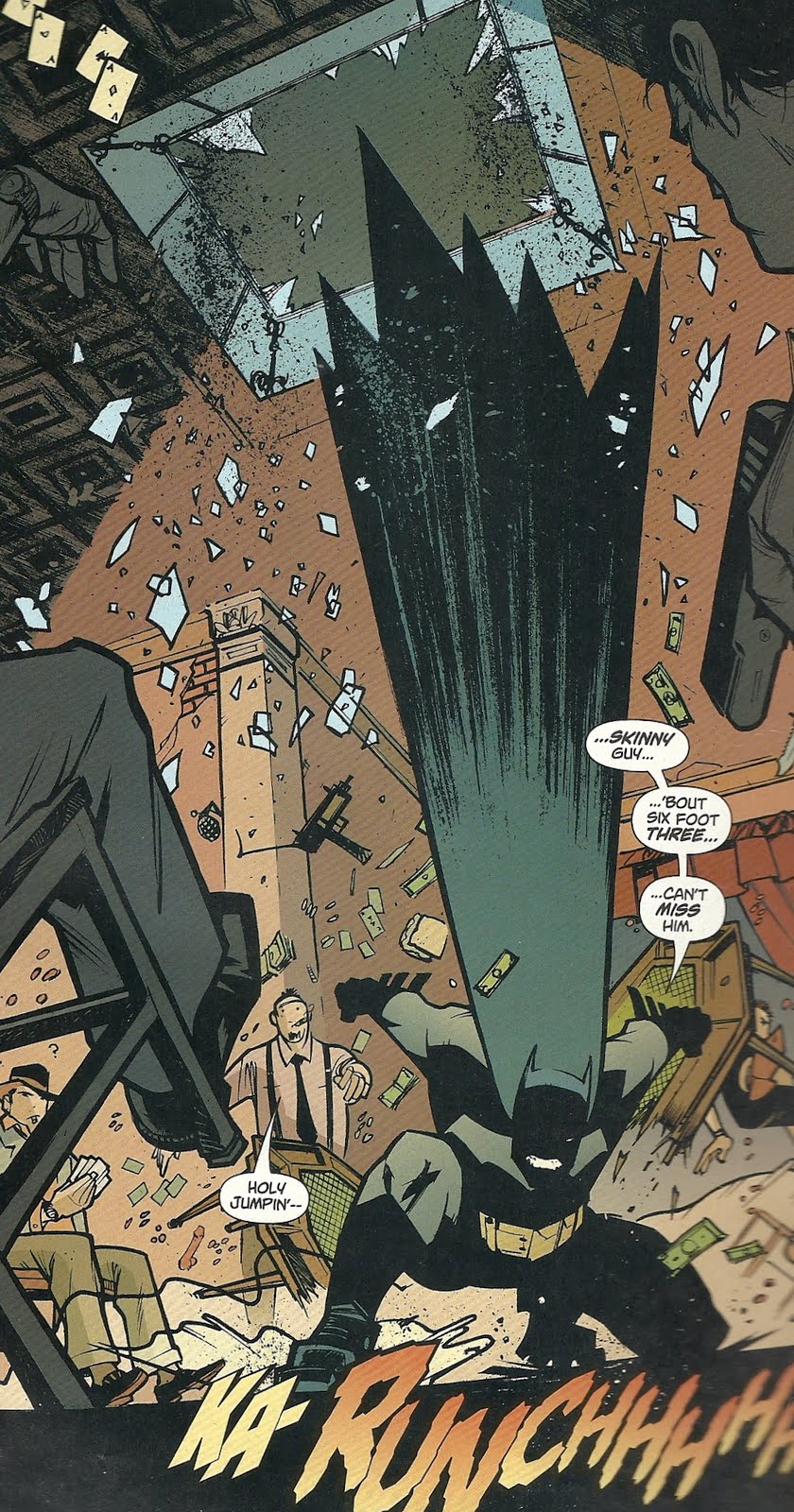
Look at this image, in which an angry Batman crashes through a skyline and hits the floor of a bad guy hideout, essentially blowing the entire room up.
 As I mentioned in the previous post on this series, though this tells the tale of Batman’s first encounter with the villain The Scarecrow, it is now set after Dick Grayson became Robin.
Murphy’s Robin is equally inspired and, as Murphy exaggerates Batman’s height and girth and Robin’s size, they clash and compliment one another visually in their size, shapes and lines in the same way that the colors of their costumes clash and compliment (and, in Bruce Jones’ script, the way their personalities and Good Cop/Bad Cop approach to crime-fighting do).
Murphy’s Robin is tiny.
 And so’s his cape.
 While artists went out of their way to design darker, tougher, more realistic and even more badass costumes for future Robins—
 —Murphy accentuates the original Robin’s little-kid-who-just-got-out-of-the-circus look.
Robin and his costume look completely ridiculous, a little kid playing dress-up, but then, so do Batman and his costume, or The Scarecrow in his costume.
Dressing up in an elaborate costume to fight or commit crime is essentially ridiculous, and Murphy’s art embraces it proudly, rather than half-assing it.
Speaking of The Scarecrow, I’ve devoted a lot of time and space to that character on my blog (as you’ll see if you click on the “Scarecrow” tag and back your way through my archives), so it’s worth taking a moment to look at Murphy’s:
 This miniseries was produced to capitalize on any Scarecrow interest associated with 2005’s Batman Begins release (DC produced a Year One: Batman/ Ra’s al Ghul at the same time), but Murphy’s Scarecrow doesn’t take any clues from Cillian Murphy’s banker-with-a-bag-on-his-head look.
 Beyond the mask and color scheme, and perhaps some tattered edges and the ropes around his armpits, it’s not all that Scarecrow-like (Cover artist Zach Howard gave Scarecrow straw “hair” between his hat and mask, but Murphy doesn’t). There’s a short cape with a jack o’ lantern clasp, fingerless hobo gloves, and a jacket with an awful lot of buckles.
 Their Scarecrow spends an awful lot of time outside of his mask too; when menacing his villains, he relies on various chemicals to keep them immobile and or scared, and unmasks to lecture them on his life, Jones’ way of having the character tell the reader much of his origin story.
 That story keeps the basic sketch of Scarecrow’s origin, that as psychology professor Dr. Jonathan Crane he was kicked out of school for his radical teaching methods on the subject of fear, and so adopted a costume and fear-inducing chemicals to seek revenge on those who wronged him, but Jones goes, much, much further back into his personal history. To his birth, actually.
Jones' Crane was abandoned by both his parents, and left in the care of his great-grandmother. A batty old lady, she moved him into a crumbling, southern mansion where she punished him by a rather elaborate method that involved keeping him in an atrium overnight, to be pecked at by a flock of ravenous crows she’d trained to attack people.
One he’s all grown-up, he journeys to Gotham to revenge himself on one of his old colleagues and then his own father, before going after his mother.
Batman and Robin are, of course, set on trying to stop him. Batman, as is so often the case, sees a lot of himself in villain—they both experienced childhood trauma that lead them to dress up in funny costumes and try to scare people—and is particularly driven to catch him. Robin, meanwhile, tries to convince Batman that they’re very different, and to deflate Batman’s obsession and self-doubt.
As I mentioned previously, the inclusion of Robin in this story seemed like a decision made for the very same reason the original Batman creators added a boy partner in the first place—it gives Batman someone to talk to, and thus moves the story along more briskly and enjoyably.
It’s kind of weird, given how many decades Batman and Bruce Wayne and Robin Dick Grayson were a team, to say this, but seeing them like this was fresh for me, presumably because I didn’t start reading Batman comics until about the time Tim Drake had come along, and DC very rarely published comics set during this particular time-period (The vast majority of Batman stories set in the past, including most of Legends of The Dark Knight, a third Batman monthly that was dedicated precisely to telling stories set in Batman’s past, focus on his pre-Robin days).
As both Batman and Robin and Bruce Wayne and Dick Grayson, Jones portrays their relationship as more of a big brother/little brother, or two friends with very different personalities, relationship, rather than the mentor/student, father/son, obsessed lunatic/voice of reason relationship we usually see.
Their banter is often surprisingly funny, something that Murphy’s artwork really helps sell.
 Note, for example, the word “shove” hand-written into the panel above, in which the two take turns trying to break through a bureaucrat’s wall of blasie bureaucracy, each thinking they know the best way to do it.
And Murphy sells them in action even better. I highlighted that panel of Batman attacking a room above. Murphy also often tilts a whole room to show falling and movement, as in this panel, wherein a hallucinating Robin turns on Batman, thinking he’s The Scarecrow.
 I was also particularly impressed with the way Murphy drew the pair swinging through the air on what used to be called their “bat-lines.”
 If you’ve read many, hell any, old Batman comics, you’re probably familiar with the site of Batman and Robin swinging over Gotham City from ropes, the ends of which and what they’re attached to rarely if ever shown (From the ‘90s and forward, when I started reading current Bat-comics, the various Gotham guardians had all adopted grappling hook guns with diamond tipped grapples that hook into stone walls, and are fired with some sort of pneumatic or explosive device imbedded in the handle; in Grant/Breyfogle books, they used to make a little PAF sound effect, and The Animated Series featured a similar little gun device).
 Here we never see where the ropes come from, how they’re attached, or what they’re attached to, we just see Batman and Robin, often reduced to silhouettes or abstracted shapes, attached to little lines that pull them off into the distances or out of panel, as if they were attached to speeding, unseen zeppelins or something.
Finally, here’s another of my favorite panels of Murphy’s work. The Scarecrow has captured and sprayed his father with his fear gas. His father, it turns out, is phobic about bugs.
When Batman and Robin intervene, and Robin tries to rouse the victim, this is what Murphy gives us:
 I’m not sure exactly what it is, the combination of thick and thin lines, I think, but that image of Robin as a giant cockroach really reminds me of a Bill Watterson drawing from a Sunday Calvin and Hobbes strip, one of those where we see inside Calvin’s imagination.
Note too how even Scarecrow’s dad gets slightly more abstracted and exaggerated in that panel, the lines of his face and body looking rougher, the shape looser.
(In the next panel, which I didn’t scan, Scarecrow’s dad responds by headbutting Robin, sending the Boy Wonder sprawling across the room with the sound effect “DOOF.”)
So that’s Year One: Batman Scarecrow by Bruce Jones and Sean Murphy. It’s a pretty great Batman comic with really great art, and I’d highly recommend it to anyone who likes Batman comics (although check the back issue bins if you can, as it’s collected with Two-Face: Year One in the trade Batman: Two Face and Scarecrow Year One, and the latter story is no damn good, but I’ll save complaining about that until tomorrow).

2 comments:
Wow. I guess I need to go ahead and buy that. You've sold me.
I read the Two-Face story when it came out, but I guess I missed this one. The Two-Face one didn't leave much of an impression on me, so naturally I didn't pay much attention when the trade came out.
Thanks for the article. I would never have looked for this one if I had not read about it. It sounds interesting, and it's nice to see Dick Grayson as Robin in a modern comic.
Post a Comment