So remember last Wednesday night, when I said I picked up a handful of comics from a 50-cent bin at my local comic book shop? And that I'd probably review them here at some point? Well, that's what this post is.

For example, this comic opens with a three-page sequence that a caption tells us occurs in "Happy Harbor, Rhode Island."
The first page is a four-panel one, devoid of words. There's a longshot of a tidal wave crashing into some boats and small buildings. Then there's a medium shot of two people being swept up in water on a city street. Then an extreme long shot of an even bigger wave (the same wave?) about the crash into a town (the same town?) with a barren, rocky island bearing a huge cave mouth in the background. Then there's a longshot of what is presumably the same island, only now the cave mouth is tiny, having shrunken from the size of a couple of houses to roughly the size of a basketball team (unless it's a different cave entirely), and we see some familiar figures obscured by shadow.


Of course, explaining what's going on in the images through narration and dialogue is only redundant if it's clear what's going on in the images from the art itself, and this art is anything but clear.
Lee Garbett and Trevor Scott are credited as the artists for this miniseries, which Keith Giffen wrote. The art is generally quite poor. The idea seems to be that the traditional DC Universe is somehow suddenly being merged geographically with the WildStorm universe, as (I think) the Justice League cave base pushed itself up through the water in Happy Harbor, causing a flood, the Wolfman/Perez era Teen Titans' T-shaped based suddenly appears in New York City, and the Legion of Superheroes' crashed rocketship base appears in Russia.
The familiar (to me, anyway) DC characters don't really speak at all, and behave rather mysteriously, so the various WildStorm characters, few of whom are introduced, named or otherwise identified, talk about them as if they've never heard of or encountered them before, and assume they are hostile. (The exceptions are a couple of Legionnaires and the civilian identities of three of the JSA members in the back half of the book).
One problem with Garbett and Scott's work is that it's so generic that there's no sense of place to anywhere in the story, so a 1960s era DCU somehow merging with and invading the 1990s-borne WildStorm universe doesn't quite register, let alone resonate. The interior of the Titans Tower is just a generic hallway, or a background-less white space, or a cloud of smoke, just like most of the settings in the book.
The Authority, Majestic, Gen 13, StormWatch and the people from Gail Simone's superhero retirement home miniseries all appear, but even though they're a lot chattier, it's not exactly clear who most of them are or what they're up to (The DC characters have the advantage of at least being recognizable enough that you'd be hard-pressed to find someone who didn't recognize, say, Superman or Batman; the same can't be said for...whoever that guy with superpowers wearing a suit and tie and hanging out with Majestic is.
Giffen has an okay premise here, although a lot of my understanding of it comes from guessing after the clues (Like the title, "Chimera Rising"), but it's so poorly executed I wonder why DC bothered. They published five more issues after this one.

I still haven't accepted the fact that they were charging $4 for a 22-page comic, and they reduced their page count without reducing their price.
Now that I've read the first two issues, I see that this is a comic I wouldn't just theoretically have liked to read as it was being released serially, but that I now know I definitely would theoretically have liked to read as it was being released serially if not for the fact that Marvel was charging, what, twenty cents per page.
Otherwise, this is pretty much perfect, only lacking in Erik Larsen's pencils to be a perfect Defenders comic. Well, Larsen's pencils and the presence of The Hulk, who appears briefly in the first issue—in a "smart Hulk" mode of some sort—in order to ask his three fellow Defender founders to stop the Hulk's Hulk, the "Black Hulk," some sort of supernatural unstoppable rage monster that looks like The Hulk made out of ink, with a more primitive, baboon-like jaw and a tail.
The Hulk recommends they team up with She-Hulk instead of him, only instead of She-Hulk they team up with the red She-Hulk, who is apparently also called She-Hulk instead of "Red She-Hulk"...? I don't know. I don't read enough of these comics to know what's going on anymore. I just know Namor, Dr. Strange and the Silver Surfer are all pretty awesome, and Fraction writes them well.
Taking Nighthawk's place as wealthy, relatively weak hanger-on in the traditional Defenders roster is Danny "Iron Fist" Rand, and it's a welcome personnel change, given Nighthawk's overall lameness.
Fraction lets the characters take turns narrating, which is usually a narrative technique I find grating, but it works well enough here. He has little problem finding a threat big enough to unite these diverse heavy-hitters (and Iron Fist) and throwing them all together fairly organically (although Iron Fist is a bit shoehorned in; apparently only present because he owns a plane and [Red] She-Hulk knows him).
The Dodsons' art is fine; much better than I expect from Marvel these days, and barring an unfortuante blur effect here or there, it's even colored nicely enough. I was sort of bummed to get to the end of the second issue and realize that was pretty much the end of Marvel's new Defenders series for me...at least until the trade collection is published and gets added to some library collections and/or I find #3 in a bargain back-issue bin.

This five-issue miniseries released under Marvel's mature readers "Max" imprint came out in 2010, but was apparently already written at that point. Like most of Kirkman's Marvel work, it was kind of quirky...and not exactly embraced by the majority of Marvel Zombies.
Reading the first four-fifths of it today, I was struck by a few things.
First, each issue was awfully sleight for being $3.99 a piece. Lots of splash pages, four-to-five panel grids on each page, each issue took me only a few minutes to read, and I was less than halfway through a bath before I was finished (Luckily I had a newspaper in there too). Second, those Max books sure had sturdy cover stock—the first three issues felt like they had backing boards built right into them, while the fourth issue featured a more standard "floppy" cover stock (although the price remained $3.99). And third, there was so little that was Marvel about the book, I wasn't quite sure why this was a Marvel book at all—did Kirkman have a pre-written superhero story that the Destroyer was grafted on to, in order to Marvel-ize the story?
In this miniseries, Destroyer is apparently the world's only superhero (with the exception of his son-in-law and sometimes sidekick, Turret), and he works for the government as a sort of terrorist and monster-fighting contractor. He's also pretty old, with artist Corey Walker giving him a head that looks like a healthier, more heroic version of John McCain's puss atop a thick body that's muscular in the way a Mike Skekowsky Justice Leaguer might have been. He's old, way past retirement age, and he's diagnosed with a bum ticker—his heart could give out at any time—and he's determined to use what little time he has left to kill every one he thinks needs killing. His long-suffering wife would prefer he spend more time with her and their family before he dies.
The characters are all pretty thinly drawn, but the drama is effective enough, and it's a solid, entertaining melodrama in the Mighty (Max) Marvel Manner. I imagine fans of Garth Ennis' Punisher work will enjoy some of the more over-over-the-top moments, like an opening panel in which the Destroyer's fist is seen emerging from an exit wound it made in the back of a terrorist's skull, pushing bits of teeth and an eyeball out with it,


I really liked Walker's deceptively simple artwork, and it's kind of too bad they used Jason Pearson's art on the covers. Pearson's a great artist whose work I like a lot, but it's awfully different from Walker's, which should have been more than sufficient to sell the book.
The back-issue bins I found these four issues in didn't have the fifth and final issue, so I have no idea how it ends. Maybe the final chapter transforms the four that came before it into something else entirely, but I liked these four okay. They're well worth the $2 I paid for 'em, although I'm sure I would have felt like I was highway-robbed if I shelled out $15.96 for 'em...
Oh! There's a scene in here where the Destroyer punches off the arm of his archenemy Scar and tries to shove it down his throat—

The latter sort of disturbs me, as "Wouldn't it be cool if the hero tore the arm off of the villain, and then tried to choke the villain to death with their own severed arm?" doesn't seem like the sort of thing that should occur to too many super-comics writer too often...

This is a book I've known by reputation for quite a while, but never actually had in my hands to read. As such, it's a somewhat strange experience, somewhat akin to sitting down to watch, say, Citizen Kane today; you can't exactly watch it with unprejudiced eyes anymore.
It was really quite good though. The artwork, it goes without saying, is beautiful, and David Hornug's understated colors serve it well. Augustyn's story is pretty straightforward, but rather remarkable in the way it parallels "Batman: Year One" (or at least a more bare-bones version of "Year One), differing only in its setting. The true identity of The Ripper was fairly loudly broadcast, despite an early red herring, but made for a satisfying overall construction nonetheless.
If you haven't read it already, I'd highly recommend you read it in whichever edition your local comic shop offers it in.
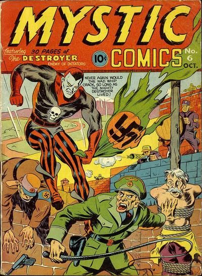
Just be careful you don't accidentally pick this up instead:


4 comments:
I picked up DESTROYER in hardcover trade for $5. It was a deal really. I pretty much feel the same way you do about it. The last issue has a very good scene which takes place in limbo, while it's no less gory, the story and use of violence does finally build to a sort of poetic theme/moment that is a defining and transforming moment for the character. I wish the whole series had more moments like it; as you note the whole lead up feels pretty thin. I don't know if the ending redeems the ulta-violence but it does justify the use of it more than anything else I've read in the medium of late.
As someone who suffered through DC/WildStorm: DreamWar on a monthly basis, I can tell you it gets worse, until an uptick in comprehensibility toward the end. Not to get spoilery, but let me also say that the book because progressively less relevant, and didn't exactly matter much to begin with.
Defenders #1 was okay, but the dollar wouldn't have kept me reading. I also draw the line at $2.99, so these types of books get exactly one issue to sell me on a trade, and this one wasn't quirky enough to keep my interest.
I only read an issue or two of Destroyer. It seemed like a repurposed Brit story. I don't know how it ends, but it seems like Kirkman had an idea he didn't want to apply to his own character, so he sold it to Marvel.
Oh, man, I LOVED the DC/Wildstorm book! I bought and read it in trade. I loved the writing and the artwork. Sorry it wasn't your cup of tea, but I thought it was really well done. I suppose this explains why no one talked about it, though. :)
"Having narration boxes explaining what is happening in the pictures, like having characters recap the action in their dialogue, has long been considered redundant..."
How I wish somebody would tell Stan Sakai that! As good as his art is, his 'Captain Exposition' scripting has long been Usagi Yojimbo's greatest weakness.
Post a Comment