the trailers for a live-action and CGI Marmaduke movie I've been seeing (beyond the obvious things wrong with them, including their very existence), and I finally realized what it was.
Unlike Garfield, whose two similarly live-action and CGI movies turning a profit despite the howling of critics and the sad head-shaking of the public at large no doubt lead to the creation of a Marmaduke movie, Marmaduke doesn't talk. Not to people, not to the audience, not to other animals. And yet he can't shut up in these things.
I doubt there are any Marmaduke fans out there with enough affection and dedication to the single-panel cartoon to be able to support the designation of "Marmaduke purist," but whether or not your cartoon animal protagonist is merely a dumb animal or a sarcastic chatterbox would seem pretty fundamental to the creation of a film based on said cartoon animal protagonist, wouldn't it?
Also, the Phil in the movie doesn't have a mustache like the Phil in the comic.
Wednesday, March 31, 2010
Monday, March 29, 2010
Review: Mail Order Ninja Vol. 1
 The premise is super-simple, and laid out perfectly clearly in the three-word title: Mail Order Ninja (Tokyopop).
Perfectly ordinary fifth-grader Timmy has perfectly ordinary fifth-grader problems—a bratty little sister, unpopularity at school, a gang of bullies after his lunch money—but he has an unusual solution to them. An ad in a catalog brays, “Hey Kids!!! Would you like to own the world’s deadliest NINJA?!” It’s for a contest giving one lucky winner “exclusive exploitation rights to the legendary warrior Yoshida Jiro for an entire year!”
Two to three weeks later, a huge wooden crate get delivered to his home, a sword emerges from within, cutting a ninja shaped hole in it, and out steps Jiro.
Written by Joshua Elder and drawn by Erich Owen, Mail Order Ninja is an all-ages comic, but closer to the for-kids end of the spectrum—as an adult, I still found a lot to enjoy in the first volume of it, but it was clear it wasn’t written to address me in particular.
It’s sprinkled with lots of little gags—I liked the industrious bullies’ self-built toll booth, and the way the hench-kids’ hairstyles complimented one another—but the central joke is sticking a ninja into various domestic and school situation. Some of the riffs on that central, foundational joke are more successful than others, but chances are young readers won’t have heard some of the more clichéd ones enough to be tired of them.
Owen’s art is a pretty accomplished appropriation of manga style (and occasional manga techniques) to Western comics storytelling. Western artists adopting manga style often makes me awfully nervous, as in so many cases it tends to come from an economic or business calculation rather than an honest evolution of an artist’s craft, but that’s not the case with Owen—this is all around solid work.
Checking around the Internet, I see there’s only one other volume of the series, and I’m rather curious to see where it goes. Elder seems to have reached the logical conclusion of his story about halfway through this volume, and the second half brings up an escalation type of conflict, in which the school’s Queen Bee character—Timmy’s rival in a school election—gets her own mail order ninja, a ninja that happens to me Jiro’s archenemy.
I’m not certain the gag can be sustained twice as long as it was here, but, again, I’m not exactly the target audience here. I liked it, though, and I can certainly imagine having loved it if I read it when I was Timmy’s age.
There's a slight chance I may not be the most observant comics critic in the world.


I first read Simon Gärdenfors' 120 Days of Simon, a graphic novel in which the author spends four months traveling and, while on the road, indulging in just about every opportunity that presents itself to have sex and do drugs and generally live the life of a libertine, about a month ago.
I wrote a review of it about a week after that.
And yet it didn't occur to me that the title may have been a riff on the Marquis de Sade's 120 Days of Sodom until, oh, about twenty minutes ago.
Gloria Steinem on Wonder Woman (Pt. 5)
"On three political positions, Wonder Woman is very clear. Violence is neither good nor inevitable. It is necessary to be strong, but only for purposes of self-defense. And, finally, enemies, whether they are male or female, can be re-educated and made to see the error of their ways."
—Gloria Steinem, from her preface to the "Politics" chapter of Wonder Woman (Bonanza Books; 1972)
—Gloria Steinem, from her preface to the "Politics" chapter of Wonder Woman (Bonanza Books; 1972)
Saturday, March 27, 2010
Comic shop comics (mostly from March 10th and March 24th)
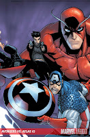
 Avengers Vs. Atlas #2 (Marvel Comics) After the New Avengers disappeared via time anomaly at the end of the first issue, the Old Avengers (fresh off their first encounter with Kang) appear. Thing being a Marvel Comic, the Old Avengers naturally assume the Agents of Atlas are actually agents of Kang, leading to 17 straight pages of fighting.
And that’s not a complaint. Artist Gabriel Hardman is a damn fine artist, and his work is representational yet still highly fluid. Applied to the original Avengers, that means they look like “themselves” and yet look realer and of the same world of the Agents at the same time.
And Parker is such a fun and clever scripter that even 17 straight pages of super-combat is a blast to read—I particularly enjoyed a two-page sequence in which Gorilla Man disarms Captain America by skipping his shield like a stone out into the water and then grows giant-size to deal with Hank Pym. It’s almost a disappointment when the all those smart guys on the two team’s finally realize they’re all heroes and can’t solve their problems by beating one another up.
There’s also an eight-page back-up story, which is probably the best of the three I’ve read so far. That was a bit of a surprise to me, given that it stars Jimmy Woo, the least interesting of the Agents (Of course, he’s still a former FBI agent and former SHIELD Agent whose portfolio was dedicated exclusively to fighting Godzilla and who now runs an evil criminal empire as a force for good, so even the least interesting Agent’s a lot more interesting than your average comic book character).
This one’s by writer Scott Kurtz and artists Zach Howard and Mark Irwin. Jimmy is investigating an evil hibachi restaurant and ends up fighting blade-wielding restaurant employees and monstrous sushi ingredients in an attempt to recover a very unexpected item for Mr. Lao, his dragon advisor. It’s a nicely structured story that doesn’t waste a panel.
 Batman and Robin #10 (DC Comics) Grant Morrison’s fourth art team shows up for the next three-issue arc, “Batman Vs. Robin.” Picking up right where the last issue left off, with Dick Grayson realizing what they thought was Bruce Wayne’s body was actually that of a clone and that Wayne must still be out there somewhere, he and his Robin and Alfred start searching Wayne Manor for clues Wayne might have left if he was really lost in the past.
It’s a pretty clever set-up, as it allows the characters to find secret passages and suchlike in the well-explored manor that are new to them, while assuaging readers’ skepticism that surely they would have noticed that secret underground church before since, you know, it wasn’t actually always there, but just appeared there after Bruce was sent back in time to build it or whatever.
In addition to this mystery, Talia al Ghul launches a rather unexpected plan to take out the new Batman, and the mysterious crime writer Oberon Sexton gets even more mysterious (Is he Bruce Wayne?)
This new team is that of Andy Clarke and Scott Hanna. They’re pretty good—miles ahead of Philip Tan—even if their style isn’t as strong and individualized as that of Frank Quitely or Cameron Stewart. Of course, the good thing about Tan’s contribution to the book is that now anyone who can produce legible artwork for a comic book that draws a Batman story for Morrison is going to seem pretty great.
 Batman: The Brave and the Bold #15 (DC) Artist Robert Pope’s cover of this issue looked so familiar to me that I had to look up Adventures in the DCU #14’s cover just to see how similar the two are:
 I guess they’re not that similar after all; Steve Vance’s Wally West is teasing Superboy by enjoying a cool drink while racing him backwards, while he’s merely goading Batman by yawning. I think I like Vance’s better, mostly because his Superboy is clearly being bugged so much more, and is trying so hard. Batman’s harder to tease; he just looks kinda pissed in his cover.
This issue is written by Sholly Fish and drawn by pencil artist Pope and inker Scott McRae. It opens with a pretty damn amazing three-page sequence, in which Batman teams up with Super-Hip and Brother Power, The Geek to take on The Mad Mod.
That right there is a perfect comic book story, and it’s just the first three pages!
The main team-up is Batman and The Flash Wally West, in a race to see who can solve a robbery by a classic Flash foe in Keystone City first. It’s a tidy little done-in-one, with a couple of twists regarding who wins and how. I really liked the ambiguity of the contest, which, like all of those classic Superman/Flash races, didn’t have an entirely clear-cut, definitive answer to who is actually fastest.
 Billy Batson and The Magic of Shazam (DC) Putting a Byron Vaughns cover on this issue probably wasn’t the best choice, given that this is the debut of Mike Norton as the title’s new ongoing artist.
 I was surprised to hear Norton would be working on this book, given that he’s done so much work in the DCU proper already and, prior to that, for Marvel Comics. Additionally, while he’s shown great range, he’s work never struck me as particularly Jeff Smith-like or Mike Kunkel-esque.
So I was really curious to see how this turned out and, to my delight, it turned out great. Norton has modulated his style so it looks different from his previous DCU work, and different from the artists who designed and then re-designed these characters, and yet it’s close enough to Smith’s original work that it seems a natural progression of it. Norton’s not aping Smith at all, but his work definitely compliments Smith’s. Just flipping through this a second time as I prepared to type up a few paragraphs of it, I was struck by how much this looked like the sort of work one would find in an original graphic novel produced by a major book publisher for a Young Adult of Juvenile audience.
I think it may be some of the best work Norton’s ever produced, and it’s the best this title’s looked since it launched—I liked what Kunkel did, and I love Stephen DeStefano’s work, but Norton’s work seems much more broad in its appeal. I know I’ve only read one issue of it, but I kinda hope he sticks around forever now.
The script is by the Art Baltazar/Franco team, and it’s decent but light; they seem far more adept at gag comics like Tiny Titans then more straight adventure fiction like this. It’s not bad or anything, but it’s nothing to get too excited about.
Norton’s artwork on the other hand…
 The Brave and the Bold #32 (DC) This by far the strongest of the J. Michael Straczynski/Jesus Saiz issues of this title I’ve read, in large part because rather than introducing heavy moral and emotional content into a 22-page superhero narrative and then not pursuing it to any king of logical resolution, JMS sticks to just putting two super-characters together in a single-issue story.
Again, his choice of heroes to team-up is rather unusual. It’s Aquaman and Etrigan, The Demon, and the latter is there for his magical expertise, which makes his presence all the more unusual, since Aquaman has a working relationship with so many other magic-types who can do the same things Etrigan does here: Zatanna, The Phantom Strager, a Dr. Fate eta. I’m not complaining though; The Demon is a more colorful, striking design than some of the others, and he’s got a more interesting way of talking (JMS writes his dialogue in rhyme; it’s all couplets here, I believe).
The story is structured not unlike an H.P. Lovecraft one, in which a seemingly deranged man tells his story about his encounter with weird monsters and evil space gods beyond human comprehension, and it boils down to Aquaman and Etrigan versus Cthullhu.
Not exactly inspired stuff—there was an episode of Justice League Unlimited* with a similar premise—but it’s well-written, and it’s not like Aquaman fans have had much else to read featuring their hero in a long time now.
I was rather disappointed in Saiz’s work this time out though, although to be fair, he disappoints in the same ways a lot of artists tackling Lovecraft do. I liked his Cthullhu a lot, its head and chest a mess of unorganized tentacles rather than something more logical looking, and there are a couple of neat-looking creatures on the ground on page seven, the big This is Cthullhu’s Army In the Sunken City of R’lyeh splash page (see the little ones that look like a dozen or so crustacean legs glued together?).
But other than those few designs, they simply look like your standard issue modern sci-fi sea monsters and zombies, the same things you would see in a Hollywood horror move playing with Lovecraft’s mythos. (And I suppose I should here note that Lovecraft, Cthullhu and R’lyeh are never mentioned by name; if you’re familiar with ‘em already, you’ll see them here, and if not, you’ll probably think JMS came up with some of this stuff).
This same page is among the most disappointing, as JMS’ narration mentions the bizarre architecture and the fact that “the angles were all wrong somehow…and if you looked at ‘em too long, your eyes would start to hurt…” But the city Saiz draws doesn’t look anything like what the narration describes—it doesn’t look non-Euclidian, or alien in an upsetting way. Granted, it can’t be easy as an artist to draw a city that looks so foreign to everything the reader knows to bother them, but then, that’s the challenge of doing Lovecraft stuff in the comics medium, isn’t it?
There are a couple of other places where the script seems to call for an image to knock the reader’s eyes out of their sockets—Aquaman amassing every living thing in the ocean behind him as a massive army to fill a whole splash page, for example—but Saiz simply provides pretty decent illustrations for.
The drawings aren’t necessarily bad, but they aren’t quite good enough, either.
 Green Lantern #52 (DC) As the multi-title Blackest Night storyline has worn on, the peculiar structure of it has informed the contents of the comics more and more, mostly to their detriment. This particular issue, the last issue of Green Lantern dedicated to the “Blackest Night” story and the second-to-last comic book featuring a Geoff-Johns written portion of the story, is the first I’ve read in which the format seems to have dictated the entire issue.
Because Johns has written the story so that it takes place in both Blackest Night and Green Lantern, he’s had to keep relevant beats in both books, but not put anything too important in GL, or else BN won’t make sense on its own, for readers who are choosing just to read Blackest Night. He’s mostly coped with this challenge by following Hal Jordan around in the pages of GL, and since he was on different planets than the other characters in BN for a while, that worked pretty well. But now that we’re in the home stretch, it’s gotten trickier and trickier to pull it off.
This issue should be the beginning of the climax of the series, and yet it ends exactly where the last issue of BN ended (and where this very comic began), with Sinestro now a “White Lantern” wielding the power of life itself. Everything that happens in this particular issue then is basically filler, although it’s really weird, really interesting, sort of exciting filler (at least, to me).
That filler comes in the form of needless splash pages and Geoff John’s own creation myth, a creation myth that is in direct opposition of a lot of what we think we know about the creation of our universe (scientifically and religiously) and the evolution of life on earth…and what we thought we knew about the creation of the DC Universe and life there.
First, the splash pages. They’re drawn by Doug Mahnke and Christian Alamy, an art team that has provided the very best work of any of the couple dozen to have drawn Blackest Night-related comics over the course of the last year or so (and, I think, the very best of the many teams to draw Green Lantern over the course of the last 52 issues).
The images in the splashes are thus rather nice-looking, but there’s absolutely no reason for most of them to have the space they occupy, other than to eat-up the page count. The first one in this issue, for example, is a two-page splash, although all it contains are eight characters in flight.
All together, there are four double-page splashes, three single page splashes (that’s one-third of the issue right there). Like I said, they are nice looking pages all, but the pacing is so weird now, and it’s a shame so much page-space is being wasted so flagrantly when there are literally thousands of characters flying around who could be shown doing stuff in all that space.
Now, back to that bit about the creation myth. It goes something like this. The “Entity” we glanced in the last issues of Blackest Night, once in Sinestro’s ring/costume/head/whatever, shares it’s story with the pink supervillain, and it goes like this.
Once upon a time, the white light entity was thrust into the black, lifeless universe. It appeared where Earth is, and it created everything in the universe. It built earth around itself, and then generated life upon earth. As this life evolved, various creatures would invent an emotional reaction of some kind (these being the seven “emotions” of Johns’ emotional light spectrum, including “willpower” and “making people afraid of you”), which would cause these various animals to power up like Pokemon and become the alien angel avatars like the Green Lanterns’ Ion and Yellow Lanterns’ Parallax. (Please see Jonathan of Living Between Wednesdays’s amusing little rant about the many ways in which sequence struck him as just plain crazy-wrong).
In addition to what this says about the origin of the universe (the Big Bang occurred where Earth is? Earth is the center of the universe?), evolution (Nothing experienced fear until insects came long) and DCU cosmology (If Earth’s the oldest planet, what’s that say about all those other ancient alien races/species?), there’s a religious component which is so stupid it’s awesome (which, as I’ve said many times, is sort of the key to Johns’ appeal—he creates comics that are at once stupid and awesome, depending on how you look at them, and sometimes elements are so one that they’re actually the other).
There’s a panel during the emotion evolution sequence showing a lush, beautiful garden, and a pink light in the distance. The narration reads, “As love ignites into existence, so does the Predator.” The Predator, by the way, is the pink alien angel avatar thing of love, the emotional light-power of the Star Sapphires (the pink lanterns). It looks like a dinosaur crossbred with an H.R. Giger alien design…only pink.
And it was apparently created…in the Garden of Eden? The next two panels clearly reference the Book of Genesis, which bolsters the reading that this panel is set in Eden (So why is “The Predator” a dinosaur monster thing instead of a humanoid? Did we descend from dinosaurs?!)
The next panel depicts a large snake with a glowing Orange Lantern Corps symbol-shaped halo, descending from an apple tree. Narration: “As a creature eats what it does not need, Avarice consumes all it touches.”
The serpent in the Eden story? The first Orange Lantern. (Which doesn’t actually gel with the story; Adam and Eve at the fruit, not the snake, and if the snake was feeling “avarice” like Larfleeze and Orange Lantern Luthor, why would it tempt others to consume the fruit instead of eating it all himself?)
Next panel: A sharp rock covered in blood, staining grass. Narration: “Rage grows from murder.” Cain was the first being to experience rage, the source of the Red Lanterns.
Next: Rain and lightning from a storm cloud, and the words “Hope from prayer.” I at first read this as the flood story, sticking with the Genesis theme, but there’s no reason to assume it is. There aren’t really any clues here; it could just be a matter of someone/-thing hoping and praying for rain because of drought and eventually getting it (The Hope avatar is a bird, which one wouldn’t really expect to be the religious type; Rage is a big bull monster though, and doesn’t even have a hand with which to lift a rock, so perhaps emotion invention transforms the emotion-inventor into a different species…?)
The sequence ends with a panel showing a burst of light over an indigo field, with the words “And at last, compassion is offered to us all.” This may just be my Catholic school upbringing following all that Old Testament imagery to its conclusion, but I saw this and though of Jesus, being suggested as the inventor of universal compassion. But perhaps we’re still in Genesis, and it’s God and/or The Entity who are showing compassion after the Flood (which may have been depicted in the previous panel), repenting for having tried to wipe out creation. If it is meant as an echo of the Noah-and-the-flood story in Genesis, that would resonate with Johns’ rainbow emotional spectrum symbolism, as the Flood story ends with God offering a rainbow as his promise not to try drowning the whole world again.
Okay, I realize I’ve gone on way too long about this at this point, but, like I said, I find this stuff really fascinating—no matter how silly it may be. I’ll have to wait to see how it all plays out in the last issue of Blackest Night and then let it rattle around in my head a bit, but this is beginning to seem like an extremely religious story for a big event comic crossover centered around Green Lanterns and zombies. (I don’t think The Entity is meant to be God or the DCU’s god, as Nekron yells at it at one point that “Whoever or whatever sent you here will regret it.”)
I’m particularly curious about how this crazy creation myth will line up with all the previous crazy DC creation myths. I recall there being a lot of that in the old Green Lantern books I never read, and then, of course, there’s the Fourth World/Kirby gods business, John Byrne’s “Genesis Wave,” Grant Morrison’s Final Crisis universal reinvention, Neil Gaiman’s Sandman stuff and Books of Magic miniseries.
In fact, Neil Gaiman used the Cain of The House of Mystery as the Biblical Cain (same with Abel and Eve) in Sandman, and Greg Rucka played around with the biblical Cain in Final Crisis: Revelations, who was a different Cain than the Sandman Cain, and…
Well, anyway. This is a big story, and while Blackest Night is hardly the best superhero comic of the last year or two, it’s becoming the most fascinating one.
 King City #4 (Image Comics) The original material in this issue includes a page of prose from Brandon Graham explaining the inspiration behind a few details from this and the previous issue (I was seriously wondering about that “Please Do Not Pump Ape Bowels” sign, as it seemed to me if Graham didn’t see a sign like that in real life somewhere, it meant he first made up the sign himself, and then arrived at the decision to change some of the letters through a fictional character’s graffiti to come up with that phrase, and man, that would just be insane), as well as a two-page comic strip that Graham says was inspired by DC’s Wednesday Comic.
You know what that means? DC should totally hire Graham for a Wednesday Comics Vol. 2 project! I’d recommend The Legion. I’d like to see him redesign 1,000 superhero costumes, and give him a couple of futuristic alien planets to fill full of Brandon Grahamtastic details.
Oh, this issue also contains the scene where Joe winds up the cat’s tail so it’s legs start running, and then rides it like a skateboard, even doing a kick-flip (Sound effect: “Cat Flip”).
I skated for a few years, but have never been able to master the kick-flip. Graham sure draws it well.

King City #6 (Image) This issue contains the climax of the original Tokyopop digest version of the comic, in which that old man character with the super-powerful evil aura that kills everything it touches passes through the city, killing the fuck out of everything by simply being that evil, comes face to face with Joe and his cat and they do battle.
It is awesome.
The original back matter this time out isn’t from Graham himself, but from Marian Churchland (the artist who drew that story for MySpace Dark Horse Presents where Conan totally kills a dude with his loin cloth). It’s a two-and-a-half-page strip in which Churchland fantasizes about what it would be like dating Max from King City while Graham ignores here. The six-page sequence devoted to their fantasy relationship is awesome (I like the panel where she’s playing William Tell with her dog…).
 Orc Stain #2 (Image) This is a perfect comic book.
  Tiny Titans #26 (DC) I wonder, is there some reason why Tiny Titans can’t say the words “St. Patrick’s Day?” Did Ireland or the Catholic church copyright it? Is it a controversial holiday that might not be deemed appropriate for kids to read about? Because there are a couple of points in this all-green issue where characters refer to the “green holiday” without saying St. Patrick’s Day, and, amusingly, the issue opens and closes with a couple of Titans drinking green milkshakes that they refer to as “Green Holiday Festive Milk Shakes” (instead of Shamrock Shakes, which probably are subject to copyright).
At any rate, the green-colored characters take center stage here. Beast Boy is babysitting Miss Martian, who sees green-clad Gizmo and, mistaking him for a dolly, gives chase. Along the way, Lagoon Boy and Kroc (the Tiny Titans version of Bat-villain Killer Croc) get sept up in the proceedings.
As every month, it’s a fun and funny comic, and Baltazar and Franco seem to only be getting better and better the longer they’re on the book. I particularly enjoyed this month’s cover…check out the range of expressions on the little green animals’ faces. What are they thinking about?
 The Twelve: Spearhead #1 (Marvel) This is a 38-page, $4 speical one-shot that’s both written and illustrated by Christ Weston, the artist for the seemingly abandoned 12-part miniseries that JMS was writing before signing his exclusive with DC Comics.
 I forgot how much I enjoyed Weston’s artwork in that series, and how much I was enjoying all of those 70th Anniversary Special one-shots Marvel was pumping out featuring off-beat Golden Agers, until I read this.
It was welcome reminder that Marvel owns a pretty exciting stable of Golden Age heroes other than the three we always see—The Invaders—characters who seem perhaps more exciting and rather strange compared to DC’s heroes of the same era, in large part because DC’s heroes of the era are so familiar, while The Blue Diamond and The Witness and The Phantom Reporter are so much more obscure, having taken decades off between appearances.
The Phantom Reporter narrates this story, and is the main character. It’s set during World War II, and he’s serving as a war correspondent, but, when he finds costumed heroes amassing for a big operation under the leadership of Captain America, he signs up to fight as a soldier.
Weston proves a very capable writer, and despite the by-now-tired superhero-talking-about-how-the-soldiers-were-the-real-superheroes routine, he works in some neat observations (the Nazis who espouse belief in a “superman” philosophy getting the shit kicked out of them by a bunch of Nazi-hating supermen, Phantom Reporter’s reaction to Mister E’s similar costume). He also manages to give most of the Twelve a spotlight at one point or another during the story, which couldn’t have been easy given how different so many of them are, but many of them play unique roles here (And Weston also manages to tease personality traits and sub-plots that were/will be important in the main Twelve miniseries).
While I was enjoying The Twelve series, I was actually looking forward to what was next for the characters more than the resolution of the actual murder mystery. After reading this, I’m fairly certain I’d rather see more of the characters outside of The Twelve, and Weston seems to be more than capable of writing their adventures as well as drawing them.
*IMDb.com is telling me it’s episodes 15 and 16 of season two, “The Terror Beyond.”
Wednesday, March 24, 2010
Gloria Steinem on Wonder Woman (Pt. 4)
"If we had all read more about Wonder Woman and less about Dick and Jane, the new wave of the feminist revolution might have happened less painfully and sooner."
—Gloria Steinem, from her introduction to Wonder Woman (Bonanza Books; 1972)
—Gloria Steinem, from her introduction to Wonder Woman (Bonanza Books; 1972)
Ad seen on marvel.com:
 Twelve issues, huh?
 I guess the publishers feeling awfully confident that their Black Widow monthly is going to last a whole year, despite the quick cancellations of recent books like SWORD, Doctor Voodoo, Captain Britain and MI13 and the ongoings-downgraded-to-miniseries like Fantastic Force and Spider-Woman.
Tuesday, March 23, 2010
Marvel June previews reviewed
 ASTONISHING X-MEN: XENOGENESIS #2 (of 5)
Written by WARREN ELLIS
Pencils & Cover by KAARE ANDREWS
The birth rate is climbing in the small African village of Karere...and these newborns are anything but normal: infants made
of steel, infants only partially visible to the eye, infants who combust and destroy city blocks. Hoping to witness the rebirth of the mutant species, the X-Men go to investigate. But what they find may just be something far more sinister and dangerous...and familiar.
32 PGS./Rated T+ ...$3.99
I saw an awful lot of grumbling online when Marvel debuted a previous Kaare Andrews cover for this series. A lot of that grumbling was a lot harsher than it needed to be; Andrews is a hell of an artist, and whether one likes his designs for these particular characters or not, that doesn’t really have much to do with how good or bad an artist he is.
Me, I kinda liked the art on that first cover, and his presence makes me a lot more interested in Astonishing X-Men then I have been previously (I dropped it somewhere in Whedon’s second story arc, I think, intending to catch up in trades some day…which I’ve yet to do).
The two characters that seem the most…wrong on this, as in the previous cover, are Emma Frost and Beast.
I appreciate Andrews’ efforts to give Emma and Storm completely different body-types, but he seems to have done so by shrinking Emma to somewhere in the neighborhood of two-and-a-half-feet tall, significantly shorter than Wolverine, whose whole visual identity is that he is shorter and hairier then everyone else. As for Beast, well, he looks ridiculous, but he looks ridiculous in a very specific way, that huge hunchbacked torso, tiny-headed way that The Big Guy characters in all early ‘90s superhero teams (all one million of them) were designed.
So anyway, do portions of this and the previous cover in the series seem to suck? Yes. But keep in mind that all evidence suggests that this is Andrews sucking on purpose for some reason.
 I'm really looking forward to John Romita Jr.'s upcoming Avengers title, if only because it means 22-pages of John Romita Jr. drawing the Marvel Universe every month.
 DARKSTAR AND THE WINTER GUARD #1 (of 3)
Written by DAVID GALLAHER
Penciled by STEVE ELLIS
Cover by CLAYTON HENRY
THE WINTER GUARD IS BACK BY POPULAR DEMAND! The Harvey Award-winning team of David Gallaher and Steve Ellis reunite to bring you the harrowing adventures of Russia's elite strikeforce! Atlantean warlord Krang has brutally invaded the coast of Russia and only the Winter Guard has what it take to stop his diabolical plan...but their actions just might have dire consequences for Russia and the rest of the world. Guest-starring the Agents of Atlas!
40 PGS./Rated T+ ...$3.99
Absolutely everything I know about these characters:
a.) They are Russian superheroes.
b.) One of them is a bear.
That second one is enough to pique my interest in this comic, but factor inn the Agents of Atlas, and this is going to be awfully hard to resist. That’s two super-teams, one with a talking bear and one with a talking gorilla, in the same comic book!
Also, Krang of Atlantis is apparently the heavy. Throw in Namor punching stuff, and this might just be the Marvel event of the summer.
FANTASTIC FOUR #580
Written by JONATHAN HICKMAN
Penciled by NEIL EDWARDS
Cover by ALAN DAVIS
THE HEROIC AGE IS HERE!
A giant toy store full of deadly videogame kids and killer Legos. An underground labyrinth inhabited by needy Swedish nannies. The Impossible Man. Arcade. And a babysitter named Johnny Storm...Enter the Frank-tastic Four.
32 PGS./Rated T+ ...$2.99
Oh man, I hope the “Frank-tastic Four” are a team of four Frank Castles whose exposure to cosmic rays gave each a different fantastic power, so that there’s a stretchy Punisher, an inivisible Punisher, a Punisher on a fire and a Punisher who is made of orange rock.
 FANTASTIC FOUR IN...¡ATAQUE DEL M.O.D.O.K.! #1
Written by TOM BELAND
Pencils & Cover by JUAN DOE
Variante Española También Disponible
M.O.D.O.K.! Monkeys! Mayhem! Marvel’s First Family returns to Puerto Rico!
There’s no such thing as a relaxing vacation for Reed Richards and Sue Storm. They thought they were getting off easy with just having to fight an out-of-control Dragon Man in an exploding oil refinery...but when the monstrous evil genius M.O.D.O.K. hatches a plan involving genetically enhanced monkeys, our heroes will be up to their ears in it! And will they be helped or hindered by the mysterious Puerto Rican figure known only as...El Vejigante?
48 PGS./One-Shot/Rated A ...$3.99
I really enjoyed the last two Beland/Doe FF-in-Puerto Rico one shots, so I’ll be looking forward to this one. If you pre-order it from your shop, make sure you ask for it out loud…in the most outrageous Spanish accent you can muster.
 HAWKEYE & MOCKINGBIRD #1
Written by JIM MCCANN
Penciled by DAVID LOPEZ
Cover by PAUL RENAUD
Variant Cover by MARKO DJURDJEVIC
THE HEROIC AGE IS HERE!
A BRAND NEW ONGOING HEROIC AGE TITLE BEGINS HERE!
Hawkeye, the world’s greatest marksman is back—and reunited with the world's most dangerous super-spy, Mockingbird—in an all-new ongoing series! The deadly duo defied every obstacle to make their way back to each other and put together the all new WCA team—but now the one thing that divided them years before has returned to haunt them: the Phantom Rider! This ancient enemy is out to destroy all our heroes hold dear, and is teaming with Clint Barton’s arch-nemesis, the obsessed assassin Crossfire, to do it! Writer Jim McCann and penciler David Lopez, the team behind the acclaimed New Avengers: The Reunion, reunite to aim the spotlight and crosshairs on Marvel’s terrorist-targeting tandem, delivering a monthly dose of classic threats, new enemies, shocking allies, unexpected twists and dysfunctional dynamics in the Mighty Marvel Manner!
40 PGS./Rated T+ ...$3.99
He’s his world’s greatest archer. She’s a bird-themed vigilante. They’re both on-again, off-again members of their world’s premiere super-team. And they’re a couple. And now Marvel is giving them their own ongoing series…perhaps just to prove that they can keep that premise going longer than DC did Green Arrow/Black Canary…?
HERALDS #1-5 (of 5)
Written by KATHRYN IMMONEN
Penciled by TONCI ZONJIC
Covers by JELENA KEVIC-DJURDJEVIC
Issue #1 Variant by JELENA KEVIC-DJURDJEVIC
The WOMEN OF MARVEL event continues with the blockbuster of the summer, a fast-paced five-issue weekly series by Kathryn Immonen and Tonci Zonjic!
Powerful forces are converging on Earth and the women of the Marvel Universe are at the center of it! Years ago, a herald of Galactus sacrificed her life for the universe. Little did anyone realize, a shred of that spirit lived on...and now she’s back for vengeance on those who abandoned her. The most powerful super heroines of the Marvel Universe must put aside their differences to stop this threat before the Earth is destroyed. Emma Frost, She-Hulk, Agent Abigail Brand, Hellcat, Valkyrie, Monica Rambeau, Sue Storm...these mighty women will be put to the test as never before, as cities are destroyed, families are torn apart, and a cosmic resurrection changes the heroes’ lives forever!
32 PGS.(each)/Rated A ...$2.99 (each)
The weekly publishing schedule is what ultimately pushed me off the fence on this one. I really like weekly comics, so this is going on my pull-list.
 NAMORA #1
Written by JEFF PARKER
Penciled by SARA PICHELLI
Cover by STEPHANIE HANS
Cover by RAMONA FRADON
The powerful agent of ATLAS and Atlantean Princess known as Namora finds a missing colony of her aquatic people in the
Barents Sea, and goes to bring them back to the new home of Oceana. But the Atlanteans are unwilling to leave and now Namora is also compelled to stay...and serve THE KRAKEN! Don’t miss an aquatic adventure like only critically-acclaimed writer Jeff Parker (AGENTS OF ATLAS, THUNDERBOLTS, FALL OF THE HULKS) can tell it!
32 PGS./One-Shot/Rated T+ ...$3.99
Okay, this is a tough one. I have a rule about $4, 22-page comic books—I don’t read ‘em. Even if I’m really interested in them for some reason, I’ll just wait for the trade on them. And I’m really interested in this one. It’s by writer Jeff Parker, whose work I like, it’s drawn by Sara Pichelli, whose work I like, it features Namora, a character I really like, and Marvel even went and got Ramona freaking Fradon to draw the cover on it. BUT, this is only a one-shot, not a miniseries, so there won’t ever be a trade to wait on! (Actually, since this is a one-shot featuring a super-heroine, and there have been several others of those solicited recently, I’m assuming a trade will eventually collect them all, but it will be an anthology featuring characters who aren’t Namora by creators who aren’t Parker and Pichelli).
I’m…I’m torn here. I don’t know what to do about Namora #1.
 From what I understand, the character pictured above on the cover of Ultimate Comics Avengers is "African-American Hulk," who rather than being a rampaging man-monster is simply a guy who looks a lot like Mr. T, only slightly more cut. I don't really know what to make of this, although if that's simply who skinny little white Bruce Banner becomes when he gets angry now, well, I suppose there might be some interesting ideas about racial identity and...oh wait, Mark Millar is writing this, isn't he? Ugh. Nevermind.
  I really like this Brendan McCarthy cover for June’s issue of Peter Parker.
X-MEN: S.W.O.R.D.—NO TIME TO BREATHE TPB
Written by KIERON GILLEN
Penciled by STEVEN SANDERS
Cover by JOHN CASSADAY
Spinning out of ASTONISHING X-MEN comes a story that will take you places you’ve never been! After Secret Invasion, Agent Brand is no longer the top dog at S.W.O.R.D. Forced to share her leadership post with former Avengers-liaison Henry Gyrich, Brand is less than pleased. Will the arrival of her boyfriend, X-Man Beast, help her out? Not when she discovers Gyrich’s plan for fixing S.W.O.R.D. is to rid Earth of ALL ALIENS! Brought to you by Kieron Gillen (DARK AVENGERS: ARES), Steven Sanders (Five Fists of Science) and topped off with covers by ASTONISHING X-MEN artist JOHN CASSADAY! Collecting S.W.O.R.D. #1-5
Well, that’s one way to sell a comic book series featuring a couple of X-characters that was canceled after only five issue due to poor sales—throw “X-Men” and a colon in front of the title.
 That's the cover of Young Allies, a new series written by Sean McKeever and featuring his take on Nomad. The solicitation said Toro was on the team too, although I don't see him...or is that big guy with horns supposed to be Toro II or something...? Anyway, it looks sort of cool.
 Marvel's full solicitations for June are available here.
Monday, March 22, 2010
DC June previews reviewed
 BATMAN #700
Written by GRANT MORRISON
Art by TONY DANIEL, ANDY KUBERT & FRANK QUITELY
Grant Morrison returns to BATMAN with this oversized special! And he’s brought an all-star roster of artists along with him including Andy Kubert, Tony Daniel and Frank Quitely to celebrate this milestone 700th issue featuring stories spotlighting each of the Batmen from different eras – Bruce Wayne, Dick Grayson and Damian Wayne. You won’t want to miss this blockbuster story that paves the way for the return of Bruce Wayne and sports mind-boggling covers by superstars David Finch (BRIGHTEST DAY) and Mike Mignola!
“Mind-boggling?” Well, I guess I’d have to see that Mignola cover before I could weigh in on it, but “mind-boggling” certainly isn’t a word that comes to mind when I look at the Finch cover.
The buildings in the background are nice, though.
BIRDS OF PREY #2
Written by GAIL SIMONE
Art by ED BENES, ADRIAN MELO & MARIAH BENES
Cover by ED BENES
Flying out of BRIGHTEST DAY, the Birds of Prey are forced to ally themselves with the worst of Gotham City’s mega-criminals while they struggle to save his life from the unspeakable horror that hunts them all! Fan-favorite writer Gail Simone (WONDER WOMAN, SECRET SIX) and superstar artist Ed Benes (JUSTICE LEAGUE, GREEN LANTERN) continue their return to the title that first brought them together!
Oh hey yeah, Penguins are birds! Why hasn’t anyone used the Penguin prominently in this title before…?
 THE BRAVE AND BOLD #35
 Written by J. MICHAEL STRACZYNSKI
Art and cover by JESUS SAIZ
Inspired as always by their idols in the Legion of Super-Heroes last issue, the Legion of Substitute Heroes has also traveled back in time to recruit new members. But where their counterparts reached out to the Doom Patrol, the Subs have managed to enlist The Inferior Five! It ain't a stretch to suggest this won't end well.
Genius. This one can’t possibly be dour and serious like the other issues of the JMS/Saiz run have been so far, can it? (If so, maybe JMS could just be in charge of thinking up the team-ups and having other writers actually write them? Because he’s come up with some pretty great combinations so far).
 BRIGHTEST DAY #3-4
Written by GEOFF JOHNS & PETER J. TOMASI
Art by IVAN REIS, PAT GLEASON, ARDIAN SYAF, SCOTT CLARK & JOE PRADO
Covers by DAVID FINCH
If this is the BRIGHTEST DAY then what is Black Lantern Firestorm doing on our cover?!
I’m not madly in love with each of those artists, but there are certainly some strong ones among them, and they’re all of the sort that DC usually gives big books, rather than the “Who’s fast? Who’s available?” way they’ve gone about filling up the pages of their weeklies in the past. That’s cool.
What’s Black Lantern Firestorm doing on the cover? Um, I don’t know. I was assuming that when the dead Justice Leaguers come back to life, the new Firestorm would be a composite made up of Jason, the current Firestorm, and Ronnie Raymond, the original Firestorm. (Actually, I thought they would have done that a long, long time ago, before the last volume of Firestorm was canceled.)
 Fuck yeah, Joe Kubert! I see they’re offering a “1-in-25” variant cover for this second issue of DC Universe Legacies (that’s the title? Seriously?), but I can’t imagine anyone preferring J.H. Williams’ cover, however great it might end up to be, to this Kubert-on-Kubert action. Wow.
  GREEN LANTERN #55
 Written by GEOFF JOHNS
Art and cover by DOUG MAHNKE & CHRISTIAN ALAMY
BRIGHTEST DAY marches on as the Main Man, Lobo, goes head-to-head with Red Lantern Atrocitus – with Hal Jordan caught in the middle! It doesn’t get more brutal than this! Plus, Hector Hammond returns . . . to join the new Guardians?
Doug Mahnke has always drawn a damn fine Lobo.

THE JOKER’S ASYLUM: THE RIDDLER #1
Written by PETER CALLOWAY
Art by CLAYTON HENRY
Cover by ETHAN VAN SCIVER
THE JOKER’S ASYLUM: HARLEY QUINN #1
Written by JAMES PATRICK
Art by JOE QUINONES
Cover by CLAUDIO CASTELLINI
THE JOKER’S ASYLUM: MAD HATTER #1
Written by LANDRY WALKER
Art and cover by BILL SIENKIEWICZ
THE JOKER’S ASYLUM: KILLER CROC #1
Written by MIKE RAICHT
Art by DAVID YARDIN
Cover by FRANCESCO MATTINA
THE JOKER’S ASYLUM: CLAYFACE #1
Written by KEVIN SHINICK
Art and cover by KELLEY JONES
Top creators lend their talents to a new installment of THE JOKER’S ASYLUM – a special month-long, weekly series of one-shots starring the greatest villains in Batman’s rogues gallery.
Each issue is narrated by The Joker and tells a special stand-alone story that gives readers an inside look into the insane lives of The Dark Knight’s greatest adversaries! This batch of tense tales spotlights The Riddler, Harley Quinn, Mad Hatter, Clayface and Killer Croc! Can you stand the madness?!
I was sort of skeptical of the first round of these Joker’s Asylum one-shots,but ended up rather enjoying the trade collecting them. I think I’ll trade-wait this round too, as that worked out pretty well.
It's still a shame they're giving them all #1s instead of just numbering the series though...
JUSTICE LEAGUE: GENERATION LOST #3-4 Written by KEITH GIFFEN & JUDD WINICK. Issue #3 art by FERNANDO DAGNINO. Issue #4 art by AARON LOPRESTI. Covers by TONY HARRIS & J.D. METTLER. DC’s biweekly JUSTICE LEAGUE event continues here! The heroes of the once-great Justice League International – Booster Gold, Captain Atom, Fire and Ice – have reteamed in order to stop a threat to all mankind. But will the heroes of the DCU take this group of misfits seriously? And what happens when Blue Beetle – a new hero with an old legacy – joins the team? And whose side is he really on? Be here to find out!
Despite my antipathy for Winick, I have to admit the more I hear about this book, the more excited I get. I wish I lived around a comic shop so I could give it a thorough flip-through before deciding whether I want to try it out or not. I guess I can always try to catch up later if it’s good.
It’s a shame that instead of contributing regular covers, Kevin Maguire’s only going to be contributing “1 in 25” variants. I don’t understand the way the Big Two comics publishers spend and make money, but it’s always struck me as super-weird that it makes financial sense to pay more than one artist to draw covers for a single book. I suppose I just underestimate the continued strength of the variant cover scheme.
JUSTICE LEAGUE OF AMERICA #46
Written by JAMES ROBINSON
Art by MARK BAGLEY & ROB HUNTER
Cover by MARK BAGLEY & JESUS MERINO
BRIGHTEST DAY continues with the start of an all-new, 5-part JLA/JSA crossover! The return of one hero heralds the release of the powerful Starheart that empowers Green Lantern Alan Scott. Now this chaotic force is unleashed on Earth, causing magic to go wild – and new metahumans to emerge! It’s more than one super-team can handle, but can even the combined efforts of the Justice League and the Justice Society contain the light and dark power wielded by one of their own? Witness the transformation of the moon and a journey into the Shadow Lands that will corrupt a hero! Continued in next month’s JSA #41, this epic event features a 5-part connected cover spotlighting both teams in glorious action illustrated by Mark Bagley with inks by Jesus Merino!
But…but I don’t wanna read JSoA! Why are you trying to make me?
POWER GIRL #13
Written by JUDD WINICK
Art and cover by SAMI BASRI
Power Girl dives headfirst into the next chapter of her life on Earth with new series writer Judd Winick (JUSTICE LEAGUE: GENERATION LOST) and artist Sami Basri (THE SHIELD)! And what events will draw her to her former JLI teammates from JUSTICE LEAGUE: GENERATION LOST?
Oh. Well, that answers that question.
RED HOOD: LOST DAYS #1
Written by JUDD WINICK
Art by PABLO RAIMONDI
Cover by FRANCESCO MATTINA
Judd Winick (BATMAN: UNDER THE HOOD) returns to write the adventures of Jason Todd in this special 6-part epic exploring the lost days of this misunderstood character. Learn what secret events led Jason on his eventual path of death and destruction. Guest-starring Ra’s al Ghul and Talia with amazing artwork by Pablo Raimondi (BATTLE FOR THE COWL: THE UNDERGROUND, X-Factor).
Let’s see, Judd Winick wrote his dumb “Holy Shit, Jason Todd is still alive!” story back in…2005. So obviously the best time to launch a six-part storyline explaining the lost days of the character between the time be was beaten to near-death and blown-up and the point at which he returned to Gotham as a villain is five years later.
After using him as a Punisher-like vigilante-cum-villain for a story arc or two. And then using him as a killer version of Nightwing who was also maybe sort of a blob of some kind. And then having him as the bad boy anti-hero member of an interdimensional super-team. And then having him as a killer version of Batman. And then having him as a Punisher-like vigilanted-cum-villain for another story arc again.
 TEAM-UPS OF THE BRAVE AND THE BOLD
Written by J. MICHAEL STRACZYNSKI
Art and cover by JESUS SAIZ
The first seven issues of J. Michael Straczynski’s acclaimed run on THE BRAVE AND THE BOLD are collected from issues #27-33, featuring The Flash, The Blackhawks, Batman, Brother Power – The Geek, Green Lantern, Dr. Fate and more!
Wow, that is one boring-ass cover. They’ve titled this collection of The Brave and the Bold quite curiously too, giving it one that makes it seem like that of a completely different series weird.
 Yes.
Yes.DC's full solicitations for June are available here.
Gloria Steinem on Wonder Woman (Pt. 3)
"How could Wonder Woman be interested in Steve, who seemed so weak and so boring? Did women really have to live in a community by themselves—a separate country like Paradise Island—in order to be both happy and courageous? The very fact that the ideal was an island—insular, isolated, self-contained, cut-off—both pleased and bothered me. And why, when she chose an earthly disguise, did Wonder Woman have to pick such a loser? How could she bear to be like Diana Prince? Did that mean that all women really had to disguise their true selves in weak feminine stereotypes in order to survive?
"But all these doubts paled beside the relief, the sweet vengeance, the toe-wriggling pleasure of reading about a woman who was strong, beautiful, courageous, and a fighter for social justice. A woman who strode forth, stopping wars and killing with one hand, distributing largesse and compassionate aid with the other."
—Gloria Steinem, from her introduction to Wonder Woman (Bonanza Books; 1972)
Sunday, March 21, 2010
Comic shop comics
(Okay, so I'm going to try that out as the name of the recurring feature that used to be "Weekly Haul," back when I lived in a city with a comic shop and would actually haul comics home from it every week. I'm now going to be visiting a shop every 2-4 weeks depending on my travel and/or how often there are enough books built up in the pull file I've established to make it worth a special trip. Same basic rules as "Weakly Haul" though—these will be short-ish, hurriedly written first impression style reviews of only comics that I actually paid money for at an actual comic book shop. The schedule will simply be completely random now).
 Avengers Vs. Atlas #3 (Marvel Comics) Due to the fact that I now live in a city completely devoid of a local comic shop and must travel 45 minutes to the nearest shop, I got the third issues of this series before the second (It’s a long, uninteresting story, but basically I didn’t establish a pull-list there in time to catch the second issue).
Writer Jeff Parker is sticking closely enough to the traditional Marvel team-up script, however, that it’s easy enough to keep up. The Agents spend the first half of the issue battling time-lost Avengers before realizing there’s been a misunderstanding and then teaming up to face common threats, so I think it’s safe to assume last issue was mainly devoted to Agents-on-Avengers violence.
The fact that Parker adheres to formula isn’t necessarily a bad thing in and of itself; it’s all about the execution, really, and this is as well executed as Parker’s superhero stuff usually is.
It’s great fun seeing Parker get a chance to play with the “real” versions of the Avengers characters after having written them so long in Marvel Adventures Avengers, and to see the oddball Agents characters interacting with the more mainstream Marvel characters like Captain America, Iron Man and Hank Pym.
Similarly, it’s nice to see artist Gabriel Hardman getting the opportunity to apply his style to classic, Silver Age, Kirby-designed characters and costumes here.
This is $4 comic, but has a back-up to help take the sting out of price tag. It’s another Atlas solo story, this one featuring Venus and created by the Captain Britain and MI13 team of Paul Cornell and Leonard Kirk. It features Venus speaking directly to readers while answering letters from various Marvel characters seeking romantic advice. (If you thought Avengers Vs. Atlas was one place to be safe from Deadpool, guess again!). I’m not sure I understand the whole Hulk-trying-to-date-his-cousin thing, but otherwise it’s a nice, light, silly piece, providing a welcome counterpoint to balance the super-team punch ‘em up of the lead story.
 Hercules: Fall of an Avenger #1 (Marvel) So the immortal god Hercules “died” in the last issue of his ongoing series Incredible Hercules, and this is the first of a two-issue miniseries following up on that. It’s written by the regular Inc Herc team of Greg Pak and Fred Van Lente, and to celebrate this important occasion, they’ve brought in the absolute worst fucking artist they’ve collaborated with on Hercules stories since they started telling them during World War Hulk.
That artist is Ariel Olivetti, who is actually quite a good artist (as demonstrated in some of the work he did in the late ‘90s or so), but he seems to be working incredibly hard to hide that fact in this issue.
It’s drawn in the faux photograph, painted-looking style he’s been working with for a quite a long time now, a style that just doesn’t float my boat the same way that good old-fashioned pencils and ink on paper does, which wouldn’t be so bad if the finished product didn’t look so half-assed.
The characters are all fairly well rendered, but the backgrounds in the first few pages are not-even-disguised-at-all-photographs, and shortly after that he quits bothering with backgrounds at all. The flashbacks tend to be a little better filled-out, but the panels set during the present feature figures floating in a white void of nothingness or, occasionally, before night sky lighting effects.
Four pages are wasted on double-page splashes, one featuring the arrival of Earth’s super-heroes at Herc’s wake, the second on the arrival of the Olympians. The first features only nine characters in medium shot, with a few silhouettes in the background (Maybe the Secret Avengers are attending?), the second features four characters in medium shot, a fifth in the background and another four or five silhouettes.
Pak and Van Lente’s script is as great as always—they manage to turn a clip-show style comic into a fun and funny exploration of the missing title character, and the many characters speaking about him. But the art is so lazy as to seem amateurish, and that’s too damn bad because Olivetti is a lot better than this.
In his defense, he does really make a few images work here.
For example, Herc and Thor downing Frost Giant-sized bottles in a drinking contest against the giants,
 and the pair of divine heroes being cradled like babies in the arms of giantesses.

Although it’s not even teased on the front cover, this issue does contain an Agents of Atlas back-up (of sorts) as the last few issues of Inc Herc did. It’s called “Greek Tragedy” and features the lady Agents Venus and Namora traveling the globe letting everyone who had any kind of business dealings with Herc no that he’s died. It’s by Paul Tobin and Reilly Brown, and it’s pretty good stuff.
 King City #5 (Image Comics) The new Image version of Brandon Graham’s series is still republishing material from Tokyopop’s original graphic novel in the oversized, comic book format, and I’m still enjoying reareading it. In addition to a lovely-looking, inexpensive format, the new covers and extra-material are well worth having. This issue ends with an elaborate two-page feature entitled “Anna’s Drawers,” in which Graham walks us through Anna’s wardrobe, the tools of her painting-mustaches-on-ads trade and the contents of her bedroom.
As I’ve noted before, a large part of what makes Graham’s comics so fun is that he’s a consummate designer and world-builder, and this huge drawing is basically him showing off his design chops and skill with wordplay and silly puns. From the names of the magazines she reads (Warm & Fleece) to the colors of her mustache paint (goteel, unibrown, etc), to her nautical bra (a “sea cup,” naturally), there’s a ton of fun stuff in the back up alone.
 Avengers Vs. Atlas #3 (Marvel Comics) Due to the fact that I now live in a city completely devoid of a local comic shop and must travel 45 minutes to the nearest shop, I got the third issues of this series before the second (It’s a long, uninteresting story, but basically I didn’t establish a pull-list there in time to catch the second issue).
 Writer Jeff Parker is sticking closely enough to the traditional Marvel team-up script, however, that it’s easy enough to keep up. The Agents spend the first half of the issue battling time-lost Avengers before realizing there’s been a misunderstanding and then teaming up to face common threats, so I think it’s safe to assume last issue was mainly devoted to Agents-on-Avengers violence.
The fact that Parker adheres to formula isn’t necessarily a bad thing in and of itself; it’s all about the execution, really, and this is as well executed as Parker’s superhero stuff usually is.
It’s great fun seeing Parker get a chance to play with the “real” versions of the Avengers characters after having written them so long in Marvel Adventures Avengers, and to see the oddball Agents characters interacting with the more mainstream Marvel characters like Captain America, Iron Man and Hank Pym.
Similarly, it’s nice to see artist Gabriel Hardman getting the opportunity to apply his style to classic, Silver Age, Kirby-designed characters and costumes here.
This is $4 comic, but has a back-up to help take the sting out of price tag. It’s another Atlas solo story, this one featuring Venus and created by the Captain Britain and MI13 team of Paul Cornell and Leonard Kirk. It features Venus speaking directly to readers while answering letters from various Marvel characters seeking romantic advice. (If you thought Avengers Vs. Atlas was one place to be safe from Deadpool, guess again!). I’m not sure I understand the whole Hulk-trying-to-date-his-cousin thing, but otherwise it’s a nice, light, silly piece, providing a welcome counterpoint to balance the super-team punch ‘em up of the lead story.
 Hercules: Fall of an Avenger #1 (Marvel) So the immortal god Hercules “died” in the last issue of his ongoing series Incredible Hercules, and this is the first of a two-issue miniseries following up on that. It’s written by the regular Inc Herc team of Greg Pak and Fred Van Lente, and to celebrate this important occasion, they’ve brought in the absolute worst fucking artist they’ve collaborated with on Hercules stories since they started telling them during World War Hulk.
That artist is Ariel Olivetti, who is actually quite a good artist (as demonstrated in some of the work he did in the late ‘90s or so), but he seems to be working incredibly hard to hide that fact in this issue.
It’s drawn in the faux photograph, painted-looking style he’s been working with for a quite a long time now, a style that just doesn’t float my boat the same way that good old-fashioned pencils and ink on paper does, which wouldn’t be so bad if the finished product didn’t look so half-assed.
The characters are all fairly well rendered, but the backgrounds in the first few pages are not-even-disguised-at-all-photographs, and shortly after that he quits bothering with backgrounds at all. The flashbacks tend to be a little better filled-out, but the panels set during the present feature figures floating in a white void of nothingness or, occasionally, before night sky lighting effects.
Four pages are wasted on double-page splashes, one featuring the arrival of Earth’s super-heroes at Herc’s wake, the second on the arrival of the Olympians. The first features only nine characters in medium shot, with a few silhouettes in the background (Maybe the Secret Avengers are attending?), the second features four characters in medium shot, a fifth in the background and another four or five silhouettes.
Pak and Van Lente’s script is as great as always—they manage to turn a clip-show style comic into a fun and funny exploration of the missing title character, and the many characters speaking about him. But the art is so lazy as to seem amateurish, and that’s too damn bad because Olivetti is a lot better than this.
In his defense, he does really make a few images work here.
For example, Herc and Thor downing Frost Giant-sized bottles in a drinking contest against the giants,
 and the pair of divine heroes being cradled like babies in the arms of giantesses.
Although it’s not even teased on the front cover, this issue does contain an Agents of Atlas back-up (of sorts) as the last few issues of Inc Herc did. It’s called “Greek Tragedy” and features the lady Agents Venus and Namora traveling the globe letting everyone who had any kind of business dealings with Herc no that he’s died. It’s by Paul Tobin and Reilly Brown, and it’s pretty good stuff.
 King City #5 (Image Comics) The new Image version of Brandon Graham’s series is still republishing material from Tokyopop’s original graphic novel in the oversized, comic book format, and I’m still enjoying reareading it. In addition to a lovely-looking, inexpensive format, the new covers and extra-material are well worth having. This issue ends with an elaborate two-page feature entitled “Anna’s Drawers,” in which Graham walks us through Anna’s wardrobe, the tools of her painting-mustaches-on-ads trade and the contents of her bedroom.
As I’ve noted before, a large part of what makes Graham’s comics so fun is that he’s a consummate designer and world-builder, and this huge drawing is basically him showing off his design chops and skill with wordplay and silly puns. From the names of the magazines she reads (Warm & Fleece) to the colors of her mustache paint (goteel, unibrown, etc), to her nautical bra (a “sea cup,” naturally), there’s a ton of fun stuff in the back up alone.
A few quick thoughts on a few recent announcements
 I just don’t think white is a good color on Sinestro, given his coloration.
 That said, I am glad he got the white ring instead of Hal Jordan (whose coloration wouldn’t look too much better in all-white anyway; that’s a hard color to pull off!), and I hope Geoff Johns leaves it on Sinestro’s finger through the end of the eighth and final issue of Blackest Night.
I think the Bad Guy Who Always Thought He was Doing the Right Thing Finally Gets a Chance to Actually Do the Right Thing story seems a lot more interesting than The Writer’s Favorite Character Saves the Whole Universe and Everyone Continues to Love Him for Being the Best Ever story, you know?
 So Eddy Barrows is going to be J. Michael Straczynski’s collaborator on Superman, huh?
 I was kind of curious about what JMS’ Superman would be like, but I don’t care for Barrows’ artwork...so much so that I’ll definitely be skipping this (Superman seems to be really exerting himself on that wall up there, doesn’t he? Why’s he trying so hard? It’s just a wall. And what’s with the anguished grimace? That wall must not only be really strong, it must be a real jerk to get Superman so angry).
With Marc Guggenheim taking over Action Comics, it looks like I’m going to continue to steer clear of the Super-books for the foreseeable future. The scripts of Guggenheim’s I’ve read have all lead me to believe he’s a fair writer—not brilliant, not bad enough to go out of one’s way to avoid—but I really don’t feel like paying cash money for comics written by the guy who said some really stupid things about gay marriage, civil unions and the Spider-Marriage while trying to promote his books that one time.
Oh well. There’s always that Superman: Earth One graphic novel series of JMS’…that’s still on, right? They haven’t decided to drop that and just run JMS’ planned stories in the main Superman title, have they? (Because now that I think of it, I guess it is somewhat weird to have the same writer on both versions of Superman simultaneously).
 Speaking of Straczynski, this sounds like the same idea as the meta-human hospital introduced in 52, except his super-hospital has a different name and is located in a different city.
Actually, the second issue of the last volume of TMNT featured Michelangelo being taken via flying ambulance to a secret superhero hospital, and the Action Age’s Awesome Hospital seems to cover some similar ground. I’m not accusing JMS of ripping the idea off of anyone. “Superhero hospital” isn’t that unique an idea; it’s basically just a riff on all the similar superhero plus some mundane real world business ideas that have popped up in superhero comics over the years. You know, your superhero tailors, superhero bars, supervillain bars, supervillain real estate agents, etc. But the fact that the DCU already has one and JMS went ahead and made up a second one seems kinda strange to me.
 I don’t generally like to just republish press release-type stuff here unless I have something to say about the comic or book being hyped, but Boom Studio’s forthcoming CBGB miniseries, bearing the name of the legendary rock club and devoted to “portraying the tales of music, discovery, heartbreak, confusion, rebellion and greatness.” The image above is the cover of the first issue, by Jaime Hernandez (obviously), and the creative roster includes comics people Kieron Gillen, Rob G., Chuck BB, Kelly Sue DeConnick and newcomers to the field like Ana Matronic (of the band Scissor Sisters), Sam Humphries of MySpace and Kim Krizan (screenwriter of Before Sunset and Before Sunrise).
 Boom sent out an electronic copy of a special one-page story being used to promote the series. It’s drawn by EDILW favorite Chuck BB. Check it out:

Saturday, March 20, 2010
Let's check in on the state of the funnies page, with the Cleveland Plain Dealer
My hometown is about an hour’s drive from Cleveland, close enough that the Cleveland Plain Dealer was delivered here, and growing up it was my favorite of the handful of newspapers available.
It had a much bigger and better comics page than that of my local hometown paper, it offered me one of my first windows into the bigger, more exciting world beyond the city limits in places with buildings higher than five stories and populations bigger than 30,000 or so. And, it was the Plain Dealer which gave me my very first professional writing opportunity—Seventeen-year-old Caleb got $20 for reviewing Kenneth Branagh’s Mary Shelley’s Frankenstein for the PD teen-written special section back in 1999.
I hadn’t really perused a physical copy of the paper since moving down south to Columbus, Ohio just about a decade ago, and my only real experience with it was online (I’d often check the PD or other Ohio papers because Columbus’ daily, The Columbus Dispatch, is the worst paper in the world, and despite having office right across form the Ohio Statehouse, they rarely had state government coverage to equal that of the PD or the Akron Beacon-Journal.
Well on Friday I found a copy at my father’s house, and it was the first time I read the Plain Dealer since print media had started dying. It looks like they slimmed down their trim size like most newspapers, and adopted a general shorter-is-better philosophy. For example, in their weekend tabloid-format entertainment section pull-out, a column that used to be somewhere between 600-800 words now looked like it had shrunk to about 400 or 500 words, and the movie reviews all looked shorter (and a few were purchased from wire services).
The most striking change was in the comics section though.
Specifically, they don’t even have a comics section anymore, they have a “Diversions” section.
This is filled without about 30 comic strips, plus crossword puzzles, the jumble, a word find, Sudoku, Dear Abby and another advice column, TV listings, horoscopes, a bridge column, some game type of thing called “Public Squares” and an ad for a car dealership, right there on the section front (Ugh).
Actually, perhaps even more striking than the funnies being relegated to a miscellaneous section of the paper is the format of the four-page section. It’s 22 inches long, like the rest of the paper, but only nine-and-a-half inches across, about two inches shorter than the rest of the pages in the paper. Well, the front of the section is nine-and-a-half inches across; the back page of the section is even shorter, about eight-and-three-quarters-of-an-inch across.
They’re also all in color. On a Friday. Weird.
 (Above: That's their funnies on the left, next to a regularly-sized newspaper page and my straight edge)
So, of those 30-ish strips, laid out pell-mell up and down the “Diversions” section, most of them are familiar to me as having been in the PD’s funnies since my childhood. There were half-a-dozen new ones that I don’t recall being there my whole life (The Pajama Diaries, Prickly City, Pearls Before Swine, Rhymes with Orange, Frazz and Free Range). That’s at least one-fifth of this comics page that’s changed in the past 25 years or so, and that’s pretty good for the comics pages in most big city dailies, I’d wager.
Well, let’s see if there’s anything to smile about in the Friday, March 19 Plain-Dealer Diversions section. (Hmm, can I still call these the funnies? Or are they now the diversionees…?)
Sally Forth
Sally’s boss (or co-worker? I haven’t read this strip in years) Ralph meets Sally’s younger, hotter sister, and can’t shut up about how bad he wants to fuck her. I think that’s what’s going on here.
This strip is hopefully a re-run from the ‘80s, because otherwise I can’t explain why Sally and her sister are dressed like that. Ralph actually calls attention to their clothes—“Look at your sister, Sal. Now this is how you should dress!”—so I assume here baggy turtleneck sweater with a giant, roll-down collar and huge hoop earrings are meant to be fashionable.
I do like the way this strip is drawn though.
Jump Start
I haven’t read this in so long that I don’t even know who the characters featured in this particular installment of the strip are.
Crankshaft
 This is the first strip on the page that I don’t understand at all. It’s one of the installments of Crankshaft where I suspect that it isn’t really a sit-com strip about a cantankerous old bus driver and his family, but is a serious drama strip that is published in another country, perhaps Germany, that has been re-dialgoued for American audiences.
I can think of no other explanation for Pam’s facial expression in the second panel.
Nice cross-hatching, though!
Born Loser
The lead character’s boss is wearing what appears to be a black tuxedo—or at least a three-piece suit—and spats. In black and white, it just looks like a nice suit. In color though, the vest is canary yellow and the tie or ascot is purple, so he pretty much looks like he’s wearing one of The Penguin’s old suits.
Hagar
Ha ha ha ha ha ha! Oh man, the wait at the doctor’s office sure can be long! And that was so even back in Viking days!
Blondie
Dagwood and his young cloneling are sitting on the couch watching TV and the television set is one of those thin, flat screen jobbies. It…upsets me, for some reason. I don’t like seeing modern technology in Blondie, as it seems anachronistic and out-of-place. I always assumed the strip was still set in the mid-fifties.
Beetle Bailey
 Actual combat appears to be occurring in this strip, for the first time in my lifetime. However, since the combat seems to involve two opposing armies of tanks, I assume it’s just some sort of war game.
Mary Worth
I only read Mary Worth on The Comics Curmudgeon, because I need someone to find something noteworthy about it and explain that thing to me.
Marmaduke
Holy shit you guys, I saw a preview of the live-action movie before Alice in Wonderland on Monday and it looks terrible. I mean, when I first heard that they were going to make a Marmaduke movie, I assumed it would be terrible, but that preview made it seem a few thousand times worse than I had imagined.
Speed Bump
 My dad laughed out loud at this one, and pointed it out to me.
Free Range
Okay, here’s another one I just flat out don’t get:
I feel there’s a joke about the use of friend as a verb on Facebook and the word “kemo sabe” to be made, but I’m not sure if cartoonists Bill Whitehead made it here. I’m not even sure a joke was made at all.
The Pajama Diaries
No joke in this strip, it’s about cancer. I didn’t know other strips could do cancer. I thought Funky Winkerbean owned it the way Peanuts owned footballs-being-pulled-away-before-they-can-be-kicked gags.
Get Fuzzy
I hate the designs of all the characters in this strip, which often makes it hard for me to enjoy it, but the script isn’t so bad.
Wizard of Id
Hmm…this is even less funny than I remember it being, and I don’t remember it ever being funny…
Judge Parker
Hey, Mike Manley’s drawing now! I didn’t read this strip. I only read Judge Parker when there’s a drawing of a sexy lady in it. This one’s just two brown-haired guys in suits talking.
Peanuts
I think it’s high time to retire the strip. The PD is printing it at about half of the size as the other strips on the page anyway, as if they too know it’s time to get rid of it, and yet they can’t quite commit to going all the way with it.
Dilbert
 I think this is the closest thing to a funny strip in today’s section.
Garfield
Scratch that. This is:
 Are you talking about the dog’s bark, or are you talking about your own strip there, Garfield?
Zits
I like the lines in this strip a lot, but this particular installment simply has a single panel of Jeremy and his mother standing over a counter top in a white void, while Jeremy says something trite that sounds like something one might see on a t-shirt.
Doonsebury
Eh, ringtone humor.
Prickly City
 This one’s new to me. A little black girl is talking to someone she identifies as “Secretary Napolitano,” who is only seen in one of the four panels, a long shot in which Napolitano is seen in silhouette. They are talking about Napolitano being bad at her job, and they are in a barren desert for some reason.
Perhaps if I read more strips I would understand the context of a little girl and the secretary of Homeland Security talking in the middle of a desert, and would thus be better able to appreciate what’s supposed to be going on here.
Pearls Before Swine
Sometimes I find this strip kinda funny. This installment didn’t do much for me though. Well, the last panel is kinda sorta clever. One character, picking a fight with another, says, “Care to step outside?” And the threatened one turns and says “Yes. Because I’m leaving.” That’s not bad, I guess.
Bizarro
This is a Mr. Potatohead joke in a one-panel gag cartoon.
Rhymes with Orange
I have nothing to say about this strip.
Non Sequitir
Or this one.
Family Circus
So the dad is standing there holding a newspaper, and the mom and dolly are standing there in identical dresses. The skirts are pink and red plaid, and fall all the way to their feet. The tops look like black tanktops over purple turtleneck sweaters. And Dolly says, “We got matching dresses… … ‘cept Mommy’s came with more curves and things.”
See, it’s funny because one of them is a grown woman who has experienced puberty, and the other is a little girl who hasn’t.
Well, it’s funny in theory.
The Amazing Spider-Man
 This is part of a zany storyline in which Spider-Man, the superhero who became a do-gooder after learning that “with great power comes great responsibility,” has decided to flee New York City because super-criminal Sabretooth is there.
This strip is fantastic.
It opens with a completely gratuitous drawing of Mary Jane in a bikini, and the second panel, which seems like it should be occurring a second or so after the first, based on the dialogue, finds MJ now fully dressed and carrying a package under her arm.
Did they just stop their conversation so MJ could take off her swimsuit, get dressed, wait in line and then make her purchase, only to pick up where they left off…?
Comics are weird.
It had a much bigger and better comics page than that of my local hometown paper, it offered me one of my first windows into the bigger, more exciting world beyond the city limits in places with buildings higher than five stories and populations bigger than 30,000 or so. And, it was the Plain Dealer which gave me my very first professional writing opportunity—Seventeen-year-old Caleb got $20 for reviewing Kenneth Branagh’s Mary Shelley’s Frankenstein for the PD teen-written special section back in 1999.
I hadn’t really perused a physical copy of the paper since moving down south to Columbus, Ohio just about a decade ago, and my only real experience with it was online (I’d often check the PD or other Ohio papers because Columbus’ daily, The Columbus Dispatch, is the worst paper in the world, and despite having office right across form the Ohio Statehouse, they rarely had state government coverage to equal that of the PD or the Akron Beacon-Journal.
Well on Friday I found a copy at my father’s house, and it was the first time I read the Plain Dealer since print media had started dying. It looks like they slimmed down their trim size like most newspapers, and adopted a general shorter-is-better philosophy. For example, in their weekend tabloid-format entertainment section pull-out, a column that used to be somewhere between 600-800 words now looked like it had shrunk to about 400 or 500 words, and the movie reviews all looked shorter (and a few were purchased from wire services).
The most striking change was in the comics section though.
Specifically, they don’t even have a comics section anymore, they have a “Diversions” section.
This is filled without about 30 comic strips, plus crossword puzzles, the jumble, a word find, Sudoku, Dear Abby and another advice column, TV listings, horoscopes, a bridge column, some game type of thing called “Public Squares” and an ad for a car dealership, right there on the section front (Ugh).
Actually, perhaps even more striking than the funnies being relegated to a miscellaneous section of the paper is the format of the four-page section. It’s 22 inches long, like the rest of the paper, but only nine-and-a-half inches across, about two inches shorter than the rest of the pages in the paper. Well, the front of the section is nine-and-a-half inches across; the back page of the section is even shorter, about eight-and-three-quarters-of-an-inch across.
They’re also all in color. On a Friday. Weird.
 (Above: That's their funnies on the left, next to a regularly-sized newspaper page and my straight edge)
So, of those 30-ish strips, laid out pell-mell up and down the “Diversions” section, most of them are familiar to me as having been in the PD’s funnies since my childhood. There were half-a-dozen new ones that I don’t recall being there my whole life (The Pajama Diaries, Prickly City, Pearls Before Swine, Rhymes with Orange, Frazz and Free Range). That’s at least one-fifth of this comics page that’s changed in the past 25 years or so, and that’s pretty good for the comics pages in most big city dailies, I’d wager.
Well, let’s see if there’s anything to smile about in the Friday, March 19 Plain-Dealer Diversions section. (Hmm, can I still call these the funnies? Or are they now the diversionees…?)
Sally Forth
Sally’s boss (or co-worker? I haven’t read this strip in years) Ralph meets Sally’s younger, hotter sister, and can’t shut up about how bad he wants to fuck her. I think that’s what’s going on here.
This strip is hopefully a re-run from the ‘80s, because otherwise I can’t explain why Sally and her sister are dressed like that. Ralph actually calls attention to their clothes—“Look at your sister, Sal. Now this is how you should dress!”—so I assume here baggy turtleneck sweater with a giant, roll-down collar and huge hoop earrings are meant to be fashionable.
I do like the way this strip is drawn though.
Jump Start
I haven’t read this in so long that I don’t even know who the characters featured in this particular installment of the strip are.
Crankshaft
 This is the first strip on the page that I don’t understand at all. It’s one of the installments of Crankshaft where I suspect that it isn’t really a sit-com strip about a cantankerous old bus driver and his family, but is a serious drama strip that is published in another country, perhaps Germany, that has been re-dialgoued for American audiences.
I can think of no other explanation for Pam’s facial expression in the second panel.
Nice cross-hatching, though!
Born Loser
The lead character’s boss is wearing what appears to be a black tuxedo—or at least a three-piece suit—and spats. In black and white, it just looks like a nice suit. In color though, the vest is canary yellow and the tie or ascot is purple, so he pretty much looks like he’s wearing one of The Penguin’s old suits.
Hagar
Ha ha ha ha ha ha! Oh man, the wait at the doctor’s office sure can be long! And that was so even back in Viking days!
Blondie
Dagwood and his young cloneling are sitting on the couch watching TV and the television set is one of those thin, flat screen jobbies. It…upsets me, for some reason. I don’t like seeing modern technology in Blondie, as it seems anachronistic and out-of-place. I always assumed the strip was still set in the mid-fifties.
Beetle Bailey
 Actual combat appears to be occurring in this strip, for the first time in my lifetime. However, since the combat seems to involve two opposing armies of tanks, I assume it’s just some sort of war game.
 Mary Worth
I only read Mary Worth on The Comics Curmudgeon, because I need someone to find something noteworthy about it and explain that thing to me.
Marmaduke
Holy shit you guys, I saw a preview of the live-action movie before Alice in Wonderland on Monday and it looks terrible. I mean, when I first heard that they were going to make a Marmaduke movie, I assumed it would be terrible, but that preview made it seem a few thousand times worse than I had imagined.
Speed Bump
 My dad laughed out loud at this one, and pointed it out to me.
Free Range
Okay, here’s another one I just flat out don’t get:

I feel there’s a joke about the use of friend as a verb on Facebook and the word “kemo sabe” to be made, but I’m not sure if cartoonists Bill Whitehead made it here. I’m not even sure a joke was made at all.
The Pajama Diaries
No joke in this strip, it’s about cancer. I didn’t know other strips could do cancer. I thought Funky Winkerbean owned it the way Peanuts owned footballs-being-pulled-away-before-they-can-be-kicked gags.
Get Fuzzy
I hate the designs of all the characters in this strip, which often makes it hard for me to enjoy it, but the script isn’t so bad.
Wizard of Id
Hmm…this is even less funny than I remember it being, and I don’t remember it ever being funny…
Judge Parker
Hey, Mike Manley’s drawing now! I didn’t read this strip. I only read Judge Parker when there’s a drawing of a sexy lady in it. This one’s just two brown-haired guys in suits talking.
Peanuts
I think it’s high time to retire the strip. The PD is printing it at about half of the size as the other strips on the page anyway, as if they too know it’s time to get rid of it, and yet they can’t quite commit to going all the way with it.
Dilbert
 I think this is the closest thing to a funny strip in today’s section.
Garfield
Scratch that. This is:
 Are you talking about the dog’s bark, or are you talking about your own strip there, Garfield?
Zits
I like the lines in this strip a lot, but this particular installment simply has a single panel of Jeremy and his mother standing over a counter top in a white void, while Jeremy says something trite that sounds like something one might see on a t-shirt.
Doonsebury
Eh, ringtone humor.
Prickly City
 This one’s new to me. A little black girl is talking to someone she identifies as “Secretary Napolitano,” who is only seen in one of the four panels, a long shot in which Napolitano is seen in silhouette. They are talking about Napolitano being bad at her job, and they are in a barren desert for some reason.
 Perhaps if I read more strips I would understand the context of a little girl and the secretary of Homeland Security talking in the middle of a desert, and would thus be better able to appreciate what’s supposed to be going on here.
Pearls Before Swine
Sometimes I find this strip kinda funny. This installment didn’t do much for me though. Well, the last panel is kinda sorta clever. One character, picking a fight with another, says, “Care to step outside?” And the threatened one turns and says “Yes. Because I’m leaving.” That’s not bad, I guess.
Bizarro
This is a Mr. Potatohead joke in a one-panel gag cartoon.
Rhymes with Orange
I have nothing to say about this strip.
Non Sequitir
Or this one.
Family Circus
So the dad is standing there holding a newspaper, and the mom and dolly are standing there in identical dresses. The skirts are pink and red plaid, and fall all the way to their feet. The tops look like black tanktops over purple turtleneck sweaters. And Dolly says, “We got matching dresses… … ‘cept Mommy’s came with more curves and things.”
See, it’s funny because one of them is a grown woman who has experienced puberty, and the other is a little girl who hasn’t.
Well, it’s funny in theory.
The Amazing Spider-Man
 This is part of a zany storyline in which Spider-Man, the superhero who became a do-gooder after learning that “with great power comes great responsibility,” has decided to flee New York City because super-criminal Sabretooth is there.
This strip is fantastic.
It opens with a completely gratuitous drawing of Mary Jane in a bikini, and the second panel, which seems like it should be occurring a second or so after the first, based on the dialogue, finds MJ now fully dressed and carrying a package under her arm.
Did they just stop their conversation so MJ could take off her swimsuit, get dressed, wait in line and then make her purchase, only to pick up where they left off…?
Comics are weird.
Subscribe to:
Posts (Atom)
