Monday, November 30, 2009

Review: The Order of Dagonet #1

Jeremy Whitley and Jason Strutz have a great concept for a story in The Order of Dagonet. When England is threatened like never before, her knights are called upon to defend her. This being 2009, however, those knights aren’t necessarily guys on in armor on horses who are handy with various edged weapons. Rather, they’re the washed-up musicians, actors, writers and other celebrities and people of note that are generally rewarded with being knighted.

While it’s a great concept, and it’s laid out quite effectively in the first issue of what’s to be an ongoing series, I have some reservations about the execution. Some of my problems with the book may be just that—my problems—so I’ll raise them, and you can decide if the things that bother me will bother you or not.

The nature of the threat is appropriately English and appropriately supernatural. Workmen disturb and ancient tree, and accidentally release a devastating invasion from the Fairies Realm. Half humanoid, half plant monstrous not-so-good Good Neighbors pour into modern England, with Titania squishing the workmen, Oberon dissolving Parliament, and Puck ripping the head off the actor playing him in a production of a Midsummer Night’s Dream.

It’s a scary-ass version of the Fairie Court declaring war on England—so far so good. My problems with the book started when we started meeting the knights.

The first one is an aging heavy metal musician who looks and dresses a bit like Ozzy Osbourne, talks in a peculiar in-need-of-subtitles version of English like Ozzy Osbourne does, and he’s named…Dizzy Claiborne.
Now, Ozzy Osbourne being summoned by Merlin and teaming up with various modern English knights to defend their homeland from fairy invaders sounds like a pretty awesome story, but this isn’t that story—at least, not quite. This is an thinly veiled analogue of Ozzy Osbourne, and it’s this that doesn’t sit well with me. The character exists in a gray area between being a fictional character and being a real person, and the results of such analogue character casting almost always leaves me somewhat frustrated—it’s not having your cake and not eating it either.

The other two protagonists are better disguised (or else not on my radar in the same way that the faux Ozzy was).

There’s a writer of popular fantasy novels for children named Gene Everyman,who looks and dresses a bit like Neil Gaiman (only in brighter hues)…
...and an elderly actor named Sir Tottington whose fallen to appearing in crappy sci-fi movies who I haven’t a good guess for (There are an awful lot of talented elderly British actors who have fallen to appearing in crappy movies these days, aren’t there?).

Again, Ozzy Osbourne, Neil Gaiman and, I don’t know, Ian McKellan or Anthony Hopkins teaming up to save England sounds like an awesome story, and one I’d much rather read than various analogues of those characters, as the presence of the analogues only serve to constantly remind the reader that these characters are supposed to be those other characters, but the creators couldn’t use them (or wouldn’t, or felt they shouldn’t or couldn’t).

I hate that.

The good news is that that’s the worst part of Whitely’s script, which otherwise moves quickly and efficiently through a pretty daunting premise and sets it up quite effectively—it’s really everything you’d want from a first issue.

Artist Strutz has a soft, highly gradated style that reminded me of chalk drawings. It’s not bad work at all, but it didn’t knock my socks off either. There are some neat designs in here, and both Strutz and Whitely know how comics work, so that the story looked and moved quite professionally (I was really impressed with the double-page spread showing the fairy release, for example), even if Strutz’s style isn’t my cup of tea at all.

(Which isn’t to say they don’t overreach at all. The opening sequence, in which the shape of the panels approximates a radio signal emanating from the BBC and then into a particular radio is laid out perfectly, but the narration boxes are at odds with the direction of the panel/rings on the second page).
Proceed with caution I guess, but do consider proceeding. You can learn more about the book, including how to get one, at Firetowerstudios.com.

Review: Hairy Things #1

Apparently there was a 2007 comic book series by Jay Carvajal and Marc Borstel entitled The Miasadventures of Clark & Jefferson, and it was about cowboys fighting some sort of aliens.

I know this because I just looked it up on the Internet. I didn’t know it before reading Hairy Things #1 (APE Entertainment), the first issue of a three-part miniseries subtitled “The Misadventures of Clark & Jefferson,” and it didn’t matter a bit.

The characters in the story obviously all knew one another, and they alluded a few times to having recently had rather unusual adventures involving creatures from the sky, but Hairy Things was perfectly new reader friendly. As I read, I got the sense that I may have missed out on something more than the sense that I missed my chance to get into something.

Hairy Things opens with the sub-titular characters, just-retired sheriff Clark and his just-retired deputy Isaiah Jefferson leaving town with their friends, Mary and Giving Bird.

They’re not on the road long when they find an abandoned stage coach, all of the people missing, lots of signs of struggle—including plenty of blood—and none of the valuables touched.

They take it into the next town they see, where they learn the locals have been being captured and eaten by what Giving Bird calls “Chiye-Tanka,” or “Big Elder Brother.” We’d call ‘em Bigfoot.

So that’s what Hairy Things is about—Cowboys vs. Bigfoot. As high concepts go, that’s one that’s right up my alley.

There’s a little bit more to it than that, with a small army of Bigfeet closing in on the town, and the townspeople far from blameless in provoking the ire of the creatures, but that’s the gist of the story.

A great deal of attention is paid to the characters, specifically their interaction with one another, which results in a pretty fun, chummy atmosphere.

I’m not crazy about the artwork, which reminds me quite a bit of that of Steve McNiven (It’s good in the same ways that McNiven’s is good, and weak in some of the ways that McNiven’s is weak). Some of the character designs are on the wonky side (Particularly regarding Mary, who looks like an unfortunately air-brushed Barbie doll), and their panel-to-panel consistency can feel unnatural, particularly in the way they emote.

On the other hand, it’s a well-written Western comedy adventure about cowboys fighting Bigfoot (that's just as fun as it sounds), so it has that going for it.


********************

Dammit. I just realized this doesn’t actually come out until January. I wouldn’t normally have reviewed it this far in advance, but I already read and wrote this up, so what the hell. Something to think about ordering in advance if you like westerns and/or Bigfoot, I guess.

Saturday, November 28, 2009

Review: Batman: Monsters

I puzzled over seeing Batman: Monsters (DC Comics) on a recent Diamond shipping list a lot longer than I should have.

It’s a collection of three short story arcs from the Batman: Legends of the Dark Knight title, consisting of seven issues all together. They’re by three different writers, two of them at least being “name” ones able to move some paperbacks by their bylines alone.

I wasn’t quite sure why these stories, though, and why these stories now. Even the binding theme of “monsters”—how is it that that’s never been used fort he subtitle of a Batman trade paperback before?—was a little shaky. One story involves a pretend werewolf, another genetically engineered soldiers, the third supervillain Clayface.

It seemed if one wanted to put together a bunch of Batman fights monsters stories—even if one were limited to issues of LDK—one could find ones that fit better into a “monster” theme. And if one wanted to simply put together short Batman stories written by James Robinson or Warren Ellis, well, there’s certainly enough material floating around that a Batman by Warren Ellis or Batman by James Robinson would be do-able.

But, like I said, I was over-puzzling over the matter. Monsters is essentially just another serviceable, evergreen Batman trade, something of a random sampling of short arcs from LDK, almost the entirety of which could be plundered to put together loosely thematic trades like this.

The first story is “Werewolf,” a three-issue arc by James Robinson and John Watkiss. The title is something of a red herring (Sorry if I’m spoiling the story at all; it is 14 years old though), although it pretty directly frames the leading suspect in a group of vicious murders in both Gotham City and London—a werewolf.

The truth is insanely complicated—animatronics and hallucinogenic gas are involved—and the mystery elements are even more convoluted, but for the most part it’s a rather fun read, and Robinson does a decent job with it (And compared to his more recent superhero work, “Werewolf” might as well be Watchmen).

The appealing elements of LDK included the fact that its Batman was more realistic, that he was divorced from the greater DC Universe and much of his own continuity, and that he was younger, weaker, more fallible and more human. All of that is in evidence here, as Batman journeys to London to get to the bottom of the werewolf killings, and finds himself contending with the cops and robbers of that country.

Watkiss’ art is dynamite, featuring big, thick lines that look like brush strokes, and a tall, slim Batman with highly expressive eyes (despite their lack of pupils). Watkiss’ werewolf design in particular is a great one; it’s gigantic, almost twice as tall as Batman, and bearing paws that could wrap around our hero’s waist. The face isn’t even all that lupine—it’s basically just a huge smile full of teeth.

One year and ten issues later came “Infected,” a two-part story written by Warren Ellis and illustrated by Hitman artist John McCrea.

The results of a top secret military experiment to breed perfect soldiers have escaped into Gotham City, and since they’re pre-programmed with war games that make them bug-fuck insane, they essentially go on a killing spree. Batman stops them.

It’s a rather Warren Ellis-y story. There’s some neat super-science ideas in it regarding the specifics of the super-soldiers—gross-looking, organs-on-the-outside, H.R.Giger-y guys who can fire bullets made out of their own bones from guns built right into their wrists—and the exploration of those ideas seem to dominate Ellis’ attention.

The climax contains two events that should have been pretty big deals for Batman—he uses a gun on his opponent, and he takes his opponents life—but neither gets much more than a passing acknowledgement in the narration that Batman would rather not have to use a gun, and that the dude he ices was essentially dead already (For a guy who hates guns and only reluctantly picks this one up, Batman sure is a crack shot).

McCrea’s one of my favorite superhero comics artists, although I’m not sure he’s the best fit for Ellis. Even when operating in a more serious vein as he does here—McCrea tends to modulate the cartooniness of his art from story to story and sometimes even character to character—there’s a fun sense of exaggerated reality to his designs that make his Batman, with his Simon Bisley profile and long cape with curling scallops, if not quite out of place in the story, then not perfectly at home either. (Sorry, that’s a really long, shitty sentence. But what are you gonna do? It’s free, right?).

The final story is the one that sticks closest to LDK’s original mandate of telling untold tales of Batman’s past (or re-telling previously told ones for post-Crisis continuity). This is the story of Batman’s first encounter with Clayface II, the shape-shifting Matthew Hagen Clayface rather than the Golden Age Clayface, and it happens awfully early in Batman’s career.

In fact, Batman says it’s only the third week of his mission, but he’s already tangling with his second Clayface? That struck me odd mainly because the story is written by Alan Grant, who wrote the “Mud Pack” storyline (which really oughta be in trade, DC) and pretty much every Clayface appearance up until the end of the nineties (after which point DC and its writers wouldn’t even bother distinguishing between the various Clayfaces, but just assume the only one was the one from the cartoon).

Grant probably wrote more Batman stories than anyone else in the ‘90s, although I was still sort of surprised to see him here, as his name isn’t quite the draw that Ellis’ or even Robinson’s is at the moment. His story is probably the best one in the book however, as it’s the only one that pretends to be concerned about anything other than the Batman + Badguys = Conflict formula that drives the earlier stories.

This 1997 two-parter was called “Clay,” and while Hagen is the villain, Batman’s main conflict is his reaction to his first encounter with this Clayface.

Batman takes a severe beating, and witnesses Clayface smashing a man’s head between his powerful hands. The image shocked the young Batman, and he can’t get it out of his mind. He spends the rest of the story in a mild state of shock over the gruesome image, and struggles with thoughts of his own mortality throughout.

Okay it’s still not Shakespeare, but Grant’s focused on telling a story about Batman’s inner life as well as his running around getting in fights, so there’s something to that. It’s nice to see shocking violence treated as shocking violence—that’s mature, sophisticated storytelling, rather than violence for violence’s sake (Reading the two-panel sequence, in which we see an image of Clayface’s hands squeezing his victims head in one panel, and the next cuts away to Batman reacting as he’s splattered with bits of gore from off-panel, and a big red “SPLORCH!” tells us what happened, I realized that today we almost certainly would have seen the head being popped on-panel).

Grant is working with Quique Alcatena, an artist whose extremely detailed artwork was so often the very best part of the Batman stories he was drawing in and around that time. His Batman is “first appearance” style Batman, with big, thick bat ears pointed at angles away from the cowl, rather than sticking straight up.

Alcatena is a perfect horror artist, and he draws the story like a horror story. We see every drop of clay on the oozing, undulating surface of the villain, who has a thick, stocky build and ponderous way of moving that suggest a man in an elaborate costume from an old black and white horror movies.

Alcatena gives Batman’s face a shell-shocked, worried look, and Hagen’s a slightly crazed one. He draws every brick in the walls of the underground settings, and every hair on the bats that fly through the Batcave. And when Grant gives him a fever dream of Batman’s about death and violence to cut loose on? Well, I wish I had a scanner to show you.

That’s three stories ranging from pretty good to pretty great scripts, with art that ranges from great to Holy shit, look at how awesome this panel is!, so I guess this collection’s existence isn’t really all that puzzling after all.

Friday, November 27, 2009

Two recent comics starring tough broads.

I wonder, is it an insult or a compliment to say that Greg Rucka’s Stumptown #1 (Oni Press) reads precisely what one would expect a Greg Rucka-written comic to read like?

Because the first issue of Stumptown, Rucka’s new creator-owned crime series from the publishers of his Queen & Country and Whiteout comics, does just that.

It stars Dex, a tough, sarcastic, trouble-prone hard-living young woman whose hard living doesn’t show up in her runway-ready good looks who is so far indistinguishable from Rucka’s Renee Montoya/Question (save that her vice is gambling), and could be most any Rucka heroine. The plot is super-straightforward, all-event and no-character genre plotting.

That probably sounds somewhat insulting, or, if it’s a compliment, then perhaps a backhanded one, but all I really mean by it is that Rucka is well within his comfort zone with Stumptown.

No, it’s not ground-breaking, no it’s not going to change your life (or anyone’s else’s), but it’s well-produced genre entertainment, and if crime is one of the genres of comics you did, then you’re probably going to dig this.

Dex is a busty, young, presumably lesbian private investigator with a severe gambling problem and a little brother with developmental issues she’s trying to support. She gets a chance to clear her debts at the local casino when the little old Native American woman who runs it hires Dex to find her missing granddaughter.

The case immediately becomes very complicated for Dex, who takes a beating or two and almost gets killed immediately. As the title suggests, the book’s set in Portland, Oregon, and it sure seems to include a lot of local color, but I wouldn’t know for sure, I’ve never been there.

Rucka is working with artist and co-creator Matthew Southworth, who’s based in Seattle, which is in the same general corner of the country, if I remember my sixth grade geography class correctly.

Southworth is a real talent, and one I suspect we’ll be hearing more and more about in the years to come. His work reminds me a bit of the sort that Brian Michael Bendis used to do for his pre-Marvel crime comics, and maybe a bit of Michal Gaydos, and a bigger bit of Guy Davis. There’s a nice balance between realism and scratchiness—Southworth’s Stumptown always looks like a comic book, even if it’s drawn in an extremely realistic style.

It’s fully-colored, which still strikes me as kind of unusual for an Oni book, and the palette is slightly muted, so the art pops without ever doing so too loudly. Hell, even the letters and cover-design are top-notch here.

Crime comic fans will definitely want to check this out, and comics readers simply looking for quality entertainment may want to give it a look as well.

Stumptown seems even stronger when read around the same time as Nola #1 (Boom Studios), as the former is well-constructed as an introduction to the character, story, conflict and premise. After one issue of Stumptown, you’ll know if it’s something you want to read another issue of or not.

Sadly, the same can’t be said for Nola. After reading the first issue, I still don’t know enough about the comic to be able to say if it’s very good or not…wait, check that. Since I have read the first issue and still don’t have enough to go on regarding the story and its quality, that sort of answers that question right there.

The narrative is split in two, with scenes apparently set in the present giving way to ones set in the past, and then jumping back and forth. Why this particular strategy is employed isn’t quite clear; I suppose it’s to keep an air of mystery about the events, without spending too much uninterrupted time on the character drama of the flashback portions, but I’m just guessing. How exactly the pieces fit together remains to be seen, but I didn’t see much to entice me into coming back next issue to see if that’s when it will start fitting together.

According to the credits, Nola is created by Chris Gorak, who gets a story credit, while Pierluigi Cothran gets a script credit and Damian Couceiro handles art.

The title refers to the main character’s name, but it’s also set in New Orleans, Louisiana (NOLA, get it?!?).

In the present, a black woman in a makeshift mask and extremely tight black top is trying to cross a bridge into post-Katrina, still-flooded New Orleans, but a pair of cops are trying to keep her out.

In the past, we spend a day in the life with a young black woman named Nola as she hangs out with her mom and goes on a “date” with some rich, married, scummy dude who has sex with her on the kegs in the backroom of a seedy bar. By the issue’s end, she’s caught in an explosion.

Presumably, both women are the same, and Nola is trying to get back into town to get revenge on her boyfriend for letting her get blown up. She kills the cops in order to do so.

So in both the present and the past, Nola’s a rather unsympathetic and unlikable heroine, and if she’s got good reason to be so unsympathetic and unlikable, we weren’t shown her motivation by the end of the first issue.

This is one of those comics that reads like an unproduced screenplay, chopped almost arbitrarily into enough chunks to fill out a comic book miniseries. It will therefore likely read infinitely better as a trade than it does at the moment as a serial. Couceiro’s art is pretty nice, at least.

Thursday, November 26, 2009

Oh yeah hey, comics used to be kind of insane, didn't they?

I have a friend who works at a used book store that deals in comics, and a recent collection they bought included two loose sheets of the above stickers, sans the books they would have come with—one of the two editions of 1994's Superman: The Man of Steel #30. The gimmick was that the issue had a "do-it-yourself" cover.

It was basically just a familiar background scene in Metropolis—
—upon which you could arrange Superman and Lobo however you saw fit.

As that strange decade's cover enhancements went, you gotta respect the creativity of this particular one.

I think I like the image of the untouched sheet of stickers as it is more than I'd like any arrangement of those stickers upon the cover, though. There's something oddly appealing about those Superman and Lobo heads and torsos floating around in white space, surrounded by multiple versions of their limbs.

Unfortunately, DC neglected to include a sticker of Superman's old haircut, so no matter how you arranged the scene, Superman had to have his mullet.

Wednesday, November 25, 2009

Weekly Haul: November 25th

Blackest Night #5 (DC Comics) I was warned repeatedly at the shop to make sure I read Green Lantern # 48 before reading this issue, so I did. It’s not really that big a deal though; GL just explains how Hal Jordan and Sinestro convince the main orange and red lanterns to join their rainbow coalition.

This fifth issue of the main miniseries that DC’s event is spun around was mostly notable for the number of splashes in it—four double-page splashes, one single-page splash. That’s a lot for a 26-page, $3.99 comic, and some of them are less-than-impressive. Did we need two double-page splashes devoted to the rag-tag rainbow Lantern corps they’re apparently going to be calling “The New Guardians?” If Ivan Reis was going to take a whole page to draw a crowd of heroes showing up for a fight, couldn’t he have gone full Perez on it, instead of just drawing 15 heroes?

There are two pretty big moments here, one of which I’ve been expecting to happen since the #0 issue, the other of which was a complete surprise, but lead to a pretty great “Oh man, the heroes are so boned now” ending. That said, you can probably glean the entirety of this issue’s story by flipping through it in the shop.

Of course, if you just did that, you’d miss the part where skull-licking, open grave-sleeping-in villain Black Hand tells Barry Allen, “Don’t worry, Flash. I won’t disturb your body. You aren’t my type.” You see, he says this because he is a necrophiliac, and he is talking about having sex with Flash’s corpse. This is the best selling American superhero comic book of the moment.


Green Lantern #48 (DC) Orange Lantern Larfleeze and Red Lantern Atrocitus team-up with the Green, Yellow, Blue, Violet and Indigo Lanterns, Doug Mahnke and Tom Nguyen draw the living shit out of everything (and attempt to do a Disney duck that doesn’t look like a Disney duck, perhaps to avoid a lawsuit) and the issue ends with the tag “The New Guardians Charge Up in Blackest Night #5!” Yes, they’re going to call this rainbow Lantern team The New Guardians! Will they get their own series after this? Will it last longer than the last New Guardians series? Why aren’t they the New New Guardians or the Brand-New Guardians? So many questions left unanswered by GL #48


Incredible Hercules #136 (Marvel Comics) “Assault on New Olympus” is a well-named story arc. What’s it about? Well, it’s all right there. Athena, Herc and Amadeus Cho grab some random Mighty and New Avengers (Wolverine, Spider-Man and –Woman, Hank Pym, USAgent, Quicksilver) and launch their attack on Hera’s New Olympus stronghold, where her and her evil allies are preparing to launch a mysterious attack that will wipe out all life on earth.

It’s pretty fun stuff, but nothing special on the awesomeness scale established by previous Incredible Herc stories.

A few random observations:

—I did not care for the way Rodney Buchemi drew Spider-Woman’s under-arm bat-wings.

—“Brevoooorted” is a pretty good sound effect.

—This is the first issue of Inc Herc to include an Agents of Atlas back-up, continuing from the back-up in the Assault on New Olympus one-shot, which continued there from X-Men vs. Agents of Atlas It’s just six-pages long, and while it looks great and reads fine, it seems a little too sleight.

—Adi Granov’s cover is pretty awful-looking, isn't it?


Justice League of America #39 (DC) Writer James Robinson tries to match the depravity of Geoff Johns’ Blackest Night #5 at the climax of this 30-Page, $3.99 issue. Black Lantern Dr. Light is found licking the severed head of Gehenna, who was transmuted into salt in an earlier issue of Blackest Night, and, when the heroic Dr. Light II arrives, the undead zombie rapist supervillain tells her, “Firestorm’s girlfriend tastes salty good. Now…Let’s see what you taste like.”

So, congratulations…?

Tuesday, November 24, 2009

Ten things that occurred to me while I was reading Amazing Spider-Man: Election Day

—The blurbs chosen for the back cover reflected the collectible nature of the Obama cover, rather than the contents or quality of the book. There’s one from Geoff Boucher of the Los Angeles Times and another from David Colton of USA Today. The former simply states that Obama hangs out with Spider-Man, and was seemingly from a news story about the issue rather than a review; the latter states “In a growing world of Barack Obama collectibles, one item soon may be swinging above the rest.”

The “collectible” being referred to, however, isn’t this collection, of course, but one of the comic books that originally contained one of the stories found inside this book. There’s therefore something rather…tricksy about the blurb.

There are two more blurbs on the inside of the book jacket; these aren’t from mainstream media outlets like the LA Times or USA Today, which is probably why they’re relegated to the inside, but they do speak to the quality of the work. Adam Chapman of Comixtreme.com says something about writer Marc Gugenheim’s script, and Daniel Schmergel of IGN.com says something nice about John Romita Jr’s artwork (“He is the Spider-Man artist of his generation”).


—Someone really needs to declare a moratorium on the telling-the-story-through-news-anchors device in superhero comics. Marc Guggenheim relies on it extensively throughout the “Election Day” storyline that accounts for most of this collection’s 180-pages, and it’s beyond tiresome. Perhaps it didn’t read quite so cheap and hackneyed when experienced in a serial comic book, one scene every week or two, but man was it irritating to have the same two talking heads appear every 20 pages or so to re-explain what I just read.


—Guggenheim’s five-issue story arc that forms the bulk of this book was surprisingly enjoyable. I haven’t been following ASM regularly, but the plot was easy to follow, the execution was engaging, and the big events and revelations—the identity of Menace, the secret behind The Spider-Tracer Killer, the winner of the New York City mayoral election—still hit with impact.

Guggenheim doesn’t write the best Spider-Man fight chatter—his jokes are neither genuinely funny nor funny in their corny unfunniness—but because the arc was so plot-oriented, Spider-Man’s voice was much less important than what was going on around him.


—John Romita Jr. is awesome. As long as he’s drawing a Spider-Man story, it can’t help but seem right on some level. I can’t help but think “One More Day” would have went down infinitely more smoothly if he were drawing it instead of Joe Quesada.


—While the Spider-Man office has seemingly done a pretty good job of assembling a “brain trust” of comics scripters to keep Amazing Spider-Man going as a fast-paced, plot-driven soap opera comic, finding artist whose style work together quite as smoothly is infinitely more challenging.

Romita dominates this book, and draws almost the entirety of the “Election Day” arc, but there’s a brief, one-issue interlude drawn by Barry Kitson and a pair of inkers, and the style-shift is quite jarring.

The other, shorter stories feature art by Marcos Martin, Andy MacDonald, Todd Nauck and, in the worst example of style shift coming in a single issue penciled by Fabrizio Fiorentino, whose work looks like this:


And Patrick Olliffe, whose work looks like this:

Each artist in that story, “With Great Responsibility Comes Great Power,” were inked and colored by different artists too, so that the two portions of the story—Spider-Man at Night Nurse’s office and Peter Parker checking in with his friends after the events of “Election Day”—look like they’re from entirely different comic books.


—Marcos Martin should draw every Spider-Man story that John Romita Jr. doesn’t have time to draw himself. The story of his collected here, “The Spartacus Gambit” from Amazing Spider-Man: Extra #1, is a court room drama telling some of the events of “Election Day” in much greater detail, and it’s just beautiful, beautiful work. Whether it’s lawyers standing around talking, or a dozen Spider-Men bouncing around a courtroom, every single image is dynamic and fun.


—The “Spidey Meets The President” story in which Spider-Man meets Obama is greatly expanded, and comes across as perhaps too a-political, with Senator John McCain being written into the story, so as to achieve something approaching “equal time” I guess.

The extra pages don’t really add much, other than giving Todd Nauck further opportunity to demonstrate he doesn’t do political likenesses very well.

Here’s his Joe Biden, who doesn’t get all that Biden-esque until the very last panel…

…and here’s his McCain, who, um, doesn’t look a damn thing like McCain…


—Matt Fraction and Andy MacDonald’s six-page Presidents’ Day Special story, “Gettysburg Distress!”, which was originally presented online, is a lot more boring than I would have thought possible for a story featuring this cover. I mean, the first panel has Professor Abraham Von Lincolnstein, “The villain so loopy he steals five dollar bills and “corrects” them with his own twisted image!”—breaking through a band wall with his robot gang, and the last panel has Spider-Man offering Captain America a fruit pie, but in between it’s just Captain America watching President Lincoln deliver the Gettysburg dress.


—The book also contains the covers of the second, third, fourth and fifth printings of ASM #583, “The Obama issue.” They’re all pretty much the exact same image…the backgrounds are swapped out, and different dialogue bubbles pasted up next to Spidey, but it’s just the same drawing of Obama giving a thumbs up while Spidey takes a picture of the back of his head over and over.


—The “Decade Variant” of ASM #599 featuring President Nixon is not included.
That is a damn shame.

Monday, November 23, 2009

Sunday, November 22, 2009

In which I check back in with a couple of series I reviewed the first issues of

The Anchor #2 (Boom Studios) I was pretty impressed with the first issue of this new series by writer Phil Hester and artist Brian Churilla, and remained so with the second issue.

Hester teases out Clem/The Anchor’s origin a bit, sends the big, bearded bruiser and his friend Hofi to Scotland to fight an even cooler-looking monster than he fought last time, while two groups of enemies plot against him on two different planes of reality.

There’s still a great deal of mystery about who exactly this guy is and what exactly he’s whole deal is, but Hester and Churilla are telling us, they’re just doing it at their own pace—there’s no sense that they’re just drawing it out because they’re still trying to figure it out themselves or want to wait for a trade or anything.

The monster that needs a-punching this time is a huge centaur-like creature with the body of a stag, and the torso of a man, with the skull and antlers of a stag where his head should be. Wristbands, a big red beard, and a Scottish-looking, red and green plaid sash complete his look.

Oh, and Clem wears a sailor shirt and trims his own beard by ripping a fist-full of it off himself. Those things are awesome.

My only reservation regarding The Anchor is its price—it’s $3.99 for 22-pages, so it’s not one I’d personally buy in comic book form (I’ve been reading preview pdfs). If you’re richer and/or less stingy than me though, you may want to check it out. If not, make a mental note to check out the eventual trade.


Days Missing #2-#3 (Archaia) I wasn’t terribly fond of the first issue of this series, and I'm still kind of confused about its existence and production, but with these successive issues the premise at least has become perfectly clear.

Days Missing has the words “Rodenberry Presents” above it’s logo, and bears a Rodenberry logo right next to the Archaia one. It also has a credit reading “Created by Trevor Roth,” a creator who neither writes nor draws the book.

I’m guessing Roth came up with the premise for the book—a mysterious superhuman steward of humanity named The Steward with the power to alter and/or erase entire days from existence, in order to save the world—and turned it over to Archaia to develop.

Each of the first three issues have had entirely different creative teams, however. The first issue was by Phil Hester and Frazer Irving, the second by David Hine and Chris Burnham, the third by Ian Edginton and Lee Moder. Those are pretty talented individuals, and creative teams well worth paying attention to, but the books obviously lacks visual consistency, and the hopping through different times to face completely different threats makes every issue seem like a one-issue series of its own.

The good news is that it means every issue of Days Missing—which is currently a five-issue miniseries, but flexible enough to lead to more minis or an ongoing if there’s demand—is equally new-reader accessible, but the bad news is that they’re also pretty hit-or-miss.

Hine and Burnham’s issue has The Steward writing in his diary about a 19th century adventure, in which he erased the day in history when Mary Shelley met a real-life doctor who had discovered a way to reanimate the dead using lightning and later encountered the monster that resulted. The inspiration for her Frankenstein was therefore real, although The Steward did away with it, so only a vague memory was left to be turned into her novel.

The story is pretty well told, and Hine thankfully doesn’t make the parallels between Shelley’s eventual story and her encounters here too heavy-handed (The real-life doctor is named John Galton, not Frankenstein, for example).

The art was pretty wretched though, and Imaginary Friends Studios colors seem to obliterate all of Burnham’s lines, so that far too often pages look like they were produced entirely by color artists. Additionally, the character aren’t very good actors, excepting perhaps the monster himself, who seems to fit better into this style of art and color than real-life, famous 19th-century poets and writers do.

The art improves quite a bit in the third issue, in which Lee Moder provides flatter, more open work with cartoonier, more comic book-y art. I think the coloring is still far too aggressive—there are colored lines rather than black ones in many instances, for example—but the pages are cleaner, crisper and easier to read than in the previous examples.

This story involves a scientist who has noticed evidence of The Steward’s hand in history and is about to find the evidence she needs to prove that there are days missing thanks to a giant Hadron super collider. Luckily for The Steward, things work out so that he doesn’t have to choose between keeping his secret and saving the day.

These two newer issues share one problem with the first, and that’s that they seem to be 25-page stories squeezed into 22-pages. Each one has examples of pages stuffed with too much dialogue in too few panels, which can be tedious to read.


Hercules: The Knives of Kush #4 (Radical Comics) My major reservations about Radical’s use of one of fiction’s most enduring heroes from the first issue of this miniseries (which I reviewed here) concerned the art, and those haven’t changed.

The covers, like the one to the right by Clint Langley, often strike a balance somewhere between a science fiction paperback cover and a heavy metal album cover, and this one is no exception. The level of detail evaporates in the interior art though, which is provided by a trio of artists and a trio of colorists (Cris Bolson, Manuel, Leonardo Silva, Dough Sirois, Cliff Cramp and Steve Kirchow).

The characters themselves have a hyper-reality about them, but they don’t always seem to fit in the environments they interact with, or at least not as smoothly. The individual panels tend to look more like rough drafts to a video game, and thus have a different feel than the covers (And its worth noting that my objection to the art reflects my own bias against such highly produced, computer-aided art—I like to be able to see the lines the artists made, and to be able to pick out what a penciler did versus what a colorist did). I just don’t like looking at this comic book, which certainly makes reading it a lot less pleasurable for me than it should be.

Steve Moore’s script for this issue is a lot more busy, packed and fun than the set-up of the first issue, though, so I’m readers with different aesthetic prejudices than me may dig it a lot more.

Hercules and his gang of mercenaries have been employed by one side in a war between Egyptian rival factions, and the book opens with Autolycus and Ioalus undercover at an orgy (where they learn valuable information about their enemies’ sorcerer/secret weapon), leads into a chariot chase that goes down like a movie car chase, segues into some court intrigue and Oh shit our bosses are kinda evil too, huh? realizations and climaxes with a face off between two giant armies, in which this more realistic version of Herc does some seriously superheroic stuff.

I don’t like looking at it, but I kinda liked reading it.

Saturday, November 21, 2009

All-American Shojo: The Dreamer

There's a pretty good chance that the existence of, and quality of, Lora Innes' The Dreamer is something you're already aware of, and have been for quite some time. If that's the case, feel free to skip this post, as it likely won't contain anything you don't already know.

As many comics as I try to read—that is, all comics—there are some pretty significant gaps in my comics reading. Like webcomics, for example. I can read short, humorous ones about Ketel One-swilling cats or talking dinosaurs no problem, but I have little patience with serial drama or adventure in that format. It's not webcomics, it's me; I am a Very Old Man and a Luddite. So Innes' Dreamer, like most webcomics, wasn't something I could get into in its native format, even if I did glance at it and think "nice art" when I started hearing that there was this lady from Columbus—a 2002 graduate of the Columbus College of Art and Design—who was doing pretty great comics work.

Another sort of comic I pretty much never read? IDW's serial comic book-format comics. At $3.99 for 22 pages, they're just too expensive, and almost any series of theirs I am interested in I end up trade-waiting, despite how much I love reading comics in the 22-page, stapled format. So when IDW published The Dreamer as a six-issue comic book series, I missed that too, despite again hearing good things about it online and around the local comic shop

The eventual trade paperback collection, The Dreamer Vol. 1: The Consequence of Nathan Hale was released in July though, so I finally sat down and read it. And you know what? The Dreamer is very good comics.

It's not a completely transcendental, all-things to all-people, everyone-must-read-this-now sort of book or anything. And it's therefore not one I'd reccommend to anyone. But if you like shojo? If you like Young Adult fiction? If you like historical romance and teen drama and nicely drawn, very expressive, clean, open, fun, slightly cartoony artwork with a hint of Japanese influence? Then perhaps this is one that you must read now, at least.

There's a blurb on the back from the website of Wizard magazine (which I believe is either a Harry Potter fanzine published by pop culture convention organizer Gareb Shamus) that says "The Dreamer reads like an excellent issue of Spider-Man Loves Mary Jane mixed together with the best parts of American history in one glorious conglomeration."

That's not quite it, and I suspect that appeared in Wizard simply because the editors had never read a Japanese girls comic (or, and I'm not sure if this is better or worse, assumed no one that reads their magazine ever has). It's more on the mark to say that The Dreamer and Spider-Man Loves Mary Jane share some of the same influences, in their visual look and their coupling of teen, school-based melodrama to some sort of fantastic element. (And hell, maybe it's not influence so much as coincidence; I doubt Innes sat down and decided she wanted to do a shojo comic, but to make it as thoroughly American as possible, and to ditch the visual tics of the stereotypical shojo comic. She may just have done a comic of the sort that has long been more prevalent in Japan than the states).

The title character is Beatrice Whaley, a 17-year-old high school senior who seems on the verge of finally achieving her years-long dream of going out with school quarter back Benjamin Cato...who just asked her out...while they were auditioning for roles in the school's production of Romeo and Juliet...! Complicating matters is that Beatrice has just started seeing someone else, albeit only in her dreams.

When she falls asleep, she finds herself in 18th-century America during the Revolutionary War. She apparently mysteriously also exists there—the people there know her, although she can't remember anything about her life there—and had some sort of relationship with the dashing, handsome Major Alan Warren.

Throughout this first collection, she travels between the two worlds whenever she falls asleep in one, and the intense dangers and higher stakes of the dream world or real past being to make her 21st century problems seem more trivial as she increasingly realizes the dreams are too real to be just dreams.

And that's the premise—a modern teenager in love with two young men in two different centuries, trying to make sense of her two lives as they exist independently and if and how they relate to one another. There's obviously some high, even teen angst-y, drama moments, but the work is charming—the mood is often light, and despite the real dangers and stresses of the past, the mood is one of only occasionally dicey adventure, not one of horror or War is Hell-ism.

I really loved it, and if Young Adult fiction, shojo comics, teen melodrama and/or American history are among your things, you should probably give it a look. You can check it out online here, but I think you should probably buy the trade (or ask your local library to buy the trade so you can borrow it). That way IDW will sell more copies, and then hopefully print another trade so the webcomics-adverse like myself can continue to follow Beatrice.


********************

BONUS: This also happens in The Dreamer...


Yeah, that Batman Confidential art is not very good at all.

Imentioned briefly on Wednesday that this week's Batman Confidential #37 had some of the worst art I saw in a comic book this week, and that it was bad enough that I decided not to buy the book, despite my interest in the subject matter (That subject matter being Batman and The Blackhawks, specifically Lady Blackhawk). (I should note that I didn't look at every single new book, so maybe the art in Batman Confidential #37 wasn't really the worst of everything that came out on Wednesday; just of the ones I picked up and flipped through).

Yesterday I noticed that DC previewed the book on their Source blog, where you can see the cover and five pretty bad pages of art, like the awful, awful one above (Is she supposed to be crying in that last panel? Is that what the clear liquid in the middle of her cheeks is supposed to signify? That's not much of a "crying" expression though, is it?). That was the first page my eyes landed on when flipping through the book in the shop on Wednesday, the one that prompted me to think, "Jesus, this looks as bad as Greg Land art. Ew."

So I was amused to see that the second of the three responses under the Source preview was from an "straightace," who said, "I like the art. A nice blend of Paolo Siquiera and Greg Land." He/she/it obviously meant that art resembling that of Greg Land was a good thing, which reminded me that there's a reason DC and Marvel publish such shitty, shitty art. It's not just to annoy me personally and to keep me from reading their comics--it's because apparently someone out there really, genuinely likes art that looks shoddy color effects applied atop re-purposed photographs.

I suppose that's something worth keeping in mind (you know, that the major American comic book publishers aren't devoting their resources to producing comics just to bug me, but man, just thinking about the fact that there are enough people out there that think Land-ian art is aces to justify the continued publication of work of this nature just depresses me right the hell out.

When Fangirls Attack linked to a post by a "bluefall" on Scans-Daily about the issue, where you can see a few more pages of the book. It doesn't look like it gets much better--they even seem to have turned old Blackhawk villain Killer Shark from a goofy villain who dresses in a shark motif into yet another generic shark-man monster character, probably necissating DCU law enforcement to round him up along with King Shark and The Shark to do a line-up whenever someone files a report about a shark-man attack.

Friday, November 20, 2009

How is it possible that no one has ever used this title for anything before?

And is the title stupid, awesome or awesomely stupid? I can't quite make up my mind.

Thursday, November 19, 2009

Two very odd scenes from Batman/Doc Savage Special #1

(Alternate post title: "Who is Batman groping now?")

I talked a bit about my disappointment with last week's Batman/Doc Savage Special #1 at Blog@Newsarama earlier this week, noting that I wasn't very happy with Phil Noto's art.

Noto is a pretty talented comics artist, and the major problem with his work on the comic was that it was simply not great work, merely pretty good work. He didn't engage in the sort of world-building the project called for, or tried to come up with a new style or match his own to the tone writer Brian Azzarello seemed to be going for in the world of "First Wave" (As Azzarello himself articulates it in the back-matter). Panels three and four are just terrible.

There were two scenes in the book that really confused me, and I wanted to draw attention to them here. The first is just an incredibly badly done sequence by Noto.

Check it out:
Let's ignore the fact that Noto seemed to have used the exact same image of a head in two consecutive panels (Damn you, computers! When I was growing up, comics artist had to draw every head with their own hands!)

Did that dude with the dark hair just stare with his blank, dead eyes at Doc Savage as he walked all the way across the room and to the door, without ever turning around to look at it?

Shouldn't there really have been another panel between those two, in which he's silent and walking toward the door?

I get the impression that he just glided across the floor without moving his legs or even blinking. That is either one creepy-ass dude, or a pretty shoddy sequence of panels.

The other odd scene is actually much, much odder, and doesn't have anything to do with Noto's execution. It has more to do with the scripting, which I'm not even sure I'm reading right.

Batman has broken into Savage's hotel room and started rifling around for some Maguffin-y documents or something, and Savage returns with a reporter who wants to interview him. The orange-colored narration boxes are Savage's, and the blue one's are Bamtan's:
Did...did they really just have Batman grope a woman to distract Savage? That...that's a really weird plan there, Batman. I...I can't even make sense of this sequence, but Azzarello and Noto expended more panels on Batman touching that woman and her reacting then they did on the drama of the dark haired dude in the previous scene's two lines of dialogue.

Sunday, November 15, 2009

Weekly Haul: November 18th

So, do I have any readers left? If so, sorry for the dearth of posting over the last few days.

As you've no doubt guessed as soon as you saw that there is a new post, my computer is back from the computer hospital, and is now healed, rested and in better shape than ever.

Just in time to help me complain about this week’s new super-comics! So let's get to it right away...I've got days worth of Internet reading to catch up on.


Batman: Unseen #4 (DC Comics) Here’s a panel of Batman entering a room after blowing the locked door open with a little Bat-bomb:

Every panel in this issue looks like this.


The Brave and the Bold #29 (DC) 
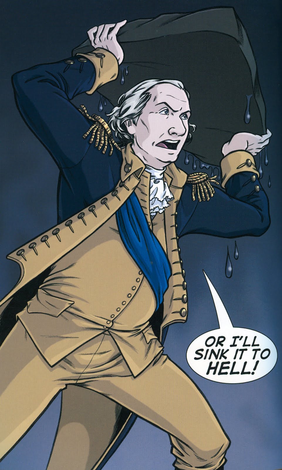
You can say a lot about writer J. Michael Straczynski, but you can’t accuse the guy of a lack of ambition. This is his third issue on DC’s troubled team-up title, and it’s by far his most complex one.

It unearths perhaps DC’s single weirdest and most obscure character, Brother Power, The Geek, star of two 1968 issues of his own title and a 1993 Vertigo one-shot by Rachel Pollack and Michael Allred. In addition to having an awesome-sounding name and origin (he’s a living tailor’s dummy, basically), he was originally presented as some sort of hero to the hippies (or DC Comics versions of hippies, anyway) and later as a “puppet elemental.”

JMS earns tremendous good will from me for simply thinking of the character and deciding to use him in the book, and pairing him with DC’s most recognizable and bankable star Batman is certainly a pretty good idea.

As cool as that is, and as ambitious a story as JMS attempts here, there’s no escaping the fact that it is not a very good comic book. Like last issue’s Barry Allen-fights-and-kills-in-World War II story, there’s a whole lot going on in this story, good and bad, and it would certainly be best served by a critic taking a few days to think about it and spending a few hours writing about it.

I’m not going to do that though. Instead, here are some bullet point observations:

—With this issue, the logo gets a little tinkering. Just above “The Brave and the Bold” is a little strip of text reading “Lost Stories of Yesterday, Today and Tomorrow” (I couldn’t find a scan of it yet online, but if you wanna see the cover for some reason, you can download the preview of it here). Both the title and that sub-title appear inside the book as well, where the name of the story usually does. Apparently DC wanted to be super-extra clear that these stories weren’t happening “today” in the DC Universe, but at some other time, just in case anyone read this issue and had a nervous break down when they noticed Dick Grayson is Batman in most of the Batman books, but here Bruce Wayne is still Batman.

—JMS lost me with the Universal movies version of Frankenstein’s monster/Brother Power, The Geek comparisons here. Obviously they are both man-like things that are not quite men and have an aura of tragedy about them, but they’re so far removed from one another that it seems a curious basis for a comic book story.

—At one point, Batman narrates that the movie Frankenstein always returned from the dead in sequels “Because he was a creature of his time. And that’s what such creatures DO. They come back. They ALWAYS come back.” What the fuck does that have to do with Brother Power, who returns to life as well? Do creatures of their times always come back? Is the Victorian Age—or Golden Age Hollywood—somehow parallel to the 1960s…or is it merely that they are time periods, and characters meant to embody those time periods always come back? Aren’t superheroes a better point of reference for Batman when it comes to characters coming back to life?

—Artist Jesus Saiz really disappointed me here. His art is solid but unremarkable, and I thought it was quite a let down last issue, when he completly wasted a splash page. The wasted opportunity here is that JMS continuously cites the first two Universal Frankenstein films, and Saiz provides art to depict scenes from them, and they just look like black and white versions of Saiz’s own designs and works, as if he was simply working from JMS’ descriptions instead of actually referencing the images, some of which are among the more iconic in American film history. There may be a legal reason for this or something, but it struck me as lazy and weird. If there is a reason not to draw Boris Karloff’s monster or to visually quote scenes from the film, then maybe the script should be written to avoid doing so, rather than forcing the issue?

—Batman’s mom is blond here. I hate when that happens.

—This is another one of those stories driven by Batman’s memories of his short childhood with his parents. Dude sure had a hell of a lot of very meaningful memories of his parents that would happen to parallel the strangest cases considering he only co-existed with them for about six to eight years.

—In addition to being about how Brother Power, The Geek is a lot like Frankenstein, this comic is also about how the 1960’s were so much better than right now, driven home with some embarrassingly blunt panels. In the sixties, everyone hung out in coffee shops, now they hang out in bars; you used to be able to pick up hitchhikers, now everyone drives right past people in need; college kids used to read books and enjoy one another’s company, now they all listen to those goldanged iPods and look at their laptops in solitude.

—I’ve read a lot of Batman comics in my lifetime, but I can’t say I’ve ever read a Batman who talks quite like JMS’s Batman. He doesn’t sound a thing like the post-Crisis Batman of the last twenty-some years, and he doesn’t quite sound like the Bob Haney Batman, or the wise-cracking Golden Age Batman either. For example…

The kids of that age called him—get this—Brother Power. The Geek.


or

What can I say?…It was the sixties.


or

Sometimes I get so caught up in the world of mega-crime and super-powered nutbars…


“Nutbars”…?! Batman called his villains nutbars? Man.


The Flash: Rebirth #5 (DC) Two thing about the cover of this issue jumped out at me. First, it wasn’t the one solicited; on that one, the figure running from the other side of the wall to deck Barry Allen was The Black Flash, here it’s the real villain of the piece, who was revealed last issue (You can download the real cover as part of the preview here if you’re dying to know but didn’t read #4).

Secondly, in the upper-right corner is this little round blurb:
Congratulations to Johns for the win, and I’m sure it’s almost always better to win a prize than not win a prize, but is it really something to trumpet on the cover of the fifth issue of your six-part series? Is it cool to be so proud of a prize…particularly one of dubious stature? I mean, winning a Spike TV Scream Award isn’t like winning one of these, you know?
I don’t have a whole lot to say about this issue of the series that doesn’t apply to the four that preceded it. The story is fairly well done and probably as good a Barry-Allen-comes-back-to-life-for-no-reason story as anyone could have written at this point, the event seems strangely small and disconnected from the rest of the DC Universe, it’s irritating to see this level of darkness and faux-seriousness retconned onto the origin of a comic book character that embodies the Silver Age of comics, artist Ethan Van Sciver does extremely solid work and occasionally pulls off an extremely admirable “special effect” depiction of speed powers, et cetera.

A couple of noteworthy-ish things happen this issue, including a new character taking on a retired code name from the Flash family and a couple of Flashes getting different costumes (I sure hope Jesse’s is temporary though…), but maybe that’s the sort of stuff better discussed elsewhere (Like say, Blog@…tomorrow).

In the mean time, I’d just like to point out this line of dialogue that Geoff Johns wrote, and remind you that the year this line of dialogue was published is 2009:
Van Sciver sure drew a nice splash page of Liberty Belle kicking the Reverse-Flash in the grill though…


Superman/Batman #66 (DC) This is part one of a story called “Night of the Cure,” a two-part arc in the Superman/Batman team-up title by Scot Kolins. In actuality, it’s part nine of Scott Kolins’ Solomon Grundy comic, which launched with a special before turning into a seven-part miniseries.

This issue doesn’t exactly demand you know what the hell went on in that series, and does a decent enough job of letting you know things like Bizarro was friends with Grundy, and that Frankenstein killed Grundy with a magic sword or whatever, and even the origins of Man-Bat and Grundy, but it still feels like a story in progress.

I like the idea of Bizarro and Man-Bat as a villain version of the Superman and Batman team, but exploring that idea isn’t the focus of this story. Instead, it’s a Blackest Night tie-in, which means a dead character gets a Black Lantern ring, a Black Lantern costume, and then acts like an asshole to a superhero before attempting to eat his or her heart.

Here, the dead-again Solomon Grundy gets a ring, and attacks Bizarro, who just failed in an attempt to befriend Man-Bat, who was just hunted down by Frankenstein, The Bride, and his scientist wife Francine Langstrom.

It’s a quick, light read without a whole lot to recommend, but Kolins’ art is pretty nice here and there, and I really liked some of his images of an upside-down, silhouetted Man-Bat and Frankenstein making eyes at The Bride.


Thunderbolts #138 (Marvel Comics) This is one of two comics I picked up in the shops and thought about setting right back down after seeing the art. The other was Batman Confidential, which I did put right back down. I brought this one back home with me, however, as it was written by Jeff Parker, whom you may have noticed I’m rather fond of.

The art is just awful.

It’s Marvel “house” style, which means the panels look photo-refrenced and lazy, it’s hard to see the work of human hands in its creation, and the coloring makes everything look soft, murky and unreal.

The character designs are uniformly boring as well, with the team leader Scourge resembling Jason Voorhees in a big coat and the one character with a genuinely neat look—The Ant-Man of the canceled Irredeemable Ant-Man—given a new, worse look. I can’t blame that on the artist here though, as I assume these characters existed prior to this issue, and maybe someone else is to blame for their overall generic-ness.

As for the story, it’s fairly accessible. This is the first time in memory that I’ve used Marvel’s re-cap page, and it worked fine for me (I coulda used one of these in Superman/Batman, actually). It’s a 22-page introduction to the team, which consists of a half-dozen superpowered assholes, some of whom may be insane, doing a great deal of killing. It reminded me a bit of Gail Simone’s Secret Six, albeit with less colorful characters and less humor (Thank God for Ant-Man!).

As I neard the end of the issue, I was thinking it would probably be my last (check out the third-to-last panel if you’ve got a copy handy…that’s such an ugly, lazy panel the book woulda been better served with an all-black one), until I got to the very last panel and saw that the Thunderbolts are going to be taking on Parker’s Agents of Atlas next issue.

Damn it. Okay, so I guess I’ll try one more issue of Thunderbolts, Parker. I can’t resist the charms of your talking gorilla and mute killer robot…


Tiny Titans #22 (DC) How can you not love a comic book that includes panels like this one?
Also, this issue introduces a few more new characters into the fold. There’s the “Elastic Four” above, including new Sidekick Elementary student Offspring, and then there’s the newest member of the Bird Scouts, Golden Eagle:
Tiny Titans is so adorable sometimes I can barely stand it.

Saturday, November 14, 2009

Oh @#$%.

A piece of my computer died this morning, and it's going to be in the shop until at least Thursday. Apparently, the computer-fixer people don't supply you with a loaner while they're doing their fixing, the way auto mechanics do. So Every Day Is Like Wednesday is going to unfortunately have go un-updated for a while.

I'm going to try to keep my posting schedule up at Blog@Newsarama from other people's computers, and I might manage to get a Weekly Haul up on Wednesday afternoon, but otherwise I won't have anything new here.

Sorry for the inconvenience.

Friday, November 13, 2009

Ryan Dunlavey's Golden Age Daredevil

Among the many cameos in this week's Comic Book Comics #4 is our old friend the Golden Age Daredevil.

The above panel is how writer Fred Van Lente and artist Ryan Dunlavey introduce and depict him (He appears in only one other panel, standing shoulder to shoulder with, I believe, Lenin and Stalin. God, I love this book).

What did the aborigines who raised him get him for his birthday? I'm betting it's a boomerang.

Thursday, November 12, 2009

Just a couple of links.


EDILW favorite J. Chris Campbell recently posted a big, huge gallery of monster images he created, and you can take a gander at it here. It's really great stuff, and if you're wondering how great, well, I stole the above two images from there, as they happen to be of a few subjects I like—scarecrows and people with pumpkins for heads. Do check it out if you haven't already (Link via The Comics Reporter).


—Here's your occasional reminder to read Tucker Stone's weekly "Comics of the Weak" column of reviews at The Factual Opinion. Here's Stone on Vampirella: The Second Coming #3:

Vampirella comics aren't bad, in and of themselves. They just make everything else around them look bad, because really, this sleazy hot girl horror comic is pretty much indistinguishable from a healthy crop of Big Two super-hero comics and most of the non-crime stuff Vertigo publishes. It's the same mediocre shit. The only difference is that Vampirella freely admits it, right on the cover. You're supposed to yell at it for that?
As per usual, Stone also tackles a bunch of the previous Wednesday's releases that I have neither the money nor the courage to read.


—Also always worth a read? Jog.


—I didn't mention it in my little review of Marvel's Assault on New Olympus last week, but reading Don MacPherson's excellent review of the same reminded me—aren't the plots of this Hercules mini-event and Marvel's upcoming Siege event awfully similar? In "Assault," Hercules apparently assembles a whole bunch of heroes to attack the bad guy Greek gods' home base of New Olympus. In Siege, Norman Osborn apparently leads his bunch of villains to attack the good guy Norse gods' home base in Asgard. Is "Assault" purposely foreshadowing Siege's plot, or is this just a weird coincidence no one at Marvel noticed until that Hercules one-shot hit shop shelves?

I may just be completely misreading what Siege is supposed to be about, of course. I just watched this stupid trailer, for example, and learned absolutely nothing about it. Aside from the fact that Dave at Living Between Wednesdays is totally right about the logo, that is.


—Todd Klein, the world's greatest comic book letterer in my humble opinion, also runs a swell blog, and his posts on logo history are always great reads. This latest is something of a must-read, though. Klein talks to Batman artist Jerry Robinson and determines that Robinson designed the Batman logo in which Batman's head and cape/wings form the backdrop of the word "Batman."

Why is this so important? Well obviously the logo stuck around a while—Klein said it was around until 1965—and it was the basis for many different updated versions ever since. The current flagship Batman title Batman and Robin, for example, boasts a version of it.

When I heard this though, my mind immediately jumped back to Paul Pope giving his lecture at the Wexner Center last year and explaining how he determined just who and what Batman was at his core: Batman is, in a sense, a logo and advertisement for himself.

While that might seem like a very artist point-of-view with which to approach a comic book character, I've been struck with how writer Grant Morrison's whole run on Batman/Batman and Robin has been something of a meditation on Batman as a living logo...a trademarked image being fought over and pirated...a powerful sigil. Yesterday's issue of Batman and Robin was, looked at from one angle, simply a conflict between Dick Grayson and Jason Todd over the appropriate use of that Batman logo.