
Here, Fraction brings his A-game. As in his Fantastic Four #1, it's a very formulaic script, with character's being introduced one at a time, but those introductions are more thorough, involve more characters and come out in conversations. Additionally, there are a lot more panels in it, so it reads more like Fraction's Hawkeye then his Fantastic FOur (that is, it won't be over two minutes after reading).
(There is still, unfortunately, a dumb-ass "AR" thingee in at least one panel, but it's thankfully a bit smaller than the dumb-ass "AR" thingee in the panels in Fantastic Four #1; replacing asterisks and editor's notes with something you need a machine and software to access is maybe the dumbest fucking thing I can think of and, honestly, almost reason enough to trade-wait this stuff).
Now, the reason I picked this up at all was that it features the artwork of Mike Allred, one of those few artists on the I'll Buy Anything They Draw list. He and color artist/wife Laura Allred do not disappoint; in fact, this may be the best I've seen Allred's art look before. That, or it's been a while since I've seen it at great length (No, that can't be it; he just did a wonderful Daredevil fill-in not long ago).
Look at this:

He does the same with backgrounds and the float-y, semi-transparent sci-fi computer screens; usually that stuff looks like special effects in a Marvel comic, but the Allreds actually, like, make it look like something that belongs in the same reality as the characters looking at them.
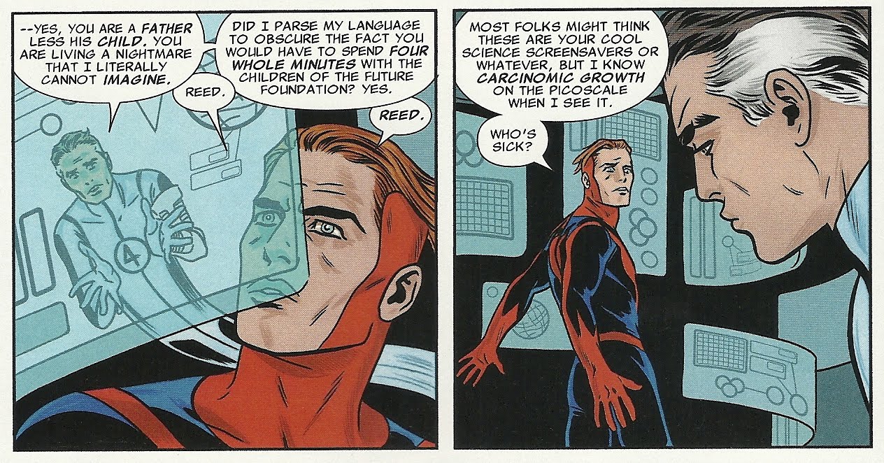

The costuming and character designs are all great; the character's are all distinct from one another, perhaps most notably in the varying body-types of the female characters; the "acting" is amazing.
This here is pretty much perfect, and exactly what I'd expect a Marvel comic book to look like or, at least, what I wish I could expect a Marvel comic book to look like. It makes me a little more disappointed in Fantastic Four than I was while reading it, and I kind of wish Marvel would have chosen someone whose style more closely resembles Allred's for FF's sister title (Nick Dragotta? Rick Burchett? Jay Stephens? J. Bone? Mike Norton?) and coloring more akin to Laura Allred's, so the books would at least look like part of the same universe, let alone companion books (and I like Mark Bagley's art; it's just very, very, very different than what we see here).
Story-wise, this is first issue 101. The Fantastic Four pick out a substitute Fantastic Four, should something go wrong with the journey they're preparing to take, and each of them pick replacements, with the exception of Johnny; we meet his recruit, but don't learn the details of how she comes to be wearing what looks like a Thing suit.
Mr. Fantastic chooses Ant-Man II, or "the dead one," who is apparently alive again (and his daughter Stature is dead...?), Invisible Woman chooses Medusa of the Inhumans and The Thing chooses (the original, green) She-Hulk.
The issue is divided into one-page, six-panel interviews with the children of the Future Foundation, followed by the recruiting sequences, until a climax that puts everyone in the same room.

Unfortunately there's no text telling us what's up with the feature, like when these particular Redeemer pages were written or draw. The art doesn't look 20 years old, at any rate, although the writing and designs are extremely dated looking, even old-fashioned. That could just be the fact that, in his 80s, Kubert's writing might have been a bit old-fashioned.
The story is about a devil-like figure with a castle in the Himalayas who looks a bit like an evil Shazam and is known as The Infernal One; he recruits some followers to help him defeat the title character, a hero who does good deeds in each life time, which he only vaguely remembers from reincarnation to reincarnation. Then it flashes forward to the year 2557, which looks like the future as it might have been envisioned in the 1960s, a time when space-robbers wore Beagle Boy hats, drop the g's at the end of their words and worry about being hanged if caught.
Kubert's narration is mostly completely unnecessary, given how clear his artwork and storytelling are.
That's followed by a neat prose feature in which Kubert discusses artist Sam Glanzman's life and work a bit, the pages full of Glanzman's original sketches from the ship he served on in the 1940s, which serves as a sort of introduction to Glanzman's U.S.S. Stevens story.
And, finally, there's another installment of Brian Buniak's take on Angel and The Ape, which continues the storyline from the previous issues.
Overall, it's a very strange package that feels all the stranger now that the guy whose name is on the cover is no longer with us, but, as strange as it is, there's no arguing with it's quality—there isn't a poorly drawn panel in its 48 pages.

This issue, like the previous six, was super-funny and super-cute.

2 comments:
I really like that She-hulk.
Those stupid "AR" things in recent Marvel comics are there in the trades too. I got the Avengers vs X-Men hardcover collection a few weeks, and those stupid fucking AR notes are all over the damn place. I have no idea what they're there for, other than to irritate the shit of the reader.
Post a Comment