
It's basically a day-in-the-life story, split into two parts, one following and narrated by Superman, the other by Lois Lane. The former has a big, busy day that begins with flying around in outerspace with a Green Lantern, fighting a space monster, settling a planet-wide war on an alien planet and escaping from an inescapable prison of Darkseid's on Apokalips.
Lois Lane's only involves a single location, but then, she can't move as fast as Superman. She's interviewing Lex Luthor, who is trying to recruit her for his presidential campaign (I guess this might fit into the pre-New 52 continuity, then; Superman and Darkseid both have their classic designs, at any rate) and has made a deadly threat to try and enforce her to comply.
Both strands are well-written—I particularly like the amount of thought Kindt put into what being Superman and having those powers must be like, and how they would influence one's behavior—and both are well-drawn, but the formatting was a little annoying while reading. The Superman portions dominated each page, the top 5/6ths of each page dedicated to Superman, and reading left-to-right and up-to-down in the basic Z patterns of comics-reading (well, all reading, actually), while the Lois portions occupy a thin horizontal strip along the bottom of each page, reading like one, long, continuous strip.
Reading the book like a normal comic means that both narratives are constantly interrupting one another, so the flow of the story is broken about twice a page, right up until the end. I would have enjoyed both better if I read them individually; reading the Superman portion first, and then going back and rereading the Lois portion all at once. But I wasn't sure if the events in each story were meant to inform one another or not, so I slogged through as it was presented.
They don't. Not really. At least, not until the very end.
It's a pretty great little character piece, and I'd recommend it, but the format is unusual in such a way that it is both interesting and kind of annoying at once.

Here he's still working with Daredevil's colorist Javier Rodriguez, who assumes pencil chores as well as coloring duties (Alvaro Lopez inks) and, what do you know, Rodriguez is a hell of an artist, and editor Stephen Wacker really oughta have him alternating with regular arist Chris Samnee whenever Samnee needs a break because, holy God, look at this stuff.
Here's one of my favorite panels, preceded by a panel for context:

The plot is that the Sons of the Serpent, apparently a pre-existing Marvel group that is maybe a mixture of the Ku Klux Klan and Hydra (my knowledge of Marvel continuity is exceptionally weak, as many of you have likely noticed), have so thoroughly infiltrated a locked-down courthouse that Matt Murdock/Daredevil has no idea which people in it are secretly Serpent agents, and he has to fight to protect a few of their intended victims without really having any good idea which civilians are actually bad guys. Also, there's a bomb.
It's a neat, surprisingly thrilling set-up (particularly given the low-stakes of superhero comics; it's not like anyone worries about whether Matt Murdock will get shot to death or not while reading) and executed with pretty much flawless comics art throughout.
Here's another page worth staring at a bit:

Wow. That's just plain old fashioned great comics-making, right there.
I don't know who deserves the high-fives for the BLAM-ing gunshots, Rodriguez or letterer Joe Carmagna or both, but those are a pretty excellent visual incorporation of a sound effect into a panel of art.
What excites me most about Daredevil is that this isn't the conclusion or launch of a big story, it's not an anniversary issue or anything, it's just another, more or less random issue of the comic. And it's this good. Daredevil is just plain always this good (Almost. There were a few weak issues, but not many out of 23-plus).

There's Doctor Doom lounging around on his throne drinking wine from a goblet and not giving a crap whether or not you can totally see up his mini-skirt or not (because he's evil). There's old John Storm freaking out and slapping a stack of flapjacks. There's an impromptu field trip lead by some of the bad kids in school to play a high-stakes game of 20 questions with imprisoned Inhuman Maximus The Mad (I don't know him at all, but based on the way he talks, the way he's drawn and the way he's imprisoned, I have to assume he's pretty evil and pretty dangerous).
And, most thrilling of all, the Four and a few of the Future Foundation kids take FF writer Matt Fraction, artist Mike Allred and editor Tom Brevoort on a Pym particle-powered trip that goes horribly wrong.

This issue also answers a question many comics fans have no doubt wondered for a very long time now: Why does Tom Brevoort always where that hat?

As fun as all that was though, I think my favorite part was the sequence that occurs on pages six and seven, where more and more members of the Future Foundation join Ahura on the roof. That's the part that made me laugh out loud, anyway.

So Matt Fraction reunites with artist Javier Pulido, the first fill-in artist on the book, who drew a two issue arc in which Hawkeye Kate Bishop rescued Hawkeye Clint Barton from the clutches of Madame Masque, and provoked the villaness' ire. This story, "West Coast Avenger," features a rematch between the two, as Masque removes her mask to pursue the quite vulnerable Kate as she arrives in L.A. to attempt to start a new life away from the other Hawkeye (Not sure exactly how or where this fits in with Young Avengers, where Kate is currently dimension-hopping, but she does mention her "team" in the narration, and hey, I can roll with it, as nothing here directly contradicts anything that happened there).
Just about everything I said about Daredevil can be repeated to refer to Pulido's work here. This is a perfect comic book, it's story told perfectly. The pages are panel-packed, so the story feels much longer than it's 30 pages, and Pulido and Fraction use a variety of panel structures and page lay-outs to keep the narrative not only constantly moving, but constantly and often dramatically changing. This is an exciting comic book to read, more for the way it's put together and the way it reads than the events that occur within it (Again, refer to the Daredevil review above; at no point did I think Masque would succeed in killing Kate).
Pulido does a neat thing with silhouettes throughout, usually for dramatic effect but, as I reached the end of the book, and saw Kate appearing in silhouette at the most unlikely of times (in close-up in a well-lit diner, for example, while everything around here is visible, including the people she's talking to...and even the Kate Bishop in another panel), I began to wonder if maybe it wasn't simply a time-saving measure, a way to provide nice-looking images (thanks in large part to the coloring work of Matt Hollingsworth) without having to go to the trouble of drawing characters' faces and clothing over and over.
It works. Or at least worked well enough that I was somewhere around page 25 before I even considered that maybe it was a way of cutting corners disguised as an effective technique. But given that it is effective, I don't suppose it matters much.
This was all-around great stuff—so much so that if Fraction and Pulido wanted to launch a West Coast Hawkeye or Lady Hawkguy spin-off series, I'd add it to my pull-list lickety split.

Langridge scripts all four of the stories contained herein (Seven altogether, including a pair of Sappo stories), and draws the last two: A Popeye/Barney Google crossover that you probably thought you'd never see (because you probably had to google "Barney Google", a character from the funny pages of your great-grandparents' days who hasn't left the same sort of cultural footprint than the adapted-into-animation Popeye did) and a surprisingly touching, even elegiac story in which Popeye writes a letter to Swee'pea's real mom.
The rest of the artwork is provided by Ken Wheeaton, Bruce Ozella and Vince Musacchia, and the remaining Popeye stories feature a pair in which Bluto is the evil (but strangely attractive, according to Olive) antagonist and another in which Popeye's pal Toar must defeat him in a boxing match in order to gain U.S. citizenship (This story, "Your Tired, Your Poor, Your Muscled Masses" includes my favorite gag in the book, a neat variation on the old angel and devil on the shoulders routine that I've never, ever seen before).
As in previous volumes, IDW went all out in securing strong and unlikely artists to provide them with variant covers, which are all included in the back with the regular covers, in a gallery that serves as a nice digestif for the eyes. In this collection, we have Popeye by Al Jaffee, series co-editor and co-book designer Craig Yoe, Mitch O'Connell and Dave Sim, whose contribution also serves as the cover for the entire collection.

As I also mentioned, I wasn't entirely sure what to read and in what order, so I just went by the numbers on the spines, skipping a collection of the "Micro-Series" and a trade entitled The Secret History of The Foot Clan (Reading these, though, I kept seeing footnotes referring to events in various "micro-series" one-shots, so I guess those occur more or less congruently with the events of this book...?)
By this point in the series (20 issues in), it's become quite clear that co-plotters Kevin Eastman and Tom Waltz's goal is to blend elements from both the original volume of the comic book series with elements from the original cartoon series, meeting somewhere in the middle in terms of characters and concepts, but with a tone more in keeping with that of the original comics.
And so there are characters who were original to the comics (Fugitoid, Karai) and characters original to the cartoon (Krang, the Rock Soldiers, the goddam Neutrinos, Slash) interacting with the main cast of heroes and villains, almost all of whom have more in common with their comics versions than their cartoon versions (And I'm merely talking about the original, Mirage-published volume of the comic book and the original 1987 cartoon series; I'm spotty on the comics that followed after Image took over, and even spottier on the various cartoons that followed the first few seasons of the original...I think I bailed around the time Michelangelo started using a grappling hook or a net instead of nunchucks).

So yeah, I liked these, and, at this point, I've gotten over the fairly dramatic and unexpected changes to the characters' origins...even the more eyebrow-raising ones, like making Casey Jones a teenage victim of child abuse or the suspension-of-disbelief problems I had with the rapid-aging and kung fu skills-acquired-through-past lives-transmission or whatever.
I really rather admired Waltz and Eastman's ability to tell one big, long, ongoing story while still managing to include the ups and downs and starts and stops and climaxes of something approaching story arcs; this series feels much more like a serial than any other modern comic book I read or have read in a long time. Rather than being written for the trade, or even just organized into story arcs, it feels like a continuing, soap opera-like narrative.
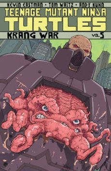
One of those little climaxes comes in the third volume, in which Splinter and the Turtles meet and fight The Shredder to a draw. The conflict of the fourth volume revolves mainly around a fifth, evil mutant turtle named Slash, and that of the sixth volume, sub-titled "Krang War," involves the Turtles teleporting to The Neutrinos' world in Dimension-X and teaming-up with them and a re-designed (I don't like the new design, honestly) Fugitoid to save their planet
from Krang.
Each book also, somewhat surprisingly, has a different artist. The third is drawn by Dan Duncan, who has been drawing the series since it's beginning. His art has been something of an acquired taste, and was so different from the style of so many of the other artists to draw the characters over the years that I was initially put off by it, but quickly grew to like it; he was particularly good at drawing action scenes, as the characters always seemed highly-animated, so that their limbs and weapons would always seem to be in the process of being violently flung when they fought; out of the corner of your eye, the art would almost seem to move. I never grew to like his Splinter, though, who always seemed to be too big, too goofy and too donkey-like to me.
For the fourth volume, he's replaced rather unexpectedly by Andy Khun, whose art is nice, but a sudden and drastic change in style from that of Duncan; suddenly the turtles all seem bigger, thicker and more swollen; their faces take on more distinct expressions, and they seem more like the Teenage Mutant Ninja Turtles I would have expected to see in issue #1 of a new TMNT series, not issues #13-#16. His artwork seems particularly static when compared to that of Duncan, though.
I preferred hid Splinter, and was a little disappointed with his Slash, which is a big, brutish, snapping turtle-style turtle, closer to Tokka from The Secret of the Ooze in a black mask than the Slash of the original cartoon.


Anyway, note the little palm tree tucked into his belt. That's Slash's binky, a plastic palm tree in the aquarium he grew up in as a normal, pre-mutated turtle in the cartoon. I completely forgot about that until I saw it here (Actually, I completely forgot about the existence of Slash at all, until he was mentioned in the comic).
For the fifth volume, Kuhn is replaced by artist Ben Bates, who is probably the best of the three. Like Kuhn, his turtles look a little more classic in terms of their size, scale and basic anatomy (although more so than Kuhn), and like Duncan, they are highly-animated, with fairly brilliantly-executed images of characters in motion (although, again, more so). He is therefore perfectly suited for this volume, which climaxes with a pretty huge battle sequence involving lots of laser guns and hand-to-hand combat.
Each volume contains all of the various and variant covers for the books (the other reason I prefer the trades of this series to the singles, beyond the too-rich-for-my-blood $3.99 price tag; there are so many cool variants I can't imagine not wanting to get, say, the Kevin Eastman or Ross Campbell versions).


4 comments:
Daredevil and the Hawkeye Annual were...sublime. Gosh, I am SO glad that I actually started picking up Daredevil...now I'm looking for back issues!
Those Daredevil pix remind me of my first 100% moments of wow while reading Frank Miller's 'Elektra Lives Again'. Those page layouts are absolutely drool-inducing, paticularly the stairwell shots in Murdock's brownstone & the police dept...
Man, it's hard to trade-wait Daredevil these days.
Roberto Aguirre-Sacasa wrote a Marvel Knights 4 story (in the mid-'00s) about himself preparing for his Fantastic Four writing assignment by hanging out with the Fantastic Four. He had a crush on the Invisible Woman.
The plan for Hawkeye is to alternate between Kate and Clint issues for a while. So not quite her own series but close.
Post a Comment