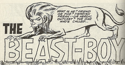
Here's a brief history of the DC Comics character Beast Boy: Introduced in a 1965 issue of Doom Patrol by writer Arnold Drake and artist Bob Brown, the green-skinned teenager with the ability to transform into any animal joined the ranks of "The World's Strangest Heroes." He survived the cancellation of the title (and the deaths of the rest of team), and in 1980 he changed his name to Changeling and became part of the cast of Marv Wolfman and George Perez's New Teen Titans, one of the decade's bigger hits and more influential books.
During the soap operatic run of the book, and various iterations of Titans comics that followed, Beast Boy/Changeling had the sort of biography typical of post-Silver Age superheroes.
While on the Titans, he became a wise-cracking, comedy-relief character, only his bravado masked his insecurities about being lame, green and less awesome than Robin and the cooler Titans. He became tight with Cyborg, whined a lot, had a rather ill-fated attraction to Terra, the teenager who would betray the Titans team in one of their more famous storylines.
After the run peaked, Changeling grew a mullet, became an evil villain, went off in to outer space, returned to earth to help start a new iteration of the Titans (1999's Titans), changed his name back to Beast Boy, left the team to have his own miniseries (2000's Beast Boy), founded a new Titans team that only appeared once in a single special (Titans West, in Titans Secret Files and Origins #2), joined another new version of the Titans (2003's Teen Titans), left to join a new version of the Doom Patrol that didn't have its own book, joined another new version of the Titans (2008's Titans), and then left that Titans team to re-join the Teen Titans team that he'd left to join the Doom Patrol.
By the time I had started reading comics, the glory days of the Wolfman/Perez New Teen Titans were ending, Changeling looked like this, and, from his appearances during crossovers and in the back issues I'd find in fifty-cent bins, I gathered that he was basically a lame character design with a visually interesting superpower who told corny jokes, moped about being green and was secretly in love with Cyborg.
I certainly didn't see any indication that, when he was first introduced in the pages of Doom Patrol, Beast Boy was totally awesome.
I owe this discovery to Showcase Presents: The Doom Patrol Vol. 1, which reprints the six issues of My Greatest Adventure, the title the DP first appeared in, and the first seventeen issues of The Doom Patrol. These include the first three comics to feature Beast Boy.*
The issues Beast Boy appear in are split into two stories apiece, and he's featured in one of each of the stories in each issue. What's his deal? Basically, he breaks into the DP's headquarters to kick their asses, tell them all off and then get them to make him a member.
It's maybe not the most effective way to join a team, but it does sound a little like the sort of plan a teenager might come up with, and it's certainly a lot more fun to read than one of those try-out issues you see on a semi-regular basis in DC super-team comics these days.
I like the tossed-off, cavalier, casual approach that Drake and Brown (and, in the second and third appearances, Bruno Premiani) take to introducing the character. There's something, at the risk of sounding corny myself, precious about the first appearance of a new superhero in old comics. At that early point, the throwing-stuff-at-the-wall-and-waiting-to-see-if-it-sticks stage, of many long-lived superhero's histories, there's a sort of danger about the characters. The creators have no idea if the character is going to appear a second, third, 33rd or 333rd time, let alone if they'll be starring in movie serials or TV cartoons and selling sticker, toys and t shirts. Nor do they really care. It's simply a matter of trying something new and seeing what happens (This happens a few times in this volume; not only in the introduction of the original Doom Patrol, but about halfway through the book the character Mento is introduced, tested for a while, and then forgotten for the next few hundred pages).
Anyway, the plan with Beast Boy seems to have been to introduce an asshole teenager to the team. As I said, his plan for getting on the team is to break into DP HQ. On his first attempt he trashes a room, a mess that Robotman reacts to by declaring, "H-H-Holy Hannah! What hit this joint--a Beatles fan convention?" Brown lovingly renders the trashed room, including little details like a spare Robot Man head on the mantle, with an axe in it, and a framed portrait of Rita "Elasti-Girl" Farr on the back wall, tilted and a mustache drawn on its face.
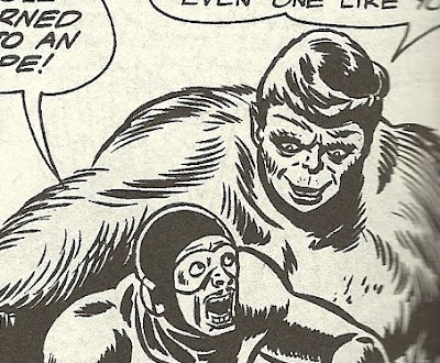
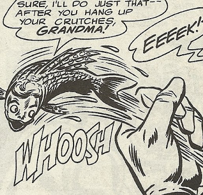
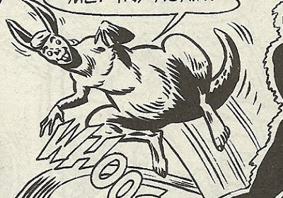
Beast Boy comes back the next night, and the trio use their fantastic powers to capture him. Here's the first panel in which he actually appears: Then he turns into a lion, mauls Robotman while calling him an overgrown jukebox and an "Alumni-numb skull," turns into a kangaroo to make a fool of Negative Man and call him an old man and turns into a fish to elude Elasti-Girl, with a "hang up your crutches, Grandma!" When they finally pin him down, he calls the bearded Professor Caulder Santa Claus.
Since he's a "freak" like them, the DP let him tag along on a mission, protecting some jewels from some high tech jewel thieves, and then send him on his way, with a box at the end cajoling readers to write National Periodicals and let them know if they want to see more Beast Boy.
In the next issue, he walks into headquarters, makes fun of the Doom Patrolers, then fights Robotman for a page before storming out. This time we learn the extremely complicated origin of Beast Boy, and the Doom Patrol come to him, when his amazing (and scientifically suspect) superpowers are used as the fuel for a mad scientist's plan to resurrect dinosaurs to help him pull off bank heists.
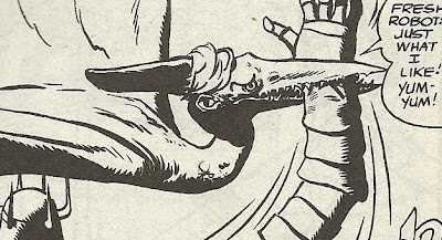
And in the next issue, Beast Boy learns his legal guardian has taken out a hit on him, so he goes to the Doom Patrol to demand their help, and fights Robotman for another page. Before they can look into his story about his foster father trying to off him, the Chief sends them all off to fight Kranus, The Emperor of Robots, a giant robot with a crown and scepter whose "every part...can live and kill--separately!"
When they do investigate Beast Boy's claims about a hit being put on him, they don't find any evidence to support his claim, and basically tell him to fuck off. (Negative Man's actual words are, "Now get off our backs and stay off," but that's 1966, Comics Code Authority-approved way of saying, "Fuck off, kid").
So that's what Beast Boy was like at the beginning, apparently—an annoying, know-it-all, disrespectful a-hole teenager whom the Doom Patrol hated on sight and tried to avoid.
Another awesome thing about the original Beast Boy appearances, beyond the fact that he acted like an all-ages version of one of James Kochalka's SuperF*ckers characters, was the way his transformations were portrayed. From at least Perez on—and perhaps much earlier—Beast Boy's animal transformations tended to look like realistically rendered animals, only green. But Brown and Premiani draw each animal he transforms into with elements of his human appearance—they all have either his hair cut, or his nose and eyes, or, in a few cases, his whole head. He turns into animals, but never more than, like, 95% animal. He always retains enough of himself to look like himself.
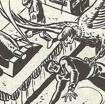
I liked this a lot better, perhaps in large part because it was different than the way his transformations are usually portrayed in comics. That is, although this is the original, 45-year-old way of illustrating Beast Boy turning into animals, it seemed fresher, because it's so different from the way these acts have been illustrated over the course of the last 30 years.
********************
Finally, the second Beast Boy appearance features a scene with an exploding dinosaur: As awesome as a scene of superheroes throwing high explosives into a dinosaurs mouth and blowing it up from the inside is, it's worth noting that, like so many awesome things in comics, Jack Kirby did it first.
********************
*I should perhaps note that I'm talking about the comic book version of Beast Boy. It was apparent from the very first episode of 2003 cartoon series Teen Titans that that Beast Boy was awesome. He was wonderfully designed (I love the little snaggle tooth), wonderfully voiced and was now an honest-to-God vegetarian cartoon superhero.
Tuesday, August 31, 2010
Monday, August 30, 2010
Some things I noticed about Action Comics Weekly #603
Continuing my post-some-scans-and-vomit-out-a-few-sentences "reviews" of various issues of DC's 1988 experiment with a weekly anthology, all of which I secured from a fifty-cent bin in a used book store! Wait, that's not even a complete sentence... See! Vomit!
Today we look at ACW #603, featuring a nice Blackhawk cover by...who would you guess that is? A young Michael Lark? David Mazzuchelli? Gabriel Hardman's dad? No, that's the work of Kyle Baker, circa 1988! It's quite subdued, too. Baker draws a Phantom Stranger strip a few issues down the line here, and that is much more Kyle Baker-y looking than this Blackhawk piece.
As usual, James Owsley and Gil Kane's Green Lantern strip remains the most hilarious feature in the book. In this particular installment, both Hal Jordan and his ring seem to be starting to run out of steam. Carol Ferris, his ex-girlfriend who is also an insane supervillain with a power gem similar to his ring, ambushes him and destroys part of a sky scraper. He tries to defend himself and put the skyscraper back together, and is soon pretty much wiped out (he himself isn't sure if his ring charge is running out or he's just too mentally exhausted to use it properly).
So once he disarms Carol, he realizes he has to "handle Carol...the old-fashioned way." Which way is that, Hal?
So, um, this is the issue where Hal Jordan slaps Carol Ferris around.
Serious discussion question time. When Hal decides he must fight Carol hand-to-hand, she slaps her a couple of times and she's down for the count. Would it be more or less offensive if Hal hit her with his fists? I'm sure the thought was that Hal punching her would have seemed a lot more brutal, but since they were going so far as to have him repeatedly hitting Carol anyway, why not just have him punch her? By not punching her, it seems to imply that she's not his physical equal, you know?
Anyway, it's a scene of a superhero knocking a woman around, so I'm not sure how much better or worse tinkering with it i n either direction would have mattered. It just sort of bothered me that he was fighting her a) at all and b) fighter her differently than he would fight a man.
Oh, and if you're wondering who "won" this fight (I put "won" in quotes because I just re-watched Roadhouse, and as Dalton says, no one ever really wins a fight), here's what happens next. Hal points his ring at Carol and thinks about killing her, but he can't make it happen ("Maybe...I'm to exhausted...or, maybe the ring needs charging..."). (By the way, I thought GL rings didn't allow the use of lethal force...?) Then the cops come in and tell GL to put his hands up ("Wha--? Police?!"), giving Carol the distraction she needs to summon her gemstone and blast Hal to the ground with purple lightning. The tables have turned! Is this the end of Hal Jordan?! We won't know until we read Action Comics #604! (Spolier: It is not the end of Hal Jordan).
I haven't mentioned the Wild Dog strip in a while, but there's this radical censorship group called the National Legion of Morality that's been making a fuss in The Quad Cities. In the last issue, they protested a magazine book store called Readworld for selling immoral publications like Playboy, Vogue, Ms Psychology Today.
The night after the League's protest, there was an explosion and Readworld, and it burned to the ground. Here is part of the news report, in which League leader Dr. Layman stares at the burning ruins: Based solely on his appearance in this panel, you don't think he might have had something to do with the fire, do you?
Here's a nice Rick Burchett/Pablo Marcos sequence from the Blackhawk strip:
It's notable because it doesn't feature our hero ogling his partner in this endeavor, which he has quite aggressively, even piggishly done constantly since they first met. Here only the reader ogles her, as Blackhawk is too busy rolling his eyes over her calling him an easy-to-beat-up drunk.
Finally, this was a name I was surprised to see in the letter column: That couldn't possibly be the same Jamie S. Rich who used to be an editor at Oni Press, and has since become a prose author and comics writer?
Hey! Some DC folks were just talking about the possibility of a new Wild Dog series at this past weekend's Baltimore convention! I guess in the DC Nation panel, someone requested a new Wild Dog series and writer Sterling Gates, according to Comic Book Resources, referred to it is Senior Story Editor Ian Sattler's "dream project," and, according to Newsarama, Sattler said "You'd all read Wild Dog if we did it and it was super, upsettingly violent, right?"
So a new Wild Dog is on DC's radar! And comic book writer Jamie S. Rich used to be a big fan of Wild Dog! DC should totally hire Rich to write a new Wild Dog! And they should have a regular Rich collaborator like Joelle Jones, Marc Ellerby or maybe Chynna Clugston or Andi Watson. I'm pretty sure that would lead to the best possible Wild Dog comic—the Wild Dog comic you never would have expected.
Sunday, August 29, 2010
This isn't a very good political cartoon.
1.) The flying saucer is labeled "Speaker Pelosi," which in a political cartoon means that the flying saucer is a symbol for Speaker of the United States House of Representatives Nancy Pelosi. So—just so we're all clear here—in this particular scenario, involving a flying saucer, flying orange robot heads and two middle-aged white people holding a "No Mosque At Ground Zero" sign being generously referred to as a protest, Nancy Pelosi is a flying saucer.
2.) Based on the few visual clues provided, these protesters are not protesting at ground zero, or in New York City at all, but out in a field somewhere. At night.
3.) The sentient flying saucer that is Nancy Pelosi is sending floating robot heads, which she refers to as "the probes," down toward the two protesters, but at the same time, she/it says, "Find out who's funding this protest." The probes are thus going to simultaneously literally "probe" the protesters in this cartoon as a metaphor for Pelosi's desire to metaphorically probe them in real life and also metaphorically "probe" them within the context of this cartoon to find out who is funding them. I guess...?
4.) In choosing to play off the word probe by imagining an aliens-probing-people visual metaphor in this cartoon, the cartoonist chose to imagine a scenario involving a flying saucer and flying robot heads probing humans. I just finished the final volume of Jerome Clark's three-volume UFO Encyclopedia from Omnigraphics, so I'm sure this is fresher in my head than the majority of people trying to puzzle out this stupid cartoon, but I'm pretty sure that nowhere in the UFO literature is there a single report of a flying saucer sending flying orange robot heads down to earth to probe people. Generally probing—i.e. sticking things in people's butts—occurs when the aliens take their victims aboard their ships.
I'm not faulting the cartoonist for inaccuracy here, I just wanted to point out that the cartoonist apparently decided to make an alien/probe reference in the cartoon, and then decided to bypass the most popular scenario of aliens probing that exists in most people's minds to invent a different one.
Given the fact that Nancy Pelosi looks a bit more like the sort of alien usually described in abduction reports than your average speaker of the house, the cartoonist therefore missed the opportunity to draw Pelosi as a gray alien. I am not a political cartoonist, obviously, but I imagine Nancy Pelosi and/or gray aliens would be fun things to draw.
********************
I was also a little surprised at the point-of-view of the cartoon, which seems to be sympathetic to the protesters who are, make no mistake, protesting against freedom of religion in the United States of America, which is among the most fucked-up things I've seen in my life. I was curious about how unusual it is for a political cartoonist to address the issue in any direction other than, "Man, these protesters are terrible, evil and/or ignorant people," so I clicked on the "Ground Zero Mosque" gallery at Daryl Cagle's Political Cartoonist Index, and while I did find at least one cartoon expressing my point-of-view on the subject......my God was that ever a depressing gallery. I was almost afraid to click on the galleries "Obama's Mosque Mess" and "Obama Is A Muslim".
********************
As depressed as the, um, beliefs of so many of my fellow Americans has made me, David Fitzsimmons' style cheers me up. I love the shape of those little people at the ground-breaking ceremony above. If you find yourself feeling blue, I'd highly recommend spending some time flipping through Fitzsimmons' archives. That guy's economic use of shapes and lines, and his bold, chunky figure designs never fail to cheer me up.
*********************
Finally, on the subject of modern political cartooning, if you haven't visited Kate Beaton's site lately, do be sure to check out her latest strip, "Ben Franklin's Editor".
Saturday, August 28, 2010
Comic shop comics: August 25th
Batman #702 (DC Comics) This is the end of Grant Morrison’s three-issue return to Batman, and the two-issue “R.I.P.: The Missing Chapter,” in which Morrison makes the connections between Final Crisis and “Batman: R.I.P.” and Batman: The Return of Bruce Wayne as clear as possible. It’s a weird mixture of exposition and flashbacks stitched together into the shape of a story, but it works surprisingly well, thanks in large part to Batman’s narration, which begins as Batman recording a message to Superman.
Tony Daniel is still on art, and it is, again, his best work so far, with very few weak panels.
Like this one! Yes, Daniel draws the worst Superman, and it still sort of boggles my mind that he's the dude drawing Batman for DC when you can google "Superman" and "Fan art" and find a mess of Superman drawings that are at least as good as that (You can also find a picture of the pony-tail having version of Nightwing making out with Superman under those particular search terms, for some reason). And he gives Batman some severe underbite in a few of these panels. But Daniel's getting there! I could totally read every page of this comic, and only rarely found things to shake my head sadly at (like that Superman).
Billy Batson and The Magic of Shazam! #19 (DC) If and when they ever get around to making a live-action Captain Marvel movie, I wonder if they’ll cast Christopher Lee? I’m getting a real Saruman The White vibe from Mike Norton’s version of Shazam.
Justice League of America #48 (DC) Aaaa! Aaaa! Sooo many narration caption boxes! Why would you do this, James Robinson? Why would anyone do this?!
Also, what was up with this stupid scene?IfBatman Dick Grayson wanted a speedster to join the Justice League of America, I wonder why he chose Jesse Quick instead of one of the three guys named "The Flash" who are alive and running around these days. Especially since one of those guys named The Flash is a founding member of the Justice League and another of them is Dick’s best friend. Hell, even if Dick was just being lazy and asking Jesse because she was in the same room as him at the time, Jay "The Flash" Garrick was in the same room at the same time!
I don't much mind—like I said at Blog@ the other day, seeing Jesse Quick fight Earth-Evil's version of The Flash will be a bit more interesting than watching one of the JLA's regular Flashes do it—I just think it's a really strange thing to toss off like that, given how many JLA readers are going to be thinking "Wait, what about Wally or Barry?" as they read that exchange. Maybe Robinson had Dick call them in one of the JSoA chapters of this "The Dark Things" storyline; I didn't read any of those.
Superman/Batman #75 (DC) I haven’t been reading this title regularly for a few years now (#35 was my last issue, although I did pick up #66 and #67, the Bizarro/Man-Bat team-up), but this special milestone issue was over-sized and packed with contributions from some great creators, so it seemed like a good time to pick up an issue again.
I probably needn’t have really bothered, as there’s only one real story in it, and it’s a pretty so-so one; after a 25-page Legion of Super-Hero Stories (and what an odd title to find a LOSH story in!), there are a bunch of two-page spreads by a bunch of interesting creators, although the best of these could easily have been read while standing in the comic shop—you’d probably be able to get through ‘em all before your foot fell asleep or the shop’s proprietor was able to point out that this is not, in fact, a library.
The cover by Frank Quitely, the artist who drew probably the best Superman story of all-time and the first arc of Morrison’s Batman and Robin, is rather typical of the offerings. On the one hand, a Frank Quitely cover is a really great idea, however this one of a couple of busts floating in front of a head and behind a couple of tiny figures is far from Quitely’s best work. I can’t remember the last time I’ve seen such a weak Quitely cover, to be honest.
The lead story, as I mentioned, is a LOSH one, and while Superman, Batman, Superboy and Lex Luthor all play rather minor roles. Given that writer Paul Levitz currently has two other comics starring the Legion of Super-Heroes that he writes, I was sorta surprised to see how LOSH-centric this story was, and that it didn’t do anything too unusual with the Legionnaires and their relations to Superman and Batman (LOSH and Adventure Comics).
The art for this story is provided by Jerry Ordway, whose work I love and usually goes quite a long way in getting me to forgive minor problems with a book, but here Ordway is colored by Pete Pantazis so that the panels more closely resemble painted art, and the result is that Ordway’s usually bold and distinctive lines become fuzzy and indistinct.
As for the rest of the book…
Steven T. Seagle and Teddy Kristiansen write a two-page story entitled “It’s A Bat…”, which is meant to be a riff on their It’s a Bird…. It basically consists of an editor calling up Seagle and asking him to contribute to Superman/Batman #75, and Seagle refusing. Meta!
Billy Tucci draws a nine-panel gag strip about cosplaying, half of which is colored fuzzily.
Adam Hughes draws a nice ten-panel, six-word piece featuring the parallel lives of Batgirl Barbara Gordon and the Silver Age Supergirl.
J.T. Krul and Francis Manapul have Superboy talking to Superman and Red Robin Tim Drake talking to Batman Dick Grayson about that one time Tim kissed Superboy’s girlfriend Wonder Girl, while Superboy was dead. Manapul’s art is nice; both story threads are done in black and white, but instead of “black,” the Batman scenes are done in dark blue and the Super-scenes in a light red. I’m not sure it amounts to a story, but Krul’s dialogue is decent enough and it amounts to an okay vignette. Nothing like this happens in it: Jill Thompson contributes two pin-ups, one of Catwoman and one of Lois Lane, both painted in a much more realistic style than she’s been working with in a while. There both gorgeous, but they are just pin-ups…I woulda preferred Jill Thompson do some comics. (Maybe DC can invite her back to do a whole issue at some point in the future…?)
Michael Green, Mike Johnson, Shane Davis, Sandra Hope and Rafael Albuquerque do something so weird I couldn’t begin to make sense of it…I think it references previous issues of the series I didn’t read.
Duncan Rouleau does “Krypto (The Super Dog) Vs. Ace (The Bat Hound),” a team-up I assumed Thompson would be handling, given her recent work with Evan Dorkin. Rouleau premises the piece as a series of eight challenges between the two super-pets, to determine “Who is best at being a superhero’s best friend?” and presents a bunch of jokes. None of them are really very funny, but his art is pretty great, as he explode the dogs’ designs into something super-cartoony, and I love his Bathound mask and utility collar.
Brian Azzarello and Lee Bermejo present the very best piece of the book, “Joker and Lex,” which is a diminutive Lex Luthor hanging out with a tall, lanky Joker, in the format and style of a Calvin and Hobbes Sunday strip. Can Bermejo really do a convincing Bill Watterson impression?
And how.
Letterer Nick J. Nap did a swell job on Watterson-style lettering too.
Okay, two more left…
David Finch writes and draws “Eternal,” in which future Batman Damian Wayne and future Superman Conner Kent/Kon-El/Superboy meet up to shoot the shit about how awesome their dads were. Possible future stories that only last eight panels are…weird.
Finally, Peter J. Tomasi wrote and Gene Ha drew a story about a father and son playing superhero together that I’d really like to make fun of given how earnest and precious the writing is (and how unappealing Ha’s artwork is when applied to drawing real people realistically), but I suspect it may be autobiographical, and the last thing I want to do is make fun of a little kid. So I’ll just note that this isn’t as good as the Joker and Lex strip.
It’s weird though. If James Kochalka wrote this exact same story, I probably would have loved it. I guess it boils down to a taste in style, or perhaps Kochalka’s work just has more life to it? Or I find life in his work where Ha’s work here just looks like creepy wax dummies to me? I dunno…I like Ha too. Just not drawing hairy bearded nerd dads and their little boys I guess.
And that’s Superman/Batman #75. All in all, I’d rather have $5 in my wallet than it in a longbox, but that’s the way the comic book…um...crumbles…?
Friday, August 27, 2010
The first volumes of two manga series from a few years ago which I just got around to trying
The Good Witch of the West Vol. 1 (Tokyopop) Despite the title alluding to The Wizard of Oz, this shojo fantasy has nothing to do with L. Frank Baum’s work (at least, not in the first volume), but does rather heavily reference the Cinderella story, with mention also being made of fairy tales Rumpelstiltskin and The Wolf and The Seven Little Goats.
Beyond the specific fairy tales referenced, the influence of the literary genre is readily apparent in the plot and characters.
The lovely, virtuous teenage girl Firiel Dee lives in a lonely village and is raised by two kindly caretakers, because her mother has died and her father, an astrologist/scholar named Gideon Dee, spends all of his time in a tower, studying the stars with his apprentice, an orphan by named Rune (Kinda sorta short for Rumpelstiltskin).
When noble’s throw a ball, Firiel attends and, despite being a commoner, catches the eye of several of the royals, for both her beauty and an heirloom from her dead mother, an heirloom which proves she’s actually a princess.
This revelation is quickly followed by the disintegration of her world, as “inquisitors” attack her village and separate her from the various members of her family, and broad, nationwide (kingdom-wide?) intrigue intrudes in her life.
Noriko Ogiwara is given a “story by” credit on the cover, but Ogiwara actually wrote the young adult prose novels this manga series by Haruhiko Momokawa (who gets an “art by” credit) adapted this from.
Having never read the novels its based on, I have no idea if this is a good adaptation of them or not, or if any English readers would know/care anyway.
All the echoes of fairy tale motifs made the story rather instantly familiar and somewhat compelling, despite Momokawa’s sometimes hard-to-read lay-outs (it reads right-to-left, which I’m quite used to, but there are a lot of double-page spreads with overlapping dialogue and narration, and I found the visual cues along the vertical axis too cluttered to read effortlessly far too often).
Part of that may simply be how shojo-y it is, with a lot of transparent dialogue bubbles, and plenty of shifting between different forms of dialogue bubbles and formal ways to deliver the verbal information.
The character designs are all pretty strong, but the often non-existent backgrounds also made this a bit more of a challenge to read than I would have liked.
As for the plot, it’s obviously a pretty elaborate one, and it’s just getting started by the close of the first volume, so I think I’d need to check out at least one more volume to decide how much of this series I really want to read. I was curious enough about what happened next to want to try at least one more, so there’s that.
The world the story is unfolding on seems to be a vaguely European one, although of a fictional variety with unusual place names. One detail I really liked—and which is probably mostly responsible for my curiosity about future volumes—is the presence of “dragons.”
When Firiel arrives at the ball, she gasps at the site of a Tyrannosaurus Rex skeleton in the entrance hall, and a character refers to it as a display of the bones of a dragon slain by one of the nobles of the castle. Later, reference is made to the “land of dragons,” and we’re shown panels of pterosaurs and sauropods. I’m a sucker for dinosaurs in just about any media, but I really liked the connection between what we’d think of as dinosaurs and what the characters in this comic think of as dragons.
Hayate The Combat Butler Vol. 1 (Viz) Hayate is a hard-working sixteen-year-old high school student with perhaps the worst parents in the world. Well, they don’t beat him or anything like that, but they are both so lazy and so bad with money and so into gambling that they’ve accrued a huge debt—which they leave as a Christmas present to their son. Since the debt is owed to the yakuza, they’ve decided to sell the yakuza Hayate’s organs.
On the run and fearing freezing to death like the poor hero of A Dog of Flanders, he decides that since all of his hard work has failed to pay off, he has no choice but to become a bad person, and he attempts to kidnap a 13-year-old and try to ransom her.
The plan doesn’t quite work out how he intends, but it ultimately spares him from the yakuza—the girl turns out to be incredibly wealthy, she thinks he’s declaring his love for her rather than attempting to kidnap her, and she ends up hiring him as her butler.
That plot synopsis doesn’t really do manga-ka Kenjiro Hata’s manic pace and zany plotting justice; does it help if I note all of that takes place in the first chapter or so? And that Santa Claus—“Santa-san,” as Hayate calls him—appears to torment Hayate throughout? What about if I note that in order to buttle for for his new mistress, Hayate must prove himself by defeating Robot Nurse Eight, a robot designed to be the ultimate butler, and Tama, a huge pet tiger that only Hayate can hear talk?
The plotting in this first volume is kind of all over the place, but by its end a cast is established: Hayate, his new mistress Nagi (whom thinks Hayate loves her), Nagi’s beautiful maid Maria (whom Hayate actually is sweet on) and head butler Klaus, who spends most of the volume trying to get rid of Hayate, often violently.
There’s a loud, flailing energy and sense of humor about the book that was a lot of fun, even if there isn’t a whole lot going on beneath the surface. I’m definitely looking forward to volume 2.
Thursday, August 26, 2010
Review: Daughters of the Dragon: Samurai Bullets
Daughters of The Dragon: Samurai Bullets (Marvel Comics) collects an early 2006, six-issue miniseries starring the Misty Knight and Colleen Wing characters, who are here working as bail bonds-babes who collect minor supervillains.
Writers Jimmy Palmiotti and Justin Gray premised the series as a sort of exploitation work, in keeping with the leads’ roots in the Marvel creators of the 1970s attempts to exploit the then-current popularity of kung fu and blaxploitation movies. It’s a self-aware, never-completely-serious action book which splits its attention between ogling its protagonists and declaring how bad-ass they are, over and over again.
That could grow awfully tiresome (and I imagine reading this story as it was serially published, 22-pages a month for six months, would have been awfully tiresome), but artist Khari Evans’s execution of all the ogling, action and all-around design work is so strong it carries the book even through the weak parts.
Evans gives each of the ladies distinct looks, with different faces, different bodies, different hair and different sets of expressions and yes, I know that’s not something that should be singled out for praise per se, but go look at a current issue of, say, Birds of Prey, DC’s book about sexy crime-fighting women, and then look at Evans work here, and the latter’s going to seem all the more special.
He dresses them in authentic-looking clothes, which, again, shouldn’t be a big deal, but is usually so poorly done in super-comics it’s refreshing to see characters who can dress themselves when not wearing their superhero costumes. The superhero costumes they wear are pretty cool too; check out the cover.
Well, okay, Misty’s doesn’t look all that great really, but I like the bionic arm sheathe, and I like the zippers and buttons and such-like—it looks like real clothes, again, something you could imagine someone actually taking off or putting on, rather than the costume-in-a-can spray paint endemic to superhero comics.
I like Colleen’s even more, particularly the tennis shoe-footie things she wears. If there were actual superhero-ing in the actual real world, I imagine a costume like that would be a pretty close approximation to what one would look like, provided you were so good you didn’t feel you needed armor plating, and could get away with wearing white.
Oh, and Evans draws nipples, making Colleen and Misty perhaps the only anatomically correct superheroes in the Marvel and DC Universes. Not bare nipples of course, since comics like this aren’t for adults, but for teenagers, but the nipples do protrude through the clothing. And if you’re wearing a super-tight, white costume without a bra, your nipples are going to show through.
I hope this doesn’t sound too prurient on my part, but I was really happy to see Colleen’s nipples showing through her costume here. It made Daughters of the Dragon one of the very rare superhero comic books that didn’t seem to be half-assed in its construction.
I know I’ve complained about this before, but the Big Two companies especially engage in this sort of half-assery, where they publish comics that aren’t safe for kids on account of all the ultra-violence, contextual profanity, exploitive sexual imagery and all-around squicky content, but still cling to a veneer of propriety, so that Brian Michael Bendis characters will say “@#$% you, mother @#$%er” and Ed Benes will draw women with huge nipple-less breasts exploding out of body paint costumes.
I’m not calling for more explicit comics from DC and Marvel here; I’m calling for them to decide just how exploitive and/or mature they want there books to be, which audiences they want which books to appeal to, and then go for it, rather than trying to appear dangerous and play it safe at the same time.
Colleen Wing’s nipples haven’t changed the comics industry since they appeared—this series is four years old, after all—but I was pretty glad to see them in this comic book. High five Khari Evans! And everyone at Marvel who didn’t pulp this book!
Okay, so the art’s great. How’s the writing? That I’m of two minds about.
There were a lot of things I didn’t like, some having to do with suspension of disbelief (How come when Rhino hits a car with his head, he destroys it, but when a car hits him on the head he gets knocked out?), some having to do with Marvel continuity minutia (Like someone named American Samurai or something appearing for a short scene that served no purpose other than giving Colleen an excuse to unzip her top), some having to do with the ways characters are portrayed (The Punisher bit, for example, was very funny, but made our protagonists seem like psychopaths for not trying to bust him then and there; also, I was disappointed Misty won her big fight at the end simply because she had a bionic arm and her opponent didn’t) but most of it having to do with too many jokes about a white, nerdy character talking in hip-hop slang, a variation of the old white guy talking like a young black guy minstrel show humor that has been played out since…well, since I’ve been alive, at least.
That might seem like a long list, but the drawbacks are more pot holes than plot holes (or anything as serious as such). The overall plot is pretty well structured, Palmiotti and Gray wring some humor out of the same white-character-who-talks-black earlier on by revealing his superpower, the pacing is strong and regularly punctuated by well done action scenes, and there’s a lot of use made of many of Marvel’s wackier super-villains, many of whom I have something of a soft spot for.
A gang of four such losers attempt to rob a very powerful renaissance woman and accidentally steal a super-maguffin she was planning on selling to the highest evil bidder. When she starts picking them off in an attempt to recover her property, Colleen and Misty get pulled into the plot, since the villains are their clients. Orka, The Porcupine, Doctor Bong, The Trapster, Mandrill, Mole Man and Iron Fist all put in appearances, in addition to those already mentioned.
This miniseries seems to have lead almost directly into a Misty and Colleen lead version of Heroes For Hire written by Palmiotti and Gray, but instead of Evans, the artwork was handled by Billy Tucci and Francis Portela. Palmiotti and Gray didn’t stick around too long either, and the book only lasted 15 issues, its main claim to fame being the fact that it was the first major American superhero publisher’s comic to put a hentai-style tentacle rape fantasy on the cover.
Oh, and I suppose it’s worth mentioning that after having read this book, I still have no idea why it’s called Daughters of The Dragon: Samurai Bullets.
Wertham was right.
Wednesday, August 25, 2010
And she calls herself a superhero...
You'll note that at no time during this scene does Supergirl produce a plastic bag to clean up the result of Krypto needing to go walkies, the thing that Krypto is most certainly doing off-panel at the bottom of the first page, while Supergirl is whistling.
What kind of superhero doesn't clean up after her dog?! A terrible superhero, that's what kind of superhero.
Actually, there are a few possible scenarios which might help justify Supergirl's inconsiderate, un-heroic behavior here.
First, she and Krypto have gone for a walk just outside the Fortress of Solitude, near the North Pole. As the name of the Fortress of Solitude implies, it doesn't get a lot of visitors, and the people we know hang out there from this comic—Supergirl, Superboy, Superman, Superboy's Bizarro clone Match, even a visiting Lex Luthor—all fly rather than walk, making it impossible for them to step in the likely result of Krypto needing to go walkies.
Yeah, Psimon, Wonder Girl and Kid Flash are shown walking through the Arctic Circle there, on a field trip with the Brainiac Club, but there visit is an unexpected and highly unusual one, as you can see from Supergirl's reaction.
Second, it's possible that Krypto disposes of his own waste, by disintegrating it with a blast of his heat vision. No, we're not actually shown that happening, but we're not shown what Krypto's doing off-panel at all, so it's certainly possible.
Third, I don't really know how Krypto's digestive system works, and am just assuming it works just like an Earth dog's. If Kryptonian dog biology is similar to Kryptonian humanoid biology in Earth's yellow sun, perhaps Krypto doesn't eat dog food and produce waste similar to that of terrestrial dogs. Maybe he's actually just a living solar battery, and just occasionally vents steam or something as a waste product. Maybe Supergirl is just floating there whistling while Krypto is sniffing a pile of ice, which is what he does when he goes on walkies.
This concludes my seven-paragraph post about a dog going to the bathroom off-panel in a gag comic for kids.
(The above pages are taken from DC Comics' Tiny Titans #31, by Art Baltazar and Franco)
Monday, August 23, 2010
Some things I noticed about Action Comics Weekly #602
That George Perez character, a real good drawer, was a real good drawer back in 1988, too. Goodness, look at this swell cover. Coast City isn't even a real city, but the way Perez drew it, with, like, every single building and car in this fictional city appearing on this cover, it looks more real than most 21st century comic book appearances of New York City.
Maybe John Stewart's just in shock, having just come home to find his wife murdered by the insane, possessed-by-an-alien-gem ex-girlfriend of the guy who's been freeloading at his apartment for a while, but he sure talks awfully callously about his dead wife.
When Jordan flies back to Stewart's, he finds Katma dead, and Stewart standing there, tapping his foot and berating Ha, as if Hal had come home drunk, cooked a bunch of omelettes and then left the kitchen a mess. Stewart refers to his wife as "hacked to pieces" and, when Jordan suggest they, like, call the police or something to report the murder, Stewart responds, "Too late for help, m'man. The lady's dead."
After enduring Stewart's three-page rant, a rant that's that's part exposition, part complaining about the whole getting-his-wife-killed thing, Jordan decides he needs to get out of that apartment. To which Stewart responds: Jeez. I know everyone deals with grief differently, but Stewart deals with it weirdly.
Stewart must have eventually gotten sick of the smell himself and called the police and the funeral home and got everything straightened out enough to have a memorial service at the cemetery. Despite feeling guilty about/being blamed for Katma's death, Jordan shows up. Not wearing a nice suit, of course, but in full superhero costume, complete with his mask and, perhaps in some sort of weird gesture in the direction of etiquette, a trench coat over his costume.
What a jackass.
Even Kilowog, the orange space hippopotamus man, knows what sort of clothing Earth funerary customs call for.
My favorite part of this issue's Roger Stern/Curt Swan/John Beatty two-page Superman strip is the way the Man of Steel sort of lingers for a few panels, making sure the guy he just saved from a hail of gunfire is okay.
Superman's pretty relaxed about having to chase down a carload of fleeing crooks, to the point that the victim is questioning why Superman hasn't flown off yet. Superman's not worried though, what with his super-senses and super-speed. He probably has time to run a few errands and go make a sandwich and still have time to catch normal human bad guys driving away in an automobile.
Once again, the highlight of the issue was the Mike Grell/Rick Burchett/Pablo Marcos Blackhawk strip. Above is a detail of the very first panel. It is followed by about four pages of Blackhawk brawling with a bunch of dudes while wearing nothing but his gunbelt and a day's stubble. There's a lot to like about the scene, from the crisp action to the way Burchett hides our hero's penis to the "Well, you don't see a naked guy beating up a roomfull of men in the pages of Action Comics very often" nature of it. But reading it in 2010, I was particularly struck by the fact that this is the sort of thing you see happen to superheroines rather frequently—the same day I read this I read a trade in which Misty Knight went right from a shower scene to a fight scene—but superheroes rarely engage in fisticuffs in the buff.
Go read my interview with Sholly Fisch at Newsarama (if you'd like)
I recently interviewed Sholly Fisch, the writer responsible for the just-ended Super Friends and the upcoming All-New Batman: The Brave and the Bold, for Newsarama. The Q-and-A was posted today, and you can read it here.
The discussion is mostly about the new volume of the DC kids comic based on the cartoon based on the comics, but I tried to cover Fisch's approach to writing for particular audiences, writing the character of Batman, and kids comics in general.
Oh, and if you need a visual aid to increase your reading enjoyment, that's artist Stewart McKenny's portrayal of Fisch from the last issue of Super Friends.
Sunday, August 22, 2010
Review: Harley Quinn: Preludes and Knock-Knock Jokes
Superhero comic industry conventional wisdom has long held that supervillains simply didn’t work as the stars of their own titles.
In the good old days, this was due to the fact that villains generally had to get punished for their crimes at regular intervals, and apparently it was somewhat frustrating to end every single issue with your lead either being hauled off to jail or seemingly killed in an explosion or something (The classic example of supervillain comics being untenable is probably DC’s 1975 Joker, which lasted just nine issues).
I assume supervillain comics—or at least ones of the ongoing, monthly variety—are still really hard to make work, even if there’s less of an emphasis on good-always-triumph, crime-never-pays morality in super-comics. Nowadays, the most popular villains have motivations that make them poor leads: A comic about a villain robbing banks and avoiding capture might be rather thrilling, but how do you do a comic about a character’s whose goal in life is to, say, kill his archenemy?
Harley Quinn seemed an even more unlikely lead for her own ongoing monthly in that she was created to be The Joker’s henchwoman/moll/love interest. If doing a comic about a crazy, killer clown-themed villain seemed difficult, how do you do one about a crazy, killer clown-themed villain romantically obsessed with another, crazier, killer clown-themed villain, a relationship that can most charitably be described as abusive?
I don’t know. But in 2000, writer Karl Kesel seemed to have figured it out, making the then-new-to-the-DCU character into the star of her own monthly comic, one that lasted some three years and 38 issues (Well, Kesel himself only handled the first 25 issues, but still!)
The first seven issues of the title were collected and released in a 2008 trade paper back entitled Harley Quinn: Preludes and Knock-Knock Jokes (Title sound vaguely familiar? It’s supposed to).
Back in 2000, Harley Quinn was familiar to Batman fans from Batman: The Animated Series (for which Paul Dini and Bruce Timm created her), and the various DC comics set in and around the “animated continuity” (Most notably 1994’s excellent special, Mad Love, by Dini and Timm). In late 1999, she was officially introduced into the DC Universe continuity, in a prestige format special which gave her an origin and superpowers. A few appearances in a few books later—this was around the time that the Bat-books were involved in the big “No Man’s Land” storyline/status quo—and BAM! Solo book.
Kesel’s approach was to keep things admirably light and fun. The Joker is still a psychopathic serial killer surrounded by hardened criminals and lunatics (like our protagonist), but Kesel established a tone similar to that the animated series that spawned his star.
A great deal of the violence is implied, talked about or otherwise danced around (One henchman has his head blown off, but the wound is obscured by someone standing in front of his body, rather than earning a detailed splash panel). The Joker and Harley are genuinely funny—even if occasionally just corny funny—and there’s not a whole lot of effort into making the book realistic, or dwelling on the sort of real world concerns that can destroy comic book stories. (You know that The Joker ogn? This is absolutely nothing like that).
Basically, Kesel writes as if he were writing the characters from and episodes of the animated series, only setting it in DCU continuity.
The book similarly benefits from its structure, which is a bit of a beaded-necklace of done-in-ones (or two’s), with connective threads holding them together.
The first issue begins with Harley and The Joker at their more-or-less default setting. She rescues him from Arkham Asylum and they begin a crime spree together, with him trying to bump her off and she eventually taking him down in self-defense. By the end of the first issue then, she’s Joker-less on her own.
From there she tries being second banana to Gotham’s next biggest supervillain (Two-Face), hosts a party for female supervillains, starts her own gang to break her pet hyenas out of the zoo, pulls off a heist at The Finger Warehouse (seen in Neil Gaiman and company’s Riddler story from Secret Origins Special #1) and, in the books only two-part story, attempts to rob Wayne Manor—at the same time The Riddler and his gang attempt to rob it (And with the Bat-people all busy, Oracle’s forced to call in then-Justice Leaguer Big Barda to save the day).
While Harley’s starting over as her own first banana in these stories, a foe she makes in the first issue has assembled a team to track her down and catch her for him, and Kesel imbues these characters and Harley’s gangmembers with strong personalities and individual voices (even the least rounded of them have a distinct character trait or tic to call their own).
It makes for interesting reading, but it’s the tone Kesel establishes that makes the book sing. It’s serious without ever being too serious, light-hearted and funny without ever being zany; it takes place within the greater DC Universe without being obsessed by continuity, and perhaps most remarkably given the general trend of Batman books over the last few decades, it’s fun and exciting rather than grim and gritty.
I think Kesel’s plots and dialogue probably could have established this well-balanced tone with different artistic collaborators, but the fact remains he has rather ideal ones in the form of Terry and Rachel Dodson.
The volume opens with about a half-dozen pages of perfect Bruce Timm homage (I actually checked and re-checked the credits to make sure that these pages were actually Terry Dodson working in the “animated” style, the aping of it is so perfect), so the book literally moves from the animated universe into the DC Universe.
The Dodson’s working in a perfect compromise style between cartoony and serious—the art is round, smooth, somewhat flat and devoid of unnecessary filigree, but the character designs are never too terribly exploded or exaggerated.
The worst you can say about the Dodson’s designs here are that all of the women are built just like Harley Quinn, but that’s certainly an effect they were intentionally going for. While there’s little of the out-and-out fan service and exploitive posing seen in the current Harley Quinn book, Gotham City Sirens, there’s an awful lot of cheese cake, of the wholesome, good girl variety.
I didn’t read this series at all when it was originally being released—I think the Our Worlds At War special guest-starring Jimmy Olsen and featuring art by the likes of Paul Grist and Amanda Connor and an issue guest-starring Martian Manhunter I found in a fifty-cent bin was the extent of my exposure to the title before now—but I was pleasantly surprised at how accomplished it was.
A large part of that surprise was due to the fact that it seemed like Kesel actually wrote a better Harley Quinn than Harley’s creator Paul Dini did (Since he started writing DCU comics regularly, Dini reformed Harley into a Catwoman-like bad girl hero). That, and I was surprised to see the Dodsons drew almost every page of this issue, save a handful near the end that Craig Rousseau penciled (in the animated style, inexplicably). When the Dodson’s became the “regular” art team of DC’s relaunched Wonder Woman title in 2006, they drew only the first four issues, and those took about seven months to come out…but then, I guess there were all sorts of problems with that Wonder Woman relaunch.
At any rate, Harley Quinn: Preludes and Knock-Knock Jokes—great stuff. I’d love to see DC continue to collect the series for a while, if only because that would be the easiest way for me to find out what happens next. Failing that, I’m sure all of these are in fifty-cent and $1 bins somewhere.
A (somewhat) shocking revelation!
Forgive the tardiness of this observation, but I didn't read any 8/11-published DC Comics until just this week, and I therefore missed out on the 8/11 DC Nation column by Eddie Berganza until just recently.
The gist of it seems to be talking up the 75th issue of Batman/Superman, which does sound legitimately cool (consisting, as it does, of two-page strips by the likes of Teddy Kristensen, Duncan Rouleau, Rafael Albuquerque and Jill Thompson...the latter of whom is hopefully doing a Krypto/Ace team-up), and announcing that he's no longer going to be editing the book. I think. (Which is probably good news? Superman/Batman started out not very good and got worse and worse, didn't it?)
What shocked me was the origin of the book: "Enter Mike Carlin and his observation of an interesting tattoo he had seen on his commute—in a melding of the S-shield and the Bat-symbol, the book's logo was born!"
I can see how the folks at DC might think the title World's Finest was too dated—it does sound stale to me. I've never liked the title Superman/Batman either though, as it sounds so bland. Why not just throw an ampersand or something in there, and call it Batman & Superman...it's still bland and descriptive, but at least it's, like, a phrase with an "and" of some kind in it, you know?
Anyway, I was surprised to learn that the title of the book came from a fan's tattoo, rather than someone inside DC's offices, and that DC publicly admitted this, as it seems to be giving credit for a DC idea to someone who's not an employee or in any way affiliated with DC.
Is taking logo design tips from the flesh of a random commuter a bit like accepting unsolicited manuscripts? Does the random commuter now have a legal case to make that he or she deserves a fraction of the profits from Superman/Batman, or that they now own Joe Chill and Ma Kent? Isn't this a potential legal nightmare for DC?!
Unless, of course, the person with the melded S-shield/Bat-symbol tattoo was Jeph Loeb.
Friday, August 20, 2010
You even have to ask?
Thursday, August 19, 2010
Comics shop comics: August 11-18
Atlas #4 (Marvel Comics) Hmm, this issue seems pretty off, perhaps because a longer story arc is being collapsed in to fewer issues so that “The Return of the Three Dimensional Man” can be wrapped up in next month’s fifth and final issue of the canceled series.
In the first three issues, Jeff Parker and Gabriel Hardman have devoted the first two-thirds of each book’s pages to a chapter of “The Return” story, while Parker and another artist have filled the back half with separate but more or less connected stories.
In this issue, Parker and Hardman present part four of “The Return,” which ends with a cliffhanger on page 13, and then on page 14 artist Ramon Rosanas picks up with part five. Hardman and Rosanas are both fine artists, and it’s not unusual for an entire comic book to be devoted to telling a part of the same story, but it’s weird in this instance; the art change now looks arbitrary (if Hardman did four more pages, then Rosanas would have handled just the pages set in a different reality) and rushed.
The quality of these last few issues probably isn’t all that important though. It’s a good read as always, its production challenges are simply calling attention to themselves this time out.
Birds of Prey #4 (DC Comics) I think four issues is a more than fair chance to give a new creative team and or a new title to hook a reader (Actually, I generally only give a team or book a single issue, but I was curious enough about the identity of the White Canary character to stick around until it was revealed).
And the Gail Simone/Ed Benes/Adriana Melo/J.P. Mayer team didn’t exactly hook me over the course of the first four issues, although I suppose this is the strongest of four.
In this issue, the various villains and their various motives are revealed, and most of the events of the previous issues are made clear. (Or at least clear-ish. I’m not sure what Savant and Creote’s faked deaths were all about, other than to shock/weary readers). Basically, Savant and the sister of a group of minor villains from a storyline back in the last volume of the title want revenge against Oracle and Black Canary, and they ally themselves with The Penguin to achieve it.
The artwork is again split between two teams, with Benes penciling and probably inking the Black Canary passages, Melo and Mayer the Oracle passages, and the two teams splitting up the parts involving the other Birds and The Penguin.
The sections vary in competency, but all are fairly lazy in the background, detail and staging department, and there’s still some basic proficiency problems I’m still surprised by whenever I see ‘em in a big publisher book like this (For example, if a character Is holding an object in his left hand in the first and third panel in which you show that character’s left hand, he should probably also be holding it during the second panel—especially if it’s a tense, you-won’t-shoot-me-because-I’m-holding-this-knife-to-the-throat-of-your-friend sort of situation).
Anyway, that’s more than enough Birds of Prey for me for now.
Brightest Day #8 (DC) This is a pretty Hawkperson heavy issue. After two pages of Hawk, Dove and Deadman (whom I really wish would change clothes at some point), the rest of the book is devoted to jumping back and forth between Hawkman and Hawkgirl’s adventures on the new Hawkworld, and J’onn J’onnz’s hunt for the space monster.
With the Firestorm storyline not showing up at all, the artwork in this particular installment is all fairly strong, although the two-page spread of Hawgirls saying “Back The Hell Off!” while something unintelligible happens in the background (it looks like two animal people shot her out of an invisible cannon, which exploded and killed them) is a pretty big waste of paper and story real estate.
Dungeons & Dragons #0 (IDW) A combination of nostalgia and brand affection, not to mention an attractive $1 cover price, was all it took me to give IDW’s attempt to turn out comics based on the world of D&D a look, but I’m afraid nothing in here made me think I’d want to give the books a second look. (Unless maybe they’ll only be $1 a piece too?)
This issue features two short stories by two creative teams, each apparently leading to a different ongoing series.
The first, by John Rogers and Andrea Di Vito, is so straightforward and traditional that reading it was even less exciting than reading a few paragraphs of a source book from the early eighties.
A campaign party consisting of a human fighter, an elven archer, a dwarven cleric (I think he’s a cleric; he take a lot of religious sounding oaths and has a hammer instead of an axe), a Halfling thief and pink-skinned, tail-having, horn-headed magic user descend through a trap-laden dungeon, fight gnolls or knolls or kobolds (it’s been a while since I’ve read a sourcebook; whichever one refers to hyena-men) and then a black dragon and, um, that’s it.
I guess it’s a little like watching a couple of other people play with a very boring Dungeon Master use a pre-built dungeon for a few minutes, and not being allowed to mess around with the di at all?
It’s certainly possible that Rogers and Di Vito have chosen such a generic start to their story in order to do something more subversive, dramatic or interesting later, but as a ten-page unit, this was competently executed but as boring as a D&D comic could possibly be.
The other story is set in the “Dark Sun Campaign Setting,” of which I know absolutely nothing—the two paragraph prose foreword makes me think “space desert.”
The six-page story by Alex Irvine and Peter Bergting has less of the standard D&D trappings about it, and the artwork has a lot more character and life to it, but, again, it’s nothing to get me excited about what happens next.
A muscular dude with a Mohawk and a lot of tattoos (not Daken is in bed with a lady, and then he gets captured by slavers, and then there’s a riot and he escapes and then it’s time for the back-matter.
I didn’t read the creator bios, Q-and-A’s with the creators, or the Young Black Dragon stats (hey, I don’t see the word THACO…do they not say THACO anymore? I loved that acronym!), but I see now that IDW has plans to release the very first trade collections of the DC/TSR material.
This is fantastic news! I have all of AD&D (Confidential to IDW: Hit me up an advance galley for a super-early review; I would love to write a blurb this book! AD&D was the comic that got me into comics! Damn, I wish I was famous enough to write introductions…) and a bunch of Forgotten Realms (Rags Morales art! This book is awesome!), but no Spelljammer or Dragonlance).
They’re also going to collect some of Devils Due’s stuff, which I think was all based around R.A. Salvatore’s drow elf novels, and there will apparently be new material set in “the fan favorite world of FORGOTTEN REALMS” at some point.
So woo-hoo!
Damn, this preview book made me awfully excited about future IDW/D&D publications, even though I didn’t care for either of the comics stories in it or plan on buying the #1 issues of either of the series previewed.
QUESTION TIME!
I’m not sure how much overlap there is between People Who Read Every Day Is Like Wednesday and People Who Play Dungeons & Dragons, if any, but if any of you know the answers to these questions, leave ‘em in the comments!
1.) What the heck is that pink lady named Tisha supposed to be?I have no idea what she is exactly, but she doesn't remind me of a "playable race," or any race exactly, from the game I remember.
2.) Are Halflings different than they used to be? This character in the sequence below is supposedly a Halfling...
...something I didn't realize simply by looking at her. It wasn't until the fighter character mentions her "Halfling luck" and they show her next to the other characters so her lack of height is apparent that I realized that she wasn't human.
I thought Halfling's were more Hobbit-like. This one's wearing shoes, doesn't seem to have over-sized feet, and doesn't seem as squat and round as all the other Halflings I've seen. Did they dehobbitify them in the last decade or something? This is a very important question to me.
3.) What happened to the ampersand?! It's different than it used to be!
Aaaaaa! Change!
Justice League: Generation Lost #7 (DC) The new JLI attempts to break into the Checkmate castle, now under the control of Max Lord. They do so by disguising themselves in Rocket Red costumes, so that if (well, this being the JLI, when) they’re discovered, Lord and Checkmate may suspect Russia instead.
—Cliff Chiang draws another great color, which includes one of the best renditions of Ice I’ve ever encountered
—Max Lord tries on his White Lantern uniform (previously see in Brightest Day #7), which is just a different color golf shirt and pants, with an embroidered White Lantern symbol on the chest
—Someone shouts “The Hell?!” This still happens in comic books, apparently
—Even though Rocket Red has a few lines of dialogue explaining how Russia has never let women join their Rocket Red brigade, Fire and Ice wear Rocket Red costumes that include breast-shaped armor to cover their breasts
—Booster Gold’s floaty little robot friend Skeets disguises himself as a Rocket Red too:This is the best Skeets scene since the floaty little robot rode a horse in the pages of Booster Gold. The only way I could have possibly liked that panel better would be if instead of simply putting on a Rocket Red-patterned, rocket-shaped holographic disguise, Skeets turned into a floaty little Sputnik.
All in all, Generation Lost remains a decent if unremarkable read, one for fans rather than converts.
Tiny Titans # 31 (DC) One of the (admittedly many) things I love about this particular title is how often Art Baltazar and Franco end up showing me things I had no idea I even wanted to see until I’ve read them in a panel of Tiny Titans.
For example, all of the various Brainiacs hanging out together as The Brainiac Club
or Baltazar’s version of Jor-ElI suppose I should note that as I was sitting on the floor of my sister’s kitchen, reading this short stack of newly acquired comics, a nine-year-old relation of mine came over and started flipping through the books and asking questions about comics in general and the ones I had with me.
Tiny Titans is the one she spent the longest with, and the only one she really read more than a few pages of (She started Atlas too, but lost interest quickly), noting that it was much brighter than all the others.
Oh, and so as not to be positive, allow me to restate my displeasure at the change in paper stock. I do not like the new, slicker paper stock! I liked the old stuff better! Please switch back DC; for em.
Okay, now I’ll try not to complain about that every month from now on.
Usagi Yojimbo: One for One (Dark Horse Comics) This is one of Dark Horse’s latest round of $1 reprints, focusing on the first issues of classic DH franchises. Hence the title. Stan Sakai’s Usagi, like Love and Rockets, is one of those long-lived series that I’ve always found a bit intimidating, ones so big I was never quite sure where to start reading, but whatever volume I picked up and read, I ultimately enjoyed reading, even if I was never sure if I was reading it the “right” way, or the way the creators intended.
I haven’t read this story, which is apparently the first issue of Sakai’s samurai rabbit’s adventures in funny animal version of feudal Japan published at DH. It opens with four splash pages recapping the basic’s of Usagi’s whole deal, and then plunges into a story that starts but doesn’t finish.
It seemed like a really good introductory issue to me—although Usagi Yojimbo has a relatively low threshold of Stuff You Need To Know before plunging in, given the whole wandering samurai having episodic adventures thing—and I was pretty sorely disappointed when I got to the last page and realized the conflicts raised in the story weren’t also going to be resolved.
I noticed that while I’ve gotten used to the fact that there are tiny little sauropod-like dinosaurs running around in Sakai’s Japan, the sight of anthropomorphic animals riding around on plain, old non-anthropomorphic horses still disturbs me.
Subscribe to:
Posts (Atom)