While sitting on my couch watching President George W. Bush’s final State of the Union speech on Monday night, I felt a bit of tension between wanting to watch it and hear what he had to say, and not wanting to waste two hours just sitting there, waiting for people to sit down and stop applauding between every sentence or two.
Damn, I thought, I should really be doing something constructive while watching/listening to this stuff—it’s not like I need 100% of my attention to follow this.
Looking around for something constructive to do, I came up empty.
It’s about that time that I usually decide that if I can’t do something genuinely constructive, I could at least write a blog post.
And this is that post! So here then is a guided tour of the comics art (and comics-like art) in my apartment, all photographed with the tiny little camera embedded in the top of my laptop screen, which reverses lettering in images for some reason I don’t understand (it has something to do with magic, I believe), while I was half watching the State of the Union speech.
Ready?
Here in my living room are two prints of covers from 2002 Marvel miniseries Deadline:
Here are better images of the covers; the prints are the same, but larger, and devoid of text:
I really liked this miniseries, written by Bill Rosemann and featuring interior art by Guy Davis. I’m a bit biased in that I was a reporter at the time, and I always find comics about reporters inordinately exciting*, and here was a brand new reporter working the super-hero beat in the Marvel Universe. Plus, she was totally hot.
We never got another mini featuring Kat Farrell, but I believe she showed up in the first issue or two of Young Avengers and maybe in The Pulse?
Anyway, I bought these two prints from artist Greg Horn who was selling his prints of his work at one of the Mid-Ohio Cons I attended. He remarked about how those images were different than most of his others in that she sure was wearing a lot of clothes. Hell, she’s got a parka on.
Not that I wouldn’t have bought any images of a scantily clad Farrell that Horn had; this just happened to be that rare Greg Horn Marvel cover work that didn’t involve a scantily clad woman.
I like a lot of Horn’s art in general; his She-Hulk covers in particular tend to be pretty good. But then, many of his Ms. Marvel covers are mind-bogglingly unappealing to me, so I don’t know, maybe the characters and concepts that play into his cover work determine the quality—or my appreciation of the quality—to a large degree.
Right next to that hangs a print of a concert poster by Cleveland’s Derek Hess, who’s been one of my favorite artists since I was a teenager.
You’ve probably heard of Hess before and, if not, cruise his site a bit. He gained acclaim as an artist while working to promote music shows in Cleveland; he would design the posters for shows he was putting on, and they were awesome.
He tended to work literal interpretations of the bands’ names into the images, often with quite interesting results. For example, a poster for a Jesus Lizard show might have Jesus surfing on the head of a rampaging Tyrannosaurus Rex. He’s since moved on to focus much more on non-rock poster related art, although his interest in music still fuels a lot of his other endeavors, including a line of clothing and his music festivals.
What’s he got to do with comics? Um, not much, really. Although he is a huge Captain America fan, particularly the old school ‘60s and ‘70s Cap who he grew up reading and admiring.
And Hess did provide the cover art for the 2002 miniseries Captain America: Dead Men Running by Darko Macan and Daneil Zezelj (Which I’ve never read. Have any of you? Is this any good?).
Here’s one of them:
The print I have is of a 1997 poster for a show featuring Man or Astro-Man?, a band I liked quite a bit back then, despite their avant garde usage of punctuation. The poster features a man standing in a tea cup which is on a saucer, and they’re flying through the air. In other words, he’s on a flying saucer. Get it?
Anyway, the piece has a lot of sentimental value for me. It was given to me by my then girlfriend for my birthday, it was the first piece of fine art I owned, it was by one of my favorite artists, it featured one of my favorite bands at the time, and the show was even sponsored by the radio station I used to listen to in high school which now, sadly, no longer exists.
In fact, the only piece of art I own which I value more is this:
But it’s hard to compete with a black velvet Jimi Hendrix passed down from your father, you know?
Next on your tour of my living room walls in this print, a reproduction of a page from Farel Dalrymple’s Pop Gun War, which is a very excellent comic book:
If you’re unfamiliar with Dalrymple’s PGW or his contributions to some excellent AdHouse anthologies, you may know his work from the new version of Omega the Unknown that Marvel is currently publishing.
I bought this piece one year at SPACE a couple of years ago. I don’t think Dalrymple was actually in attendance that year though; if my memory serves, one of his Meathaus peers was selling prints of his.
Next we have this lovely piece by Columbus’ own Adam Brouillete, probably my favorite Columbus-based fine artist:
(Please note the shadow of my laptop obscuring the image. I really am a fantastic photographer)
To explain why I like Brouillette’s art so much would risk getting on a long-ass tangent here, but suffice it to say he covers some of the most awesome subjects in a very awesome visual style.
Here, for example, is an image of Thor shooting lightning bolts out of his beard while some totally Nordic looking guys play battle axes like guitars atop a storm cloud full of skulls. Here is a many-eyed squid that is sick in the south pole, surrounded by blank-eyed penguins on ice floes, a submarine, and a whale that seems to be totally freaking out about something.
The above image is entitled “Moral Issue.” I bought that one from a gallery show. Brouillette’s original art is pretty affordable for original art. If I were a millionaire, I would own a lot of it, but even as a hundrednaire, the little pieces are within my budget.
I do have one other piece by him, which was given to me by a former roommate:
It’s entitled “Phenomenon,” and depicts one of Brouillette’s signature little red men doing a wicked motorcycle stunt off a ramp.
Hanging right above that is the work of another Columbus artist, Paul Volker:
It’s entitled “Octopus With Hindenberg,” and should prove pretty self-explanatory. Please visit his completely insane site some time and check out his completely insane work—even the list of title’s is funny. It’s also remarkably affordable, which probably explains why it hangs on the walls of so many of the people’s houses I’ve been inside of in Columbus.
The final piece of cartoony, Columbus-generated art I have is this one by Rob Jones. (I think it was “Rob,” I only met him once, to buy it).
It’s entitled “Squid First,” and is, as you can see, a painting of a cute squid over a rising sun motif. It’s painted onto a piece of a rainbow bedsheet that has been stretched over a wooden frame, forming a cheap-ass canvas (“Cheap-ass” being something I look for in all the original art I own).
It says “Saki Ika” and “Konichiwa,” the former meaning “squid first” in Japanese, and I’m sure you know what the latter means.
I totally love cephalopods.
Here we have a picture of J’onn J’onnz done in crayon:
It was drawn on a backing board, so I put it in a plastic bag when I hung it up. You may not believe this, but it only cost me $1! I bought it from the artist at Mid-Ohio Con. I have a few more, too, which I haven’t gotten around to hanging up yet.
Check ‘em out:
That was easily the best $5 I’ve ever spent at a con. Sadly, I can’t remember the artist’s name, so I can’t sing his praises here. I want to say it was Grant Baker, based on the signature on the back, but I can’t be sure:
Does that look like “Grant Baker” to you? I don’t know. If that looks familiar to you though, lemme know, huh?
And this is another print I bought at Mid-Ohio:
It’s by Marc Hempel, the extremely talented artist responsible for The Sandman arc “The Kindly Ones,” probably the most idiosyncratically illustrated arc of the series. It’s entitled “Nature Girl” and is of a naked lady. I have never been able to find a cheap frame to fit it, and I’ve always been too poor to have it custom-framed, so it’s been not hanging in two different apartments for…oh, maybe three or four years now.
And that is all the comic book and/or vaguely comic book-like art I own.
*Except for Paul Jenkins’ Sally Floyd from Frontline. I really detest her/the scenes Jenkins writes featuring her. Like that one where she told Captain America he sucks cause he’s not on myspace?
Thursday, January 31, 2008
January 31st's Meanwhile in Las Vegas...
This week's Las Vegas Weekly comics review is of the IDW release of Jim Munroe and Salgood Sam's Therefore Repent!. If you happen to have read Therefore Repent!, let me know what you thought in the comments. It's a pretty different sort of book, so I'm really interested in other people's take on it.
If that whole being an editor thing doesn't work out for DC's Jann Jones, maybe she can get a job hand-crafting products for DC Direct. Did you see that image of her crocheted Ambush Bug in this week's DC Nation column. I'd totally buy one of those.
The Ambush Bug doll that is, not the new Ambush Bug: Year None miniseries. Well, actually, I will buy that, too, but that's not what I was referring to two sentence ago. I'm both a little surprised and a little impressed that DC's even attempting an Ambush Bug mini.
Considering how terrible a lot of these returns to "old favorites" sell, be they miniseries or maxiseries, new retooled versions by newcomers or straight-up original flavor and creators, they've got to know this thing isn't going to do very well. And yet they keep rolling 'em out—Checkmate, Omega Men, Suicide Squad, Infinity Inc., Captain Carrot, et cetera. I guess you've gotta kind of admire that. Or at least be happy you're getting a new Ambush bug series. (Me, I woulda first tested the Bug waters by commissioning Keith Giffen and Phil Jimenez to do a JLA: Classified story set during 52 #24 over a year ago, but what do I know).
How weird was it to see not one comic-centric cast on The Colbert Report of late, but two—both Marjane Satrapi and Joe Quesada sat down with Colbert this week (although I suppose the former was there more as a movie maker than a comics creator, but the line is awfully blurry, given that she made a movie based on the comics that she made).
That was the first time I've seen Satrapi in live-action...I'm much more used to her comics avatar and, when I think of "the real" Satrapi, I think of that black and white photo on the inside back covers of her books. I was kinda surprised how different Satarapi the comics creator looks from Satarapi the comics character, although I suppose there's no reason I should have. Most of the time when I see the "real" cartoonist after spending hundreds of pages with their self-drawn avatars, I'm surprised by the gulf between the two. When I bought some comics from Jeffrey Brown at SPACE one year, for example, I couldn't believe he was actually him. Joe Sacco's glasses aren't really opaque, James Kochalka's not really an elf, Art Spigelman's not really a mouse nor does he wear a mouse mask, etc.
In fact, the only autobio comics creator who looks exactly the same in both their comics and in real life that I can think of off the top of my head is probably Harvey Pekar, and Pekar doesn't draw himself, but is drawn by others. Someone smarter and better connected than I could probably write a pretty intersting article about why autobio comics creators draw themselves the way they do, and why they tend to look less like their avatars than autobio comics creators who are drawn into their comics by other people (ala Pekar).
Or maybe not.
Regarding Quesada's appearance, I thought he handled himself much, much, much better than he did upon his first appearance on the Report during which I cringed and winced quite a bit. Of course, he and Colbert seemed to have rehearsed much of the interview, which might have helped account for that, but I didn't cringe or wince once.
Thinking about Quesada as media personality—how come Dan DiDido's never on the Report or Howard Stern?—it occurred to me that as much as he tries to channel Stan Lee's old huckster persona, it never quite feels right. That is, seeing him in public as the face of Marvel Comics still seems off, as opposed to seeing Stan as the public face of Marvel.
Stan seemed like an eccentric uncle, whereas Quesada often seems like a smarmy older brother, and I'm not certain of why that is (Maybe just that Lee's old enough to be my grandfather, whereas Quesada and I are much closer in age?).
I think part of it might just be that Lee is a more strking visual persona. He has a "look" and a sound all his own. The two-tone hair, the shaded-glasses, the moustache—Lee is designed into a character. Quesada's just a guy with a haircut that makes me think he's a jerk. Maybe he should cultivate some unique physical attributes, in the hopes of acheiving a sort of iconic visual look some day.
I'm thinking a huge, bushy beard.
Labels:
colbert,
jann jones,
meanwhile in las vegas...,
quesada,
satrapi
Wednesday, January 30, 2008
Weekly Haul: January 30th
Action Comics #861 (DC Comics) I actually forgot that Geoff Johns, Gary Frank and Jon Sibal’s latest issue of the six-part “Superman and the Legion of Super-Heroes” story was a Superman story until about half-way through, when the Man In Blue stepped in to settle an argument between two of the Legionnaires. Johns and company are doing a lot to make this thing new-reader friendly, but there’s no getting around how insular it all is. Is this what newcomers usually feel like when they give superhero comics a try?
Avengers: The Initiative #9 (Marvel Comics) Writer Dan Slott capitalizes on some of the sub-plots he set in motion with his very first issue in a deadly way, as a character who kinda sorta washed out of The Initiative and an alien artifact that kinda sorta washed out of The Initiative join forces to kill their way through a sort of conspiracy among the leadership. The result? Yellowjacket, Taskmaster and the bottom of Marvel’s character barrel fight for their lives against a deadly villain. Slott and his co-writer Christos Gage construct it into a fairly tense and dramatic story contraption, and the book never ceases to surprise me with the way it’s positively saturated with Marvel minutiae. I mean, it’s just soaking in the Marvel Universe. I suppose that’s as much of a turn-off to some as it is an attribute for others; me, I like it just fine.
Batman #673 (DC) Writer Grant Morrison finally capitalizes on one of the DCU continuity changes expressly mentioned in the “New Erth” rejiggering brought about at the climax of Infinite Crisis (Issue #7 dropped in June of 2006), the one which stipulated that now Batman really did catch his parents’ murderer Joe Chill after all. Morrison weaves at least two old Silver Age stories into a framework built out of the Batman portions of 52 and the ongoing Batman vs. Other Batmen storyline from Morrison’s run. (Specifically? Both the story where Batman reveals his identity to Chill and the one where Robin Dick Grayson seems to die on an alien planet after Batman subjects himself to a military experiment; they’re both collected in the way, way out of print library-friendly collection Batman from the ‘30s to the ‘70s).
It jumps around quite a bit, but it’s chockfull of fun little nuggets, like Batman’s funeral, young Bruce Wayne’s imaginary friend Bat-Mite, the Whirly Bat, the “first appearance” costume and—are you sitting down Project Girl Wonder-types?—a memorial display case for Stephanie “Robin IV” Brown in the Batcave.
I know I’ve said this for the last few issues of Batman, but it holds true here, too—pencil artist Tony Daniel isn’t the right artist for this book, particularly under Morrison. This particular issue isn’t as poorly staged as, say, the prologue issue to “The Resurrection of Ra’s al Ghul,” but it’s decidedly sub-par, with the guiding principle behind the work seemingly being only to fill-up the panels, not to fill them up with imagery that needs to be there.
For example, check out pagse four and five—two horizontal panels stacked on top of one another, making for two widescreen-style semi-splashes (You can see them here). Neither of the drawings demand that much page real estate, or make use of the extra space. We merely a single extreme close-up of Batman’s face, and then a medium shot of him Whirly-Batting his way past some generic-looking buildings.
Even the cover is disappointing. Where’s the rest of the body the arm clutching the pearls is attached to? Is there just a severed arm clutching a string of pearls under the folds of Batman’s cape?
Captain America #34 (Marvel) The new Captain America’s new costume looks much, much better as drawn by Steve Epting and Butch Guice and colored by Frank D’Armata in the interiors than it does as painted by Alex Ross on the covers. Ross’ brand of realism doesn’t work with some costumes—even some he himself has designed—and the metallic look of this costume is one such case.
As for the rest of the issue, it’s a typical Ed Brubaker one; strong enough to be somewhat entertaining and engaging all on its own, but it takes on much greater power when read with all the other chapters.
It seems to me that Brubaker is a fantastic serial storyteller, but still a step below the apex (Compare Brubaker’s work to say, All-Star Superman, where every issue stands perfectly well all by itself, but is also part of a larger serial narrative). So, much like the Death of Captain America issue that was the last time Cap got any mainstream coverage, I can’t imagine this will win over new fans to the medium. But it may get some of the regular Wednesday crowd who weren’t already reading to add it to their pull lists.
Fantastic Four #553 (Marvel) Well that’s it. Dwayne McDuffie, Paul Pelletier and Rick Magyar’s superlative run on FF ends this issue, with the delay-tastic team of Mark Millar and Bryan Hitch taking over next issue. Goodbye “World’s Greatest Comic Magazine,” hello World’s Latest Comic Magazine. I enjoyed McDuffie and company’s run on this book quite a bit, and am pretty sad to see it go. This issue proves a perfect send off, starting with a neat blackboard recounting of the long-established rules of time travel in the Marvel Universe, with a few twists.
In fact, the entire issue is little more than the FF of the future and our FF arguing with each other and the Dr. Doom of the future about fate, time travel and Reed Richards’ morality, with some nice fisticuffs (including a two-page splash of a brawl that really earns the space it uses up). McDuffie does some of his best writing on the title since his first issue on the last page of this story, providing a nice, classic sounding epilogue to his whole run, and Pelletier again acquits himself quite admirably, nicely differentiating the two FFs.
Michael Turner’s cover is as awful as always. But I was actually glad to see it, because I knew it was the last time I’d be bringing a Turner cover into my apartment. Woo hoo!
Green Lantern #27 (DC) Geoff Johns and welcome guest artist Mike McKone continue to bring the big, dumb fun in this next chapter of this “Sinestro Corps War” fall-out story arc. I was glad to see the yellow ring head to the man it did on the first few pages—I’ve been thinking about how cool it’d be if he got a ring ever since Sinestro tried recruiting Bratman—and it’s too bad that the Lanterns intervened before he got it on his finger, activating a new costume (even if it only lasted a page, like Batman’s Green Lantern costume in GL #9). The rest of the issue reads like a story that belongs more in Green Lantern Corps, as its full of Corps business and the non-Earth Lanterns. It was fine by me—although my eyes did start to glaze over a bit on page eight—but your mileage may vary.
Madman Atomic Comics #6 (Image Comics) Maybe the most bored I’ve ever been reading such a beautiful-looking superhero comic book.
The Mighty Avengers #8 (Marvel) Speedy guest-penciler Mark Bagley continues to get this title closer to synching up with New Avengers after Frank Cho’s almost immediate derailing of the plan to have two simultaneous Avengers titles telling the same stories from different perspectives. This issue we get the big Mighty Avengers vs. the Venomized New Avengers and people of Manhattan that happened in flashback back in December’s New Avengers #36.
To be perfectly honest, I think Brian Michael Bendis and Bagley missed a golden opportunity to give readers a Venomized Wolverine and company that Marvel could continue to make toys of for years to come (Hell, I remember the Venomized Punisher from an old issue of What If…? was one of the rarest and most popular of the first wave of Marvel Kubricks*). We barely get a panel of the New Avenomers, and they don’t look as thoroughly integrated as Venom himself was with Spider-Man’s black costume. Maybe there’s a nerdy, Marvel Universe reason for this—it takes weeks for the symbiotes to synch up with their hosts to that degree—but I don’t care. I really wanted to see an all-black Iron Fist with a big white dragon tattoo on his chest.
Ah well. The rest of the issue involves a lot of punching, Iron Man stressing out about Skrulls, Janet doing a better job of costume design than she did last issue, and, in the one panel that makes it all worth while, Wonder Man noticing the Venomized birds.
Notice how when the crowds of New Yorkers are cured and restored to their human shape in this issue, drawn by Bagley, they’re still wearing clothes. However in the New Avengers version, drawn by Leinil Yu, they’re totally naked.
The New Avengers Annual #2 (Marvel) And hey, speaking of New Avengers, here’s their second annual, coming two years after “annual” #1. This issue finishes up the Hood Gang vs. The New Avengers plot from the last few issues of New Avengers, and is basically just a round two of the big fight in the previous issue. Remember how there was a big-ass, issue-long fight scene between the two groups? Well, here’s another one, this one a lot less cluttered (there are no illusions of random heroes clogging up the panels) and drawn by artists Carlo Pagulayan and inker Jeff Huet.
I like the fact that someone in editorial either reads EDILW, “Best Shots” at Newsarama or (more likely) has coincidentally given me exactly what I needed during round one of this fight, providing a guide to all of the low-level villains who make up the Hood’s army in this issue.
For all the punching, kicking and cameo-ing, and the few advances in the team’s status quo (Did Dr. Strange just quit? Did Jessica Jones just do what it looks like she did?), the scene that will probably get most talked about on the comics blogosphere will be the one where the Hood and his gang once again menace Tigra in her home.
The last time it happened, Hood pistol-whipped her while a colleague filmed the beating to later be shown to their hooting and hollering male colleagues. Was Bendis a misogynist for writing a scene where the Hood hit Tigra so hard that her breasts popped out of her blouse?
He laughed the suggestion off in a Newsarama interview, but was apparently defensive enough that he felt the need to discuss it, and share his script (Long story short? It seems like it was Yu’s fault if it looked too sexy).
Now here we have the Hood and his team menacing Tigra in her own home again. This time, she’s naked in bed. Hood strokes her hair while threatening to kill her and her mom, and Jigsaw slaps her out of bed before they leave.
Later in the issue, she catches up to them and joins the fight against them, after first putting on her action bikini, which is maybe meant to be her redemption as a hero instead of simply a scantily clad victim but, man, what’s the deal here? Did Bendis just coincidentally get another artist who wants to make bad guys-threatening-a-heroine scenes look as sexy as possible, or…what, exactly?
Because I can’t imagine this scene happening with, say, Hank Pym. Hell, do male superheroes even sleep in the nude? (The only one I can think of is James Dalton, and before you say he’s not a superhero, may I remind you that he tore a man’s throat out with his bare hands. If that’s not a superpower, I don’t know what is).
Project Superpowers #0 (Dynamite Entertainment) You’d have to read the legal indica to even find the title, as the logo is simply a stylized “S,” but the Alex Ross spearheaded Golden Age superhero reclamation project originally announced with the prosaic name of Superpowers is not the reality show sounding Project Superpowers. No wonder Dynamite tried its best to play down the title, burying it in the fine print.
As you may recall, this is Ross and Jim Kueger project which takes all those awesome superheroes from the Golden Age most of us have never even read an actual comic book featuring—The Green Lama! The original Daredevil! The Arrow! The Owl! Fucking Cat-Man!—and weaves a new adventure featuring redesigns by Ross. This zero issue features interor art by Doug Klabua and Stephen Sadowski.
I am tremendously excited about this book, having spent much of my life being curious about characters like the Jack Cole Daredevil and Yellow Claw (the former of whom just goes by ‘Devil and the latter of whom gets a cameo), but I have to admit, this was something of a disappointment.
The characters all look cool, but Ross and Krueger’s story is a little too much on the stupid side. In modern day’s the former Fighting Yank is an old man, being haunted by both his ancestor and The American Spirit, and invisible ghost who wears the flag like a shroud (a pretty awesome visual) and talks in an annoying red, white and blue font/bubble combo all its own.
Between the Spirit and the Yank, we hear of his adventures in World War II, which involve a fight against Nazis and the occult (Again?! Hasn’t Mignola copyrighting magic Nazis in comics yet?) and Pandora’s Box. See, Nazis are the evil that escaped from the box, and superheroes are the hope, so to win WWII, the Yank needs to put all the heroes in the box to lure in all the evil.
Krueger and Ross play it admirably straight but, well, there’s no way around how eye-rollingly goofy it is. Kauba and Sadowski’s art is fine, but I don’t care for Captain Moreno’s coloring of it—it’s often too dar, and with that sickly, computer-like photorealism pretension sheen I find off-putting. If any comic should look like it was drawn on paper by human hands and colored with a bright, primary palette, it’s this one.
And because this is a Dynamite book, it of course has a ludicrous amount of variant covers. It looks like five all together, counting the alternate versions and incentive “negative” versions, including two versions by Michael Turner. (The image above is actually two of the Ross covers combined).
So not off to a very good start, but hell, it’s only $1, so it’s a low-risk intro to the series, I suppose.
The Spirit #13 (DC) Wow, this book is late. Not only does the cover say “The Spirit Holiday Special” and feature a gift-wrapped Spirit wearing a “Merry Christmas” gift tag, but the DC Nation on the back page is from December 19th.
Like the previous summer special, this is an anthology, with three different creative teams tackling The Spirit.
The first is a Halloween story (?) by writer Glen David Gold and Eduardo Risso involving a diamond heist turned tiger heist that is a nice low-stakes crime story. That’s followed by a holiday-less story by Denny O’Neil and Ty Templeton (an artist I can never get enough of) with a few twist, one predictable and one unpredictable. Finally, Gail Simone goes the Owly route for another holiday-less story set in the winter, in which the Spirit briefly gets amnesia, and everyone talks in pictograms and punctuation. This one is by Phil Hester and Ande Parks.
Visually, all three are beautiful looking stories. Verbally, they’re all pretty strong, although I think the last special was overall a little more ambitious and had more complex results. Still, anyway you look at it, this is a pretty excellent comic book.
Ultimate Spider-Man #118 (Marvel) Bendis finally makes good on a sub-sub-subplot he’s been teasing since at least 2001—how’s that for long-term planning? It’s something I’ve expected for a while, but man, I didn’t expect it to give us an Ultimate Universe version of Spider-Man and his Amazing Friends.
This is an incredibly strong issue, and a ton of fun to boot. Bendis is perhaps a little too cute in the various narrators’ all starting off their monologues the same way—“AAARRGGHH!!!”—but here we have an issue in which Spider-Man never even appears in costume or using his powers, and it’s still exciting as all hell.
Peter and his classmates get a couple of high-profile super-powered visitors after school, in the form of Bobby “Iceman” Drake (Spider-Man’s ex-girlfriend Kitty Pryde’s ex-boyfriend) and Johnny “The Human Torch” Storm, who used to go to school with them all. There’s a pretty priceless scene in which the super-heroes all start piling up around Peter and ignoring his neurotic response, and it ends in a bonfire at the beach.
Yes! Teenagers just hanging out and doing…teenager stuff. And it’s fun. And funny. And sharply written. And extremely well drawn. I can’t remember the last time I enjoyed an issue of USM this much but, damn, this is a good comic book. And this is #118! It’s been good, ranging from fairly decent to fantastic, for, like, eight years now. Wow.
*I collected Kubricks, especially Bearbricks, for a while, back when I was wealthier. Please don’t judge me by the contents of the shoeboxes in my closet, but by the content of my blog.
Tuesday, January 29, 2008
Like Steven Seagal, J'onn J'onnz is...Hard To Kill.
What's with all this talk about killing the Martian Manhunter, lately? DC's not seriously considering killing off one of their "Big Seven" heroes in the upcoming Final Crisis series just because they think people can't possibly be interested in universe-wide stories that don't involve death, do they?
I'll be pretty bummed out if J'onn J'onnz is killed, even though I'm sure it will be temporary. While he's never really broken through and become a transcendant sort of character, he's been around for decades, which indicates a certain amount of lingering appeal. Something about the Martian Manhunter clearly works on some level, even if it's not often the company and/or itss creators find the right way to isolate and capitalize upon what it is exactly. And this perpetual second banana status is something that I personally find enormously appealing; like his slightly more popular unpopular Justice League peer Aquaman, J'onn is a cool character that its easy to feel proprietary about. Like, as a fan, you feel that you see his true greatness, even if so few others can, you know?
If Rich Johnston's rumor reporting proves to be something more than a rumor, and if Netzer's Save J'onn campaign is unsuccessful and DC does kill off the big guy, then it looks like the person who will be acting as executioner would be Grant Morrison, and this is a somewhat odd role for Morrison, given that he clearly seems to like and "get" J'onn.
Morrison kept J'onn front and center throughout his run on JLA, and a great deal of what John Ostrander and Tom Mandrake would put into their short-lived Martian Manhunter monthly came from plot points, changes and innovations suggested by Morrison's JLA and DC One Million work. Speaking of which, Morrison imagined a future of the DC universe one million months after the debut of Action Comics, and in the 853rd Century, J'onn J'onnz was still alive, albeit transformed into some sort of Martian god, having bonded with his entire planet.
According to Morrison's take on the character, J'onn J'onnz controls his body on a molecular level—that is, he can control every single molecule of his body. That's a pretty impressive power, and coupled with all his others (Superman's + Charles Xavier's + The Vision's), make J'onn J'onnz probably the most unbeatable superhero of them all.
He is just not going to be easy to kill (Note that in boty The Dark Knight Strikes Again and Kingdom Come the creators found ways to take J'onn out of the future of the DC Universe without killing him). Now, if anyone can come up with a good way to off J'onn, it would be Morrison, who has proved time and time again that he's got a pretty good imagination between his ears.
He'll need it to come up with a convincing way to off J'onn.
Let's look at a couple examples of J'onn's unkillability, shall we?
First, let's examine a scene from 2001's prestige format JLA Versus Preadator, by John Ostrander, Graham Nolan and Randy Elliott. Now, stop your sniggering. This is actually a pretty good comic book, particularly by the standards of crossovers between DC superheroes with Dark Horse's Predator or Aliens comics (I just read Superman and Batman Vs. Aliens and Predator a couple weeks ago, and it was seriously one of the stupidest things I've ever read; it was the sort of comic that I had a hard time believing actually existed and wasn't just a bad dream I was having).
The story is pretty basic, leaning more toward the DCU side of things than the Predator side. The alien hunters who had previously vexed Superman and Batman decide to hunt the JLA en force, and they are given super-powers by The Dominators (whom you can learn more about in Invasion!; or at least you could if DC would collect the damn series into a trade!). So we get to see things we should never see, like a stretch-powered Predator vs. Plastic Man, a shrinking Predator vs. The Atom, and so forth.
What I found most appealing about it, beyond the fact that it wasn't anywhere as near as stupid as a lot of the DC/Dark Horse crossovers, was Nolan's art. He has a real nice clean, smooth, classic-looking line, and he's an ace storyteller who handles action and acting superbly. The production values on this thing really draw attention to how great Nolan is, and after seeing his work on the Batman books for so long in the '90s, it was quite a kick to see him drawing thre rest of DC's biggest heroes.
Anyway, what does this have to do with killing J'onn? Okay, check it out. Superman and Green Lantern Kyle Rayner are just returning to the JLA Watchtower and what do they find but
Oh my God! Someone totally cut off J'onn's head! And put it on a spike! He's clearly, definitely dead now! You just don't get up and walk away from a wound like that! Superman explains Predator aliens to Kyle, having met them in Superman Vs. Predator, and concludes that they must have killed J'onn...
But what's this? Aaaa!
J'onn survived decapitation by moving his brain into another part of his body. Then it's a simple matter of someone handing him his head and sticking it back on top of his neck hole. A quick sit down in a ring-generated easy chair, and he's as good as new. Gross, but good as new nonetheless.
Let's look at another of J'onn's near death experiences, this one from his own title. It was part of the story that introduced us to his evil twin brother Ma'alefa'ak, which is anglicized into the rather evil-sounding "Malefic." This is again by John Ostrander, and features art by Tom Mandrake. I think their Martian Manhunter series was vastly underrated, and makes for a great read for anyone interested in the DCU at the time (the amount of guest-stars made it something like a Brave and the Bold style team-up book most of the time). If there's one storyline that should be collected into a trade, it's this one, as it is essentially a Morrison Era JLA story, which happens to focus on J'onn.
Anyway, in Martian Manhunter #8, Superman unequivocally declares J'onn J'onnz dead. He recovered his skull, all of the flesh burned off of it, from a crash site on the moon, and laid it on the table in front of his teammates (luckily it was just a meeting table and not one anyone actually ate off of, because that's hella unhygenic).
How did J'onn end up as just a skull in Superman's hands? Well, in the previous issue, Malefic tricked him into a booby-trapped Martian jump ship, the interior of which exploded into flames, the only thing that can rob J'onn of his powers and, as his belly mouth told Superman in that Predator story above, it's the only thing that can truly destroy him. Here's how that went down:
How can he possibly survive that?
With some really, really weird foreplanning, of course. The next time we see J'onn, it's as a little hand with a face on it, which he teleported down to Z'onn Z'orr, the Martian city that the Hyperclan used as their base in JLA: New World Order, and which was serving as J'onn's version of a Fortress of Solitude afterwards.
In flashback we learn what he did, exactly:
He created a "mirror self," which included both duplicating his brain in his hand and then moved his "Ta'ash," or "soul" in English, into his hand, Martian vision-ed it off and teleported it to safety, allowing the rest of his body and his other brain to walk into a death trap.
Then he simply borrows mass from the planet Earth (Martians borrow mass from their planet, which is how they're able to change sizes and desnsity), and looks for some threads:
These come from the semisntient Martian flower the Zo'ok, which was Ostrander's post-Crisis version of this guy:
Of course, J'onn recently changed his clothes after touching the super-evil mind of Black Adam in World War III, and it's not clear if he's wearing a Zo'ok which just zip, fwip, twip, whipped into a different configuration, or if Ostrander's work on Martian culture is all out the window post-Infinite Crisis (J'onn's new skull shape, for example, is neither his native Martian private one nor his Martian public head-shape). At any rate, old-school Zook is back in continuity, appearing in that dumb-ass Superman/Batman story that was a six-part sequel to a not-very good story by Mark Verheiden and Ed Benes in the pre-Infinite Crisis Superman titles.
So what have we learned? Killing J'onn J'onnz is a lot more difficult than it may look. And, also, never listen to Superman if he tells you J'onn's is dead. He's 0-2 when it comes to pronouncing his teammate dead now.
Labels:
graham nolan,
mandrake,
martian manhunter,
ostrander,
predator
Monday, January 28, 2008
Attention Democrats: Don't waste your votes on Hillary Clinton
Even if she does beat Barack Obama to win her party's nomination to run for president in the fall, she's not going to win. She can't win.
Why not?
Because she's a woman.
And there won't be a woman president of the United States until the year 3000. Now, the fact that it will take another 992 years before we get a woman in the Oval Office may seem hard to believe, but that's the way it is. Don't take my word for it though; I'm just repeating what I heard from Wonder Woman and her mom:
And how do they know what's going to happen so far in the future, anyway? Because it's already happened!
Drop some science on us, William Moulton Marston!
That sounds reasonable.
So does this mean that the Republicans will keep the White House for another term? Or that Barack Obama will be our next president? All we can know for sure is that the next president won't be a woman. So Democrats in the upcoming Super-Tuesday states would do well to give their votes to Obama or John Edwards; otherwise they're just throwing them away.
Sunday, January 27, 2008
Billy Ireland's Chris Columbus
Uncle Sam is probably the greatest character creation of political cartoons, a symbol/character who has never gone out of style there, and has gone on to a great career in armed forces recruitment and WWII era propaganda (not to mention superhero-ing).
While he seems to be the most successful and most often-used political cartoon character, others have appeared over the years and still show up fairly frequently—Lady Liberty/Statue of Liberty, England’s John Bull, the Russian Bear and, of course, the Democratic Donkeys and Republican Elephants.
Columbus cartoonist Billy Ireland had a few creations of his own, which he used quite often in his work. One was Old Man Ohio, who, like his name implies, was an old man who symbolized the state of Ohio. The other was Chris Columbus, sometimes spelled “Kris” because, I don’t know, maybe spelling things with a K was funny to people in the early 1900s.
Chris Columbus was drawn with hair and clothes to resemble Christopher Columbus from that Sebastiano del Piombo portrait which seems to be his most common portrayal. His physical appearance would vary greatly depending on the subject matter Ireland was addressing in the cartoons; he was generally more realistic looking in the political cartoons, but given a more abstracted and highly animated, silly design when appearing in Ireland’s “Passing Show” (which was discussed in Friday’s post).
Ireland used Chris as a symbol for the city; as Uncle Sam was to the United States, Chris Columbus was to the city of Columbus, Ohio. It’s probably an obvious idea, but I still think it’s pretty inspired. After all, how many modern American cities share their names with an easily identifiable and caricature-able historical figure?
I’ve seen other local cartoonists—um, the guy they had at the Dispatch before the guy they have now, at least—draw Columbus to stand in for Columbus the city too, but Ireland’s usage is differentiated by the fact that he was, oh, let’s say ten thousand times a better artist (Um, nothing personal, guy who used to work for the Dispatch whose name I can’t remember!).
In a cartoon featuring the foundation of the city’s park system, Ireland drew Chris standing around with a couple of other guys, one marked “City Council.” Another had him hanging out with Santa Claus and William Byrd (I don’t really know what that subject was, really). When drawing a cartoon about a proposal to fix up the city, Ireland drew Chris at a tailor’s, getting his measurement taken.
One of my favorites, which I didn’t scan either, was a part of a “Passing Show” in which I think a new airport opened…or maybe a new airline…? Whatever it was addressing exactly, it dealt with airplanes somehow bringing Columbus and the city of Los Angeles together.
Ireland drew Chris and a beautiful angel woman marked Las Angeles before a clergyman airplane performing a ceremony that concluded, “I now pronounce you…neighbors.” While, off to the side, two proud and happy looking train engines looked on.
It wasn’t easy to find scan-able images of Ireland’s Chris from the collection of cartoons Lucy Shelton Caswell authored (more on that book in Friday’s post too), but here are a few I managed.
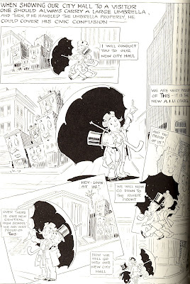
In this (pretty poorly) scanned detail of “The Passing Show,” Chris leads a visitor to the city on a tour of the place, taking care to angle the umbrella just so to keep the not so nice looking buildings out of view at all times.
This is one of Ireland’s looser versions of Chris, in which he is drawn more like a mascot or funny character. Ireland must have been using him in “The Passing Show” for some time at this point, because he doesn’t even bother to tag him as “Chris” or “Columbus” as he sometimes did.
I love the expressions on the faces (or is that façades?) of the derelict buildings in this sequence…how they start out all proud and eager in the first panel, and then are increasingly crestfallen as it progresses.
Here are two of the political cartoons featuring Chris. City Council wasn’t always presented as his wife, but here are two examples in which she, er, it is:
These are three years apart, but not how different Chris looks in each, aside from wearing the same clothes. And his wife sure has changed! In the second one, she even gets a name, “Mrs. Councilella Columbus.”
I really like the relationship Ireland infers between the city of Columbus and its City Council—that of a somewhat henpecked husband constantly being railroaded and dragged around by his wife. The city and its council were in a voluntary relationship, but one was clearly in charge of the other, and the city had to always go along, even if it wasn’t excited to do so.
Don’t feel too bad for Councilella and Chris though. They did share happier times, too. In one panel of a “Passing Show,” for example, they’re shown joyfully taking their kids to the circus when it stopped in town. And that Councilella was much prettier than the one with the crazy collar window shopping up there.
Labels:
billy ireland,
caswell,
columbus comics,
political cartooning
Saturday, January 26, 2008
Billy Ireland's use of map shapes in his cartoons
In yesterday's post about late Columbus cartoonist Billy Ireland, I had mentioned how similar Ireland's political cartoons from the first decades of the 20th century to those being produced in the first decade of the 21st (The main differences being how rare abstraction was in Ireland's work, and how intricately drawn it was).
The most frustrating similarity? Ireland tended to over-label the components of his cartoons. And by "over-label," I simply mean "label." Because so often, Ireland's ideas are so perefectly crystallized in the drawings themselves that the labeling becomes completely superfluos.
Now, one of the many rewarding aspects of a book like Lucy Shelton Caswell's Billy Ireland, whcih collects so many cartoons from a single newspaper cartoonist in one place, is that by seeing such a large swathe of their work, one gets to see the issues they were most concerned with and become familiar with the techniques they used.
One strategy that Ireland seemed to employ quite often was using the shapes from the map as components in his drawings, using, say, the shape of the United States as the body for an animal, thus visually telegraphing that the animal is a symbol for the U.S. (and thus making labels or good old tried and true Uncle Sam unnecessarry).
Here are a half-dozen or so examples, all culled from Caswell's book.
This one's actually pretty abstracted for Ireland. The eagle doing the feeding and the world-bird are both pretty loose in terms of representation, leaning closer to "cartoony" cartooning than a lot of his political cartoons tended to. I'm not 100% on what real world events this was responding to—I gather from the other cartoons on the topic in the book that plenty of other countries were relying on the U.S. for food in and around World War I?—but the point of the cartoon sure is clear.
The words "the world" seem pretty unnecessary on the baby bird, since it's head is shaped like the world. Similarly, the "U.S." tag on the eagle seems a bit much. You can't get much more obvious in terms of "This is America!" symbolism than an eagle dressed like Uncle Sam.
Of course, this likely has more to do with the way cartooning was done in Ireland's day than any sort of weakness on his part. I mean, the words "Some job!" aren't necessarry across the top, but all of his cartoons have similar over-telgraphing, explaining the joke to readers, in case the picture itself doesn't do the job.
But looking at the picture, it's hard to see how it wouldn't. The size of the baby bird, it's huge gaping mouth, all those other babies, the tiny eagle, the look on his face—it's pretty clear the bird labeled U.S. is comically overwhelmed in its task of feeding the world, right?
Note the way Ireland tags the eagle with "U.S." It doesn't have the letters written on its body, or a button, or a T shirt, as is more cocmmon these days, but has a tag hanging off it. He does this a lot when labelling characters; sometimes they just grow off the character like that, and some time they dangle by a string, as if they were price tags.
Here's a great cartoon in which he uses the shape of the United States as a central image. What a great, simple, evocative way to say "this boat symbolizes the United States." I like the contrast with the especially realistic men doing the rowing, and the Uncle Sam who looks as real as your own uncle. It makes the images single non-representational image—the United States-shaped boat—stand out.
Again, I don't think it was necessarry to mark it "USA," but hell, it was 1917; maybe most Columbus Dispatch readers hadn't taken basic geography in school. I don't know.
Here's one I love—an Americamel. In this case Ireland resisted labeling the beast "U.S.A.," but labeled a couple of individual states on it. Maybe he had to label Florida, so people didn't mistake that for a turgid camel penis or some sort of cancerous chest growth.
And another great use of the shape of the United States. Check out the Americow's haunches. The north western states really blend into an emaciated cow's ass quite well, don't they? This is one that kinda confuses me. I think the americow is the mom cow and the gigantic calf is Europe, looking to feed off the states, despite the states needing their own food? I don't know, really. But those are some nice-looking cow heads. And clever use of a globe and map. And Uncle Sam as farmer.
Finally, here's Ireland using the shape idea on a more local level...
Here, the labeling of everything except the state is probably needed, as were it not for the "Mother Nature," there'd be no way to know that was anything other than some random old lady. Again the shape from the map is the only highly abstracted part of the drawing, calling attention to it and giving it stronger impact. I don't know why more Ohio cartoonists don't do this...the state's shape is such that it could easily be used to stand in for almost anything concave, you know?
It's probably not apparent to any of you not from Ohio, but the background to the right? That's taken from the seal of Ohio. Those hills are in Chillicothe, where Ireland was born. The area is currently a state park.
Friday, January 25, 2008
Who is Billy Ireland?
(Above: A detail from “The Passing Show” featuring “Carmen Ohio.” That’s the name of a 1902 OSU football song that’s still quite popular, but is here anthropomorphized into a symbol of the team)
Now that I know who he is, it seems strange that I’ve gone this long being completely ignorant of Billy Ireland, despite having lived in Columbus for about eight years now and being as interested in comics and cartooning as I am.
You see Ireland was, according to Ohio State University Cartoon Research Library curator Lucy Shelton Caswell, Columbus’ greatest cartoonist. And this is a city that can boast of having been home to several great cartoonists, from Milton Caniff to James Thurber to this Jeff Smith character you’ve probably heard of, so it’s actually quite a heap to be said to be at the top of.
I first heard his name just a month or so ago, when I saw the listing in the Wexner Center for the Arts’ calendar for Caswell’s lecture on “Columbus’ greatest cartoonist,” whom she’d previously authored a book on. Simply titled Billy Ireland, it was first published in 1980 by Ohio State University Libraries*, but a newer, updated version** was more recently released, which prompted the lecture.
I tracked down a pretty battered copy of the 1980 version from my library. It was an oversized trade paperback held together with tape, and it didn’t take too many pages before I became deeply impressed with Ireland’s ability to draw. But it’s the back section of the book, in which his weekly “The Passing Show” is collected, in which merely being impressed turned to flat-out awe.
In an odd synchronicity, that week I was reading a (extremely boring) book about the history of a local suburb, and both Ireland and “The Passing Show” showed up in it. Apparently, he was quite the prominent figure in Columbus during the first third of the 20th century, and an event in the suburb getting covered in his cartoon was a big enough deal to be put in the city’s history.
How did I manage to live here this long without having ever heard of him?
The book certainly went a long way toward rectifying that, and I went to check out Caswell’s presentation yesterday to see what else I could learn. I’m going to share all that with you now, like it or not.
It was not a pleasant day in Columbus yesterday. It had been snowing big, fluffy flakes for much of the morning, and while it wasn’t enough to shut anything down, it was just enough to make leaving one’s house inconvenient—you’d have to clean off your windshield, your feet would be wetter and colder than usual and, as is usual in inclement weather, one’s fellow Columbusites would forget how to drive.
Visiting OSU’s campus is never terribly pleasant either, at least not for the poor/cheap. I used to live a few blocks from the heart of campus, so attending events there was simply a matter of a few minutes’ walk, but now I have to drive in from a suburb, and spend twenty minutes driving around back-alleys and sidestreets trying to find a parking spot within a few blocks. That, or shell out three bucks to park in the garage conveniently located right next door to the Wexner Center’s film/video theater, which is where the talk was to take place.
I don’t know if the snow, cold and/or inconvenience of ever going to campus for any reason was a factor or not, or if it was perhaps the 4:30 start time, before those with day jobs would punch out and be able to attend, but the theater wasn’t exactly crowded.
I counted 25 people there, counting Wex staff and volunteers, friends of Caswell’s and yours truly. The smallness of the crowd was accentuated by the size of the theatre (it sits about 300 people), but it reminded me that no matter how many graphic novel reviews you see in respectable newspapers, how many hundreds of Marjane Satrapi profiles are written or how often Joe Quesada gets asked on the radio or TV to talk about the latest lame event in the fictional lives of Captain America or Spider-Man, there’s still a certain small-ness to comics.
At the start of her lecture, Caswell put the front page of The Columbus Dispatch from the day Ireland died up on an overhead projector, as a way of emphasizing how important he was to the city at the time. Ireland’s death was the front page; there were four huge pictures of him, several articles and remembrances, and the sorts of headlines usually reserved for wars. (Nowadays the Dispatch devotes that same amount of front-page coverage to each and every OSU football game).
Caswell then spoke briefly about Ireland’s biographical details, the same ones covered in her book, before turning to the work itself. She put up several of his political cartoons dealing with local, state, national and international topics—all given the same weight in terms of the quality of the drawing and complexity of the image and message construction—and then dove into “The Passing Show.”
And, as I noted earlier, this is where admiration easily turns to awe in earnest.
Caswell said the best way to describe “The Passing Show” was as “an illustrated column” dealing with whatever was of interest to Ireland. But it was a page long. An entire newspaper page. And he did it every single week. For 27 years.
Each “Passing Show” had a unique title strip across the top, with the words “The Passing Show,” “by” and a shamrock representing Ireland, all arranged into little scenes, like the letters all playing baseball or football, or forming a bridge, or baby birds in a nest, or captured German soldiers or whatever. Below that would be a dozen or so little mini-features or cartoons. There were more or less regular features within the page, like one-panel strip “The Jedge and Jerry” and caricatures highlighting local people and their interests and accomplishments, but the bulk of the page were standalone text and cartoon pieces dealing with nature, corn on the cob, OSU football, city politics, fashion and whatever the hell Ireland felt like drawing that week.
The dozen or two little pieces didn’t really interact with one another, and Caswell said the page was designed to be read over the course of the day, with some people returning to it throughout their reading experience, while others sat there and read the whole thing.
Appearing fairly regularly was Ireland himself. Not just as the shamrock-headed caricature in the title panel,
but also as a little, fat white-haired guy in a janitor’s outfit; the page was his page, and he saw himself as in charge of its maintenance.
You probably can’t tell from that little scan there,
but each one of these things was a massive amount of work (The smaller reproductions in the book were still too big for the scanner, and Photoshop couldn’t take the size of the image when I was saving pages to re-post here).
(A detail from the above "Passing Show," guest-starring J. Wellington Wimpy)
I mean, you’ve probably heard cartoonists complaining about how difficult it is to crank out six daily strips and a Sunday strip, right? Well compare that work load to Ireland’s on “The Passing Show,” and keep in mind he’s not simply drawing the same simple character talking to each other for three panels like in, say, Dilbert or The Boondocks (to name two strips I really like, neither of which are exactly brilliantly drawn), but this involved a considerable amount of planning, character design and drawing each week.
Caswell pointed out in her talk that Ireland not only cranked out a weekly page of the newspaper for those 27 years, he was also responsible for four to seven editorial cartoons a week.
(Part of a "Passing Show" from the week of a Columbus auto show; note the top half of the badly-scanned page is arraned to resemble the front of an automobile)
I would have loved to have watched him work at the drawing board; it’s hard to imagine a man’s hands moving fast enough to produce so much work, especially considering that he was married, had kids, and was very involved with the Dispatch’s business, city politics and policy, and, according to Caswell, loved to hunt, hike and golf (That last one being a passion shared by 99% of today’s newspaper strip cartoonists, based on the number of limp golf-focused jokes I’ve seen in them over the years).
Actually, the way he worked at the drawing board is one of the things that Caswell covers in the book. He’d hold the page against his desk with his left hand (which usually also held a cigar) while drawing with his right.
During the question and answer portion, someone asked Caswell if it were possible for someone to do something like “The Passing Show” today, and she said it was possible, but difficult, and that “very few people have it in them to do it.”
Me, I would probably have straight up laughed if I were her. Even if there were artists capable of that kind of weekly workload, can you even imagine a newspaper turning over an entire page to a cartoonist today? And a local one at that, one who is mainly cartooning on topics of local interest?
Back to Ireland’s bio for a moment: He was born in 1880 in Chillicothe, Ohio, and started working for the Dispatch as an 18-year-old in 1898, remaining at the paper through his death in 1935.
I don’t know how unusual it was for the cartoonist to be as influential and powerful within the paper as Ireland was, but he definitely seems to have been, and I’ve always thought of cartoonists as somewhat marginal figures within their papers.
In 1905, Robert F. Wolfe and Harry P. Wolfe, owners of the Wolfe Brothers Shoe Company, purchased the Dispatch, and became friends with Ireland (Particularly Robert, Caswell said). This friendship allowed Ireland to buy stock in the company, and become involved with its general editorial direction, with he and the Wolfes taking up the same local causes back in the day (Interestingly and/or depressingly, over a century later, the Wolfe family still owns the Dispatch, which has grown into a local media empire, including TV and radio stations, suburban papers, a Spanish language paper and what used to be Columbus’ alternative newspaper).
Caswell repeated anecdotes from Will Rogers saying he subscribed to the Dispatch just for Ireland, and that William Randolph Hearst had tried to entice Ireland to syndicate his work, going so far as to promise to build a color printing plant in Columbus, but Ireland turned him down, being more interested in the city and state than what was going on outside it.
She also repeated one about Milton Caniff (which is apparently pronounced “Cuh-niff;” I always thought it was “Cane-iff;” good thing I’ve never had occasion to say his name out loud, I guess). It was Ireland who hired Caniff at the Dispatch, allowing him the means to continue going to college. When Caniff was considering a career change, forsaking cartooning for acting, Ireland told him, “Stick to your ink pots, kid. Actors don’t eat regularly.” And thus Terry and the Pirates was saved.
As for the work itself, that is easily the most valuable thing about Caswell’s book, which reproduced plenty of political cartoons and “Passing Shows” (The book is mostly a collection of these, with a relatively small percentage of the book devoted to Ireland’s bio).
The political cartoons are a bit of a revelation in that they are so clearly the work of an age long gone—the earliest one reprinted in the 1980 volume is 120 years old now—and yet in some ways share the strengths and weaknesses of today’s political cartoons (Has political cartooning really just not changed much over the last century?).
Ireland’s artwork is somewhat old-timey in just how detailed and representational it is. There are an awful lot of ink lines in almost every one of them that is represented in the edition, and terribly few of them have any sort of serious abstraction within them. In many cases, the drawings themselves aren’t trying to be funny, just good drawings, and humor will come from juxtapositions.
I mean, check this out:
That’s a really nice drawing of a really realistic snake, you know? Ditto the dove drawing. The most abstracted part of the drawing is the German dude, and he’s not exactly what you’d think of as “cartoony” looking.
One thing I can’t help but notice—and lament—in Ireland’s work is the need to relentlessly label everything. This is something that drives me crazy about the bulk of modern political cartoons (and, to expand a bit, about comics in general—the need to use more verbal communication than necessary, when the visual handles it just fine). It’s easy to forgive Ireland because, hell, it was the early 20th century and political cartooning was still new-ish, so I’m not going to hate on him the same way I would on someone political cartooning today, but there’s a real excess of labeling in that image above.
The German doesn’t have the word Germany written on him, and yet its clear, even a century later, that that’s what he’s supposed to represent. A dove holding an olive branch is a pretty universal symbol for peace, did it need to be labeled “Dove of Peace,” with the branch redundantly further labeled “peace?”
Probably not. It’s still a nice image and a strong cartoon, I just wanted to point out that over-labeling was a problem as far back as the early 1900’s. And Ireland would sometimes accomplish it in strange ways, having tags sort of sticking off his figures identifying them, as if they were huge washing instructions on their clothes or whatever.
Seeing so many of his cartoons gathered in one place, it’s easy to get a sense of what issues he was passionate about. In addition to attacking Germany, Europe and the League of Nations around World War I, he would commonly speak up in favor of women’s suffrage and better support for veterans, against both Ohio’s KKK and FDR’s New Deal, and, in what was apparently a pet issue of his, in favor of keeping the quail on Ohio’s songbird list (thus keeping it illegal to hunt). Caswell noted that among the local issues he was most passionate about was the sad state of the riverfront, which he and Robert Wolfe campaigned to have cleaned up.
They eventually succeeded, which, during her talk, Caswell said she likes to think of as proof that one person can make a big difference in their city. You can literally drive around Columbus today and see streets that look the way they do now because of Ireland' campaigns.
After reading about Ireland and looking at his work, I'm beginning to think Columbus needs another public campaign—one to erect a statue of Ireland somehwere around here.
Billy Ireland Weekend will continue here at Every Day Is Like Wednesday tomorrow and Sunday, with a couple of looks at some of Ireland’s cartoons, and many, many fewer words than I subjected you to tonight. Promise. We'll get back to making fun of superhero comics and posts about how awesome Martian Manhunter is*** on Monday.
*I found a copy at my local library, but it might prove more difficult to track down outside of the Buckeye State; here’s a great site for finding where the closest library to you that owns a particular book might be. You’ll probably want to bookmark that shit, cuz it’s hella useful.
**I understand the new version is a hardcover, and features quite a bit of color art; the original is all black and white. For those of you outside of Columbus and thus nowhere near OSU, it looks like you can buy the book for $35 online here.
***Very awesome.
Subscribe to:
Posts (Atom)