Saturday, January 30, 2010

Three picture books of note

1.) Jeremy Draws a Monster (Henry Holt and Company) A couple of weeks ago I wrote a post about a rather exceptional picture book, Henry In Love by Peter McCarty. It was such an impressive work that on my next trip to the library, I grabbed just about everything of McCarty's that was in at the time. Some of them were fairly engaging (Hondo and Fabian, T is for Terrible), some of them did nothing for me (Baby Steps, Moon Plane), but by far the best of the lot, the one that came closest to replicating a lot of what I liked about Henry In Love, was Jeremy Draws a Monster.

This is the book that immediately preceded Henry (by just a few months, actually), and the art style is extremely similar, right up to and including the way McCarty allows one to see through some elements of some of his drawings, and the sort of zen blank expressiveness of the character designs.

Unlike Henry, Jeremy is a human being, although he's not rendered all that representational a human being. In super-simple, declarative sentences, we learn that Jeremy spends all of his time alone in his room/apartment drawing, while other kids all play together outside. The things Jeremy draws become "real," or at least as real as he imagines them to be (or, at most, as real as Jeremy himself is to us as readers), which makes the very drawn-looking style, in which McCarty allows readers to think of his drawings as drawings instead of trying to disguise the fact by covering up all the unnecessary lines, appropriate.

Everything in Jeremy's room looks like he himself may have drawn it.

When we get to the event referenced in the title, we see that he draws the monster not on paper, but in the air in the middle of his room and, two of McCarty's illustrations later, there's an awesome-looking monster standing there. You can see the monster design on the cover above. It may be more difficult to tell online than in person, but the monster's skin is composed of blue ink line work...as simple as the design itself is, the monster looks quite thoroughly sketched as if with a cheap blue Bic pen, the sort of thing a talented artist might draw in the back of his school notebook during a very boring lecture.

The monster turns out to be a monstrous house guest, rudely demanding things from Jeremy, and Jeremy draws them as best as he can (which is pretty good, considering he draws a lot like McCarty).

"Draw me a sandwich. I'm hungry!" it demands (without saying thank you when he get it). "Draw me a comfortable chair. Draw me a television. I want to watch the game. And draw me a hot dog too," and so on.

My favorite part is when the monster says, "Are you going to sit there all day? Draw me a hat. I'm going out!" And Jeremy, who silently responds to each request, with a blank face that never betrays any exasperation, comes up with this big fancy red top hat:
I love that. Where is the monster going? Why does the monster think it needs a hat to go out, or to go where he's going? Does he need a hat? Why does Jeremy draw that hat? Why does the monster and Jeremy both agree that that's a good hat for a monster to go out in? As you can probably tell, I found the suggestion of the story of the monster's hat enormously intriguing and entertaining all by itself, and that's only, like, two pages of the story.

That's not the whole story of the book though, and when Jeremy gets (quietly, blank faced-ly) fed up with the monster and draws him a one-way bus ticket out of town, the gentle conflict suggested at the beginning of the story is resolved. There's a moral to the story, but it's one that's just kind of there if you want to look for it; otherwise, the story works quite perfectly on a "this happened, then this happened, then this happened" sort of level. In other words, it have varying levels of complexity and is thus able to address various audience of different age levels. That makes it a pretty perfect children's picture book, if you ask me.


2.) The Red Book (Houghton Mifflin) Not to be confused with that big crazy Carl Jung book, or the report on infectious diseases, this is a Caldecott-winning, wordless picture book by Barbara Lehman. How wordless is it? Well, the cover doesn't even feature the title (The spine has "The Red Book" on it, though, and the title is almost hidden on the title page).

It's one of those children's picture books that is of some interest to comics readers/thinkers/talk about-ers, because of how close it is to being straight comics...close enough that it may actually be comics, depending on where you want to draw the line between comics and not-comics.

Because it's wordless, there's no prose involved at all, which would eliminate it from being classified as illustrated prose. Most of the pages are not divided into comics-like grids, but each full-page functions as a single comic book panel. And then there are a couple of pages like this
which are divided into comics page-like grids.

So, comics? Not comics? I don't know. I think Comics can legitimately claim Lehman's Red Book if Comics is so inclined.

The story is that of a little girl who finds a magical book which allows her to see what's happening to a little boy who's very far away. Which is the same magic all books have really, although the ability to look in on exotic locales and faraway people, and to even visit with them, is rendered literal...and two-way...and three-way.


3.) Bunny Days (Dial Books) This is the follow-up to Tao Nyeu's 2008 book Wonder Bear (Previously discussed here), and is composed of three shorter stories, each featuring a half dozen little white rabbits getting into some sort of trouble, and then getting out of that trouble with the help of a big white bear with big claws that looks an awful lot like the bear in Wonder Bear (although he seems to employ more technological know-how than magic in his problem-solving here).

In "Muddy Bunnies," the bunnies are splashed with mud from Mr. Goat's tractor, and the bear puts them in a washing machine that's incongruously set up and working on a hill (Don't worry, the bear uses the delicate cycle). In "Dusty Bunnies," Mrs. Goat is vacuuming the grass for some reason, using a vacuum cleaner with a little face on it and she accidentally sucks up all the bunnies. Bear dusts them off, fixes the vacuum and solves the problem of bunnies being accidentally sucked up by vacuum cleaners in the future. And finally, in "Bunny Tails", Mr. Goat is trimming hedges when he accidentally cuts off the bunnies' little cotton ball tails. Bear re-attaches them...with a sewing a machine.

Nyeu's art retains the considerable virtues it displayed in Wonder Bear, and the marriage of domesticity with wild nature gives the entire book an amusing incongruity. Additionally, there's a refreshing (naughty?) sense of danger in the way one character sticks others in the washing machine or puts them under a sewing machine, without fine print saying "Bunnies are trained professionals. Don't try this at home."

Unlike Wonder Bear, which was silent, each of these stories is told with words as well as pictures, and each one of them ends with the words "Everyone is happy," a fresh, new, simpler and more realistic version of "They all lived happily ever after." Perhaps the formulation is necessitated by the fact that the bunnies keep finding themselves in unhappier circumstances, but there's something really comforting about that expression, and the way it's repeated over and over gives it an almost mantra-like quality.

Here's a video with some images from the book:

Friday, January 29, 2010

Three pieces of cartooning advice from Marjane Satrapi (one of which is secondhand)...

...as gleaned from from Da Capo Press' 2009 book Heroes and Villains: Essays on Music, Movies, Comics and Culture* by David Hajdu, author of The Ten-Cent Plague (Hajdu's piece quoted from below—everything in italics is him—was originally published in the October/November 2004 issue of Bookforum)

1.) BE LIKE A LIZARD
"Emile Bravo told me, 'When you are drawing, be like a lizard—be perfectly still, but aware of everything around you. Don't waste your energy with a lot of movement while you're working. Be like a lizard.'"

2.) DRAW IN INK
Dispensing with drawing-class convention, she uses a marker rather than pencil; the ink, being less forgiving, "forces me to concentrate," she says. "Otherwise I would sit here all day and draw shit."

3.) USE CHEAP PAPER
She draws on the most inexpensive paper she can find. "If I use very good paper, I feel like I have to make a masterpiece," she says, "and the best way to make shit is to feel like you have to make a masterpiece. I feel now like the world is waiting for a masterpiece every time I put a brush in my hand, and that is a bad thing. Cartoonists shouldn't have to be too good."


*Mostly music, though. By my count, only four of the 40 articles collected in the book are about comics or comics creators.

Thursday, January 28, 2010

Hey, wait a minute...


How does Principal Slade drink coffee while wearing his mask if his mask doesn't have a mouth hole?


(Sequence from Tiny Titans #24, by Art Baltazar and Franco. As to why that odd little creamer makes Slade shrink, you're probably better off just reading the issue instead of having me explain it to you)

Oh hey, look at this stupid thing.

That's the cover of Justice League of America #42, as revealed on DC's Source blog today. It's by artist Adrian Melo, and it seems like a fairly typically bland image of three superheroines thrusting their breasts at the reader (compare it with Mark Bagley's cover for the issue, which suggests action, conflict, a suggestion of a story, and a bunch of heroes and villains).

But take a second look at Starfire on the right there, with her hand on her hip and all of her weight on her right foot (As always, click for a larger version). See her little comet-like fire trail? That means she's flying. That's the posture in which Melo decided to draw Starfire flying in. Your typical model standing there looking sexy pose, except she's actually flying through the air while she's in it...?

Actually, maybe the title of this post is unfair. That's actually kind of funny. Like, as a kid I always used to wonder why Superman always adopted that particular Superman-flying pose, with his hands balled into fists and his arms held in front of him. It's not like only his hands could fly and were just dragging his body after them...couldn't Superman fly in any pose he wanted?

I used to think it would be funny if he would, like, pretend to be sitting down with his hands in front of him as if he were driving an invisible car and would fly like that, or pretend he was skiing or ice-skating or whatever.

Maybe that's what's going on here, Starfire is just adopting an unusual flying pose for the sake of comedy.

That, or the artist just drew some ladies sticking their breasts out, and a colorist or someone else came in and added the flying fire trail later.

At any rate, it sure makes me not want to buy it! Luckily the Bagley cover has the opposite effect on me.

Wednesday, January 27, 2010

Weekly Haul: January 27th

Amazing Spider-Man #619 (Marvel Comics) I’m really only reading this for the art, but it’s worth noting that Dan Slott’s scripting remains highly accessible, and contains a clever idea (Mysterio’s behind-the-scenes mob takeover) or intriguing hook (For example, what’s gotten into Aunt May?!) or two. I imagine it’s even more appealing for long-time Spidey fans, for whom names and faces like Captain Stacy, The Big Man, Hammerhead and Silvermane mean something. For me, the greatest pleasure is simply marveling at the way artis Marcos Martin draws a punch, or a facial expression or the hunch of Spider-Man’s shoulders. If ASM looked this good each week, and was written at least this good, I’d happily read it regularly.


The Atom and Hawkman #46 (DC Comics) This is another of those Blackest Night tie-ins that are themselves back from the dead, and it’s one of the tie-ins that seems more likely to be relevant to the overall storyline, given that it’s written by Geoff Johns.

I suppose there is a relevant moment or two, as it focuses on the newly Indigo Lantern-ized Ray Palmer trying to hold off Black Lanterns while the original Indigo Lantern sends out an SOS to the various Lantern Corps, but the majority of the issue is merely a recap of Ray Palmer’s history, specifically as it pertains to his ex-wife Jean Loring, and a reenactment of the nonsensical murder scene from the start of Identity Crisis.

Ryan Sook is the artist whose name is on the cover, and in the solicitation, but Sook merely contributes the cover and, I’m going to guess, maybe the first 10 or 12 pages of the book, while the not very Sook-like Fernando Pasarin finishes the rest of the book. (Please see this post at Funnybook Babylon for a good—if depressing—accounting of just how often these creative team changes happened in Big Two super-comics this month. Yeesh).

So if you’re buying this just for its relevancy to the Blackest Night storyline, you can probably just read the last three pages in the shop. And if you’re buying it mainly because you like Sook’s art, well, be advised there’s much less of it than originally advertised.


Batman and Robin #7 (DC) Oh hey, here’s a novel idea! Why not put an artist who is capable of drawing comics pages on one of the most-read books in the direct market?

After a three-issue, nigh unintelligible run by Philp Tan, in which the script had to fight through the art to get to the reader, writer Grant Morrison is joined by an on-again off-again collaborator, Cameron Stewart, who has calibrated his style just enough to make his art look slightly more serious and realistic than in some of his other books.

Morrison does what I appreciate most about his superhero work, creating things at a breathless clip. Dick Grayson has teamed up with The Knight and Squire (Oh what I’d give for a Morrison/Stewart miniseries featuring that pair!), somewhat accidentally, Batwoman, to fight some crime in England and do what you’d expect people who know about Lazarus Pit’s to do when a loved one dies.

Along the way, Morrison introduces at least a half-dozen British rogues—most of them simply by name, but still—and London’s answer to Arkham, which is where a Beefeater (The Beefeater?!) currently serves as a guard.

It’s pretty much perfect super-comics, and, like the first three issues of Batman and Robin, tainted only by the knowledge that this artist won’t be sticking around for long either. (Well, there are some misplaced dialogue balloons on page 19, but otherwise…)(UPDATE: Here's a scan of the panel at Comics212.net)


Billy Batson and the Magic of Shazam #12 (DC) You know, I’m pretty sure “the wisdom of Solomon” and “the ability to calculate the timing of the electrons and atoms in solid matter so that you can pass through it” are two entirely different powers…


Green Lantern #50 (DC) First and most importantly, this issue features an appearance of another Black Lantern character I had specifically requested seeing, so whether it was merely a coincidence or if writer Geoff Johns is an avid reader of EDILW and is constantly trying to make me happy, thanks for Black Lantern Aquababy!
Second, congratulations to Geoff Johns for sticking with the Green Lantern title for fifty issues. It’s almost impossible to overstate what a rare achievement that is for Big Two super-comics in this day in age; I think Brian Michael Bendis’ run on Ultimate Spider-Man/Ultimate Comics Spider-Man is the only current Big Two superhero run in that ballpark*.

I give Johns a lot of shit on this site, but I do want to take a moment to acknowledge the fact that he’s dedicated himself to long-term storytelling like this—and that DC has allowed him to do so—is really worth applauding, and that commitment is (in large part) why the Blackest Night story/event is doing as well as it is. It took Johns being willing to commit five years of his life (well, however long it takes him to write a monthly comic script every month over the course of five years, anyway) and DC being willing to let a writer do what that writer wanted for such a long period of time to get to Blackest Night, which is working out exceedingly well for both Johns and DC. (And I hope the folks at DC have noticed).

Now, as for this particular issue, it is—thankfully—a return to form after last month’s hodgepodge GL #49, which was by far the worst issue of this series.

Pencil artist Doug Mahnke is back on art, and he draws all 29 pages of it himself, even though four other artists help with his inking (This issue’s oversized and costs $3.99, although it’s worth noting that there are three double-page splash panels and a single full-page splash panel, so it doesn’t necessarily “read” oversized). As Mahnke has proved again and again on this title, he’s exceptional at drawing horror and monster motifs, possessing an all-too-rare ability to marry a great deal of detail with slightly loose superhero design work. There isn’t really a bad page or bum panel in this whole book, and, when you consider what #49 looked like, that is an accomplishment.

As for the story side of things, well you see the above sequence, right? The one where an undead Aquaman presents his wife, who has vomited out her heart and all of her blood and had the replaced with hate-blood, with their undead zombie baby, and she vomits acid hate-blood on them both?

This is another of those issues where Johns is pirouetting on the razor’s edge between awesome and stupid, and he’s just cold doing a whole ballet routine this month. The New Guardians (the rainbow corps Hal Jordan assembled) and the New New Guardians (the seconds that Ganthet recruited in the last issue of Blackest Night) team-up, and devote most of this issue to fighting the Black Lantern Spectre.

For reasons not entirely clear to me**, they can’t defeat it, so Hal remembers back to Green Lantern: Rebirth and decides the only way to beat the Spectre is to allow Parallax to take possession of him again, which happens in a neat little panel of the giant space bug climbing into Hal’s mouth (Damn, I shoulda scanned that one too, actually).

The cover gives away this month’s “Holy shit!” cliffhanger ending, but then, this storyline has been all about giving fans exactly what they want rather than surprising them, so I doubt anyone’s going to hold that against the book.


Justice League of America #41 (DC) Well, this is sort of awkward. James Robinson and Mark Bagley start their run on the title for real now, people! with their fourth issue on the book, and yet the issue is set after Blackest Night (concluding in March) and after Justice League: Cry For Justice (concluding next month, if it keeps its current schedule).

Our narrator Donna Troy (ugh) tells us that they “survived” Blackest Night… "Prometheus too…some of us anyway.” And that’s where we start, after the conclusion of Cry (which is pretty well-spoiled here, so not sure why anyone is actually going to buy #7 next month) and Blackest Night, and, while there probably wasn’t too much suspense about it, it turns out Donna, Wonder Woman, Hal Jordan and Oliver Queen all get de-Black Lanternized and are still alive and not wearing any unusual rings at the end of the crossover.

This is an oversized, $3.99 issue (and one fortunate to have one of the few pencillers who could manage to draw 30 pages a month as its regular artist), seemingly devoted to putting together a new League.

Wonder Woman asks Donna and some Titans to join Dr. Light on a new Justice League, Dr. Light asks her friends from Metropolis (The Guardian and Mon- “I hope he gets a codename soon” El) and of course Hal Jordan and Ollie Queen.

Robinson spends some time on some of the characters’ motivations—particularly Donna’s—and the writing’s decent enough, although perhaps because of the publisher’s scheduling difficulties, question marks kept cropping up in the team assemblage (Like, why can’t Wonder Woman join the team, for example). He also sets a weird scene back in 1777, featuring frontier hero Tomahawk, Lady Liberty and other characters of the era.

How that will fit in with what’s going on isn’t made explicit yet, but it is intriguing and, for the first time in a long time, I’m kind of excited about the next issue of JLoA.

On the downside, this issue was unfortunately Congorilla-free (cover appearance aside), and, while I don’t mind it if it’s only temporary (as I have to assume it is), I really, really don’t care for Starfire and, especially, Donna Troy, and hope the line-up will continue to get tweaked as additional characters become available again.


*Um, except for like a half-dozen other writers and titles I didn't think of as I typed that sentence, but my commenters did when they read it. Please see the comments for several other examples, perhaps the most salient to the Long, Well Planned Runs Leading To Successful Sales and Big Story/Events probably being Bendis on New Avengers and Ed Brubaker on Captain America.


**Okay, forgive the tangent about science and physics in the DC Universe here. As I understand The Spectre, it is a vaguely anthropomorphized aspect of element of God, an angel-esque being that is usually bonded to the spirit of a dead human being to give it something of a consciousness. As I understand the Black Lantern rings, they aren’t really bringing the dead back to life, but are animating their corpses, running advanced programs to imitate the personalities of the deceases, as well as their powers.

In the case of the Black Lantern Spectre, though, there is no body to bond with. In a previous issue of
Blackest Night, a ring took possession of the Spectre’s current host, Crispus Allen. But Allen is himself a ghost, and doesn’t have a body either.

If The Spectre is entirely immaterial, I guess I don’t understand how a ring can possess it, let alone acess all the divine powers. For example, we’ve also seen Black Lantern rings posess Deadman, but basically one took his body and made a Black Lantern Deadman, while the ghost/spirit version of Deadman remained unaffected. What makes the rules different for the two dead characters?

So far, the Black Lantern Spectre has just been growing and shape-chaning and suchlike, so it’s possible the ring is just possessing, like, a bunch of ectoplasm or something, and hasn’t accessed the Spectre Force itself, but I don’t really know. They might have explained all this in last week’s
Phantom Stranger #42, which had a Black Lantern Spectre on the cover, but I didn’t read that.

Tuesday, January 26, 2010

Twenty more-or-less random thoughts that occurred to me while reading The List

1.) It's just called The List, not Dark Reign: The List. I thought that was a little weird, given that the individual special all shipped with overly complicated titles, like Dark Reign: The List—The Avengers, Dark Reign: The List—Wolverine and so on. They put the words "The List" in what looks like some kind of Dark Reign font, though.


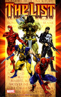
2.) I honestly can't tell you how much I hate this cover:
Not because I'm bashful about expressing my hatred for it, but simply because I can't quantify that hate. It's a lot of hate though.

Here we see five random Marvel characters more or less milling around in various half-assed poses, a list of names hovering behind them (Please note: That is not actually Norman Osborn's list, which is eight items long and shown a couple of times throughout the course of the book.) Also note that Wolverine, who is barely even in the book (despite having his name on one of the specials collected), is wearing the wrong costume, and The Punisher seems even more off-model, forgetting to put his gloves on.


3.) The book is pretty much a perfect sampler platter of the Marvel Universe circa 2009. Here's the creative roster, for example: Brian Michael Bendis, Andy Diggle, Matt Fraction, Jonathan Hickman, Rick Remender, Greg Pak, Jason Aaron, Dan Slott, Marko Djurdjevic, Billy Tan, Alan Davis, Ed McGuinness, John Romita Jr., Ben Oliver, Esad Ribic, Adam Kubert and others. Additionally, many of the characters are in modern, assuredly short-lived iterations (The X-Men are on their little island Utopia, Daken is running around as Wolverine, Bruce Banner can't turn into the Hulk, and is mentoring his son Skaar, etc). Some stories are better than others, of course, and there are a variety of art styles, but overall it's not a bad way to check in with the Marvel Universe as it currently stands.


4.) Marvel just recently released a book entitled Brian Michael Bendis: 10 Years at Marvel, celebrating the anniversary of the company's most successful and influential writer. So you know Bendis has been at this—making comics in general, making Marvel comics specifically—for a really, really long time now. So I was amused to see the first two pages of his Avengers special:
As long as Bendis has been writing these damn things, he still doesn't seem to have been able to figure out an effective way to put one of his very Bendisian conversations into a comic book page layout. That, or Ares is standing on one leg throughout that conversation for some reason.


5.) Fun fact: Lexapro is the brand name for the drug Escitalopram, a selective serotonin reuptake inhibitor, which is used primarily for the treatment of depression (although it is also often prescribed for anxiety disorders). I'm neither a doctor nor a psychiatrist, but as far as I know, it's not prescribed to paranoid schizophrenics. Spider-Man seems to be making a joke about Clint Barton/Hawkeye/Ronin II being paranoid, so Lexapro is a weird one to go with.


6.) Barton/Hawkeye/Ronin totally wants to kill Norman Osborn, for reasons not entirely clear to me based on this single story (He refers to the X-Men's little island as "a concentration camp," which doesn't seem much different then when they were confined to the Xavier mansion post-House of M, and is a lot less concentration camp-like than, say, Guantanamo Bay...did Hawkeye wanna kill Tony Stark or or Maria Hill or any U.S. presidents...?).

Some of the Avengers argue with Barton how killing is wrong. This story is written by the same man who wrote Secret Invasion, in which Barton advocated genocide against the Skrulls and killed a whole bunch of them himself. Everyone in the room with him in this scene were A-OK with killing Skrulls. I just don't get the moral compasses of Bendis' Avenger characters at all, as they're always changing without explanation, like a compass in a movie where the characters enter into some kind of screwy energy field or something, and the needle spins at random.

That said, while I understand the premise of "Dark Reign," the whys of it have never made any sense to me. Osborn was publicly known as a serial killer, and his redemptive act and the reason for his popularity in Secret Invasion was simply shooting the about-to-be-killed-anyway Skrull queen in the head before Wolverine could chop her head off or one of the other dozen heroes about to kill her killed her. If Secret Invasion was merely a miniseries devoted to making Osborn the new-new Nick Fury, Bendis really should have spent more time on him in the series, and shown him actually doing things that would make a reasonable case of his succeeding where Tony Stark failed (or, I don't know, maybe he just did a deal with Mephisto or Loki, and they changed Marvel continuity for him...maybe that will be part of Siege).

Wow, I got off topic real fast there, didn't I...?


7.) Norman Osborn kills 107 people in an explosion to send a message to Daredevil. That's a whole lot of civilians to just kind of kill randomly for pretty much no reason. The Daredevil story is the second one in the book, and it's the first of several times in which Osborn attempts to take out someone on his list, doesn't quite do it, and then just moves on. There's a frustrating amount of non-status quo changing, for a series all about an almost all-powerful Osborn attempting to change the status quo.


8.) I don't care for Billy Tan's artwork much. He draws one big, beefy Daredevil.


9.) I was dreading the Secret Warriors chapter, as I had little-to-no interest in the characters after meeting them in Secret Invasion, but it turned out to be a Nick Fury solo story, and, thanks to Hickman and McGuinness a pretty damn good one.


10.) I like how Fury breaks into Avengers Tower to get at Osborn, which Barton just did a few chapters ago, and he manages to do so much more effectively. It may just be a coincidence—not sure how much each writer knew about the other writers' plots—but the effect is a demonstration of how awesome Nick Fury is (and/or how relatively lame Barton is, I guess).


11.) Fury's own list is awesome, as is the fact that he has it all written down on a piece of paper and ready to show to Osborn, just in case the subject of lists comes up when they meet.


12.) I really like the way McGuinness draws Ares in his helmet:


13.) McGuinness does a lovely job of drawing Osborn making Green Goblin faces without his mask, quite effectively demonstrating that even though Osborn is supposedly reformed and in control, he's still essentially a crazy supervillain (Other writers usually demonstrate this by having Osborn yelling at himself or something a little more obvious). Poor show on the repeating image there though, McGuinness!

14.) I can't add anything of value to Abhay Khosla's discussion of the X-Men special, which I hope you've all read by now.

Although it is a pretty frustrating story. Osborn goes to the trouble of creating a weapon specifically designed to kill Namor, because Namor betrayed him by leaving his evil cabal (And how did that work, exactly? Osborn had a secret weapon behind a door to keep his reluctant allies in line, one so scary they couldn't quit. Yet Namor, Emma Frost and Doctor Doom have all since quit. Did they reveal what that weapon was? Did Osborn just never use it? If the Sentry's on his side, why not just have the Sentry beat these traitors up?). So Osborn has this monster weapon kill Atlanteans ("Hundreds are dead, if not thousands," Namor reports), and the monster ultimately attacks Namor and the X-Men. They kill it, and then Namor throws its severed head at Osborn and glowers at him.

And that's the end of that. Osborn lets Namor go, Namor leaves without trying to kill Osborn (despite the whole "hundreds are dead, if not thousands" thing).

That's pretty weird, isn't it? It's like the two enemies saw they only had a few pages left in that particular issue, and decided they would finish this later...maybe in a Siege book.


15.) Hey, if they ever get around to a Namor movie, I wonder if they'll be able to use the blue-skinned Atlanteans, or if moviegoers will just accuse them of biting off Avatar?


16.) I wonder if some of these stories will be re-collected elsewhere, perhaps grouped with the ongoing titles whose characters they feature. The Punisher issue, for example, is a pretty pivotal moment for the character, and what comes next in his own Marvel Universe book.


17.) This was my first exposure to the Bruce Banner/Skaar team. It seemed like a neat twist on the Banner/Hulk dynamic, with both personalities physically present at the same time and interacting with one another. I also liked how Pak played Banner as a sort of MacGyver-esque superhero (Has there been a Skaar, Hercules, Banner and Amadeus Cho team-up yet?). That said, I hated the art on this chapter, and I didn't understand the conflict or the resolution. I think Osborn "won," but I didn't understand how, or the goals of the participants.


18.) The Punisher story stood out as being one in which there is a clear winner and a clear loser. The Punisher gets throoughly killed in a way that's rare in superhero comics, with Daken literally slicing him into little pieces and leaving them as a bloody pile, removing any and all suspicion that The Punisher could somehow survive (Well, he does of course...the very next storyline in his personal monthly title was called, um, "FrankenCastle," and featured him as a Frankenstein's monster). I knew it was coming, and it was still something of a shock to see The Punisher finally get killed.

The more I thought about it though, the more unfortunate the issue seemed, like a bit of a lost opportunity. Marvel's only going to get so many chances to kill off The Punisher after all, and it would have been nice if he had a better death than being killed in a one-on-one fight with Wolverine's mohawk and tattoo-having son Daken. The Punisher's fought and beat and/or escaped from pretty much every superhero in The Marvel Universe multiple times by now, right? And it's Daken who finishes him off? It might have been more satisfying to see him run a gauntlet of Dark Avengers before Daken chopped him up, if not having a more unbeatable Avenger like Ares do him in.

This is another story that repeats something from earlier in the collection, in this case a fight with Daken. In the first chapter, we saw Barton take on and/or defeat most of the Dark Avengers—including Daken—before Ares ultimately captured him. If Hawkeye can take Daken and Daken can kill The Punisher, does that mean Hawkeye can wipe the floor with The Punisher? That doesn't quite sound right, does it...?


19.) Jason Aaron's Wolverine story is pretty fantastic. As I mentioned early, Wolvie just barely appears in it at all, and it's basically a team-up between the Grant Morrison-created Marvel Boy with the Grant Morrison-created Fantomex for a mission inside "The World," the Weapon-Plus factory from Morrison's New X-Men run. And surprise, surprise, Aaron writes both characters really, really well, making him one of the few people who can satisfyingly follow Morrison (Of course, this was only a single story, but it was still striking how much more closer to Morrison's Marvel Boy Aaron's was than, say, Bendis' first crack at the character was).

Maybe after Siege Bendis will retire from Marvel Universe-running, and they'll let Jason Aaron handle the gig for the next five or so year...?


20.) I was kind of shocked how good Adam Kubert's Spider-Man story was, particularly since the last time I saw his work it was pretty unimpressive. It's really too bad he can't keep a monthly schedule.

Monday, January 25, 2010

Some random links

2009 SPACE Prize winners announced: Each year at Columbus' own Small Press and Alternative Comics Expo (SPACE to its friends), founder and organizer Bob Corby collects submissions from exhibitors to honor some of the most exceptional works, with cash and plaques. Who won the 2009 prizes? Find out by clicking here. If you disagree with the results of the general category and want to know who to blame for such terrible choices, you can blame me (in part). I was one of the judges for that category this year (although the prizes are awarded Dancing With the Stars-style, with voting by the other participants counting for half of the score.

The 2010 is April 24 and 25 this year, so save the date if you haven't already.


WOW.: Spotted at Robot 6 earlier today, a link to Nerd City, where you'll find three images of God himself as drawn by Jack Kirby himself. I can't stop thinking about what a The Book of Genesis Illustrated-like project by Jack Kirby might have looked like.


Boom Studios announces...something: Earlier today I received an email from Boom Studios with the subject line "BOOM! Announces..." and the contents of the message were simply the above image, which looks an awful lot like Sam Jackson wearing a funny costume and holding a gun.
What project is this teaser image teasing?

Well, it can't be an Ultimate Nick Fury or Mace Windu comic, since Marvel and Dark Horse publish those based-on-Samuel L. Jackson's-likeness projects. J.K. Parkin at Robot 6 scoured Jackson's IMDb page, but couldn't find anything that sounds reasonable (I'd totally buy a comic featuring his character from Deep Blue Sea fighting his way out of that shark's stomach and swearing to hunt down all of the intelligent super-sharks for revenge).

So I guess I'll just have to guess.

Hmmm...

...

...I'm going to go with Black Tesla, the story of how visionary super-scientist Nikola Black, AKA The Black Tesla must recover the stolen magical alternating current light bulbs that the evil Thomas Edison stole from his lab, and screw them back into his shoulder pads to restore his lightning powers before Edison can tap into the earth's harmonic field and destroy the world.

Am I close?


One day, all of my favorite musical acts will have collections of comics based on their works: First Belle and Sebastian, then Tori Amos, and now The Magnetic Fields. Well, blog How Fucking Romantic is doing it online instead of in a paper comics collection, but still—pretty cool. Check out these comics adaptations of 69 Love Songs by "a loose collection of mostly London-based comic-artists, illustrators and writers, who have grown up listening to the Magnetic Fields and got together over a mutual love of the songs." (Grew up on? Why, 69 Love Songs just came out in...1999? Eleven years ago?! Jesus, I'm old!). I feel kinda...weird reading some of these, and I'm not entirely sure if the songs translate all that well to a comics format, given the virtues of this particular concept album is the amazing versatility of the musical styles and instruments employed, and the way Stephen Merrit emotes or even pronounces some of the lyrics can lend different meanings to the words he's singing. But whatever; I love comics, and I love this album, and anything that brings fans of one to the other is a good thing in my book.


Nancy and Sluggo at COSI...?: I enjoyed this story from Sparkle Comics #4, which The Big Blog of Kids' Comics posted, and Tom Spurgeon and a few others have since linked to.

Is Donna Troy the first superhero to join the Justice League who doesn't even have a superhero name?

Despite my extreme dissatisfaction with writer James Robinson's recent Justice League work (three issues of JLoA, and what I've read of his Cry For Justice series), I'm still sort of looking forward to reading his JLoA #41 on Wednesday.

It's the issue in which he and collaborator Mark Bagley finally unveil their weird new line-up (which seems to be half-Titans, half-Cry cast), and I'm pretty curious about how exactly they're going to proceed, given that it will be set after the conclusion of Cry (currently scheduled for release on February 24...Robinson's last three issues have also been set after that unfinished storyline, but this issue may be more significant in that it involves characters currently tied up in Cry) and also after Blackest Night (which doesn't conclude until March 31).

That seems like an awful lot of convoluted continuity gymnastics, mostly stemming from the fact that Cry is apparently way, way, way, way behind schedule, which is a less-than-ideal situation if a half-dozen or so other books are tied into the conclusion of the series. (Based on the characters appearing, for example, JLoA will have more than a little bit to do with Titans and the Superman books...in fact, this review of a new issue of Titans, for example, suggests it is closely tied to the events of Cry and Robinson's JLoA).

Anyway, here's a little preview of this Wednesday's issue, from DC's Source blog. There's a scene where the former Wonder Girl Donna Troy, whose superhero identity is, um, "Donna Troy" talks to a cop about the fact that she doesn't even have a superhero name (I re-posted the relevant page above, but see The Source for the whole shebang).

I try not to think too much about Donna Troy, and am rarely forced to, but her joining the Justice League, DC's premiere superhero team, really just underscores the fact that she's lacking in one of the pretty fundamental, base-line requirements to being a superhero at all. Maybe even more so than superpowers or a costume, you gotta have a superhero name.

It really seems like the sort of thing that would be in the Justice League charter, like the monitor duty requirement or a "no duplication of powers" rule.

Has any other superhero ever joined the Justice League without having a superhero identity to go by? Excepting those who serve more as mascots, administrators or honorary members (Your Snapper Carr, Oberon or The Yazz types), the only one I can think of is Zauriel, who at least had the benefit of not being a human being and not having the sort of name you might find in a phone book.

Sunday, January 24, 2010

Review: GoGo Monster

The cover of Taiyo Matsumoto’s GoGo Monster (Viz) features a beautiful parade of animal-like creatures, each composed of pieces that look like aspects of animals you’re probably familiar with and brilliantly bright colors. They’re packed close together among a few trees in a wide-open, white vacuum-like space, and they all seem to be marching toward Yuki Tachibana, a little school boy rendered in scratchy black-and-white and seemingly lacking the rounded suggestion of a third dimension that the creatures possess. He’s busily scribbling on his desk.

You won’t see any of the bright, purely abstracted creatures on the cover on any of the book’s 465 interior pages. Nor will Tachibana. Nor will anyone. It’s not just that Matsumoto didn’t draw any inside, but even if they were there you wouldn’t be able to see them.

You see, you’re a grown up. You’re all black and rotted inside, like all grown-up are. You’ve lost all ability to see the others and their otherworld and, if you’re like most people, chances are you won’t even be able to notice the effects these creatures and their interactions with one another and the natural world have on our visible world.

Tachibana’s only in his third-year of school, and while he’s exceptionally sensitive to a peculiar supernatural world’s intersection with his school, even he’s losing that ability. He can no longer see-see the others, and he never hears from the leader among them that once befriended him. He can still see the wake of mischief they leave, and aspects of a world unique to his perceptions, but he laments that as he grows older it’s getting fainter.

That’s essentially the core conflict in Matsumoto’s master work, or at least one of the core conflicts as I see it, and I wouldn’t necessarily trust me to navigate Matsumoto’s dense symbolism, invented mythology and long, long stretches of meditative image essays correctly, if there even is a correctly.

Besides, the great pleasure of GoGo Monster is doing so yourself.

Tachibana is naturally ostracized by his classmates and, to a certain extent, the teachers at his school as well. They’re a little afraid of him, but mostly just regard him as a weirdo, inventing visions for attention. Are the things he sees and the things he talks about simply the products of his imagination? Is he insane? Or is it all real? Is the school haunted by warring supernatural creatures, turning it into a nexus that touches a completely different world unlike any we’ve seen?

Matsumoto is awfully coy on the subject. When we first meet Tachibana, his only friend is Ganz, the kindly old school caretaker, who has seen other kids who have seen the things Tachibana has seen in the past. He’s quickly befriended by Makoto Suzuki, a new kid in school who is fascinated by Tachibana, and hasn’t built up the sort of resistance that the other kids in school has.

Around the edges of their story is “I.Q.,” a kinda sorta point-of-view character who seems weirder than even Tachibana. He always wears a box on his head, viewing everything through a single eye-hole cut in it, and seems to spend all of his time in the school’s rabbit run.

It may not be immediately apparent from the art (and certainly not from the storytelling or subject matter), but Matsumoto is the creator of Tekkon Kinkreet, and it says something about his considerable talents that GoGo Monster seems to be the work of an entirely different person.

His work is quite representational—to a point. He point-of-view, the “camera” shifts quickly from panel to panel, finding unusual angles, and the characters occasionally stretch or shift ever so slightly, a forearm looking a little too long here, an ankle behaving strangely, an adult’s face growing cartoonier than the perfectly (but never mechanically) rendered school grounds, airplanes, desks, objects and animals.

Matsumoto leaves a lot of whites in his art, and its rather light on shading, calling greater attention to the artist’s line work, which is here occasionally scratchy and remarkably loose. There’s a tactile quality to the lines here, making it easy to see Matsumoto’s pencil moving up and down the paper as you read, or imagining you can brush your fingertips across the surface and dust aside excess lead. Or maybe that was just me.

(Joe “Jog” McCulloch insightfully referred to it as “furiously cartooned” when discussing it in his best of the year piece. And McCulloch named it his single best book of 2009, by the way, if you need a more enthusiastic recommendation and knowledgeable opinion to check it out)

I don’t mean to spend too much time trying to pick the book apart though, separating various elements and trying to categorize and evaluate them. This book is what a great graphic novel should be—irreducible. Each and every bit of it serves the work as a whole, creates a world, evokes a mood, tells a story, proposes ideas, stokes feelings.

The word “perfect” can be a dangerous one for a critic to use, as it establishes an extreme terminal point on a scale or spectrum of that critic’s assessments of quality. It boxes the critic in, even if only a little bit, and thus I’m always hesitant to use it. I keep it behind glass with the word “emergency” printed over it, and usually leave it there, unused.

But I have to admit, after reading GoGo Monster, after spending some time staring at a blank Word document, after writing and re-writing pieces of this review, I’m sorely tempted to break “perfect” out.


********************

RELATED: While looking for a cover image to use at the top of the post that actually reflects the cover I was talking about—the book comes in a cardboard slipcase with different imagery, which is the image I ended up using up there—I came across this 2008 post at Same Hat!. Do check it out; it’s got lots of great images of the book, and will give you a much better sense of the visuals than my stumbling attempts to do so likely did. There's also a photo there of the cover I was actually talking about, the one on the book itself rather than the slipcover—the copy I read came from a library, so it was sans slipcover.

Saturday, January 23, 2010

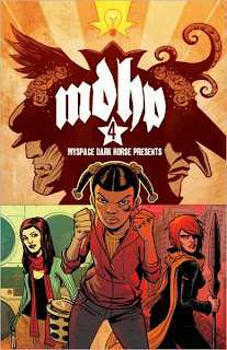
A few words about every single story in MySpace Dark Horse Presents Vol. 4

"Buffy the Vampire Slayer: Always Darkest" by Joss Whedon and Jo Chen

Jo Chen is by far the best of the Buffy artists I’ve seen, able to strike a perfect balance between celebrity likeness and original art that stands, lives and breathes on its own. Her tendency to give characters played by actresses with small breasts remarkably larger bra sizes aside, her covers tend to be the very best part of the (admittedly terribly few) Buffy books I’ve read, and I can say with some confidence that my BTVS TV series virginity aside, I’d certainly read an ongoing comic if Chen drew the interiors.

So in that Chen drew this whole story, it is awesome.

On the other hand, it’s only three pages long, and it took you far longer to read the last few sentences than it will take you to read this story. It’s a dream sequence most notable for Spike and Angel going all yaoi, with a little punchline ending.


"Rapture" by Michael Avon Oeming and Taki Soma

This is an eight-page sample of Soma and Oeming’s vaguely-Christian post-apocalypic adventure, which I believe is currently being published as a miniseries.

There’s this gal flying around with a scarf and a magic spear (The Spear of Destiny…maybe…?), fighting cannibals at the behest of a flying, cloaked character called The Word who probably isn’t actually Jesus Christ, but man, isn’t weird to have a character named “The Word” and a Christian post-apocalyptic fantasy story?

He looks kinda like a spooky superhero and has an upside-down pentagram on his chest.

Oeming’s art is, as always, a pleasure to read, but this sample didn’t make me want to read Rapture comics. I wouldn’t mind reading a review of the eventual trade paperback though, if only so I can understand what the book is actually about.


"Dreamstar" by Gilbert Hernandez

So, is DC ever going to hire Hernandez to do a Power Girl comic?


"Penny: Keep Your Head Up" by Zack Whedon and Jim Rugg

Unlike a lot of the stories herein, this one doesn’t seem to be attached to any sort of larger comics series or franchise. Instead, it’s just a well-made, sweet little eight-page story about a lonely young woman trying really, really hard to save the world through acts of social activism, and having trouble getting a date in the process.

By the time I closed the book, I think this remained one of my favorite stories in the volume.


"Martha" by Dave Chisholm

It’s two old men in a little car vs. a young woman on a motorcycle in this weird little Road Warriors kinda story with a twist ending. I love Chisholm’s art.


"A Day at the Zoo" by Carolyn Main

This is actually my very most favorite story in this volume. It’s about a grade school field trip to a zoo, and the many crazy things that happen to poor Violet and her pet gerbil while they’re there. It’s…it’s kind of hard to describe exactly. You can read it for yourself here (please do!), and then proceed to her website where it’s quite easy to burn an hour or more taking in all her great art and comics.


"Em and Gwen: Magic Spell" by Farel Dalrymple

Dalrymple is an artist who, like Jim Rugg from a few stories ago, is one whose work, style and line I admire so much that it hardly matters what he’s drawing, so long as he’s drawing it. Like, whatever the actually story is supposed to be about, whatever the events in it or the dialogue, I just like looking at the way Dalrymple draws fists and faces and curbs and walls and telephone poles and fences and the corners of buildings and so on. Also, he’s a fantastic letterer.

This is one of the several stories in this volume that I have no idea if it’s connected to something else or is supposed to be a standalone story.

It’s about two girls named Em and Gwen. We meet Em winning what looks like a prearranged fight with a boy from a private school. Then she goes to a magic tree that Gwen apparently lives inside to get the sweatshirt she left there. And that’s, well, that’s it, really.

As literature goes, it ain’t great, but there are some nice moments of comics working as only comics can, and it is all drawn (and lettered) by Dalrymple.


"Flower Mecha" by Angie Wang

Okay, here’s another one that is on my short list of favorites. The plot? A girl is on a picnic, when she’s attacked by pollen. She retaliates by getting inside her Flower Mecha, but then she’s attacked by a bird, a bee and a butterfly, which necessitates upgrading into a different mecha.

While there’s some funny word play, and the story is rather amusing, it’s the way that Wang tells it that is important here.

Each of the eight pages is divided into three rectangular panels stacked vertically. The style is old-school fine art Japanese, and everything depicted is highly-stylized to fit with that aesthetic, even the more modern stuff like goggles and racing gloves employed by our heroine when she’s seen within the cockpits of the mechas. The action in each sequential panel whips in alternating opposite directions, making for a exhilaratingly, violently kinetic work. It’s only 24-panels long, but God is it action-packed.

Actually, don’t listen to me try to find the right words. Just go read it. And if, like me, you were unaware of Wang’s work, you should check her and it out here and here.


"The Secret Files of the Giant Man in Paris" by Matt Kindt

The format of Kindt’s graphic novel 3 Story: The Secret History of Giant Man played such an important role in the story, that an eight-page, side-story would seem all but impossible. But Kindt does it, and does it well.


"Tickets" by Mike Lawrence

Eh, I did not care for this story at all. It’s well drawn, but way too precious, with narration that makes the fairly obvious beats of the story over-obvious.

Also, I thought the old lady exploded during the panel with the SPLATHOOM!! sound effect in it.


"Piper’s Pet" by Nicholas Kole

A little kid using a piece of delicious-looking pie as bait in an attempt to catch a pet. Why kind of fish are attracted to that particular bait? This two-page, 16-panel story provides the answer.


"Face of Evil" by Tory Novikova

The moral of this story about a mysterious pirate is, if I’m reading it correctly, that girls are evil. I thought so.


"R.J. Jr., The Dragon’s Librarian" by Alec Longstreth

I quite enjoyed this short story about a book-hording dragon, his own personal librarian, and by the latter for get new reading material by the former.

Longstreth’s art is very simple in design, but the panels are all very busy and detailed, which is sort of a neat trick the more I think about it.

I didn’t much care for the backwards name gags though. They’re just kind of there.


"The Origin of Man" by Kate Beaton

This is a two-page, full-color comic strip in which Charles Darwin thinks he’s discovered which animal man has evolved from (Hint: it’s native to the Galapagos), but is laughed at by his fellow scientists, who embrace an even more ridiculous theory.

The great thing about Beaton is that almost everything she draws because of the way she draws it, a two rare but completely invaluable talent in a cartoonist. The look on Darwin’s face in each of these panels is honestly enough to crack me up, devoid of context.


"An Early Sunset" by Joseph Lambert

Genius.


"The Catch!: A Wondermark Tale" by Dave Malki

I admire the hell out of Malki’s Wondermark and the way the strip’s constructed, both in regards to the imagery and the plotting, but this story seemed to go on a page or two too long for my tastes. Don’t get me wrong, it’s pretty funny, and at least two disparate threads are brought together in a satisfying conclusion, but I think Wondermark works much better in smaller bites.


"Sinfest: Street Poetry"

Tatsuya Ishida, doing what Tatsuya Ishida does best.


"Achewood: The Garage Sale" by Chris Onstad

This is an eight-page, full-color story that deals with the familiar subject matter of Teodor having a grage sale, and Roast Beef showing him how it’s done.

It’s a fine example of Onstad’s considerable virtues as a writer, including a random assortment of fully realized, highly idiosyncratic characters that belong to an unusual subculture (i.e. garage sale regulars), and his regulars essentially just being themselves, interacting with a specific set of circumstances (Asks Ray, “What’s the chick scene at a garage sale? Pretty bad?”).


"Werewolves on the Moon: Versus Vampires—Bad Blood" by Dave Land and the Fillbach Brothers

I didn’t much care for this one. It’s actually a sort of prologue to the Werewolves on the Moon Dark Horse published, but because of that they aren’t actually on the moon at all during this eight-page story, nor do they fight vampires…in fact, there are no vampires at all. So the title doesn’t do much to prepare one for the story, which is essentially a light-hearted crime story wherein all the participants are werewolves for a reason that is never made apparent.


"The Goon and Ann Romano: Gone Dishin’" by Ann Romano and Kristian Donaldson

This Romano character showed up in the previous volume, writing the introduction and appearing in a not-very-good-at-all story full of lame celebrity gossip jokes.

This one’s a lot better, in large part because it involves The Goon, Franky and the weird world of the Goon.

There’s a bar fight involving fish-men, and a giant octopus cook holding a cooking utensil in each tentacle and neither of those are the best part—the bartender is a monstrous fish-person who has lost each of his hands and had them replaced with hooks, and yet he’s still—successfully!—in disguise, wearing a fake beard.

The Romano character doesn’t really add much other than pop culture references and a Lindsay Lohan joke (Is it cool making fun of Lohan? It just seems kind of mean to me at this point), but Romano the writer does a pretty decent Goon story.


"The Marquis and The Coachman" by Guy Davis

Davis’ dark, bizarre-looking, alternate history hero stars in a short eight-page story in which he encounters and battles some of Davis’ typically strange monster designs. It’s been a long time since I read the original Marquis comics, and I’ve sort of forgotten the exact premise, but I enjoyed this short little peek back into that world, and Davis’ art is always a pleasure to read, perhaps especially in a case like this, where it’s in service of a story that is all Davis, from the words to the settings to the character designs to the architecture.


"And What Shall I Find There?" by Mike Mignola, Joshua Dysart and Patric Reynolds

Migonla simply co-writes this Hellboiverse story about a very young Trevor Bruttenholm in 1939 rural France, where he seeks the supernatural answer to an obscure art folklore mystery. It’s a typically pleasant horror story of the sort Mignola is now known for, and while Patrick Reynolds art lacks the high degree of stylization present in that of Mignola himself or many of his collaborators (Guy Davis, Duncan Fegredo, Richard Corben, etc), it’s certainly effective and pleasant enough.


"Star Wars: Dark Times—Blue Harvest" by Mick Harrison and Douglas Wheatley

I could count the number of Star Wars comics I’ve read on one hand, and my interest level in the franchise at this point is probably at the lowest point it’s ever been in my life (I was born in 1977, and thus quite literally grew up with Star Wars), so I was expecting this to be rather hard to get through.

I was therefore quite pleasantly surprised that it was a fairly engaging read, and by the time if was over I found myself wanting to know where the story it sets up continues so I could find out what happened to the protagonist, a retired Jedi knight forced to become a bounty hunter.

I suppose that has a lot to do with Harrison’s skill as a writer, and the fact that he is basically telling a story that would make just as much sense in ancient Japan or the American Old West as it does in space. That is, it’s not contingent on the setting or, at its heart, a Star Wars story. It’s just a story that happens to be in space, and happens to bear the Star Wars brand name. (In fact, if it weren’t for the presence of some alien species—whatever race Hammerhead is from, the Asian stereotype banker aliens of the new trilogy—I recognized from the movies filling up the crowd scenes, I probably wouldn’t even known this was a Star Wars comic).

It also has to do with how lush and fully realized Wheatley’s artwork is. Richly colored by Dave McCaig, they achieve the more beat-up, lived-in aesthetic of the original trilogy, which seems appropriate given the subject matter.

Thursday, January 21, 2010

Reviews: Blink, Cownt Tales, Fearless Dawn and Spandex

Blink: Breathe in the Beat (Onward Studios) This 2009 mini-comic from writer/artist Max Ink contains two short, previously published pieces—the first a 2007 piece from Oh, Comics! #16, the second from a smaller 2006 minicomic.

Both are short vignettes featuring Ink’s characters Blink and Sam more or less just hanging out and talking, and sandwiched between a prose “creatorial” and a longer, four-page “Sketchbookery” section in which Ink walks reader’s through some of this process and, finally a neat little page featuring some local history on the settings his characters pass through.

Sam and Blink, like Ink and I, live in Columbus, Ohio, and one of the many appealing aspects of Ink’s work for Columbusites is recognizing places in our hometown and seeing how well Ink captures and renders them.

In the first story, “Beatnik Picknik,” the ladies walk around the main branch of the Columbus Metropolitan Library (where I get all those trashy super-comics trades from!) on their way to a poetry reading, while chatting.

Ink is a hell of a draftsman. The story opens with a drawing of the front of the library. Check this out:
His characters aren’t quite as representational, but they’re certainly well put together, and Ink’s pages generally remind me of ‘80s independent cartooning. This one, for example, I think has a pretty strong Dave Sim vibe: At the end of the story, there’s an equally gorgeous pin-up of the girls reading in the topiary garden next to the downtown library.

The second story, “Space to Breathe,” lacks the same strong sense of place, but is perhaps a slightly more focused narrative. The ladies are outside at night, looking up at the sky, and talking.

This particular comic may be out-of-print at the moment, but you can find out for sure—as well as learn more about Ink and his work—by checking out his website here.


Cownt Tales (Cahoots Studios) Chances are you’re already familiar with the writing of Michael May, who blogs at Michael May’s Adventureblog and contributes reviews to Comic Book Resources’s Robot 6 blog, but did you know he also dabbles in bovine-based horror comedy comics?

It’s true, as Cownt Tales readily attests. The title character is a cow who is a vampire cow, and if you’re wondering why a female cow (udder and all) is going by a male title (instead of, oh, The Cowntess), well that’s actually addressed in the three short stories collected in this 18-page black-and-white comic.

May works with three different artists, each given their own story, and each of those stories is introduced by a different barnyard EC-style horror host (Billy Z. Bub, Farmer McBones and, um, Frankenkitty).

The first is by Gavin Spence, and tells the origin of The Cownt, which involves Count Dracula himself getting his ass killed by a bull, and bleeding his potent vampire blood all over the grass where a cow was grazing.

Spence’s art looks like this:
That’s followed by “Udder Nonsense,” a story drawn by Paul Taylor (who I think may draw the best cows of the three) in which The Cownt visits a plastic surgeon in the middle of the night to discuss an udder-removal surgery (it’s just not that scary, in addition to being too female for the now male-identifying vampire cow).

The final piece, “Lactose Intolerance,” is illustrated by Jessica Hickman and tells the tale of a scantily clad vampire slayer attempting to destroy The Cownt, who finds a pretty good (if gross) use for his/her udder after all.

Rounding out the book are pin-ups by Patrick Gleason, Kate Cook and Spence, and an explanation by May of the character’s extremely nerdy real-world origins.

I can say without reservation or qualification that Cownt Tales is certainly the best comic anthology about a gender-confused vampire cow I’ve ever read.


Fearless Dawn #2 (Asylum Press) As with the first issue of Steve Mannion’s rock ‘em, sock ‘em, tongue-in-cheek adventure series, the story is so straightforward as to be uninteresting, but is saved by Mannion’s artwork. If someone else were drawing this, it might be so uninteresting as to be boring, but Mannion’s so skilled at drawing curvy ladies, muscley men, goofy faces and silly action scenes that it hardly matters—the script is mostly just something to hang his panels on.

When we last left Dawn and her would-be rescuer Number 7, they had injected themselves with a “combat drug” that turns people into monsters in order to break out of the prison where they were being held by sexy Nazi Helga and her small army of straight-from-WWII Nazis (including one big hulking monster guy). They do a lot of fighting, and, just when it looks like they’re about to be re-captured, a new character enters the fray—Mannion’s Betty, who looks like Betty Page and here is given a purple version of Lady Blackhawk’s duds, with a cartoon chicken where the Blackhawk symbol would be.

There’s not really much too it other than great drawing chops, so I suppose you’ll now whether or not this is a comic for you based on how highly you value an artist’s ability to just draw things really, really well.

If you need a reminder, here’s what Mannion’s art looks like:


Spandex #1 Martin Eden’s Spandex, his self-published comic about an all-gay super-team that operates out of an abandoned night club in England, received a ton of press a few months back, either because Eden is really good at placing stories in the press, or the press is really excited about the idea of gay superheroes.

While I remember seeing a lot of articles popping up in my Google News feeds about the book’s existence, I don’t recall seeing a whole lot of reviews, so this is my very late attempt to rectify that.

Spandex is actually really, really good super-comics. It’s bright, it’s light-hearted, it’s fun, it’s sexy, it’s dramatic-bordering-on-melodramatic, it’s got a few shocking twists and hooks to get you interested in the next issue—it is, honest to God, everything superhero comics should be.

Oh yeah, and it’s actually a superhero comic that is actually created for adults specifically, not for the same juvenile PG-13 audience that the vast majority of DC and Marvel’s “serious” superhero works are aimed at. Characters use swear words! Human bodies are anatomically correct! People have R-rated sex!

Eden seems to have consulted the rainbow (an appropriate symbol) when creating the roster for the team Spandex (which I have a hard time believing no one ever used as the title of a superhero comic before…it seems kind of obvious, doesn’t it?). Diva, Glitter, Mr. Muscles, Butch, Prowler, Indigo and Liberty (The first transvestite superhero?) each have their own color of the rainbow they work...
...and Eden gives them all nicely simplified costumes and designs (Perhaps the relative lack of clothes many of them wear helps contribute to that simplicity).

There’s a pleasant simplicity to Eden’s artwork in general—it seems stripped down to the basics, but not necessarily amateurish at all. Certain images look stronger than others (I got the sense the pages in this book were created over a long span of time), but the lead feature is quite well drawn, and if its lacking in detail or filigree, it’s apparently an intentional stylistic choice.

That lead story is one in which the team does battle with a fifty foot-tall lesbian, introducing themselves and their powers during the course of the conflict. Meanwhile, similarly colorful and apparently alternative lifestyle-living villains watch from afar.

Eden does an excellent job of integrating the basic elements of old-school superhero comics into this story, lending the entire endeavor an aura of the subversive. It’s because it is so familiar and normal that the differences stand out so.

That 15-page adventure is followed by an eight-page sequence in which the heroes return home and become themselves again, and two-page Mr. Muscles story in which the action is equally split into two parallel threads sharing the same captions; in one, our hero goes to a clinic to get tested, in the other he battles alien invaders.

If you’d like to learn more about Spandex, and/or order the first issue, this is the site you want to visit.