I have a short Q-and-A style interview with comics historian and editor Craig Yoe about Dan DeCarlo, Jetta and Dan DeCarlo's Jetta (IDW Publishing), his new book collecting all three issues of the series and a bunch of pin-ups by 37 artists.
In addition to being a nice little bit of recovered comics history, an entertaining read, a collection of great comics art and a source of hours of Googling enjoyment scanning the home pages of the contributing pin-up artists, it's also a very educational book.
For example, here are three things I learned from it:
1.) Once upon a time, a "#1" on the cover of a comic book was seen as a deterrent rather than an enticement to buying a comic book. Jetta was only published for three issues, but those issues were numbered #5, #6 and #7. Why was that?
According to Yoe, "Many of [Jetta publisher] Standard's comics, like Jetta, began not with a number one issue, but with the number five. This was a ploy to fool newsstand dealers into thinking that it was a solid title with a track record."
Given that comics today are often relaunched, and publisher's occasionally go to great length to get a "#1" on the cover, I thought that was a pretty telling detail about how much the selling of comics has changed in the last fifty-some years or so.
2.) Betty Cooper cosplays as Black Canary. As you can see from the above image, a piece of original art DeCarlo drew for Will King. That's actually only half of the image, which is spread across two pages of Dan DeCarlo's Jetta, but I could only fit half of it on my scanner. DeCarlo drew Betty in Black Canary's original costume, so the other half has her high-heeled black boots with the pirate-y cuff, with DeCarlo's signature beneath it.
3.) Before Willie Lumpkin had The Baxter Building on his route, he starred in his own comic strip. Yoe includes a page of four comic strips in his introduction to the book. The first three are try-out strips form a newspaper syndicate, and the fourth one is the one above (which I've cut from it's four-panel horizontal strip format to make it fit better on a vertical blog like this). It's called Willie Lumpkin, and was published through Publishers Syndicate around 1960 or so. Look how young Willie was! (You can see a few more examples of the strip here).
Thursday, April 29, 2010
Isn't "Being Jonah Hex" super-power enough?
Oh hey, look what based-on-a-comic book movie finally got around to releasing a trailer. I take back everything I said concerning reservations about the make-up (as recently as yesterday!); he looks pretty damn Jonah Hex-y to me. Well, his left eye could be a bit more bulging for my tastes—it varies from artist to artist, but I like when it's frozen wide-open—but not bad otherwise.
All the crazy gun business seems more Desperado than Jonah Hex, but I'm not going to say no to horse-mounted gattling guns and dynamite-lighting-then-launching crossbows.
The bit about supernatural powers is rather troubling though. Hopefully that was just played up for the sake of the trailer, in the hopes of selling Hex as a superhero of the Old West instead of simply a disfigured Clint Eastwood-like killing machine of the Old West.
I do hope it's good, though.
Wednesday, April 28, 2010
Library comics Pt. 2: Batman #688-#691
Around about the time that Bruce Wayne was dying in Final Crisis, DC released the above teaser image to online comics-covering media outlets and then ran it is a house ad in many of their books.
The Tony Daniel image served as something of a teaser for many of the storylines to come during Batman: Battle For The Cowl and the “Batman: Reborn” branding of the entire rejiggered Batman line. (Aside: It’s kind of interesting to look at it now, after the books it’s teasing have come and gone, and we can sort of figure out what’s being referred to in there. It looks like they held back on revealing the new Batman and Robin costumes, putting Damian in a suit and Dick Grayson in the old Batman costume, and I guess Batwoman is holding a magnifying glass because she was in Detective Comics? Shoulda gave her a deerstalker and a pipe too…).
The element of the image I was most drawn to* was the weird half-and-half, red and black Batman costume on Two-Face standing behind the gun-toting Batman (who ended up being Jason Todd, who was only Batman for about two and a half issues of Battle).
It’s an interesting design, in large part because it’s so damn weird—compared to the costumes Jason Todd and Tim Drake (that’s him on the far left with the stick) sport especially. It was also rather intriguing because of the story possibilities it offered. During 52, Batman, Nightwing and Robin all took a year off to travel the world and train as a team, and Batman handpicked the then-temporarily cured Harvey Dent to fill-in for him as Gotham’s vigilante crime fighter.
Dent had since lost half his face again (for what, the fifth time? The sixth?) and became an evil archcriminal again, but perhaps when news hit that the real Batman was dead, he would decide to fill-in for Batman again…this time permanently, and with his own costume?
That would be a Batman story I hadn’t heard yet, and when it comes to the Batman franchise, stories that haven’t already been done three or four times generally qualify as ingenious innovation.
So of all the little visual teases to be seen in the above image, the crazy-looking Two-Face-as-Batman one I was most interested in seeing play out.
Where did it play out? In Batman #688-#691, the last four issues of writer Judd Winick’s aborted second run on the title, for which he was paired with pencil artist Mark Bagley, fresh off his run on weekly comic Trinity.
Unfortunately, it’s not much of a role. Here is every single appearance of the Two-Face Batman from those comics, starting with Daniel’s cover for #691 and then proceeding to panels from Bagley and inker Rob Hunter’s interiors from #690 and #691 (So, um, SPOILER ALERT):
That’s the big reveal of a mysterious villain from early in the arc, a last page splash-page from #690 (Note the comically large darts in Batman’s shoulders).
That’s the Two-Face Batman from the title page of #691.
And that’s the next page of the same book, in which Dick Grayson realizes he’s hallucinating because he was just shot up with some gigantic drug-filled darts, and he’s really just been getting punched around by Two-Face in a pair of Bat-gauntlets.
So that neat-o Bat-costume? The idea of Two-Face running around as a Batman replacement of some kind? There was absolutely nothing to it. The costume was apparently designed for no more than a three or four page drug-induced dream sequence.
That seems like a bit of a waste, doesn’t it? In fact, it made me wonder if perhaps it initially was part of some story arc that never came to be, because, if not, it’s pretty strange that it was given that much space in the “I Am Batman” teaser image promotion thingee, if there was nothing more to it than a few panels of Dick Grayson imagining it.
As for the story that the comics actually do contain, it’s called “Long Shadows” and, like the previous Winick-written issue of Batman, it’s actually pretty good—particularly on the Judd Winick-written DC super-comic scale.
It opens with some unseen figure knocking current Batman Dick Grayson around the Batcave saying things like, “Batman’s dead. So what does that make you?!” while doing so.
We then flash back a couple of weeks to the beginning of Grayson’s career as Batman, and, over the course of three issues, work our way back to that opening scene (Which I spoiled by positng about Two-Face’s Batman costume above).
This is another surprisingly character-focused issue by Winick, and the story is split between two main subjects: The differences in the way that Dick Grayson and Bruce Wayne approached Batmanhood, and a conflict between Two-Face and Grayson.
As Batman, Grayson smiles…a lot. Like, a Bob Haney-written Batman a lot. He also allows himself to be photographed and recorded, and works harder to leave evidence for the police, making convictions easier. He’s a kinder, gentler Batman, something which the world at large notices and remarks upon, but only Two-Face seems to realize that means a different person is playing the role of Batman.
Meanwhile, The Penguin, Two-Face and Black Mask II are all jockeying for position in Gotham’s underworld, and Two-Face sics Batman on Penguin, all the while trying to figure out what all the little changes he’s noticing can mean, before he ultimately finds a way into the Batcave to ambush Dick Grayson.
Winick writes the main players fairly well—for the most part, they all sound and behave like themselves, which, for this kind of comic, really accounts for about 75% of whether or not the scripts are “good” or not. The focus on things like how Dick and Bruce fight differently, and how Dick gets along with a Robin and a sarcastic British butler differently are welcome, giving Batman a different focus than Grant Morrison’s Batman and Robin.
Winick’s still showing some of his personal ticks, however. Two-Face and The Penguin are both completely interchangeable characters here; either of them could play either’s role just as well, and, as presented here, there’s no reason that it couldn’t have been The Penguin who figured out that the Batmen had changed and tried to use that to his advantage (Except for the fact that Daniel or whoever had already designed a Two-Face Batman costume…although I bet a fat little Batman in a top hat would have looked fairly cool too).
Winick writes the bulk of the Two-Face scenes like the bulk of all his villain scenes—The Penguin, Lex Luthor, Dr. Sivana, Brick—with the bad guy explaining his plans to an underling at great, expositionary length).
There were also a couple of things that felt a bit off. The first was the inclusion of some more superheroic elements. Two-Face’s plan to get at Batman is to hire a metahuman with a very specific teleporting power to teleport him inside the Batcave, by somehow touching a Batarang and then teleporting to the location it was made in.
Obviously Batman is a superhero, and superpowers are well within his milieu, but, in general, Batman seems to appear in comics with superpowers more than superpowers appear in Batman comics. Two-Face trying to hire Titans/Doom Patrol villain Warp, for example, or coming up with a plan that involves teleportation at all seems like more of a pre-Crisis Batman story than a post-Crisis one to me. I understand why Winick did it, since he wanted to get Two-Face into the Bat-cave without actually knowing the Bat-cave’s location or figuring out that Bruce Wayne was Batman, but it seems like more a Superman/Batman or The Brave and The Bold storyline to me, rather than a Batman one, if that makes sense.
The other odd thing is that Grayson is eventually able to convince Two-Face that he is indeed the same Batman Two-Face has always fought, he’s simply started acting a little different, changed gloves and got a new belt.
Two-Face seems to get convinced awfully quickly after having spent the bulk of the story researching the differences between the two Batmen–he changes his mind in the course of a single fight scene—and given that he’s been fighting Dick Grayson as Robin and/or Nightwing for, I don’t know, a decade or so, he should know him pretty well by now.
Some of Batman’s longest-lived foes, like The Joker and Two-Face, have often been shown as knowing that Batman’s Robins have changed over the years, and that Nightwing was the first Robin, so one would think an old hand like Two-Face would be a little more on the ball here.
It’s been a while since I read Prodigal, the storyline about Dick Grayson temporarily becoming Batman from the nineties, but I seem to recall Two-Face being one of the major villains in it, and Two-Face figuring fairly prominently in some Robin: Year One-era stories written around that time.
And then there’s the fact that Two-Face just had a big, personal, intense conflict with Dick Grayson in Nightwing’s “Batman: RIP” tie-in arc, which, coincidentally enough, also involved Dick Grayson in a fight while suffering drug-induced hallucinations.
The artwork is perhaps the best I’ve seen from Bagley since he left Marvel and Ultimate Spider-Man for DC. I’m not entirely sure what to attribute the strength of his work here to, but it may simply be that he had no reason to rush, as he was drawing on a 22-pages-per-month schedule, instead of the 40ish-per-month schedule of Trinity or the 30-pages-per-month schedule of JLoA.
His artwork clearly reflects Winick’s story about Batman being a different Batman, and his Dick Grayson-as-Batman is often smiling and almost always airborne. It’s clear that there’s a different person under the costume, and given that Bagley’s art has never been super-exact when it comes to individualizing characters by their facial features or body structure, that’s a testament to his communicative ability.
Also, it’s just plain hella dynamic work. Check out this page of Batman fighting:
He shoots himself like a missile at those crooks.
Unfortunately for Winick and, I suppose, the Batman readers at the time, his run on the book would be cut short—presumably because he dared speak out of turn about behind-the-scenes goings-on in the Bat-office—and this marked the end of his run.
His leaving the book must have been rather sudden and unexpected, as he was clearly building up conflicts for future storylines. One was Black Mask II’s presence, as the mysterious new legacy villain played Penguin and Two-Face off of one another, and, by the end of the story, had managed to get The Penguin to serve under him and to exile Two-Face from Gotham.
The next writer, Tony Daniel, would pick up on that plotline in his run, but not on the one Winick introduced at the very end of the book, in which Grayson finds a hidden flash drive in the Batcave and discovers that his mentor was secretly investigating the murder of The Graysons, and was apparently hiding some details from Dick.
What exactly was the original Batman hiding? That’s what Dick asks aloud at the end of the last issue of Winick’s run, and we never do find out.
Oh well. The important thing is that Winick was apparently punished for telling Comic Book Resources that he was originally writing Battle for the Cowl, not how good the actual comic books are, right?
*After this element, of course.
********************
Next: Tony S. Daniel and Sandu Florea's Batman #692-#696
The Tony Daniel image served as something of a teaser for many of the storylines to come during Batman: Battle For The Cowl and the “Batman: Reborn” branding of the entire rejiggered Batman line. (Aside: It’s kind of interesting to look at it now, after the books it’s teasing have come and gone, and we can sort of figure out what’s being referred to in there. It looks like they held back on revealing the new Batman and Robin costumes, putting Damian in a suit and Dick Grayson in the old Batman costume, and I guess Batwoman is holding a magnifying glass because she was in Detective Comics? Shoulda gave her a deerstalker and a pipe too…).
The element of the image I was most drawn to* was the weird half-and-half, red and black Batman costume on Two-Face standing behind the gun-toting Batman (who ended up being Jason Todd, who was only Batman for about two and a half issues of Battle).
It’s an interesting design, in large part because it’s so damn weird—compared to the costumes Jason Todd and Tim Drake (that’s him on the far left with the stick) sport especially. It was also rather intriguing because of the story possibilities it offered. During 52, Batman, Nightwing and Robin all took a year off to travel the world and train as a team, and Batman handpicked the then-temporarily cured Harvey Dent to fill-in for him as Gotham’s vigilante crime fighter.
Dent had since lost half his face again (for what, the fifth time? The sixth?) and became an evil archcriminal again, but perhaps when news hit that the real Batman was dead, he would decide to fill-in for Batman again…this time permanently, and with his own costume?
That would be a Batman story I hadn’t heard yet, and when it comes to the Batman franchise, stories that haven’t already been done three or four times generally qualify as ingenious innovation.
So of all the little visual teases to be seen in the above image, the crazy-looking Two-Face-as-Batman one I was most interested in seeing play out.
Where did it play out? In Batman #688-#691, the last four issues of writer Judd Winick’s aborted second run on the title, for which he was paired with pencil artist Mark Bagley, fresh off his run on weekly comic Trinity.
Unfortunately, it’s not much of a role. Here is every single appearance of the Two-Face Batman from those comics, starting with Daniel’s cover for #691 and then proceeding to panels from Bagley and inker Rob Hunter’s interiors from #690 and #691 (So, um, SPOILER ALERT):
That’s the big reveal of a mysterious villain from early in the arc, a last page splash-page from #690 (Note the comically large darts in Batman’s shoulders).
That’s the Two-Face Batman from the title page of #691.
And that’s the next page of the same book, in which Dick Grayson realizes he’s hallucinating because he was just shot up with some gigantic drug-filled darts, and he’s really just been getting punched around by Two-Face in a pair of Bat-gauntlets.
So that neat-o Bat-costume? The idea of Two-Face running around as a Batman replacement of some kind? There was absolutely nothing to it. The costume was apparently designed for no more than a three or four page drug-induced dream sequence.
That seems like a bit of a waste, doesn’t it? In fact, it made me wonder if perhaps it initially was part of some story arc that never came to be, because, if not, it’s pretty strange that it was given that much space in the “I Am Batman” teaser image promotion thingee, if there was nothing more to it than a few panels of Dick Grayson imagining it.
As for the story that the comics actually do contain, it’s called “Long Shadows” and, like the previous Winick-written issue of Batman, it’s actually pretty good—particularly on the Judd Winick-written DC super-comic scale.
It opens with some unseen figure knocking current Batman Dick Grayson around the Batcave saying things like, “Batman’s dead. So what does that make you?!” while doing so.
We then flash back a couple of weeks to the beginning of Grayson’s career as Batman, and, over the course of three issues, work our way back to that opening scene (Which I spoiled by positng about Two-Face’s Batman costume above).
This is another surprisingly character-focused issue by Winick, and the story is split between two main subjects: The differences in the way that Dick Grayson and Bruce Wayne approached Batmanhood, and a conflict between Two-Face and Grayson.
As Batman, Grayson smiles…a lot. Like, a Bob Haney-written Batman a lot. He also allows himself to be photographed and recorded, and works harder to leave evidence for the police, making convictions easier. He’s a kinder, gentler Batman, something which the world at large notices and remarks upon, but only Two-Face seems to realize that means a different person is playing the role of Batman.
Meanwhile, The Penguin, Two-Face and Black Mask II are all jockeying for position in Gotham’s underworld, and Two-Face sics Batman on Penguin, all the while trying to figure out what all the little changes he’s noticing can mean, before he ultimately finds a way into the Batcave to ambush Dick Grayson.
Winick writes the main players fairly well—for the most part, they all sound and behave like themselves, which, for this kind of comic, really accounts for about 75% of whether or not the scripts are “good” or not. The focus on things like how Dick and Bruce fight differently, and how Dick gets along with a Robin and a sarcastic British butler differently are welcome, giving Batman a different focus than Grant Morrison’s Batman and Robin.
Winick’s still showing some of his personal ticks, however. Two-Face and The Penguin are both completely interchangeable characters here; either of them could play either’s role just as well, and, as presented here, there’s no reason that it couldn’t have been The Penguin who figured out that the Batmen had changed and tried to use that to his advantage (Except for the fact that Daniel or whoever had already designed a Two-Face Batman costume…although I bet a fat little Batman in a top hat would have looked fairly cool too).
Winick writes the bulk of the Two-Face scenes like the bulk of all his villain scenes—The Penguin, Lex Luthor, Dr. Sivana, Brick—with the bad guy explaining his plans to an underling at great, expositionary length).
There were also a couple of things that felt a bit off. The first was the inclusion of some more superheroic elements. Two-Face’s plan to get at Batman is to hire a metahuman with a very specific teleporting power to teleport him inside the Batcave, by somehow touching a Batarang and then teleporting to the location it was made in.
Obviously Batman is a superhero, and superpowers are well within his milieu, but, in general, Batman seems to appear in comics with superpowers more than superpowers appear in Batman comics. Two-Face trying to hire Titans/Doom Patrol villain Warp, for example, or coming up with a plan that involves teleportation at all seems like more of a pre-Crisis Batman story than a post-Crisis one to me. I understand why Winick did it, since he wanted to get Two-Face into the Bat-cave without actually knowing the Bat-cave’s location or figuring out that Bruce Wayne was Batman, but it seems like more a Superman/Batman or The Brave and The Bold storyline to me, rather than a Batman one, if that makes sense.
The other odd thing is that Grayson is eventually able to convince Two-Face that he is indeed the same Batman Two-Face has always fought, he’s simply started acting a little different, changed gloves and got a new belt.
Two-Face seems to get convinced awfully quickly after having spent the bulk of the story researching the differences between the two Batmen–he changes his mind in the course of a single fight scene—and given that he’s been fighting Dick Grayson as Robin and/or Nightwing for, I don’t know, a decade or so, he should know him pretty well by now.
Some of Batman’s longest-lived foes, like The Joker and Two-Face, have often been shown as knowing that Batman’s Robins have changed over the years, and that Nightwing was the first Robin, so one would think an old hand like Two-Face would be a little more on the ball here.
It’s been a while since I read Prodigal, the storyline about Dick Grayson temporarily becoming Batman from the nineties, but I seem to recall Two-Face being one of the major villains in it, and Two-Face figuring fairly prominently in some Robin: Year One-era stories written around that time.
And then there’s the fact that Two-Face just had a big, personal, intense conflict with Dick Grayson in Nightwing’s “Batman: RIP” tie-in arc, which, coincidentally enough, also involved Dick Grayson in a fight while suffering drug-induced hallucinations.
The artwork is perhaps the best I’ve seen from Bagley since he left Marvel and Ultimate Spider-Man for DC. I’m not entirely sure what to attribute the strength of his work here to, but it may simply be that he had no reason to rush, as he was drawing on a 22-pages-per-month schedule, instead of the 40ish-per-month schedule of Trinity or the 30-pages-per-month schedule of JLoA.
His artwork clearly reflects Winick’s story about Batman being a different Batman, and his Dick Grayson-as-Batman is often smiling and almost always airborne. It’s clear that there’s a different person under the costume, and given that Bagley’s art has never been super-exact when it comes to individualizing characters by their facial features or body structure, that’s a testament to his communicative ability.
Also, it’s just plain hella dynamic work. Check out this page of Batman fighting:
He shoots himself like a missile at those crooks.
Unfortunately for Winick and, I suppose, the Batman readers at the time, his run on the book would be cut short—presumably because he dared speak out of turn about behind-the-scenes goings-on in the Bat-office—and this marked the end of his run.
His leaving the book must have been rather sudden and unexpected, as he was clearly building up conflicts for future storylines. One was Black Mask II’s presence, as the mysterious new legacy villain played Penguin and Two-Face off of one another, and, by the end of the story, had managed to get The Penguin to serve under him and to exile Two-Face from Gotham.
The next writer, Tony Daniel, would pick up on that plotline in his run, but not on the one Winick introduced at the very end of the book, in which Grayson finds a hidden flash drive in the Batcave and discovers that his mentor was secretly investigating the murder of The Graysons, and was apparently hiding some details from Dick.
What exactly was the original Batman hiding? That’s what Dick asks aloud at the end of the last issue of Winick’s run, and we never do find out.
Oh well. The important thing is that Winick was apparently punished for telling Comic Book Resources that he was originally writing Battle for the Cowl, not how good the actual comic books are, right?
*After this element, of course.
********************
Next: Tony S. Daniel and Sandu Florea's Batman #692-#696
Labels:
bagley,
batman,
tony daniel,
two-face,
winick's writing
Tuesday, April 27, 2010
Two Oracles
(SPOILER ALERT, I guess. Don't read this post if you haven't read last week's Brave and the Bold #33 yet but intend to in the new future, and want to be surprised by its ending)
The other day I talked a bit about The Brave and the Bold #33 by J. Michael Straczynski and Cliff Chiang, featuring a story entitled "Ladies' Night" about Wonder Woman, Zatanna and then-Batgirl Barbara Gordon going out for a night on the town.
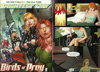
In one of those weird juxtapositions one sometimes finds in super-comics, the very last page of the story (which is set in the present, after Barbara Gordon had given up her Batgirl identity to become Oracle), is on a page facing a house ad for the new volume of the series Birds of Prey.
The result is that readers get to see the character drawn in two very different styles by two very different artists at the same time.
Here's a better look at the house ad, featuring Benes' muscular, buxom Oracle, with a face completely identical to that of Black Canary (They even have the exact same little identation between their upper lips and noses, which catch the light in the exact same way!):
And here's Chiang's Barbara Gordon from within the story:
I don't really care for Benes' work much, but it's kind of neat to see his version of the character side by side with Chiang's like this. They look like the same person, so its not like either artist did anything radical in terms of character design, and yet the two artists render the character completely differently.
That is, both Barbara Gordons look like Barbara Gordon, but through very different aesthetic lenses.
(By the way, if you haven't read the issue and have no interest in ever doing so, at least read the dialogue JMS wrote for Oracle in that last panel, and try not to laugh).
Monday, April 26, 2010
Heads-up: There's a pretty nice John Romita Jr. piece in USA Weekend.
Are you familiar with USA Weekend, the Gannett Company-produced entertainment magazine insert that is distributed nationally as a pull-out section of Sunday Gannett papers?
Well, this past weekend's edition had a cover story about Robert Downey Jr. and Scarlett Johansson. The story is only a couple hundred words long, and it's mostly about the photo shoot the two stars did from the cover, consisting of observations about how good-looking Johansson is and what she's wearing and quotes from the two stars about how much they like each other and the movie.
You can read the story online here if you're curious, and there's a Downey/Johansson gallery from the shoot here, but for our purposes the most exciting piece of the Iron Man 2 coverage package is this, a 17-inch centerfold pull-out poster spanning two pages of the insert.
It's an interesting piece, in which Romita draws the all of the principal characters from the movie, in an old-fashioned Hollywood blockbuster movie poster lay-out (save it's horizontal instead of vertical). I thought it was especially interesting because Janson's an artist with an extremely distinctive style (as is Klaus Janson, who inked the piece), and not one known for doing celebrity likenesses.
The characters are clearly the movie versions rather than the Marvel Comics versions—Nick Fury's black rather than white, Black Widow has kinky rather than straight hair—but Romita drew Tony Stark, Natasha Romanoff and Nick Fury instead of Robert Downey Jr., Scarlett Johansson and Samuel L. Jackson.
I can't fit it on a scanner, so I can't show you the whole piece in detail here (and it doesn't seem USA Weekend wants me to anyway, so go click around their site), but there's a couple of the heads above, and here's a detail of villain Whiplash, who is drawn in a long enough view that his facial features reced and become unimportant—it's the costume and the tech that JRJR's drawing:According to USA Weekend's site, they have a circulation of 22.6 million, with 48 million individual readers each weekend. Which means Romita's artwork got one hell of a big audience this past week, particularly when you consider even a best-selling comic book of his like World War Hulk would have only got about 100,000 sets of eyeballs per issue.
Between this and the film Kick-Ass (which, successful or not, still got a lot more looks than the comic did, and I assume Romita got a created by credit during the title sequence...?), Romita must be having one hell of a month.
Oh, and he's drawing Marvel's Free Comic Book Day offering, which should be fairly widely distributed to people who don't already read Marvel comics every Wednesday, and then drawing a new Avengers series written by Brian Michael Bendis, huh? Romita's going to be having one hell of a month next month too.
It's nice to see a talented, hard-working artist get so much attention...particularly when that artist is still around to enjoy it and personally benefit from it.
Ed Benes' Scarecrow
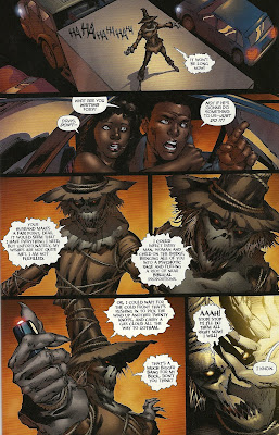
That's Ed Benes' Scarecrow, inked by Rob Hunter and colored by Ian Hannin and J.D. Smith. Benes drew the character in 2009's Batman #687 (review here).
I think the design most closely resembles that of Kelley Jones, with the rope entiwined around the body and a skull-like face registering through the mask, with glowing pinpoint eyes.
Benes' Scarecrow has a more jack o' lantern-like face, however, with a jagged mouth formed by interlocking triangle teeth. His red eyes look like they're rattling around in empty skull sockets, and in lieu of a nose he has to little nostril holes.
Here's a page from the comic, with few more panels of the Scarecrow:
All in all, he looks like a skelton from the mouth to the hat brim, with a jack o'lantern mouth, and grungy hair, which could either be straw or simply really dirty human hair.
It's a pretty good design for the character, and certainly accentuates his scariness—unlike some of the other Scarecrow designs, there's no "off" switch on this costume; it looks like the face is always going to be really scary, no matter what the man inside is doing, thinking or feeling. Heck, it doesn't even look all that much like there is a man inside.
I was pleasantly surprised to see that Benes gave the character a rather skinny, scarecrow-like physique too, instead of simply defaulting to his standard male character design, which he sometimes employs far too generously.
Sunday, April 25, 2010
Library comics: A brief introduction, and Batman #687
My current base of operations is a small town in northeast Ohio, right on the coast of Lake Erie. How small a small town is it? The population is currently about 21,000, and the whole city is just under eight square miles—as long as you’re not carrying anything heavy, you can get anywhere in it on bicycle.
There are two libraries within the city limits, and their collections leave a lot to be desired, especially if you’ve just moved here after spending years in Columbus, Ohio, where the 22-branch Columbus Metropolitan Library system carries just about every single graphic novel or comics collection you can think of—the only ones I haven’t been able to find that I’ve looked for there have been the two recent-ish Uncle Sam and The Freedom Fighters series from DC.
Given the size of the community they serve, it’s perhaps no surprise that this libraries aren’t overflowing with comics collections, and they’re suffering from the same financial stresses as every other library in Ohio…and our neighbor to the East, Pennsylvania and, for all I know, every library in the US.
A poor economy and housing market has lead to less taxes being collected, which has lead to state governments being much poorer than expected, which has lead to cuts, which has lead to libraries with shrinking state support, meaning less money for collections, which means fewer Kevin Smith and Jeph Loeb trade collections.
Especially if you’re a small library serving a small town.
Of the two libraries, I believe I mentioned that one of them doesn’t even have a graphic novel section, just some Neil Gaiman, Alan Moore and manga comics intershelved with the fiction in the youth section (the other library does have a small collection, which is where I’ve been getting all those crappy Teen Titans books).
The graphic novel section-less library did carry comic books however, in the form of off-the-rack, single-issue, comic book-comics, which I was a little surprised to see. In the youth magazine section, there were three stacks of comics, with one issue from each stack given a little display slot in which the cover faced out to let patrons know what books were in those stacks.
The three stacks each consisted of a single title, all DC books: Batman, Superman and Scooby-Doo. I didn’t check the dates, but the Superman and Batman piles seemed to start shortly after the 2006 “One Year Later” jump. Batman began with the Morrison run and went all the way up to the latest issue of the series, the Tony Daniel-written, Guillem March-drawn Batman #698. Superman began with some Kurt Busiek-written issue, and seemed to continue well into the current James Robinson-written, triangle-numbered crossover era.
I assume the library had subscriptions to each of these titles, it struck me as a little odd given the relative cheapness of trades paperback collections (particularly with the discounts libraries can get) and the fact that trades will last indefinitely, whereas comics tend to fall apart awfully quickly. It’s especially odd given that Superman has been crossing over into two to four other titles a month, so if you only read Superman, you’d be reading every fourth chapter of a story, without access to the chapters in between.
While I’ve read some of these comics (the Morrison-written issues of Batman, the Busiek-written Superman and some of Robinson’s earlier issues of the same title), there were an awful lot I haven’t.
So I scooped up stacks of each, and decided I’d blog my way through them. I’m going to start with Batman #687, and then divide the Batman stack into a couple of posts, as the creative teams change a bit during those dozen or so issues.
********************
Batman #687
If you’ve been reading this blog very long, than chances are you’re well aware of my feelings about Judd Winick’s DC superhero writing and Ed Benes’ artwork. To put it mildly, neither of them are particular favorites of mine, and, if you asked me to assemble a creative team that would guarantee that I wouldn’t buy a particular comic book, Judd Winick and Ed Benes would probably be it.
They’re the creative team for this issue, with Rob Hunter inking Benes’ pencils, and Tony Daniel, another artist whose work I’ve found incredibly disappointing, provides the cover.
Needless to say, I didn’t buy this issue of the new comics shelf the week it came out.
It’s cover is branded with a “Batman: Reborn” banner above the title, indicating that this is one of the post-“Batman R.I.P.”, post-mourning issues of a Batman comic, in which Dick Grayson becomes Batman and the whole Batus quo gets a bit of a shaking up (Damian is the new Robin, they leave the Batcave for an underground bunker in downtown Gotham, they have a new Batmobile, Tim Drake leaves town to dress up like a character from Kingdom Come, etc).
The title page refers to the story, “A Battle Within,” as “an epilogue to Battle for the Cowl,” although it’s not really. In fact, this story is about Dick Grayson’s decision to become the new Batman, despite his reservations about doing so, which was also the subject of Battle for the Cowl. In other words, this tells the same story as that more-or-less unnecessary story, only completely differently. It’s not exactly contradictory, but it is redundant—one need not read both Battle and this issue, and, in fact, were probably better off skipping Battle, as this story is shorter and better.
And this is something rather interesting about the current state of the Batman franchise—the various Batman-starring titles all seem to be telling the same story, so a devoted Batman fan need not read them all, but simply choose the one they like best. Grant Morrison’s Batman and Robin—the flagship book which, after Morrison left Batman, has been driving the overall Batman story, with the other titles following Morrison’s lead—explained the changing-of-the-Batmen its way. Battle for the Cowl offered another explanation. It seems Batman did as well. DC seems to be offering readers their choice of flavors, as if the publisher would like you to pick a Batman book or two to follow and ignore the rest, rather than trying to push them all on you (banner branding aside).
There’s nothing wrong with that, of course. I picked my preferred flavor of Batman—Morrison and a series of guest artists’ Batman and Robin—and got a complete Batman story without needing to follow anything going on in Batman, TEC, Batman: Streets of Gotham, Red Robin, Batgirl, etc. It’s nice that the publisher has laid out a choose-your-own-Batman-adventure line of comics, but it’s a little weird too, isn’t it? Why not try to sell all Batman comics to all Batman fans? Is DC, or at least the Batman office, not chasing every dollar possible, not squeezing as much money out of their core readers as possible? That’s…unusual.
Because this is first appearance of Dick Grayson as Batman (well, one of the first appearances of Dick Grayson as Batman…the first appearance of Dick Grayson as Batman in the title Batman, I guess), it’s a special issue, 30- pages long and with a one-off artist in the person of Benes.
It’s by far the best work I’ve seen from Benes since his run on Birds of Prey, perhaps in large part because the cast of the book—Dick Grayson at two different ages, Alfred, Damian, some guests in certain scenes—is a lot smaller and more varied in age than the cast he was so struggling with in Justice League of America, where everyone looked the same and Benes rarely seemed to furnish panels with backgrounds.
It probably also helps that there are next to no women in the issue—Wonder Woman gets three panels, and that’s about it—so his habit of over-sexualizing all female characters regardless of the context didn’t distract from the story the way that his JLoA work did.
Or, as I’m fishing for explanations, there’s also the possibility that Rob Hunter’s inks look better on Benes’ pencils than some of the others who have inked him before.
Or hell, I don’t know, maybe Benes had just gotten a lot better than he was.
Well, this part sucked:
Took me a couple of readings to realize the point of view flipped between the second and third panel there; it looks a bit like the figure atop the penny jumped into Batman and knocked him backwards.
Which isn’t to say he’s dynamite here or anything. His character work still has all the drama of posed action figures. Take, for example, this scene, in which Superman and Wonder Woman deliver Batman’s recovered cape and cowl to the cave and ask Alfred if he’s doing all right:
Ha, I love that panel of everyone striking an identical eyes-downcast-but-still-flexing pose during their “awkward” silence.
This is also one of the best DC scripts I’ve seen from Judd Winick. In fact, I can’t really find anything wrong with it. I’m not fond of the assigning more than one narrator to a single story, but there are no mistakes in it; nothing grates or sounds too off, no one talks about anything wildly inappropriate.
The book opens with a scene from back in the day, with a young, still-Robin Dick Grayson launching a sneak attack on Batman in the cave as part of his bat-homework, before jumping to Alfred staring at an empty cape and cowl in a display case, being sad about the fact that Bruce Wayne “died” during Final Crisis and now there’s no Batman.
Grayson is still in the cave and still fighting crime, but doing so from the shadows or safely from within the cockpit of the Batmobile, while dressed as Nightwing…he doesn’t want to put on the suit and make it official.
The book ends with The Scarecrow holding a city bridge hostage with strategically placed fear gas chemical bombs, and then Dick Grayson sneaks up on him to confront him, not appearing in the Batman suit until the very last panel, a last-page splash page.
Along the way, Winick explains some of the things that probably aren’t all that important—that is, Morrison glossed over them in order to leave them to the readers’ imagination—but if you wanted to know why Batman didn’t have a big Superman-style funeral, or why Dick and company relocated to downtown, or why he finally relented and decided to become Batman (aside from the rationale given in Battle), well, here you go.
One nice thing Winick did, and will do more of later, was to go out of his way to stress how Dick Grayson’s Batman and Bruce Wayne’s Batman are pretty different Batmen, something Alfred stresses when the two of them share repartee.
If I were Winick or Benes, and a friend asked me if they could read some of the stuff I’d done for DC, this would probably be the first book I’d hand that friend.
Next: Winick, Hunter and Mark Bagley's Batman #688-691
There are two libraries within the city limits, and their collections leave a lot to be desired, especially if you’ve just moved here after spending years in Columbus, Ohio, where the 22-branch Columbus Metropolitan Library system carries just about every single graphic novel or comics collection you can think of—the only ones I haven’t been able to find that I’ve looked for there have been the two recent-ish Uncle Sam and The Freedom Fighters series from DC.
Given the size of the community they serve, it’s perhaps no surprise that this libraries aren’t overflowing with comics collections, and they’re suffering from the same financial stresses as every other library in Ohio…and our neighbor to the East, Pennsylvania and, for all I know, every library in the US.
A poor economy and housing market has lead to less taxes being collected, which has lead to state governments being much poorer than expected, which has lead to cuts, which has lead to libraries with shrinking state support, meaning less money for collections, which means fewer Kevin Smith and Jeph Loeb trade collections.
Especially if you’re a small library serving a small town.
Of the two libraries, I believe I mentioned that one of them doesn’t even have a graphic novel section, just some Neil Gaiman, Alan Moore and manga comics intershelved with the fiction in the youth section (the other library does have a small collection, which is where I’ve been getting all those crappy Teen Titans books).
The graphic novel section-less library did carry comic books however, in the form of off-the-rack, single-issue, comic book-comics, which I was a little surprised to see. In the youth magazine section, there were three stacks of comics, with one issue from each stack given a little display slot in which the cover faced out to let patrons know what books were in those stacks.
The three stacks each consisted of a single title, all DC books: Batman, Superman and Scooby-Doo. I didn’t check the dates, but the Superman and Batman piles seemed to start shortly after the 2006 “One Year Later” jump. Batman began with the Morrison run and went all the way up to the latest issue of the series, the Tony Daniel-written, Guillem March-drawn Batman #698. Superman began with some Kurt Busiek-written issue, and seemed to continue well into the current James Robinson-written, triangle-numbered crossover era.
I assume the library had subscriptions to each of these titles, it struck me as a little odd given the relative cheapness of trades paperback collections (particularly with the discounts libraries can get) and the fact that trades will last indefinitely, whereas comics tend to fall apart awfully quickly. It’s especially odd given that Superman has been crossing over into two to four other titles a month, so if you only read Superman, you’d be reading every fourth chapter of a story, without access to the chapters in between.
While I’ve read some of these comics (the Morrison-written issues of Batman, the Busiek-written Superman and some of Robinson’s earlier issues of the same title), there were an awful lot I haven’t.
So I scooped up stacks of each, and decided I’d blog my way through them. I’m going to start with Batman #687, and then divide the Batman stack into a couple of posts, as the creative teams change a bit during those dozen or so issues.
********************
Batman #687
If you’ve been reading this blog very long, than chances are you’re well aware of my feelings about Judd Winick’s DC superhero writing and Ed Benes’ artwork. To put it mildly, neither of them are particular favorites of mine, and, if you asked me to assemble a creative team that would guarantee that I wouldn’t buy a particular comic book, Judd Winick and Ed Benes would probably be it.
They’re the creative team for this issue, with Rob Hunter inking Benes’ pencils, and Tony Daniel, another artist whose work I’ve found incredibly disappointing, provides the cover.
Needless to say, I didn’t buy this issue of the new comics shelf the week it came out.
It’s cover is branded with a “Batman: Reborn” banner above the title, indicating that this is one of the post-“Batman R.I.P.”, post-mourning issues of a Batman comic, in which Dick Grayson becomes Batman and the whole Batus quo gets a bit of a shaking up (Damian is the new Robin, they leave the Batcave for an underground bunker in downtown Gotham, they have a new Batmobile, Tim Drake leaves town to dress up like a character from Kingdom Come, etc).
The title page refers to the story, “A Battle Within,” as “an epilogue to Battle for the Cowl,” although it’s not really. In fact, this story is about Dick Grayson’s decision to become the new Batman, despite his reservations about doing so, which was also the subject of Battle for the Cowl. In other words, this tells the same story as that more-or-less unnecessary story, only completely differently. It’s not exactly contradictory, but it is redundant—one need not read both Battle and this issue, and, in fact, were probably better off skipping Battle, as this story is shorter and better.
And this is something rather interesting about the current state of the Batman franchise—the various Batman-starring titles all seem to be telling the same story, so a devoted Batman fan need not read them all, but simply choose the one they like best. Grant Morrison’s Batman and Robin—the flagship book which, after Morrison left Batman, has been driving the overall Batman story, with the other titles following Morrison’s lead—explained the changing-of-the-Batmen its way. Battle for the Cowl offered another explanation. It seems Batman did as well. DC seems to be offering readers their choice of flavors, as if the publisher would like you to pick a Batman book or two to follow and ignore the rest, rather than trying to push them all on you (banner branding aside).
There’s nothing wrong with that, of course. I picked my preferred flavor of Batman—Morrison and a series of guest artists’ Batman and Robin—and got a complete Batman story without needing to follow anything going on in Batman, TEC, Batman: Streets of Gotham, Red Robin, Batgirl, etc. It’s nice that the publisher has laid out a choose-your-own-Batman-adventure line of comics, but it’s a little weird too, isn’t it? Why not try to sell all Batman comics to all Batman fans? Is DC, or at least the Batman office, not chasing every dollar possible, not squeezing as much money out of their core readers as possible? That’s…unusual.
Because this is first appearance of Dick Grayson as Batman (well, one of the first appearances of Dick Grayson as Batman…the first appearance of Dick Grayson as Batman in the title Batman, I guess), it’s a special issue, 30- pages long and with a one-off artist in the person of Benes.
It’s by far the best work I’ve seen from Benes since his run on Birds of Prey, perhaps in large part because the cast of the book—Dick Grayson at two different ages, Alfred, Damian, some guests in certain scenes—is a lot smaller and more varied in age than the cast he was so struggling with in Justice League of America, where everyone looked the same and Benes rarely seemed to furnish panels with backgrounds.
It probably also helps that there are next to no women in the issue—Wonder Woman gets three panels, and that’s about it—so his habit of over-sexualizing all female characters regardless of the context didn’t distract from the story the way that his JLoA work did.
Or, as I’m fishing for explanations, there’s also the possibility that Rob Hunter’s inks look better on Benes’ pencils than some of the others who have inked him before.
Or hell, I don’t know, maybe Benes had just gotten a lot better than he was.
Well, this part sucked:
Took me a couple of readings to realize the point of view flipped between the second and third panel there; it looks a bit like the figure atop the penny jumped into Batman and knocked him backwards.
Which isn’t to say he’s dynamite here or anything. His character work still has all the drama of posed action figures. Take, for example, this scene, in which Superman and Wonder Woman deliver Batman’s recovered cape and cowl to the cave and ask Alfred if he’s doing all right:
Ha, I love that panel of everyone striking an identical eyes-downcast-but-still-flexing pose during their “awkward” silence.
This is also one of the best DC scripts I’ve seen from Judd Winick. In fact, I can’t really find anything wrong with it. I’m not fond of the assigning more than one narrator to a single story, but there are no mistakes in it; nothing grates or sounds too off, no one talks about anything wildly inappropriate.
The book opens with a scene from back in the day, with a young, still-Robin Dick Grayson launching a sneak attack on Batman in the cave as part of his bat-homework, before jumping to Alfred staring at an empty cape and cowl in a display case, being sad about the fact that Bruce Wayne “died” during Final Crisis and now there’s no Batman.
Grayson is still in the cave and still fighting crime, but doing so from the shadows or safely from within the cockpit of the Batmobile, while dressed as Nightwing…he doesn’t want to put on the suit and make it official.
The book ends with The Scarecrow holding a city bridge hostage with strategically placed fear gas chemical bombs, and then Dick Grayson sneaks up on him to confront him, not appearing in the Batman suit until the very last panel, a last-page splash page.
Along the way, Winick explains some of the things that probably aren’t all that important—that is, Morrison glossed over them in order to leave them to the readers’ imagination—but if you wanted to know why Batman didn’t have a big Superman-style funeral, or why Dick and company relocated to downtown, or why he finally relented and decided to become Batman (aside from the rationale given in Battle), well, here you go.
One nice thing Winick did, and will do more of later, was to go out of his way to stress how Dick Grayson’s Batman and Bruce Wayne’s Batman are pretty different Batmen, something Alfred stresses when the two of them share repartee.
If I were Winick or Benes, and a friend asked me if they could read some of the stuff I’d done for DC, this would probably be the first book I’d hand that friend.
Next: Winick, Hunter and Mark Bagley's Batman #688-691
Saturday, April 24, 2010
You know who should draw Aquaman? Kate Beaton.
That's the second panel of a recent Aquaman strip the cartoonist posted here.
You'll notice that the Aquaman she draws is the 1990's version, from the Peter David-written volume of Aquaman, with the beard and the harpoon hand. Why that Aquaman? Here's what Beaton wrote under the strip:
I could definitely get into a "crazy dude living under the water" take on Aquaman, especially as drawn by Beaton. She certainly has a way with DC superheroes. If you missed it, here's her Wonder Woman strip from last fall.
You'll notice that the Aquaman she draws is the 1990's version, from the Peter David-written volume of Aquaman, with the beard and the harpoon hand. Why that Aquaman? Here's what Beaton wrote under the strip:
As new as I am to learning about superheroes, everything that is well known to everyone else—like the fact that Aquaman is regarded as kind of lame—is new and hilarious. I read a bit about Aquaman growing a beard and having a harpoon hand and living in a cave and talking to spirits or something, and thought, how can anyone not like this guy? This crazy dude living under the water. Anyway that is the only version of Aquaman that I am really into.
I could definitely get into a "crazy dude living under the water" take on Aquaman, especially as drawn by Beaton. She certainly has a way with DC superheroes. If you missed it, here's her Wonder Woman strip from last fall.
Labels:
aquaman,
awesomeness,
kate beaton,
links,
wonder woman
Friday, April 23, 2010
Comic shop comics (April 21st)
Archie #608 (Archie Comics) Wow, Archie Comics aren’t very well written, are they? The artwork in this issue, which had an intriguing enough cover that even I noticed it and decided to pick it up, was fairly decent, with pencil artist Bill Galvan and inker Rich Koslowski affecting a Dan DeCarlo-designed style well enough, although the Pussycats all seem a lot thinner and less curvy than I remember seeing them.
So liked looking at the characters in the panels okay, but jeez, do they have to make these things so damn painful to read?
Avengers Vs. Atlas #4 (Marvel Comics) The fourth and final issue of Jeff Parker and Gabriel Hardman’s miniseries pairing the Agents of Atlas team with the original Avengers line-up concludes with the latter taking center stage, doing battle with an elaborate metaphor for a Marvel Comics fan’s desire for an ideal, personal, static continuity. Like the three issues that preceded it, it’s a nicely done, fun, straightforward, old school superhero comic, featuring quite lovely art. Hardman, colored by Elizabeth Breitweiser, comes up with some pretty interesting ways to communicate semi-abstract concepts like a sentient chronovirus, and a character at different points in his own timeline communicating with himself, while everyone else looks on psychically.
The Agents solo back-up story is “My Dinner With Gorilla Man,” a tense, one-scene story by Jason Aaron and Giancarlo Caracuzzo in which Gorilla Man meets someone who wants to take his curse from him by force.
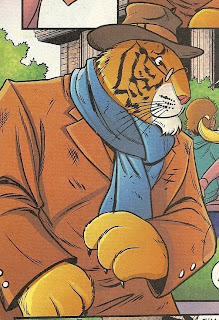
Billy Batson and the Magic of Shazam #15 (DC) Still the #1 comic book source for images of nattily dressed tigers:
Brave and the Bold #33 (DC) J. Michael Straczynski and Jesus Saiz’s run on this title has mostly consisted of JMS finding two unlikely characters to stick together in a zany-sounding team-up, and then proceed to tell the most downbeat, dour faux-serious story he could think up.
This issue also has an unlikely team-up: Wonder Woman, Zatanna and Batgirl Barbara Gordon, but instead of Saiz the artist is Cliff Chiang, one of the comics industry’s number one artists when it comes to the drawing of beautiful women.
JMS would have to work awfully hard if he was going to turn 22-pages of Chiang drawing pretty girls into a downer.
But by page seven, when Zatanna and Wonder Woman convince Batgirl that they all need to take a night off once in a while to party if only to de-stress and stay sharp, I was pretty sure JMS had changed his ways. The whole middle section of the book consists of these super-girls putting on dresses and having fun: Clubbing, dancing with old men, doing karaoke, eating late-night breakfast in a diner, etc.
But he got me again! I don’t want to spoil the exact nature of the ending, but suffice it to say that while the bulk of the story may be set years back, when Barbara Gordon was still Batgirl, it ends with a coda set in modern times, and there’s a very particular reason these three particular heroines are all out dancing together.
The last panel is about as ham-handed as a panel can possibly be, with Barbara Gordon stating something that was completely obvious without her needing to say a word not one time, not two times, not three times, but four times in a single panel.
The result is a conclusion that seems overly fussy, and makes the entire story, as fun as it is, seem like a rather unnecessary continuity patch along the lines of explaining why Barry Allen wears a bow tie or why Power Girl decided to quit wearing that yellow costume she sported for a while. And it’s too bad that JMS’ effort is so apparent, because Chiang’s art is effortless.
Click to get a better look of this montage splash page:
I hate to praise his work too specifically, because a lot of what’s good about his work should be industry-standard, rather than exceptional—his characters look like real people, he draws different characters with different body types and facial structures, he draws settings and costumes like he’s left his apartment and seen clothes in real life, and so on.
It’s lovely, lovely work, and well worth picking the book up just to look at.
Oh, and JMS and Chiang manage two completely unexpected shining moments in here. One is a neat fake-out on page 13, and the other is the peculiar lay-out that splits the comic in half during the only two-page spread in the book, in which a panel from another comic book seemingly intersects with this narrative perpendicularly, breaking one of Brave and the Bold #33’s panels clean in half.
Green Lantern #53 (DC) It may be the “Brightest Day,” but it’s hardly a new day. In Geoff Johns’ first post-Blackest Night issue of Green Latnern, the book the event spun out of, I was overwhelmed with a sense of déjà vu repeatedly.
There’s a classic GL supervillain in touch with some sort of mysterious, ancient cosmic threat, there’s what looks to be some sort of evil Guardian talking about ancient prophecy whatnot (a Guardian-type who also looks like its maybe a mummy? Awesome!), you’ve got a room full of obelisks devoted to the different colors/emotions from the War of Light, and so on.
Additionally, all of the various colored Lantern characters are apparently sticking around, as six of the seven shown on the cover appear within.
It’s a weird sort of set-up issue (ending with three different mini-ads for three different characters who will be appearing in three different books), in which a lot happens and yet nothing seems to happen.
There was enough comical Hal Jordan hero worship (villain Hector Hammond’s whole deal has, under Geoff Johns, become that he just thinks Hal Jordan is so damn handsome and cool that he wants to become him), and more than enough Johnsian zaniness to keep me fully engaged.
For example, Sinestro throwing up a peace sign shield to block an attack, Larfleeze’s use of his own personal Guardian, the fact that the little mummy bad guy seems to be planning to collect all those crazy Pokemon angel monsters like Parallax and a rather jowly-looking Lex Luthor coming up with another wild land scheme.
I’m really glad that Doug Mahnke and Christian Alamy are sticking around as the creative team on GL now that Blackest Night is over (and Ivan Reis is presumably available again…or will be, once he recovers). They are both incredible artists, and Mahnke’s ability to do superheroes, comedy, and rather detailed scary-ass shit makes him a perfect choice for a superhero title full of weird aliens and goofy concepts.
I can’t stop looking at his Lex Luthor, who looks like the old Silver Age Luthor from the neck up, as if he’s gotten that sort of puffy, fat-face look that some Holywood actors get when they reach a certain age, and all the Ethan Van Sciver-level of detail he and Alamy pack into the faces of the more monstrous characters.
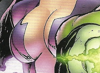
Oh, by the way, is there a reason Carol Ferris doesn't have nipples?
Was that explained in some Green Lantern story from the '80s I missed?
Hercules: Fall of an Avenger #2 (Marvel) Greg Pak and Fred Van Lente’s script is as fun and funny as always, but holy moley, what is up with Ariel Olivetti’s art? Painted-looking figures pose and float before blank spaces filled with either computer-generated color fields, special effects and dropped-in photos. It’s ugly, ugly stuff, and there’s no reason a story revolving around a bunch of Greek gods, Marvel superheroes, and Greek gods filtered through Jack Kirby designs should look so lifeless.
Also, I’m going to have to subtract some points for this scene, in which Phobos shows Pluto his worst fears,as I’ve already seen that scene, in Alan Grant and Simon Bisley’s Batman/Judge Dredd: Judgment on Gotham(Which isn’t to say they swiped it intentionally or maliciously or anything; only that it’s not all that original gag, and it was better executed by Grant and Bisley, as they gave it more space and a lot more effort).
The Agents of Atlas back-up, in which Agents Namora and Venus travel the world informing Herc’s old business associates that the immortal hero had apparently died, has a lot more life in it, thanks to pencil artist Reilly Brown’s expressive, action-packed, honest-to-God, panel-border-to-panel-border drawn artwork.
The back-up loses points too, however, for a scene in which the script mentions a minotaur, but the art shows a centaur.
Oh, the shame…
Justice League of America #44 (DC) Hi James Robinson, how’s it going? I know you probably don’t want or need any comics-writing advice from me, given that you’re a successful professional comic book writer and I’m just some guy who complains about comic books on the Internet, but after reading the latest issue of JLoA, I think I’ve noticed one major problem you seem to be stuck on.
You know how about, oh, ten years ago, when thought bubbles stopped appearing in Marvel Comics, and the trend of eschewing thought bubbles for narration boxes came into vogue? That is an absolutely fine and legitimate stylistic choice, putting character narration into narration boxes instead of thought bubbles floating above their heads, as all you’re really doing is switching the point-of-view of the comic from a sort of third-person, omniscient narrator constantly checking in on the thoughts of the lead to a first-person story narrated by the protagonist.
But if you’re going to have a bunch of characters thinking thoughts, say, four, then it doesn’t work quite as well, since what you’re doing is no longer sharing the characters’ thoughts so much as introducing four first-person narrators into a narrative that already has a third-person omniscient narrator, and what you get is a mess. Like Jeph Loeb’s Superman/Batman, or Brad Meltzer’s Identity Crisis and JLoA, only worse.
Basically, your book ends up reading just like an old Chris Claremont-written X-Men comic from back in the day, only a little more pretentious and a lot more colorful. Well, good luck with the rest of your run! I hope you got all of your shittiest writing out of your system with Cry for Justice!
Showcase Presents: Dial H For Hero Vol. 1 (DC) I didn't read this one yet. It's long.
Tiny Titans #27 (DC) Raven is babysitting Kid Devil for the weekend, and her father, the four-eyed, be-antlered interdimensional demon god Trigon, is quite taken with the infernal toddler. Featuring a one-panel cameo by Blue Devil…from the neck down.
Thursday, April 22, 2010
Wednesday, April 21, 2010
Deadman and his White Lantern ring to the rescue
(Panels from Tony Millionaire's Sock Monkey #2, from Dark Horse's 2000 miniseries and from DC's Brightest Day #0, penciled by Fernando Pasarin. Scans of the former swiped from this post)
I can't decide.
Tuesday, April 20, 2010
Marvel July previews reviewed
I have zero interest in ever reading another Joe Quesada-written Spider-Man story after the last one—retconned continuity aside, "One More Day" was just plain terrible comics writing—but I have to admit I really dig this Paolo Manuel Rivera cover to Quesada’s story about what happened on Spider-Man’s wedding day now that he’s no longer married. According to Chris Sims, it’s a tale at least partially inspired by Whitney Houston.
Amanda Conner sure is a good drawer, huh? And that’s a pretty great cover all around—design, story pitch, rendering, total package.
Wow. That is some cover. Take a bow, Brett Booth.
Holy shit, This is the greatest X-Men cover ever. I want to buy this issue just to leave it on my coffee table so people will ask me what the hell is wrong with me and what Astonishing X-Men is, since it doesn’t look very much like the movies they’ve seen.
DEATH OF DRACULA #1
Written by VICTOR GISCHLER
Penciled by GIUSEPPE CAMUNCOLI
Cover by GIUSEPPE CAMUNCOLI & MARKO DJURDJERVIC
He is the legendary Lord of the Vampires. Dracula. Who would dare attempt to overthrow him? Only Dracula's son Xarus, a ruthless and clever upstart with the bold ambition to unite all the world’s vampire sects under one flag. But Xarus's older brother Janus isn't sure he likes the idea of a new regime and seeks allies to oppose Xarus. The ultimate battle to control Earth's Creatures of the Night unfolds, with the future of the vampire race – and possibly the Marvel Universe – at stake.
48 PGS./One-Shot/Parental Advisory ...$3.99
Get out of Mark Millar’s head, Victor Gischler!
GORILLA MAN #1 (of 3)
Written by JEFF PARKER
Penciled by GIANCARLO CARACUZZO
Cover by DAVE JOHNSON
“If you kill the magical Gorilla-Man, you become immortal.”
Shooting from the pages of ATLAS, comes an all-new exploration of fan-favorite GORILLA MAN! Yes, Ken Hale is blessed with might and cursed with inhumanity, but you don’t know the entire tale, and how his history may destroy his present! See his storied past as an Agent of Atlas, a soldier of fortune, an ally of the Avengers, and a Howling Commando! Three incredible issues by JEFF PARKER (ATLAS, THUNDERBOLTS, FALL OF THE HULKS ALPHA) and GIANCARLO CARACUZZO (ATLAS)! Plus a "Many Legends of the Gorilla Man" reprint.
40 PGS./Rated T+ ...$3.99
Fuck yeah! This first issue is $4, but includes a reprint of a story I actually really wanna read. Now, do I buy the singles, or wait for the trade? I trade-waited the Marvel Boy series, but then, that was about a Marvel Boy, and this is about a gorilla man.
Well, I guess I've got a few months to mull it over yet.
LUKE CAGE NOIR GN-TPB
Written by MIKE BENSON & ADAM GLASS
Penciled by SHAWN MARTINBROUGH
Cover by DENNIS CALERO
During his ten years inside Riker’s, he went by the name of Inmate 3457AG15. But on the outside, he was known as Luke “The Power Man” Cage, an urban legend to a people that needed a hero. Now, he’s been released. But on his first day on the outside, he finds out there’s one hell of a price to being free. He’s been extended a helping hand by childhood chum, Stryker, now mob boss of all of Harlem. He’s been given a very stiff arm by one of the city’s most vicious enforcers, Tombstone. And he’s been given a hard job by Randall Banticoff, a white man with a white wife found dead in a Harlem alleyway. Is Luke Cage destined to be a hero for hire? Or just a chump for a double-crossing set-up? Collecting LUKE CAGE NOIR #1-4.
112 PGS./Rated T+ ...$14.99
Did any of you guys read this series? What's the verdict? Good? No good? I haven't sampled any of these Noir books yet, but I really like Shawn Martinbrough's art.
MARVELMAN CLASSIC VOL. 1 PREMIERE HC
Written by MICK ANGLO & VARIOUS
Penciled by MICK ANGLO & VARIOUS
Covers by MICK ANGLO & JOE QUESADA
Who is the mysterious Marvelman? If you only know him from his dark, deconstructionist eighties revival, then you don’t know Marvelman! Go back to the very beginning — 1954’s MARVELMAN #25 — and witness firsthand the earliest atomic-powered adventures of the mightiest man in the universe...the fearless fighter of evil know as Marvelman! Collecting material from MARVELMAN #25-34 in the original black-and-white..
160 PGS./Black & White/All Ages ...$34.99
Woah, $35 for 160 pages in black and white? That’s a whole lot, isn’t it? I’d be interested in checking this out in an Essential format, or something akin to DC’s Chronicles program format, and I’m one of the relatively few Wednesday Crowd-ers who are genuinely excited about Golden Age super-comics.
Actually, 1954…that’s probably really pushing the definition of “Golden Age,” isn’t it? And yet it’s not quite within the bounds of the US industry’s Silver Age either. Hmm, now I’m even more curious about this book. But not at that price point.
MARVELMAN FAMILY'S FINEST #1 (of 6)
Written by MICK ANGLO & VARIOUS
Penciled by MICK ANGLO & VARIOUS
Cover by MARKO DJURDJEVIC
Remastered Variant Cover by MICK ANGLO
Variant Cover by DOUG BRAITHWAITE
“A recluse Astro-Scientist discovers the key word to the Universe, one that can only be given to a Boy who is completely honest, studious, and of such integrity that he would only use it for the powers of good. He finds such a Boy in MICKY MORAN, a Newspaper Copy Boy, and treats him in a special machine which enables him to use the secret. Just before the Scientist dies, he tells MICKY the key word which is KIMOTA. Micky Moran remains as he was, but when he says the Key Word KIMOTA he becomes MARVELMAN, a man of such strength and powers that he is Invincible and Indestructible!” And with those words in 1954’s MARVELMAN #25 began the saga of one of the most storied characters ever to emerge from the British comics market. Now, thrill to the adventures of Marvelman, Young Marvelman and Kid Marvelman as they take on enemy agents, mad scientists and more in this “best of” series!
40 PGS./Black & White/All Ages ...$3.99
And what’s this nonsense? Just publish a collection of this stuff already no one wants a serial comic book series of it they just want the Alan Moore and company stuff Jesus.
That’s Alessandro Barbucci and Barbara Canepa’s cover for a new Sky Doll series, Sky Doll: Lacrima Christi. I like how you can cherry pick Marvel covers this month—this one, Anita Blake, Astonishing X-Men—and, if you grouped them all together and ignored all the Deadpool and Iron Man stuff, it makes Marvel look like the weirdest porno publisher in the world. Of course, I suppose you could do that almost every month, huh?
X-WOMEN #1
Written by CHRIS CLAREMONT
Pencils and Cover by MILO MANARA
International superstar Milo Manara joins X-Legend Chris Claremont for X-WOMEN! Go on a high-flying, death-defying, globetrotting adventure with your favorite X-Ladies. Storm, Psylocke, Shadowcat, Marvel Girl and Rogue save the world and look great doing it. Don’t miss this prestige event!
64 PGS./One-Shot/Rated T+ ...$4.99
Here's something rather high on the list of things I don't see very often—an X-Men comic I really want to read.
YOUNG ALLIES #2
Written by SEAN MCKEEVER
Penciled by DAVID BALDEON
Cover by DAVID LAFUENTE
Still reeling from the events of last issue, the Young Allies are desperate to hunt down the Bastards of Evil by any means necessary--even if it means taking on their parents!--while the Bastards are up for a little hunting trip of their own...
32 PGS./Rated T+ ...$2.99
"Bastards of Evil" is an infinitely better team name than "Terror Titans."
Marvel's complete solicitations for July releases can be found here.
Subscribe to:
Posts (Atom)