 Batman: The Return #1 (DC Comics) This $5, 30-page comic special—which includes 16 pages of sketches, parts of the script and a reprint of the cover of this very issue in an attempt to justify the extra dollar price tag—leads into the new status quo of the various Bat-books, most particularly writer Grant Morrison’s new, ongoing monthly Batman, Incorporated and pencil artist David Finch’s new, ongoing monthly Batman: The Dark Knight.
Based on this book alone, the former sounds like it should be interesting, as Batman Bruce Wayne attempts to take his war on crime global by turning his small band of Batman lieutenants into a small army of Bat-soldiers.
The latter sounds like a nightmare, unless Finch proves to be a much better writer than he is an artist. His work here shows that she can draw very well, but is a pretty rotten storyteller, which certainly doesn’t bode well for his own book.
Even allowing for the specifics of Finch’s style—the fact that he gives the bats that are “common on the eastern seaboard of the United States of America” huge pterodactyl-sized wings and werewolf heads, for example, or the early-Image Comics over-rendering of character faces—the kindest word I can think of to describe Finch’s abilities to tell a story through images is “amateurish.”
Check out the sequence on pages nine and ten, in which Batman, a gunman wearing a dynamite vest and a young hostage boy all plummet off the edge of a skyscraper, and we lose one of the figures halfway through, and airbags emerge from…somewhere never visually established.
On one panel on page 11, a father clutches his rescued son to his chest, the dialogue explaining how the boy is his “life,” but in a few panels the boy has completely disappeared along with Batman (Did Batman kidnap him, or did Finch just not draw him? The latter, the story suggests; the former, the art suggests).
 Or the spread on page 12 and 13, where the various Bat-people are all at rest in comfortable poses, and in the next panel, Batman has covered some fifty yards, to find Oracle has appeared out of nowhere. He mentions the envelopes the characters are holding in the dialogue, which we see they aren’t holding, and then they suddenly appear in their hands. Was Finch drawing the book panel by panel, as he read the script through for the first time…?
 Morrison’s script is full of some fun ideas, as both the writer and the title character seem very excited about their new direction, although there is an awful lot of looking backwards to Frank Miller’s Bat-canon. Morrison and Finch re-do the Year One scene in which the bleeding, dying Bruce Wayne sees a bat alight on his father’s bust and rings for Alfred to come stop his bleeding, and, later, echo The Dark Knight Returns in a scene in which Batman battles a big, hulking mutant in a mud-pit.
Morrison introduces a crime organization concept that sounds like Marvel’s Hydra or The Spirit’s Octopus with a name change (although it’s still named for an aquatic monster!) and he’s apparently sticking to his Batman-fights-alternate-versions-of-himself-constantly theme, with Bruce Wayne and Damian facing what looks like a Sandperson from Star Wars dressed up as Batman.
There are a few head-scratching moments involving the Bat-girls—
 —made more head-scratching by the fact that both ladies anchor their own titles by writers who aren’t Grant Morrison, but I guess that’s to be expected in a book meant to reset an entire line of books (Red Robin, meanwhile, appears in the corner of one-panel, but never gets mentioned, and Batgirl Cassandra Cain remains MIA and of no concern to Batman and pals).
 Will Batgirl and Birds of Prey pick up on Batman's assignments for Batgirl and Oracle, even if to show them rejecting them, or what? I'm curious about Oracle's "avatar," which seems to involve a Batmobile version of Professor Xavier's hovering action chair from the '90s...
Oh, and since I wrote about the new Batman Incorporated logo previously, I thought I should mention that I liked this one logo from this page of the back matter:
 The third one down, right before the final logo? I like that one okay. Look how far they came from the original concept here though. Wow.
  Brightest Day #14 (DC) This is the next in the series of issues in which the entire issue is devoted to a single storyline. This time, it’s Deadman’s storyline. Seeing the Bat-signal over Gotham, Deadman gets the bright idea to hand the White Lantern ring over to the just-got-back-from-the-dead Batman Bruce Wayne and let him figure out how to complete the quest the ring/Life Entity sent him on.
Batman’s not the right guy for the job, it turns out, but in the process of finding that out, we get to see Ivan Reis draw Batman a couple of times, and put him in a neat-o all-white Bat-costume (I like what Reis and company do with Batman’s eyes on the bottom of page 10, by the way).
We also get a recap of the origin of Deadman, including bits from his childhood that I assume are new, as well as a new development in Deadman and Dove’s working relationship and Batman now knows about the existence of Max Lord.
With the weakest of the Brightest Day artists all MIA, this is an exceptionally strong issue, visually, perhaps the strongest since the almost-all J’onn Jonn’z issue penciled by Gleason.
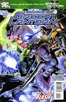
 Green Lantern #59 (DC) I like the part where Larfleeze picks Barry Allen’s pocket. Barry keeps his wallet in a heretofore unseen back pocket in his skintight red suit? I was not aware of that.
This is an exceptionally talky issue, which is only strange in that that Hal and Barry seem to talk to one another for a good 15 pages or so while a coupla space aliens just sort of stand around, three feet away, never butting in to ask who this “Ollie” person they keep mentioning is, or if the two of them would like some privacy or anything.
There are a couple of pretty big plot developments—Salaak want the Guardians to get an earth person to spy on Hal Jordan on behalf of the Corps, the Indigo avatar thingee possesses someone, we learn about the sinister nature of the Indigo tribe, Parallax returns and possesses someone else—but the two parts that stick out in my mind are Larfleeze picking Barry’s pocket and the weird opening sequence about health insurance. It seems like there’s probably a political point being made—or attempting to be made—in that first scene, but I don’t know if I have the energy to look for Geoff Johns’ opinions on federal domestic policy in his book about alien super-cops.
Doug Mahnke and Christian Alamy continue to be the best.
 Justice League of America #51 (DC) The five-person JLA line-up, AKA “Batman’s Angels,” are trapped inside an impenetrable force field with The Crime Syndicate and some big crazy-looking guy calling himself The Omega Man.
I mean, really crazy-looking. Writer James Robinson hasn’t explained this guy’s whole deal yet—he popped out of a resurrection machine that half the people who built it thought would resurrect a dead Luthor and the other half thought would resurrect Darkseid—but I sort of liked him based simply on how insane Mark Bagley’s desig for the character is:
 He looks even more bizarre in profile, when it becomes clear his face is basically part of a small sphere full of teeth and bad guy triangle eyes.
 Oh, and minor character Blue Jay, who Robinson seemingly killed off in his opening issue for the series, is still alive and kicking. Well, punching. That’s cool—I think he’d make a neat addition to this fairly wacky line-up.
This is a very strange issue of an increasingly strange run on the title, so much so that it’s hard for me to even review it, even in the manner of these just write whatever pops into my head as soon as I get done reading a stack of comics style of “reviews.”
There’s a Crisis worth of cameos, and a lot of DC superheroes running around, shouting and fighting. Mark Bagley draws it all, so it looks pretty cool. Robinson’s not doing anything as grand, sharp and exciting as Grant Morrison did on his run, nor is he doing anything as clever, fun and character focused as Keith Giffen and J.M. DeMatteis did during their run, but he’s not doing anything wrong (he’s even toned down the Brad Meltzer-styled multiple-narrator narration quite a bit).
That’s good enough for me.
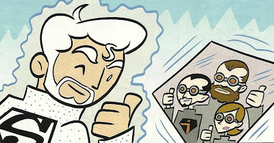
Tiny Titans #34 (DC) The central joke in this issue is that the characters Art Baltazar draws every month finally realize that his style is so stripped down and simplified that very little actually differentiates the characters from one another—mostly it’s just their hair and clothes. So naturally two characters of the same age, gender, hair color and hair style—like Superboy and Zatara—look like identical twins in the pages of Tiny Titans.
 When Zatara winds up in a Superman t-shirt, the confusion gets even worse, and the issue offers more of Baltazar’s puppy version of Krypto (which I never get tired of looking at), wearing a Kid Flash costume in one panel, and more of Baltazar’s version of Jor-El. None of the Jor-El gags were particularly funny this time out, but I just like looking at a Tiny Titans version of the 1978 movie version of the comic book character.
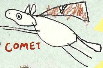
 Oh, and this issue contains a kid named Gordon’s drawings of the various super-pets on the letters page. I’ll just scan one, but they’re all pretty awesome:
 If Baltazar ever needs to take an issue off, I hope they consider letting Gordon draw a Comet story as a fill-in artist.

1 comment:
LOVED that issue of Tiny Titans. As I continue to expose my kids to more comics, they display a certain level of anxiousness and excitement each time we visit the comic shop and they find Tiny Titans has been pulled for us...
Post a Comment