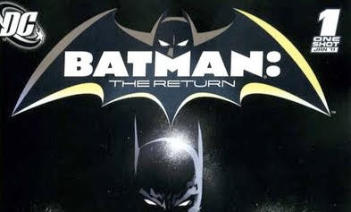
I really like that big, fat colon in the logo. No sarcasm, no exaggeration, no lie...I honestly think that looks really cool next to the big, fat, Batman font up there.
Maybe I like it because of how unusual it looks. You don't see a lot of colons in the titles and logos of comic books really, despite how frequently they have them. Generally, the colon appears in the fine print inside the book, but on the actual cover the sub-title or whatever phrase follows the colon would just appear under the franchise or character title that appears to the right of this. Like, they could have just as easily lost the colon and just centered the word The Return under Batman up there, and we still would have known that this book was Batman: The Return. The colons are usually implied. But this time, they went ahead and just stuck that colon in there, and made it as big, bright and bold as the letters in the word Batman.
That's awesome.
(Yeah, yeah, I know, the littlest things excite me sometimes...)

2 comments:
One thing I don't like about that logo, though, is the way that the M in BATMAN, under the Batman cowl, makes it look like Batman has grown out a soul patch or a skinny goatee.
I noticed this also. Initially I found it strange, until I realized that the colon was there to help center the "M" under the Bat-face.
Post a Comment