 That's Ed Benes' Scarecrow, inked by Rob Hunter and colored by Ian Hannin and J.D. Smith. Benes drew the character in 2009's Batman #687 (review here).
I think the design most closely resembles that of Kelley Jones, with the rope entiwined around the body and a skull-like face registering through the mask, with glowing pinpoint eyes.
Benes' Scarecrow has a more jack o' lantern-like face, however, with a jagged mouth formed by interlocking triangle teeth. His red eyes look like they're rattling around in empty skull sockets, and in lieu of a nose he has to little nostril holes.
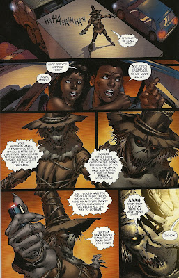
Here's a page from the comic, with few more panels of the Scarecrow:
 All in all, he looks like a skelton from the mouth to the hat brim, with a jack o'lantern mouth, and grungy hair, which could either be straw or simply really dirty human hair.
It's a pretty good design for the character, and certainly accentuates his scariness—unlike some of the other Scarecrow designs, there's no "off" switch on this costume; it looks like the face is always going to be really scary, no matter what the man inside is doing, thinking or feeling. Heck, it doesn't even look all that much like there is a man inside.
I was pleasantly surprised to see that Benes gave the character a rather skinny, scarecrow-like physique too, instead of simply defaulting to his standard male character design, which he sometimes employs far too generously.

2 comments:
I love it when you devote posts to character designs, and particularly Scarecrow's. I love that guy.
I love the jack-o-lantern influence on the mask here. Simplistic but creepy.
I think Benes finally won you over, Caleb.
However, I still think Yellow Lantern Scarecrow is the most interesting the character's ever been, and Johns has promised more with the character.
Post a Comment