 Archie #616 (Archie Comics) Well, I bought an issue of an Archie comic, so this particular issue—the one that put President Barack Obama and reality TV star Sarah Palin sharing a soda at the malt shop on the cover—achieved its goal of selling an Archie comic to someone who doesn’t normally read Archie comics (I assume that’s the goal; I suppose getting mentioned on cable news shows and by late night comedians is probably on its wishlist as well).
 In that respect, it succeeds, regardless of how strong or poor the contents are, although I was pleasantly surprised by its readability. Artist Dan Parent does a nice coloring book version of Dan DeCarlo that was pleasant on the eyes, even if the lay-outs were a little jumbled here and there and there are some pretty poorly-paced pages (Have a copy in front of you? Flip to page four for a good example).
Alex Simmons’ script is perhaps a little more problematic, mainly because it approaches Sarah Palin, a poisonous subject that can only hurt its host. Simmons’ Obama gets the most panel-time, and he’s presented as a generic, bland character—you could swap him out for any president from the last 200 years or so, and nothing need change too radically in the scene, which mostly just revolves around Archie being tongue-tied in the presence of a president.
Veronica is managing Archie’s campaign for class president or representative or whatever against Reggie, and, because of her richness, she has no problem introducing Archie and Obama, and then spinning it as an edorsement. Reggie and his manager retaliate with their own photo op, and after scoffing at the idea—“I’m not going to Texas to see G.W.!”—he apparently goes to see Palin at a book-signing or paid speaking engagement in Riverdale (the specifics aren’t discussed) and uses the photo in a similar manner.
The student body is suddenly interested in both campaigns, and are bitterly divided because, I don’t know, partisan-ship (It’s hard to imagine many high school kids in Riverdale agreeing with any of Palin’s politics, and while they tote signs and yell at Archie supporters, the specifics of the arguments have more to do with their high school than anything Palin or Obama ever talk about).
The book ends with both characters appearing in Riverdale to se the record straight, and presumably we’ll see much more of both next time.
I’m sure this story says something about the politics of Riverdale (and that of Archie Comics) although I want to finish it before I talk at any great length about it. What’s clear at this point, however, is that the de facto leader of the Republican Party, at least as Archie Comics reads the potential market, is a one-term ex-governor who makes her living appearing on a reality TV show, going on book and speaking tours and as a paid pundit for Fox News, while the leader of the Democratic party is a sitting U.S. president.
That doesn’t look good for America and Democracy; I voted for Obama and will do so again in 2012, but I’d prefer the party he runs against be a serious one, as it a two-party system with one real party and one joke party isn’t going to work all that well (Not that it’s been working all that great anyway).
Well enough politics, let’s talk about religion now, shall we…? Naw, let's save something for next column.
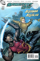 Brightest Day #16 (DC Comics) The cover might be overstating the Aquaman Vs. Aqualad scene in the book—they do fight, but only for about two pages—and most of the Aqua scenes are here concerned with moving Jackson into the penultimate phase of embracing superhero-dom, as he gets his costume, gets some weapons that focus his water powers (weapons apparently already seen on and explained in the Young Justice cartoon) and poses for a splash page with Aquaman.
 The rest of the book’s pages are devoted to the Firestorm/Deathstorm part, which I’ve thus far mostly dreaded given the poor quality of art in that storyline, but it seems that it’s a plotline that will become increasingly important in the book’s second half. For example, here Firestorm goes to the JLA for help and thinks he perhaps destroyed the entire universe on the last page.
Taking a longer view, Brightest Day is perhaps a somewhat troubled series, with most of the stories seemingly completely unconnected with one another. It reads more like an anthology series than an story with a large cast, and it’s seems that by the sixteenth issue of a 26-issue limited series the threads would be starting to tie together.
I’m enjoying two or three of those threads so much I really don’t mind—I’ll sit through that weak Firestorm art or having to read about Hawkman (whose story tends to at least be inadvertently hilarious at all times) in order to see Gleason draw Martian Manhunter or read about Aquaman for the first time in years.
 Green Lantern #60 (DC) It’s Parallax-possessed Barry Allen versus Hal Jordan in this issue, and while the superheroes have fantastic powers and Doug Mahnke is a fantastic pencil artist capable of illustrating super-deeds clearly, effectively and excitingly, the Flash versus Green Lantern fight was a pretty good example of the limits of realistic superhero comics.
If the space monster in The Flash really has access to his powers and wants to kill Hal Jordan, then our protagonist should have been dead in the first panel of the book…writing a fight scene with these two particular characters with their two particular power sets (the bad guy, remember, can move at faster-than-light speed) with the requisite level of realism the Green Lantern title has developed over the last 60 issues or so would require Geoff Johns to explain a lot (tons of telling, relatively little showing), and/or come up with an interesting way to slow down time to draw the fight out and somehow make it fair.
It’s really just standard punch-trading though. There’s a rather nicely conceived splash page showing Paraflashx beating Hal while dragging him across the two pages, but he speaks a few sentences of dialogue. It’s the old-school comic book problem of the art and the script occurring at different paces, like Captain America having a paragraph of dialogue while performing a single flying kick: The images in superhero comics generally capture about a second, whereas the dialogue they share panels with take several seconds…or longer.
Here that disconnect is greatly exaggerated, given how fast The Flash is supposed to be.
This hardly ruins the comic, and less persnickety readers probably wouldn’t even notice, let alone waste a part of their evening typing up a few paragraphs about it, and, honestly, I can edit the scenes in my head so they make sense—Maybe Parallax was so new to Flash’s body that he couldn’t reach very fast speeds yet, maybe he was just toying with Hal because he wanted to keep him alive so he could possess him again some day, maybe Hal Jordan’s ring was generating an invisible force field to protect him from what a bunch of high-speed death blows, and so on.
Of course, I’d rather get swept up in a superhero fight scene and not have to edit it in my head, you know?
Maybe it’s not the comic though. Maybe it’s me.
Anyway, the bulk of this issue is Flash vs. GL fight, with the Geoff Johns “Oh shit!” climax being the revelation of who the little Guardian-shaped mummy that’s been floating around collecting the space monsters really is.
It’s a familiar Green Lantern bad guy, who has lately been more of a whole DCU or Multiverse-level bad guy thanks to Kurt Busiek’s last few usages of him. Don’t feel bad if you didn’t see it coming; he is in a pretty different-looking body than usual, after all.
Mahnke’s artwork is, as always, top-notch, and puts that of most of his peers on DC’s super-comics to shame. And that’s with four different inkers involved.
I suppose it’s also worth noting that this is only a 20-page comic, which is the new page count DC is adopting in order to keep more of their books at $2.99; rather than bumping up the price, they cut a few pages.
I mention this only because I didn’t actually notice the shorter length while reading, and had to go back and count the pages to see if they had started doing that yet or not.
I was a little surprised to see that it was a 20-pager too, given that there’s the aforementioned double-page splash, a page-and-a-half splash (basically, a two-page splash panel with three smaller panels in the corner of one page), and two single-page splashes. That’s still an awful lot of space given up for giant panels given a lower page count; I assumed we’d see fewer splashes in the $2.99/20 books than we saw in the $2.99/22 books.
But, like I said, I didn’t even notice reading, so maybe it won’t be a big deal—at least, it’s not so far with this particular writer and/or artist and/or title.
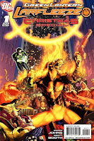 Green Lantern: Larfleeze Christmas Special #1 (DC) Ever since it was first announced, presumably in a joking fashion by writer Geoff Johns at a comics convention panel, I was looking forward to this.
 The character, DC’s Orange Lantern powered by the emotional spectrum’s color of avarice, is a multi-tusked space baboon who, Hal Jordan’s narration tells us, talks like Gonzo from the Muppets, and, as drawn by Doug Mahnke, is usually funniest-looking part of any of the many Green Lantern stories to feature the various-colored Lanterns over the last few years.
Geoff Johns doesn’t always do comedy very well, but his stories tend to benefit when he applies a light touch, and he’s portrayed Larfleeze less and less as a tragic horror type of character and more and more as comedy relief.
None of which suggests he’s a prime candidate to carry his own comic, even a one-shot, and so giving Larfleeze his own book and attaching the words “Christmas Special” to it always struck me as a rather daring move on DC’s part (Although perhaps it just seems daring; if you were to ask a comic convention crowd to clap for characters they’d like to see get their own comics—a metric DC apparently uses as market research—then Larfeelze probably gets at least as much clapping as the THUNDER Agents or The Shield or Ragman or Lobo or Azrael).
In other words, I’m all for DC taking risks—even minor ones—and attempting funny comics.
And I hope the fact that this one turned out just awful won’t discourage them from trying again in the future.
Before we get into the quality of the book, let’s take a moment to note the deceptive marketing and the extremely poor value of the book. Dccomics.com tells us it’s a 32-page book, which savvy comics consumers like us know actually means it’s the standard 22-page comic with ten pages of ads. It’s priced at the Marvel price point of $3.99, which normally would be enough to keep me from purchasing, but since it is such an oddball book, it didn’t sound like something that would pop up in a trade somewhere, so what the hell, I thought, I’ll splurge a buck—it’s Christmas.
As it turns out, the solicited story by Geoff Johns and artist Brett Booth is actually only 16 pages long, with a two-page back-up by Art Baltazar and Franco adding up to 18-pages of comics.
Filling up the rest of the book are ads and four pages of “extras” like a Green Lantern house ad wishing the readers Happy Holidays, a maze, a Larfleeze Christmas ornament and a recipe for Orange Lantern cookies. These might be fun features—I enjoy when such things appear in Tiny Titans or Super Friends, for example—but the kids books generally don’t charge you for them, and they’re usually done in an appealing visual style, rather than in Brett Booth’s style, which isn’t exactly kids activity book ready. (None of these things are mentioned in the preview, nor is the Baltazar-drawn back-up).
(Aside: Those cookies do look pretty awesome)
Johns’ story, which could have easily fit into DC’s Holiday Special given its short length and narrow focus, finds Larfleeze going through his understanding of the Christmas ritual in order to get everything he wants delivered to him by Santa Claus on Christmas morning.
When he awakes to find no presents under the tree, he flies off to find Santa, and instead finds Hal Jordan, who breaks it to him that Santa isn’t real, and the most important thing to acquire during the holiday season is “The Christmas Spirit,” which a brief, confusing montage shows Larfleeze attempting to get by giving away stuff with Green Lantern.
Johns might have had some clever dialogue in here somewhere—no joke really lands, given the poor execution of the art—but the book is more tragedy than comedy, as it ends with Larfleeze curled up in the fetal position, crushed by the fact that the one thing her really needs is denied to him.
I can’t imagine whose idea it was to have Booth draw this comic—Adam Schlagman and Eddie Berganza are the editors, although one imagines Geoff Johns could demand pretty much any artist he wants at this point—but he’s not up to the task.
It’s no surprise that the Anita Blake Vampire Hunter artist does terribly proportioned, ever-morphing human anatomy, and has difficulty with recognizable human expressions, but his Larfleeze is no better, really:
 I guess the fact that he’s human from the neck down presents the same problems for Booth that drawing the human characters does.
Additionally, the artwork is often impossible to read. For example, what the hell causes this beard to go flying off in these panels?
 It seems like such a wasted opportunity, given the fact that 16-page (mostly) comedic Christmas special would have provided the perfect opportunity for DC to make a more unusual choice of artist.
 For example, someone from their Johnny DC line (Mike Norton, using his more cartoony Billy Batson style? J. Bone?), or the other Van Sciver brother or…well, you get the idea. Preferably someone who could draw well and could draw comics well, and in this particular instance DC seemed to have a good excuse to look far afield of their usual suspects.
I mean, here’s Baltazar’s Larfleeze:
 Does it look more simplified and cartoony than, say, Doug Mahnke’s Larfleeze? Sure. But this is a Christmas Special, as it says in the title, so why not do a more simplified and cartoony Larfleeze, given that, you know, the words “Christmas special” usually refer to children’s cartoons.
At any rate, however you feel about detail and style, Baltazar is clearly better at human proportions and maintaining them from panel to panel and page to page.
As for Baltazar’s story, it’s about Glomulus flying around space, visiting the otherly colored Corps and trying to gather presents for Larflleze, with lots of cute little gags at the expense of those characters.
Well, there’ s always next year’s Green Lantern: Larfleeze Christmas Special #2, I guess…
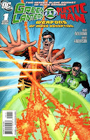 Green Lantern/Plastic Man: Weapons of Mass Deception #1 (DC) And here’s the next disappointing Green Lantern one-shot I read this week, and the first of two over-sized DC one-shots I read that seemed to be published mainly so someone somewhere could clean out their office.
It’s by Marv Wolfman and Brent Anderson, and my guess remains that it was originally created to fill two issues of the Brave and The Bold (Wolfman wrote a two-parter for the title during the 10-issue stall-for-JMS period of its existence, and this special is 44-pages, with a cliffhanger on the bottom of page 22 and a scene-setting splash on page 23).
I’m a big fan of Plastic Man, and Wolfman and Anderson are both solid craftsman, so I thought this would be right up my alley, but it turned out to be pretty tedious reading, accidentally recycling points about the characters made by others and even ending on a gag another Plas story ended on.
The set-up is pretty strange, as Plas and Hal team-up because they are both apparently on the JLA in this book, although Plas hasn’t been on the team since about 2004 (he pitched in a few times since), and Hal Jordan has never officially rejoined the League since coming back to life, save for two story arcs at the beginning of the current volume of JLoA, an maybe an issue of James Robinson and Mark Bagley’s current run).
I don’t think these two characters have even been in the same room since Jordan came back to life, excepting maybe that ceremony at the beginning of the last JLA arc (the Infinite Crisis tie-in written by Bob Harras) and a few scenes in Cry For Justice).
At any rate, Plas found some alien space-guns while doing some earthbound crime-fighting, and since his case intersects with Hal’s, the Green Lantern deigns to team-up with Plas, even though he finds him an annoying clown.
As written here, it’s not hard to see what Hal hates about Plas—Wolfman writes him as a Spider-Man-like motormouth character who is constantly joking and changing shape to reflect those jokes, unfortunately the vast majority of those jokes fall into the unfortunate valley between Funny and So Unfunny As To Be Funny.
Hal Jordan is simply a personality-free straight man here, doing nothing but griping about Plastic Man and scolding him….right up until the climax, where he realizes that despite Plastic Man being a goofball, he’s actually a true hero and joking around is his way of blowing off steam. Heavy.
Wolfman tries to balance space-crime and old-fashioned criminal underworld characters and settings, so that the pair are after a crime cartel of humanoid ducks who are selling laser guns to earth scum, but the marriage is a forced and unhappy one, at least until the climax.
Anderson’s art is solid, and the weirdness of the alien ducks is kind of cool, but his Plastic Man is a pretty ugly one, and most of the settings look pretty generic (JLA HQ, for example, looks like half the offices I’ve worked in, rather than a superhero base in space).
The biggest disappointment for me was the cover, however. It’s a nice enough image, I suppose, but because the logo was designed to echo the old Greeen Lantern/Green Arrow logo, I was disappointed that Anderson didn’t have a GL/GA parody or homage to go along with it.
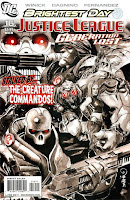 Justice League: Generation Lost #16 (DC) In this issue, the team of heroes are attacked by the new-ish version of The Creature Commandos, under the control of Max Lord. Meanwhile, Batman Dick Grayson and Power Girl—wearing a slightly different costume due to what I assume is a coloring mistake that gave her pants—continue to circle around the mystery of Lord’s existence and the actions of the former Justice Leaguers hunting him.
 Winick’s scripting is fine, and Fernando Dagnino and Raul Fernandez’s art is decent at its weakest, and awfully sharp at its strongest.
This conception of the Creature Commandos, as little more than a faceless horde of cannon fodder in monster drag, is a particularly dull and unimaginative take on a cool old crazy concept—even Dustin Nguyen’s cover image featuring his personal designs for some of the Commandos is bland and uninspired—but I did like the Mummy character who was the team’s field doctor, bandaging their wounds.
 Neat, huh?
 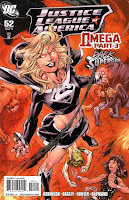 Justice League of America #52 (DC) In this issue, Supergirl becomes Dark Supergirl, which I believe is a callback to Jeph Loeb and Ian Churchill’s first arc on the current volume of Supergirl, and though I read the issue with that Supergirl on the cover, I honestly can’t remember anything about it beyond the fact that I noticed Churchill drew Supergirl’s tiny micro-miniskirt even tinier when she became evil.
 Blue Jay (whom I kinda like and would hope sticks around the League for awhile, even though I’m dropping this book myself as soon as Bagley leaves and Booth arrives) offers a theory for why she changed into a bad guy version of herself here, but the strongest impression it left on me was the way it made my eyes roll.
The bad version of Supergirl is, of course, more sexually aggressive than the good, normal version of Supergirl because, duh, female sexuality is bad:
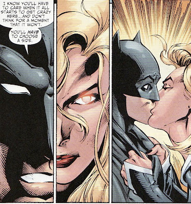 (I don’t think that’s writer James Robinson or DC Comics’ point or anything, but that’s what the scene suggests nonetheless…particularly if sexual politics is something you think about when reading superhero comics, and a surprising amount of people do just that).
 Plot? The Justice League, The Crime Syndicate, Tangent Green Lantern and Blue Jay are still trapped in Washington D.C. with the seemingly unstoppable Omega Man. The quality level is on par with the last few issues—if you liked those, you’ll like this; if not, probably not.
I like the way Mark Bagley draws groups of heroes standing around, I like all the bright colors of those superheroes’ costumes, I liked the cliffhanger ending and I liked seeing Hal Jordan get killed—even if it’s the Hal Jordan from a parallel universe.
Oh, and on the opening page Bagley and company draw EDILW favorite Zauriel, and either intentionally or accidentally give him a new costume, blending elements of his first appearance angel clothes and his later heaven-forged armor/superhero suit:
 I like it.
  Mighty Samson #1 (Dark Horse) Like Dark Horse’s other recent Shooter-written revivals of old Gold Key characters and concepts, this first issue is priced at the regular Dark Horse price point of $3.50, but contains both an all-new story by Shooter and a reprint of the character’s original appearance. I’m a sucker for both a good value and old, obscure-ish super-characters, so I find these first issues hard to resist. They certainly offer nice opportunities to check out the new directions and see if it’s something one might want to follow in singles or come back for in eventual trade.
 The concept of the original Samson is a mixture of silly and familiar. In a post-apocalyptic future, human civilization has started over on the ruins of our civilization, and the radiation of the nuclear war that provided the apocalypse part of the post-apocalyptic setting has mutated animals into all kinds of crazy-looking monsters. In to this world is born a super-strong dude, named after the Bible’s super-strong dude, Samson.
Shooter plays the story completely straight, and while that naturally leads to some cheesy scenes and plenty of B-movie style melodrama, it’s all of the sort most reader’s would likely expect from this. Shooter’s not reinventing the wheel here, or doing anything of great literary value, but he is doing solidly entertaining craftsmanship, so I imagine anyone who likes barbarian comics and pulp adventure—particularly of the sort Dark Horse has made itself known for over the past decade or so—should find a lot to like here.
The biggest revelation for me was the work of artist Patrick Olliffe. I’m familiar with his name from his work at DC and Marvel, usually on books with accelerated schedules, and that work has rarely been anything more than competent.
This seems like the work of a completely different artist though. The settings are more fully realized, the character designs are sturdier, the characters act better, and the action is more fluid and expressive. I’m sure I haven’t read everything Olliffe has ever drawn, so feel free to take this with a grain of salt, but I think this is the best work of his career and, in fact, worth picking up exclusively to see that work.
Shooter adds a lot more political intrigue and interpersonal character dynamics into his story than are apparent from the back-up, and he also reenacts a biblical scene, in which his Samson kills a multitude of foes with the jawbone of an animal.
The sole disappointment I had with the book was the rather uninspired Raymond Swanland painted cover, which looks fairly interchangeable with the sort of cover you might see on a Radical Publishing fantasy comic (plop a dead lion on Swanland’s Samson, for example, and he could be Radical’s Hercules) or something from the short-lived Virgin publishing house.
The Golden Key books were known for their fantastic painted covers, which often put even the strong cartooning of the talented veterans who drew the interiors to shame.
For example, here’s a monster Samson fights in the first issue of the 1964 series:
 And here’s what it looked like on the cover:
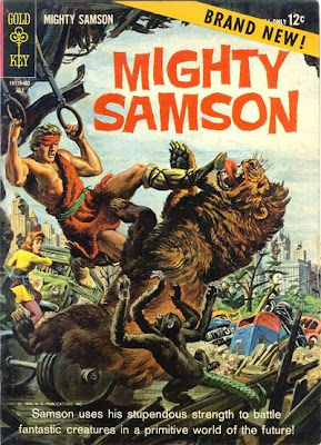 Compared to those old Gold Key covers, Swanland’s cover looks pretty generic, and blends right into today’s comics racks.
 Olliffe’s cover (yes, of course there’s more than one cover for this issue) is better…
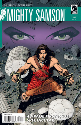 …but still doesn’t seem to replicate the drama or aesthetic of those ‘60s covers.
 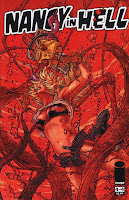 Nancy In Hell#2-#4 (Image Comics) I read and rather enjoyed the first issue of this four-part miniseries, but wasn’t able to find the second issue until just this past week, so I had #3 and #4 sitting around, waiting for #2 to show up so I could finally read the rest of the story.
I’m glad I hunted them all down, although I suppose it would have been simpler to just wait for the trade (If and when a trade comes out, I’d recommend it if you’re at all interested in the subject matter of scantily clad women, horror movies, Hell, demonology or gore).
The first issue ended with writer El Torres teaming up Nancy, a somewhat generic “final girl” horror movie type of character—defined more by her will and spunk and ability to survive than by personality quirks or specific details and emotions—with Lucifer. Together, the pair are going to journey through Hell to its very gates, and escape.
Torres’ version of Hell, the afterlife and Christian creation, cosmology and theology is pretty clever. I liked his takes on a lot of it, and while I certainly wouldn’t join a church that shared that worldview, it makes for interesting reading, fresh riffs on old—some of the oldest, really—concepts in Western literature.
It also cleverly uses a character type and plot engine from horror movies as part of the nefarious schemes of demonic forces: Nancy is in hell because she’s a candidate for an ultimate final girl, and if anyone can survive hell, it would have to be the ultimate final girl.
Torres doesn’t disappoint with the ending either; there’s a twist, which is of course to be suspected, but it’s not the most obvious twist.
It’s unfortunate that Juan Jose Ryp was unable to draw the rest of the series after starting it—Antonio Vasquez and Malaka Studio are credited with #3 and the bulk of #4—not because the other artist who drew parts of the series are poor ones, but simply because the book would have benefited form a singular artistic vision and style.
The PG-13-bordering-on-R amount of exploitative imagery and the copious gore certainly mean this isn’t a book for everyone, but all its exposed female flesh, rotting zombies and lakes of blood are merely icing on a cake made from quite disparate ingredients. If you can stomach it, it’s a real treat.
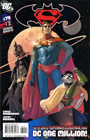 Superman/Batman #79 (DC) Someone give writer Chris Roberson a prize, because he’s accomplished something plenty of writers stumble with—picking up the batons of Grant Morrison comics and running the next lap of the eternal relay of corporate super-comics with them, and not stumbling.
Roberson and artist Jesus Merino—whose superhero work has rarely, if ever, looked better—return to the 853rd Century of Morrison’s DC One Million for a team up of The System’s Finest team of Superman and Batman.
I’ve talked at great length and great frequency regarding my affection for Morrison’s JLA run, and the DC One Million story spilled from it’s pages into a special miniseries and the entire DC line, eventually spawning one of the better DC series of the ‘90s—Tom Peyer and Rags Morales’ Hourman.
So, sure, I’m happy to see some of these characters, designs, concepts and settings back in play. But I’m even happier to see them being done justice. The story is fast-paced, clever and occasionally surprising. The artwork is beautiful, something I don’t really see enough of in super-comics these days (as you may have deduced form all the complaining about art I generally do in this recurring feature).
The plot revolves around Epoch, The Time Lord climbing into the battle-suit he wore in the Morrison-written, Smeiks-illustrated JLA/WildCATS crossover (hey, that’s the same team responsible for the DC One Million miniseries; nice!) and traveling back in time to face Batman, Robin and Superman in…I don’t know, whatever year Superman and Batman’s third year on the job was (looks like the ‘70s or ‘80s from the civilian fashions).
It’s to be continued next issue, which is cool in that it mans there’s another issue by this talented team coming up, but bad in that I pre-ordered this one form my shop, but not Superman/Batman #80—I didn’t think this book would ever be good two issues in a row again!
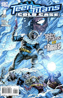 Teen Titans: Cold Case #1 (DC) This is the other odd one-shot that seemed published at random, given the fact that the characters on the team and their conflicts dates this as a Titans story from a few years back (Kid Devil is alive and on the team, Robin’s wearing his “One Year Later” costume and kinda sorta dating Wonder Girl, Superboy and Bart Allen are still dead, etc).
 I’m not sure where exactly it fits, but I assume it would be somewhere between the end of Johns’ run and the earlier parts of McKeever’s…?
Whatever the case, it’s the best all-around Titans comic story I’ve read since Johns left the title, perhaps in large part because it is set in the past and thus not forced to keep up with all of the changing crossovers and status quo changes that were weighing the title down for years on end.
Other events are mentioned and serve as motivating factors, of course—the “case” being referred to is apparently the murder of Robin’s dad Jack Drake in Identity Crisis, and this is essentially the story of Robin dealing with some of the psychic fall-out from that story, and the various ways his teammates help or fail to help him.
It also contrasts the Flash villains The Rogues and the Titans as different sorts of teams and families.
It’s by Mark Sable, and it’s very well constructed, both in terms of plot and theme. It’s complicated enough and has enough characters that there’s no way to do a brief synopsis here, but it is essentially Deathstroke getting the Flash villains to fight the Teen Titans, while he stays off the battlefield, messing with his daughter's and Robin’s minds.
The artwork is by Sean Murphy—although for some reason DC slapped a Jason Fabok cover on top of a book by the Joe The Barbarian artist—and it’s the best-looking Teen Titans story since…God, I can’t remember the last time I read a Teen Titans comic that had great art for more than 20 consecutive pages. (Teen Titans: Year One, maybe?)
Muphy’s one of those artists who does everything right: I like his lay-outs and backgrounds, the way he draws Ravager’s boots and the Titans' sleepwear and The Trickster’s costume, the way his characters fall down when they get punched or soar through the air when jumping, the way his Captain Cold and Heatwave pose while aiming their guns, the little beams that fly out of Mirror Master’s gun. Hell, he makes Ravager’s costume look cool, he makes an image of a sad-face Robin compelling and his action scenes are a delight to read.
The book is too concerned with continuity minutae to have very broad appeal—if you don’t already know and like at least most of these characters, there’s not a lot to grab on to hear other than nice artwork—but it’s really good for what it is.
Yotsuba&! Vol. 9 (Yen Press) As wonderful as it is that there exists a comic book that includes a panel of a little girl doing this:
 It’s more wonderful still that this same comic can make a reader feel just like that.

7 comments:
Aw, Come on. Tell us how you really feel! If you're going to trash someones work then doing it properly!
Best!
Brett
Eddie Berganza should probably warn his artists against drunkenly googling their names.
Mr. Booth,
Caleb's comments were perfectly fair. You've been working in comics for at least 15 years now; if you're not going to evolve as an artist in all that time you should at least try to develop thicker skin.
Thanks for reading Brett (I checked out your site by clicking on your blue, underlined name there, and I see you do draw really cool dinosaurs).
Commenters in general, please be nice to one another (I had to delete one comment for being too harsh).
Concreteface,
Ah, no, I was being a bit sarcastic as I enjoy reading the negative reviews, you can't please everyone. I was actually looking for something else (any buzz for the Starman/Congorilla special. It took me to the kinds words he had to say about the JLA 54 cover. As I said I like to read the bad stuff so I clicked on the blog name and got the Larfleeze review.) Caleb said he was going to get into why my work is so bad but didn't really do it, thus the comment. I am by nature a smart @$$.
Corey,
Telling me you don't think the art has changed in 15 years isn't a review. If you're going to do things like that then give reasons you don't like it, like the arms are too long or the hair isn't what you like. Trust me, when someone tells you you should die before you draw another issue of X-men this sort of stuff rolls off. I'm perfectly happy to hear a critique of the art but that wasn't one. It's clearly not true, or at least not as true for me as it is for others. Sure some of it's the same but I like those parts.
Caleb,
Seriously, go ahead and review/critique it. We clearly like different art styles so it won't bother me.
And thanks, on the dinosaurs compliment. That actually means more to me than the comic stuff:)
Sorry it took so long to get back here. I forgot the name of the blog and wanted to finish up some work before I went looking. I'll have to remember to check the email box:)
Best!
Brett
Welcome, back Brett. Remembering the name of the blog is easy—just get Morrisey's "Every Day Is Like Sunday" stuck in your head, and change "Sunday" to "Wednesday."
I just reread what I wrote about the Larfleeze special, and I guess I didn't get too specific about what I didn't like about the art there (Just FYI, the idea with these columns is to read all the books I bought on a particular trip to the shop, and then write about 'em immediately after, so they tend to be more off-the-cuff and to not get into the nitty-gritty of things.)
It's certainly safe to say we probably don't like the same styles. (This is just a taste thing, but you seem to use a whole lot of lines, and I prefer simple, strong compositions, the fewer lines the better, for example).
The examples I used from the Larfleeze special were to show the main characters' anatomy and his relation to the bed he was jumping out of, and the panel where the beard flies off of Santa (I could assume why it flew off of him, but I couldn't tell if from the art or the context of the script either).
I haven't read a ton of your work, but you're not an artist who jumps to mind when I think comedy, and I think the tone of the book was a little uncomfortable...visually, as well as everythingelsey, really.
Anyway, as you mentioned I did note in discussing the solicitation of Starman/Congorilla that it was "the second time I've meant to talk at greater length about Booth's work during long posts, and end up sounding dismissive of it; one of these days I'm going to devote a couple paragraphs to what I like and dislike about it, I swear."
Originally I wanted to talk about your work a bit after reading the Scarecrow short in the Untold Tales of Blackest Night anthology, but that was the last book I was writing about in a several thousand-word post, and I kinda petered out. ("I haven't quite made up my mind about Booth's art. I don't really care for it, and yet there's something somewhat appealing about it").
In short, there's a slightly cartoonish, exaggerated quality to your drawing—particularly the figures and eyes of the faces—that I like, but the rendering tends to lose me, and of the stories I've read—and I probably haven't even read 100 pages of your comics work at this point—aren't generally laid out in a way that's clear or easy to read.
And when you're dealing with subject matter like Batman villains and Justice League characters, a reader can't help but compare every story he or she reads with the work of every other artist to draw those characters, and the bar is understandably pretty high.
I remember thinking that Scarecrow story reminded me a lot of Todd McFarlane as well...I wanted to say something about how you shared McFarlane's cartoonier, gritty '90s style, but, I never really got into it.
I WILL devote a whole post to digging into your art at some point in the future though, especially since your work is going to be pretty prominent at DC for some time (and, um, because you asked).
Maybe I'll wait until after the JLoA story arc gets collected though, so there will be a nice big chunk of it to look at and talk about...
I did read Starman/Congorilla yesterday, and will have a review of that. It won't be very in-depth or art-focused, as it will be another installment of "Comic shop comics."
--Caleb
P.S. You should draw many more issues of X-Men before you die. If you want to draw more issues of X-men.
Hi Caleb,
Not a big Smiths fan, unless it's Girlfriend in a Coma;)
I wasn't actually super happy with the leaping off the bed panel, but the deadline was... insane. So the whole thing was a rush job, but we got it done. I agree with you on the beard, I forgot to mention to the colorist (Andrew) to make it look like they were flying fast, it just didn't get caught. I finished the pages on a Tuesday, Andrew finished on Wednesday and the book went off tot he printers on Friday, Close! It happens, a lot more frequently then people know;) I don't usually do funny, but I do like funny. It is damn hard to put expressions on a face that shouldn't actually be able to do them, the tusks in the mouth being the biggest problem.
It is funny to me that you keep saying McFarlane, while I did like his work it was mainly for Spidey's webs and his capes. But my main draw to comics and the art thats the base for my work is older Art Adams, not the real cartoony stuff. The Uncanny X-men Annual 10 stuff. Slighty cartoony, longish art deco people with lots of detail. Jim came later and after awhile I sort of switched back to the elongated style. To me it looks more elegant, but that's just me. I do appreciate others styles (love Kevin Maguire's work as well as Alan Davis.) The more plain stuff just looks unfinished to me, I'm not saying it is, just saying that it's not what I like. I like things, things to look at to keep me looking.
I'd wait until after the JLA run, I did switch up the style a bit for the darker material. I haven't done that kind of work in years so it took me a bit to get used to.
The JLA fans seem a bit... invested in the characters;) But the Anita Blake fans were as well, mainly one guy out of the 30,000+ and he was pissed it wasn't manga so I took his critiques with a grain of salt. Laurell seems to like it.
Best,
Brett
Post a Comment